In this article, we’ll outline ten common logo design mistakes and how you can avoid them to strengthen your brand’s impact.
Discover the top 10 logo design mistakes that weaken branding. Learn how to avoid overcomplicated designs, poor font choices, and weak scalability. Find out how the correct color selection and brand alignment can enhance your logo’s effectiveness, make it memorable, and increase visibility across all platforms. Avoid these errors to strengthen your brand identity.
A well-designed logo is crucial for building a brand’s identity and recognition. However, many businesses fall into common pitfalls when designing their logo. These logo design mistakes can hinder your brand’s potential and create confusion with your target audience. Let’s go over these 10 logo design mistakes and highlight the solution.
Table of Contents
10 Common Logo Design Mistakes to Avoid for Stronger Branding
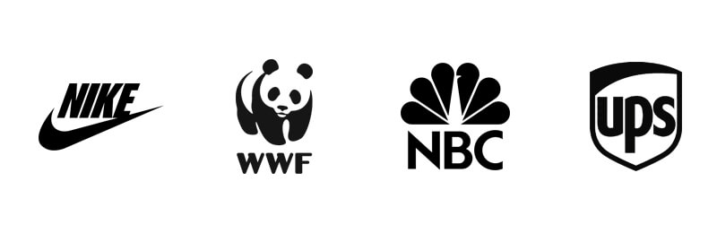
1. Overcomplicating the Design
Mistake: Trying to incorporate too many elements, colours, or intricate details into a logo can result in a cluttered design that is hard to interpret.
Solution: Keep your logo simple. Simple logos are more memorable, scalable, and easier to recognize across various mediums. Think of iconic logos like Nike or Apple; their strength lies in their simplicity.
2. Following Trends Too Closely
Mistake: While it may be tempting to follow the latest design trends, creating a logo based solely on current fads can quickly date your brand.
Solution: Focus on timeless design principles. Your logo should be as relevant in five or ten years as it is today. Incorporate subtle nods to trends, but ensure the core design is timeless and flexible for future use.

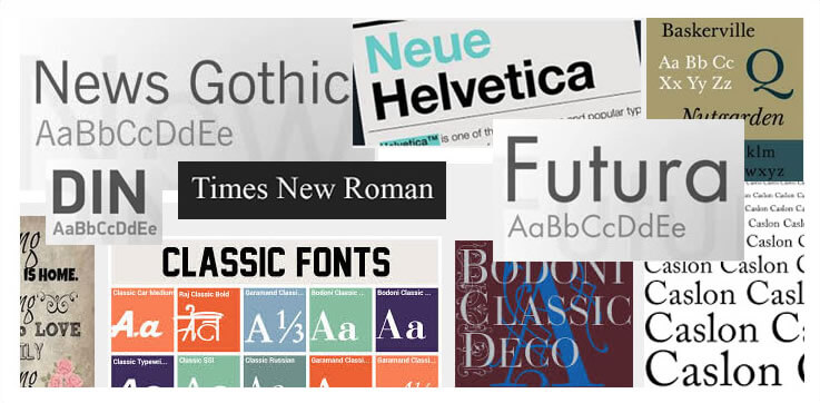
3. Poor Font Choices
Mistake: Choosing the wrong font can make your logo look amateurish or incompatible with your brand identity. Fonts that are hard to read or too elaborate can turn off potential customers.
Solution: Select fonts that align with your brand’s tone and style. If your business is professional, opt for clean, sans-serif fonts. For a more creative or playful brand, you might explore decorative fonts—but ensure they are legible.
4. Neglecting Scalability
Mistake: A logo that looks great on a website but falls apart when printed on business cards or billboards is a major issue.
Solution: Design your logo with scalability in mind. Test it at different sizes to ensure it remains legible and maintains its impact, whether it’s on a small product label or a massive billboard.
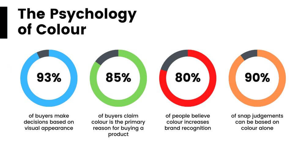
5. Ignoring Colour Psychology
Mistake: Picking colours at random or simply using your favourite ones without understanding the psychology behind them can weaken your brand message.
Solution: Choose colours that reflect the emotions and values of your brand. For instance, blue evokes trust and professionalism, while red conveys excitement and urgency. Understanding how different colours affect perceptions will help you create a logo that connects with your audience.
6. Using Stock Imagery or Clip Art
Mistake: Incorporating stock images or clip art into your logo design can make your brand look unoriginal and generic.
Solution: Invest in a custom logo design that is unique to your brand. Custom graphics ensure that your logo is distinctive and not mistaken for another business’s identity.
7. Failing to Consider Versatility
Mistake: A logo that only works in colour or looks awkward when placed on different backgrounds can limit its usefulness.
Solution: Design a logo that is versatile. It should work in black and white, grayscale, and different colour variations. Consider how it will look on various backgrounds (light, dark, textured) to ensure maximum adaptability.
8. Neglecting Brand Alignment
Mistake: Designing a logo that doesn’t align with the brand’s identity can confuse your audience. For example, a playful, cartoonish logo may not be appropriate for a serious law firm.
Solution: Ensure your logo accurately reflects your brand’s personality, values, and industry. If your brand is formal, opt for a sleek and minimal design. For more creative brands, you can afford to take more design risks.
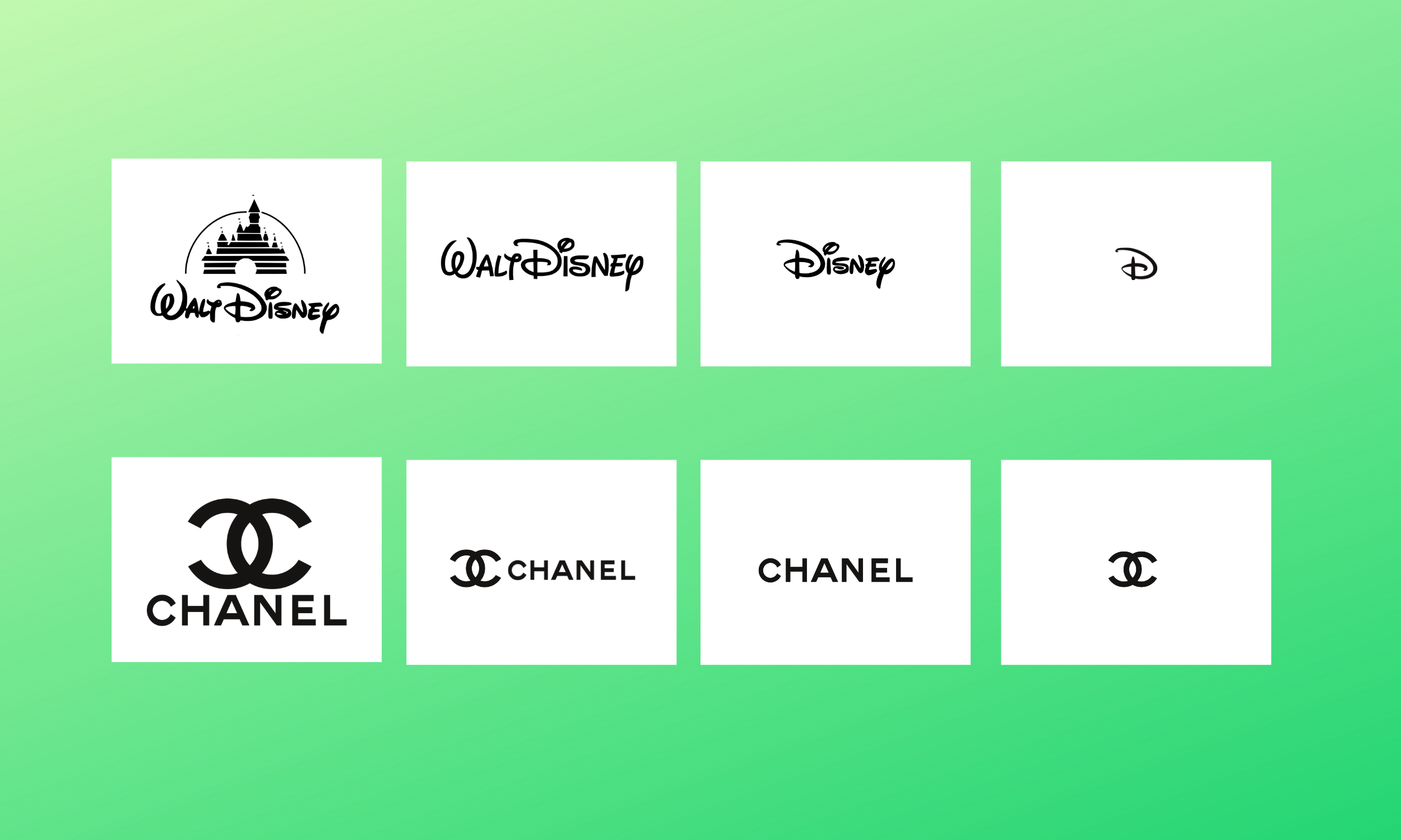
9. Copying Competitors
Mistake: While it’s important to know what your competitors are doing, copying their logo can lead to brand confusion and legal issues.
Solution: Differentiate your brand by creating a unique logo that reflects your business. Your logo should set you apart from competitors, not blend in with them.
Like the example above of Chanel and Huawei, although not an exact copy or even an atempt in my opinion, some would argue that there are design similarities if you turn the Huawei logo on the side so it looks like the Chanel logo that could cause confusion with some people. It could even be another variation and concept for the same Chanel logo.
There was a legal dispute in 2017. However, the European Union Court ruled, declaring the Chinese brand logo can’t be traced to Chanel specifying no risk of confusion between the two logo designs, emphasising in particular that Chanels double C was immediately recognisable and associated with Chanel.
10. Ignoring Feedback and Testing
Mistake: Falling in love with a logo design without gathering feedback from others can lead to a design that doesn’t resonate with your target audience.
Solution: Test your logo with a variety of audiences, both internal and external. Ask for honest feedback and make adjustments as necessary. Consider A/B testing different versions of your logo to see which one performs better in real-world scenarios.

Conclusion
Your logo design is often the first impression people have of your brand. Avoiding these common logo design mistakes can set your brand up for success, ensuring your logo is both memorable and effective. A strong logo will communicate your brand’s message clearly, stand the test of time, and create a lasting connection with your audience.
Take the time to invest in a thoughtful, well-executed logo design, and your brand will reap the rewards.
Further Reading:
- The Different Types Of Logo Design
- 10 Examples of Powerful Global Branding
- Learning from the World’s Most Famous Logos
- Best Global Rebrands and Logo Redesigns of Major Brands
- The Psychology of Shapes in Logo Design
- Unlocking the Magic of Logo Design: A Guide to Creating Memorable Logos
- Branding Beyond Borders: Elevating Your Global Presence through Impactful Logo Design
- Colours that Define Your Brand: Unlocking the Power of Colour Psychology in Logo Design
- Logo Design Trends to Watch Out for in 2023: Stay Ahead of the Curve!
- Most Expensive Logos In The World
- Every Good Logo Tells a Story! 40 Famous Brand Logos & Their Hidden Secrets
- Famous Logo Designers and Their Distinctive Style
- Using the Golden Ratio in Logo Design
- 20 Famous Brand Logos Constructed in Grid Systems
- 14 design principles of good logo design
Join The Logo Community
We hope theses 10 Common Logo Design Mistakes to Avoid for Stronger Branding has helped. If you would like more personal tips, advice, insights, and access to our community threads and other goodies, join us in our community.
You can comment directly on posts, access our community threads, have a discussion and ask questions with our founder Andrew.
If you’re looking to learn more about brand strategy, we highly recommend eRESONAID with our friend and acclaimed brand strategist and author Fabian Geyrhalter, it’s packed full of knowledge and insights you will need to learn to become a brand strategist or apply what you learn within your own business.


Author Bio
Andrew Marriott is the owner and founder of The Logo Creative™. He is an award-winning designer with over two decades of experience designing logos and specialising in branding for companies worldwide.
FAQ – Common Logo Design Mistakes
What are the most common logo design mistakes?
Common mistakes include overcomplicating the design, poor font choices, neglecting scalability, ignoring colour psychology, and using generic stock imagery.
How can I avoid logo design mistakes?
Focus on simplicity, choose legible fonts, ensure your logo scales well, use colours that align with your brand’s emotions, and invest in a custom design.
Why is scalability important in logo design?
A scalable logo maintains clarity and impact across different mediums and sizes, from business cards to billboards.
How does colour choice affect logo design?
Colour impacts how your brand is perceived, with different hues evoking specific emotions. Choosing the right colour scheme reinforces your brand identity.
Should I follow design trends for my logo?
While trends can inspire, focus on timeless designs that will remain relevant for years rather than quickly becoming outdated