In this article we’ll break down essential logo design tips for beginners to help you create a logo that’s both visually appealing and meaningful. Whether you’re designing for a startup, personal brand, or small business, these logo design tips for beginners will set you on the right path.
Table of Contents
Essential Logo Design Tips for Beginners
Designing a logo can be a daunting task, especially for beginners. However, with the right logo design tips for beginners, you can create a memorable and impactful logo that effectively represents your brand. A great logo is essential for making a lasting impression on your audience, and it can significantly influence their perception of your business.
In this comprehensive guide, we’ll explore the essential logo design tips you need to know, from choosing the right colors and fonts to keeping your design simple and timeless. Let’s dive in!
1. Understand the Purpose of a Logo

Before you jump into the creative process, it’s crucial to understand what a logo does. Your logo design is not just a pretty image—it’s a key element of your brand’s identity. It should reflect your brand’s values, culture, and industry while being easily recognizable. A good logo makes a lasting first impression and helps potential customers trust your brand.
Essential Tip: Ask yourself what message you want your logo to convey. Do you want your brand to appear professional, fun, trustworthy, or innovative? Your logo design should reflect this identity.
2. Start with Research

One of the best logo design practices is starting with thorough research. Understanding your competitors, your target audience, and industry trends will help you craft a logo that stands out.
- Competitors: Look at the logos used by competitors in your industry. What works well? What’s overused? Avoid following trends blindly, as they can make your logo appear generic.
- Target Audience: The design of your logo should resonate with your audience. For example, a children’s brand would typically have a colorful, playful logo, while a law firm might go for a more professional and minimalist design.
Essential Tip: Use competitor analysis to identify what not to do—creating a logo that is distinct from the crowd is key to standing out.
3. Keep It Simple

One of the most common beginner mistakes is overcomplicating the design. Logos that are too complex or busy can confuse your audience and dilute your brand message. Simple logos are often the most effective because they are easy to recognize and remember.
Think of iconic logos like Nike’s swoosh or Apple’s apple. Both are incredibly simple yet memorable. Simple logo design tips include using clean lines, minimal text, and limited colors to ensure your logo can be easily recognized in various formats.
Essential Tip: Stick to one or two elements. A logo should be easy to identify at a glance, whether it’s on a billboard or a business card.
4. Choose the Right Colors
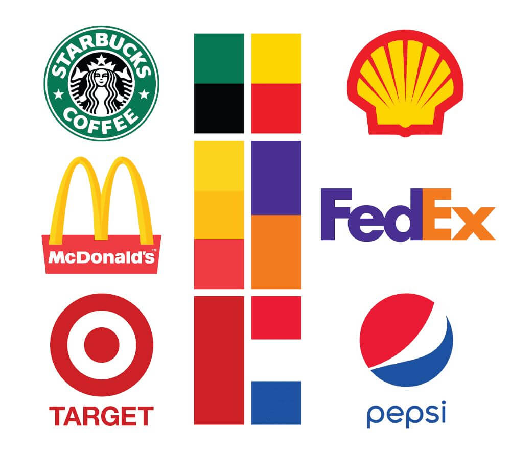
Color plays a significant role in the psychology of branding. The right color can evoke specific emotions and make your brand more memorable. For example, blue is often associated with trust and professionalism (think Facebook or LinkedIn), while red evokes passion and energy (such as Coca-Cola or YouTube).
Choosing colors for logo design involves understanding the feelings and emotions different colors evoke and how they align with your brand’s identity. Be mindful of cultural differences, as colors may carry different meanings across cultures.
Essential Tip: Stick to a minimal color palette—often two or three colors are enough. Ensure the logo works well in black and white, as it may need to be reproduced in grayscale.
Learn more about colour phychology in logo design
5. Pick the Right Font
Your font is just as important as your logo’s color and shape. Best fonts for logos convey the right tone for your brand. Serif fonts, with their traditional, professional appearance, are commonly used by industries like law and finance. Sans-serif fonts, on the other hand, are clean, modern, and widely used in tech and creative industries.
Script fonts can add elegance and creativity, but they should be used carefully, as they may be harder to read. Always ensure your font is legible, even at smaller sizes.
Essential Tip: Avoid using more than two fonts. Mixing too many font styles can make your logo look cluttered and unprofessional.
6. Make it Scalable

Your logo needs to be versatile. It will be used in a variety of formats and sizes—from business cards to website banners to billboards. That means your logo must be scalable without losing its impact or becoming pixelated.
Creating a vector-based logo (using software like Adobe Illustrator) ensures that it can be resized without losing quality. This is one of the most important logo design basics for beginners.
Essential Tip: Test your logo at different sizes. Does it still look good as a tiny icon on a mobile screen? Does it retain its clarity when printed on a large banner?
7. Avoid Design Clichés

Beginners often fall into the trap of using clichéd design elements, such as light bulbs for ideas or globes for international brands. While these elements might make sense, they can make your logo look generic and unimaginative.
Instead, aim for originality. Think about how you can represent your brand’s core message in a unique way. A great logo should be one-of-a-kind and memorable.
Essential Tip: Steer clear of stock images or clip art. Your logo should be custom and tailored to your brand.
8. Get Feedback

Once you’ve created a draft of your logo, seek feedback from others. What looks good to you might not resonate with your target audience. Sharing your design with friends, colleagues, or even potential customers can provide valuable insights.
Essential Tip: Create multiple versions of your logo and ask for specific feedback. For example, does the color scheme work? Is the font legible? Does the design reflect the brand’s values?
9. Be Timeless, Not Trendy
Design trends come and go, but a timeless logo will endure. While it may be tempting to follow the latest design fads, doing so can result in a logo that feels dated within a few years. Instead, focus on creating a design that will remain relevant for the long term.
Many famous logos, such as Coca-Cola or McDonald’s, have remained largely unchanged for decades, proving the power of timeless design.
Essential Tip: Avoid overly trendy fonts, colors, and elements. Opt for a design that feels classic yet modern.
10. Test It Across Platforms
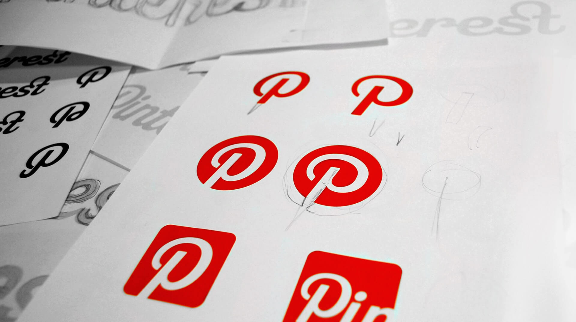
Your logo will appear on many platforms, from websites and social media to printed materials. It’s crucial that it looks good everywhere. Test your logo in various contexts, including:
- Social media profiles (e.g., Facebook, Instagram)
- Website headers and footers
- Print materials (business cards, brochures)
- Branded merchandise (t-shirts, mugs)
Essential Tip: Ensure your logo retains its integrity across all these platforms and mediums. This is one of the most important easy logo design techniques for beginners.
Final Thoughts
Designing a logo is both an art and a science. By following these essential logo design tips, you’ll be on your way to creating a logo that not only looks great but also effectively represents your brand. Remember, your logo is often the first interaction customers will have with your brand, so it’s worth investing time and effort to get it right.
As a beginner, the simple logo design tips we’ve covered will help you avoid common pitfalls and logo design mistakes and ensure your logo is versatile, scalable, and memorable. Whether you’re designing for yourself or a client, understanding the fundamentals of how to design a logo is key to creating a successful and enduring brand identity.
Now, get started on your design journey and create a logo that will stand the test of time!
Join The Logo Community
We hope you found these 10 Essential Logo Design Tips for Beginners helpful. If you would like more personal tips, advice, insights, and access to our community threads and other goodies, join us in our community.
You can comment directly on posts, access our community threads, have a discussion and ask questions with our founder Andrew.
If you’re looking to learn more about brand strategy, we highly recommend eRESONAID with our friend and acclaimed brand strategist and author Fabian Geyrhalter, it’s packed full of knowledge and insights you will need to learn to become a brand strategist or apply what you learn within your own business.

FAQ – 10 Essential Logo Design Tips for Beginners
What are the most important logo design tips for beginners?
The most important logo design tips for beginners include keeping the design simple, using the right colors, selecting appropriate fonts, and ensuring scalability. Start by researching your audience and competitors, then focus on creating a versatile logo that aligns with your brand identity.
How do I choose the right colors for a logo?
Choose colors that align with your brand’s personality and target audience. For example, blue conveys trust, while red signifies energy. Limit your palette to 2-3 colors for simplicity and make sure your logo looks good in black and white.
What font should I use for my logo?
The best fonts for logos depend on your brand’s tone. Serif fonts communicate tradition and professionalism, while sans-serif fonts are modern and clean. Always prioritize legibility, especially at smaller sizes.
How do I create a professional logo as a beginner?
To create a professional logo, research your brand and competitors, use simple elements, select complementary colors, and choose readable fonts. Test your design across different platforms and get feedback before finalizing.
What makes a logo timeless?
A timeless logo avoids design trends and focuses on simplicity, versatility, and relevance. It should work well across all mediums and remain impactful for years to come.

