Typography can make or break a logo design. According to a recent Adobe study, 75% of consumers judge a brand’s credibility based on its logo design, with typography playing a crucial role. Let’s explore 10 essential typography rules for logo design beginners.
Whether you’re creating your first logo or looking to refine your skills, understanding these fundamental logo typography rules will help you craft more professional and impactful logos.
Listen, I’ve been designing logos for over two decades now, and I can’t tell you how many times I’ve seen great concepts fall flat because of poor typography choices. You know what’s wild? According to Adobe’s recent research, 75% of consumers make snap judgments about a brand’s credibility just by looking at its logo. That’s huge! Let me walk you through everything I’ve learned about typography in logo design – the wins, the fails, and all the essential logo typography rules you need to know.
Table of Contents
Understanding Typography Basics in Logo Design
I remember my first paid logo project like it was yesterday – I thought I could just pick any “cool-looking” font and it would be ok. Boy, was I wrong! Typography in logo design is like the voice of your brand. Think about it – would you trust a corporate business that uses a font like Comic Sans in their logo? (Trust me, I’ve seen similar happen, and it wasn’t pretty!)
Typography isn’t just about picking cool looking fonts – it’s about communication. Over the years, I’ve learned that effective logo typography can make the difference between a brand that sticks in people’s minds and one that gets lost in the crowd. Here’s what I really wish someone had told me when I was starting out in logo design:
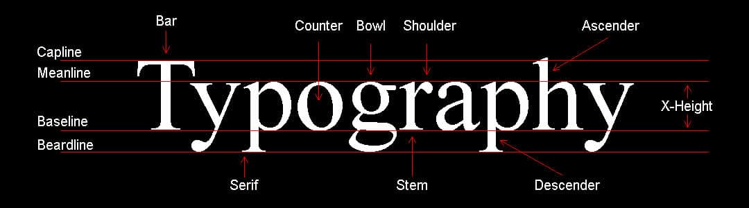
First off, let’s break down some key terms you’ll need to know. Think of typography like a toolbox – you need to know what each tool does before you can build something amazing.
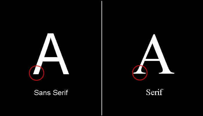
Serif Fonts
Serif fonts are like the business suits of the typography world – they’ve got those little feet (called serifs) that give them a classic, established feel.
Sans-serif Fonts
Sans-serif fonts are their modern, clean-cut cousins – think Silicon Valley start-ups.
Understanding the 5 Main Typeface Families in Logo Design
Let me tell you about the time I confused a client by using the terms “typeface” and “font” interchangeably – it was a mess! After that experience, I learned to explain typography in a way that makes sense to everyone. Think of typefaces like music genres, and fonts like specific songs within those genres. Let’s dive into the five main typeface families I work with daily.
1. Serif: The Classic Storytellers
I have a funny story about serifs. Early in my career, I tried to convince a law firm to use a playful sans serif for their logo. They looked at me like I’d suggested writing their legal documents in crayon! Here’s the thing about serif typefaces – those little feet (serifs) at the end of letters aren’t just decorative. They carry decades, even centuries, of built-in trust and credibility.
When I’m working with established brands or traditional industries, serif typefaces are my go-to choice. Think about the New York Times logo – those serifs practically whisper “established in 1851.” I’ve found that brands like Sony and J.P. Morgan use serifs brilliantly to convey their heritage and authority. My personal favourites are Garamond for its elegance and Times New Roman for its timeless reliability.
2. Sans Serif: The Modern Minimalists
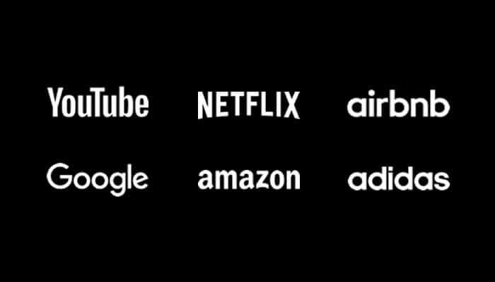
Here’s a tip I wish I’d known years ago: when in doubt with a tech or startup logo, sans serif is usually your safest bet. These clean, no-frills typefaces are like the little black dress of the typography world – they never go out of style! I’ve seen this first-hand working with start-ups who want to appear forward-thinking but reliable.
Look at brands like Airbnb and Target – their sans serif logos feel fresh and approachable. I remember redesigning a traditional company’s logo from serif to sans serif (Helvetica, specifically), and it instantly took 20 years off their brand image! Arial and Calibri are other great options to use when clients want that modern, clean look.
3. Script: The Artistic Signatures
Oh boy, script fonts – they’re like the double-edged sword of logo design! I once had a client who wanted their entire company name in a complex script font, including their website URL. Try typing that into a browser! But used correctly, script typefaces can add that perfect touch of personality to a logo.
I love using script typefaces for brands that need to convey elegance or creativity. The key (and I learned this through many, many revisions) is to use them sparingly. Snell Roundhand is great for luxury brands, while Pacifico works wonderfully for casual, friendly vibes. Just remember – if you can’t read it at a glance, it’s probably too complex!
4. Monospace: The Digital Veterans
Monospace fonts have a special place in my heart. I actually stumbled upon their power while designing a logo for a cybersecurity company. These typefaces, where each character takes up exactly the same amount of space, have this wonderful way of conveying technical precision and reliability.
What’s fascinating about monospace typefaces is their versatility. Sure, they were born for coding (I still use Source Code Pro when showing clients code examples), but they’ve evolved way beyond that. I’ve used Bergen Mono in logos for tech companies, and even Courier for brands wanting that authentic, typewriter feel. Just be careful – not every letter needs to look like it came from a 1980s computer!
5. Display: The Creative Wild Cards
Let me tell you about my favorite display font mishap – I once got so excited about using this super unique display typeface that I forgot to check if it included all the characters we needed. Guess what? No ampersand! Now I always check the complete character set before falling in love with a display font.
Display typefaces are like the seasoning in cooking – a little goes a long way. I’ve found they work best for short business names or iconic single letters in logos. Clearview and Johnston are great examples of display faces that balance uniqueness with readability. Just remember what I always tell my clients – you want your logo to grab attention, not give people a headache trying to read it!
The key to working with these five typeface families is understanding their personalities and knowing when to use each one. I always tell my design students: it’s not about picking your favourite typeface – it’s about picking the right typeface for the brand story you’re telling. Trust me, after you’ve worked with these families for a while, they become like old friends – each with their own special qualities and perfect moments to shine!
One of the biggest lessons I’ve learned is that typography is all about balance. You know those logos that just feel “right” but you can’t explain why? That’s usually because they’ve nailed the typography fundamentals – spacing, proportion, and logo design hierarchy. It took me years to develop an eye for this stuff, but I’m going to save you some time by sharing what really works.
Rule #1: Choose Fonts That Match Brand Personality
Let me tell you about a mistake I made early in my career. I once designed a logo for a children’s toy store using a serious, clean font, because they said they wanted to look professional and not too fisher price! – talk about missing the mark! The client took one look and said, “This feels too corporate for a toy store.” I agreed and said “I was only following the brief, I did try to explain” So it was back to the drawing board.
That was a wake-up call about the importance of educating clients of the importance of matching fonts to brand personality. I just followed the clients request knowing they would not like it instead of educating them.
Here’s what experience has taught me about font selection: it’s like choosing an outfit for an important occasion. You wouldn’t wear a tuxedo to a beach party, right? The same goes for fonts. I’ve found that serif fonts tend to work beautifully for brands that want to convey tradition, reliability, and sophistication. Think about those high-end fashion logos or prestigious university emblems.
Sans-serif fonts, on the other hand, are my go-to for modern, tech-savvy, or straightforward brands. I remember working with a start-up that wanted to appear “trustworthy but innovative” – we went with a clean sans-serif that perfectly captured that balance. The key is understanding the subtle messages each font style sends.
One thing that really bugs me (and I see this all the time) is when designers choose fonts based on trends without considering longevity. Sure, that super quirky display font might look cool right now, but will it still work in five years? I always tell my clients to think long-term with typography choices.
Rule #2: Maintain Perfect Legibility at All Sizes
Oh man, this early lesson was painful for me! Picture this: I designed what I thought was the perfect logo for a client, everyone loved it on screen, but when it went on their business cards? Complete disaster! The delicate font I’d chosen turned into an unreadable blob at small sizes. That taught me one of the most valuable lessons in logo design: test, test, and test again at different sizes.
Here’s a top tip I’ve developed over the years: if a logo doesn’t work as a favicon (those tiny icons in your browser tab), it needs work. I actually start many of my designs at a super small size now – it’s like building a ship in a bottle. If it works when it’s tiny, it’ll usually work everywhere else.
The thing about scalability is that it’s not just about making sure letters are visible – it’s about maintaining the essence of your design across all applications. I’ve found that the best way to test this is to print your logo at different sizes and view it from various distances. It’s amazing how many “perfect” designs fall apart under this simple test.
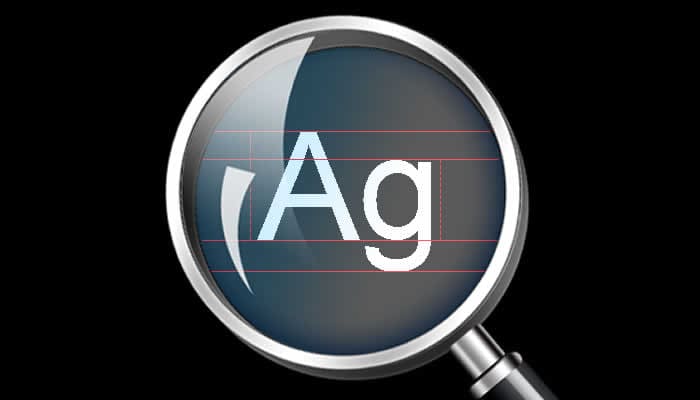
Rule #3: Master Letter Spacing and Kerning
Let’s talk about what I call the “invisible art” of typography – kerning and spacing. You know what’s funny? Once you start noticing bad kerning, you can’t unsee it. I remember walking down the street one day and spotting a store sign where the ‘AV’ in their logo had this huge, awkward gap. It drove me crazy every time I passed it!
Kerning is like conducting an orchestra – every letter needs to play its part perfectly with the others. I spent countless hours early in my career adjusting letter spacing by eye, until I learned about optical kerning principles. Here’s a trick that changed my process: turn your logo upside down when kerning. It sounds weird, but it helps you focus on the shapes and spaces rather than reading the words.
I’ve developed my own little system for perfect letter spacing. First, I look at the overall rhythm of the word – spacing should feel like a steady heartbeat. Then, I focus on problematic letter pairs (like ‘AV’ or ‘To’) that often need special attention. Finally, I test the spacing by blurring my eyes slightly – this helps reveal any inconsistencies in the overall texture.
Rule #4: Create Proper Hierarchy in Multi-Line Logos
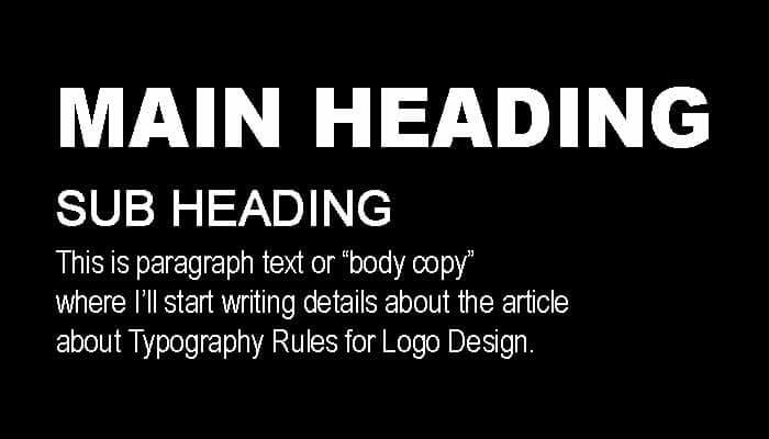
You wouldn’t believe the number of multi-line logos I’ve seen that look like they’re playing a game of “who can shout the loudest?” I remember working on a restaurant logo where the tagline was actually competing with the business name for attention. Talk about a recipe for confusion! (See what I did there?)
Creating hierarchy in logo typography is like directing traffic – you need to tell people’s eyes exactly where to go first. Through years of trial and error, I’ve discovered that it’s not just about making one part bigger than another. It’s about creating a natural flow that guides the viewer through the information in order of importance.
Here’s something that took me way too long to figure out: contrast is your best friend when establishing hierarchy. I’m not just talking about size differences – I’m talking about weight, spacing, and even case changes. I once transformed a cluttered three-line logo by simply using a bold weight for the main name, regular weight for the secondary text, and delicate letters for the tagline. The client was amazed at how such a subtle change made such a huge impact.
Rule #5: Limit Your Font Combinations
Okay, confession time: Early in my career, I was like a kid in a candy store with fonts. Three fonts in one logo? Sure! Four? Why not! (Spoiler alert: This was not my finest hour.) It wasn’t until a mentor sat me down and said, “Just because you can use multiple fonts doesn’t mean you should,” that I really got it.
These days, I live by what I call the “power couple” rule: if you’re going to use two fonts, they better work together like Batman and Robin. I’ve found that the most successful logos often use just one font family, playing with weights and styles instead of introducing another typeface. It’s like cooking – sometimes the simplest recipes taste the best.
I had this client once who insisted on using their three favourite fonts in their logo. After showing them how elegant and impactful their brand could be with just one well-chosen font family, they completely changed their mind. Sometimes less really is more!
Rule #6: Consider Custom Type Modifications
This is where the real fun begins! I remember the first time I modified a letterform in a logo – it was terrifying and exciting all at once. I was working on a fitness brand logo, and the ‘O’ in their name just wasn’t dynamic enough. After several attempts to find the perfect font, I realized I needed to create my own solution.
Custom type modifications are like tailoring a suit – you start with something good and make it perfect for your specific needs. But here’s the catch: you need to know the rules before you can break them effectively. I learned this the hard way after modifying some letters that ended up looking like they’d been through a blender!
One of my favourite projects involved subtly modifying a standard sans-serif font to incorporate hidden meanings. We adjusted the ‘A’ in a tech company’s logo to include a subtle upward arrow. Most people don’t notice it consciously, but it adds that extra layer of thoughtfulness to the design.
Rule #7: Ensure Cross-Platform Compatibility
Let me tell you about a nightmare scenario: I once designed what I thought was the perfect logo, only to discover it looked completely different on the client’s website because the custom font wasn’t properly embedded. Since then, I’ve become almost obsessive about cross-platform testing!
The digital world is like a jungle – you never know where your logo might end up. I’ve learned to think about everything from social media profile pictures to app icons during the design process. One trick I’ve developed is creating a “logo testing checklist” that includes all possible use cases, from embroidery to email signatures.
The key lesson I’ve learned about cross-platform compatibility is to always, always have a backup plan. Even the most carefully chosen fonts can display incorrectly in certain situations. I now make it a point to create fall-back options for every logo I design, just in case the primary fonts aren’t available.
Rule #8: Balance Negative and Positive Space
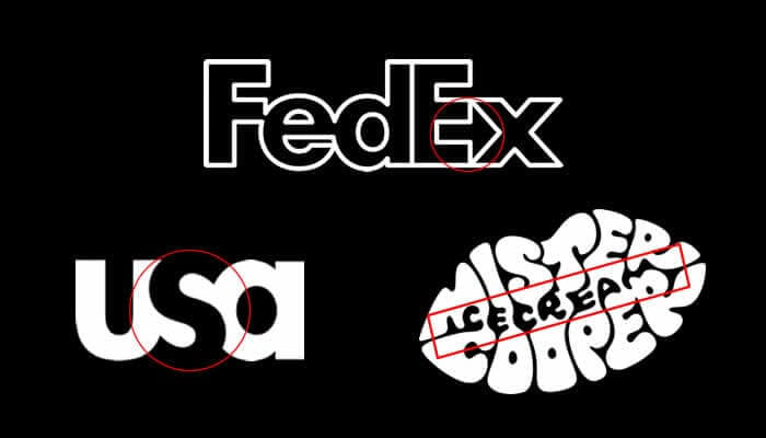
Understanding negative space was a game-changer for me. I used to focus solely on the letters themselves until I realised that the space around them is just as important. It’s like music – the silence between the notes is what creates the rhythm.
I had this amazing breakthrough moment while working on a minimalist logo. The client wanted something simple but memorable, and I was struggling until I started paying attention to the negative space. By adjusting the letter spacing and shapes, we created this beautiful balance where the empty spaces became as important as the letters themselves.
Here’s a tip that revolutionised my approach to negative space: try looking at your logo in reverse (white on black) during the design process. It’s incredible how this simple switch can reveal balance issues you might have missed otherwise.
Rule #9: Maintain Consistency with Brand Guidelines

If I had a dollar for every time I’ve seen a beautifully designed logo get misused because of poor guidelines… well, let’s just say I’d have a pretty nice vacation fund! Creating clear typography guidelines isn’t just about being controlling – it’s about protecting the integrity of the brand you’ve worked so hard to create.
I learned about the importance of guidelines when one of my early clients ended up with their logo in seven different fonts across their marketing materials. Now I provide detailed documentation for every logo I create, including specific measurements, spacing rules, and usage examples.
The key is to make your guidelines thorough but not overwhelming. I use lots of visual examples and clear, simple language. Remember, these guidelines might be used by people who don’t speak “designer,” so clarity is crucial!
Rule #10: Test Typography in Context


The final rule is something I wish I’d known from day one: test your logo typography in the real world before finalising anything. I mean really test it – not just on your computer screen or in mock-ups, but in actual applications.
I now have this ritual where I create a series of real-world mock-ups for every logo I design. We’re talking business cards, signage, social media profiles, the works. I even go as far as viewing the logo from different angles and distances. Does it work on a billboard? How about on a pen? These tests have saved me from many potential disasters.
One of my favourite testing methods is what I call the “five-second rule” – show someone the logo for five seconds, then ask them what they remember. If they can’t recall or read the typography clearly, it’s back to the drawing board!
Conclusion
After years of designing logos, I’ve learned that great typography doesn’t happen by accident. It’s a careful balance of rules and creativity, technical knowledge and artistic intuition. These ten rules have saved me countless hours of revision and helped me create logos that not only look great but actually work in the real world.
Remember, these rules aren’t meant to constrain your creativity – they’re meant to guide it. As you develop your own style and approach, you’ll find ways to bend and adapt these rules to serve your unique vision. The most important thing is to stay curious and never stop learning.
Further reading: Why Typography is Important in Branding
I’d love to hear about your experiences with typography in logo design! What challenges have you faced? What solutions have you discovered? Drop a comment in the community chat and let’s learn from each other. And if you’re working on a logo right now, take a fresh look at it with these rules in mind – you might be surprised at what you discover!
Want to learn more about typography in logo design? Check out the detailed rules above, and don’t forget to bookmark this guide for future reference. Still have questions? Drop them in this community thread, and I’ll do my best to help you out!
Remember, mastering typography takes time and practice. I still learn new things with every project, and that’s what makes this field so exciting. Keep experimenting, keep learning, and most importantly, keep designing!
Frequently Asked Questions about Logo Typography
Let me tackle some of the most common questions I get from designers and clients. After taking countless typography workshops, these are the questions that keep popping up – and trust me, if you’re wondering about these things, you’re not alone!
Can I use free fonts for logo design?
Oh boy, this is a question I get at least twice a week! Here’s the deal – while there are some fantastic free fonts out there (I’m looking at you, Google Fonts!), you need to be super careful about licensing. One of my previous clients got into hot water using a “free” font that wasn’t actually licensed for commercial use. They just didn’t know and failed to read the licencing terms.
The short answer is yes, you can use free fonts, BUT – and this is a big but – you need to carefully read the license agreement. I always recommend checking sites like Google Fonts, Font Squirrel, or Adobe Fonts (if you have a Creative Cloud subscription) for commercially-safe options. Pro tip: Keep a copy of the license agreement when you download the font. Future you will thank present you for this!
How many fonts should I use in my logo?
You know what’s funny? When I first started designing, I thought more fonts meant more creativity. Let me tell you – that approach led to some pretty chaotic designs! Through years of experience (and some gentle criticism from mentors), I’ve found that one to two fonts is usually the sweet spot.
Think of it like cooking – too many ingredients can ruin the dish. I usually stick to one font family and play with different weights and styles. If I do use two fonts, I make sure they have a clear purpose and complement each other like peanut butter and jelly!
What's the difference between TTF, OTF, and web fonts?
Ah, the alphabet soup of font formats! I remember being completely confused about this when I started. Let me break it down based on what I’ve learned from actually using these in real projects:
TTF (TrueType Font) is like your reliable old Toyota – it works everywhere and gets the job done. OTF (OpenType Font) is more like a luxury car with all the bells and whistles – it offers more advanced typography features. Web fonts are specially optimized for website use, kind of like having a car designed specifically for city driving.
For logos, I typically recommend having both TTF and OTF versions available. I’ve had clients come back month’s later needing different formats for various applications, so it’s better to be prepared!
How do I know if my logo typography is too trendy?
This question brings back memories of a logo I designed in 2015 using a super trendy geometric sans-serif that now looks… well, let’s just say it screams “2015”! Here’s my rule of thumb: if you can immediately associate a font style with a specific time period or trend, think twice about using it.
I now do what I call the “timeless test” – I ask myself, “Would this typography have looked good 5 years ago? Will it still look good 5 years from now?” If the answer to either is “no,” I reconsider my choices. Remember, trends come and go, but good typography is forever!
What's the minimum size my logo typography should be legible at?
Let me share a real-world story: I once designed this beautiful logo with delicate typography that looked amazing on screen. The client loved it… until they tried to use it on their business cards. The thin lines practically disappeared! Since then, I follow what I call the “business card rule.”
Your logo typography should be clearly legible when printed on a standard business card (around 1 inch or 2.5cm in width). I actually test all my logos at this size during the design process. If it works at this size, it’ll usually work everywhere else. And don’t forget to test it as a favicon (16×16 pixels) for websites!
Can I modify licensed fonts for my logo?
This is one of those “it depends” situations that used to drive me nuts when I was starting out! Most commercial font licenses allow for basic modifications in logo design, but there’s a catch – you need to check the specific license terms.
I’ve made it a habit to always read the fine print. Some fonts allow full modification, others only allow minor adjustments, and some prohibit any changes. When in doubt, reach out to the font foundry directly. I’ve found most are pretty responsive and appreciate being asked rather than assuming!