In life, there are a couple of things that will never go out of fashion, like the classic tuxedo, or the figure-hugging red dress with a long slit. When it comes to logos, there are also a couple of designs that will be with us for a long time. Logos that have stood the test of time and have been around for generations.
The golden arches of McDonald’s or the famous Coca-Cola have been around for ages and haven’t changed at all. However, the logos themselves have become timeless because of their designs. Here are ten logo designs that will never go out of fashion.
Table of Contents
Vintage is here to stay
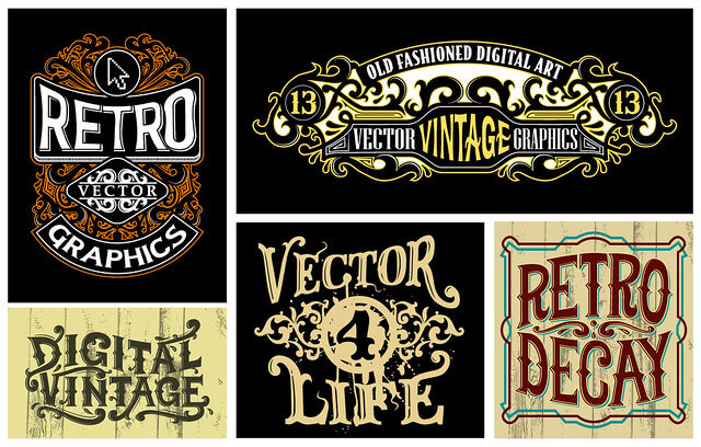
If you are in the mood for nostalgia or giving your brand a classic feel, then you need look no further than a vintage design theme for your logo. These grainy textured and often fuzzy designs try to replicate the old printing machines and give often give the logo a hand-made feel.
When these prints came out originally, they were mainly done in monochrome. However, the contemporary twist adds some colour and vibrancy to this age-old classic. Obviously, these logos are meant for a certain niche of products and services and won’t necessarily work with digital or technological business.
Less is more, the minimalist approach
Every day, we get bombarded with logos of thousands of companies. There is no way that we can process all the detail in everything anymore, there is just too much. That is why the minimalist approach is so popular.
Given that things aren’t looking to slow down, minimalist approach design feature that won’t go out of fashion. You want your audience to get to know your brand quick and easy and minimalist logos provide you with a platform where a mass audience can recognise your brand easily and in record time.
Monochrome, simple and focused
Monochrome logos have been around for quite some time and they resemble the vintage logos in terms of their simplicity. From a monetary point of view, monochrome logos are cost effective because you don’t have to spend extra money on colour prints.
Furthermore, these logos are clean cut and give a professional feel to the logo if done properly. What’s more, you can experiment with more detail in your logo seeing that the logo will “read“ easier. There aren’t any complex colours to sift through and the design, regardless or detail is seen as a whole.
The colourful lot
On the other hand, many people can’t stick to a single colour and that isn’t a bad thing either. However, if you can’t see the world in black and white and if you need colour, stick to the primary colours and don’t try and make it too complicated.
There are plenty of colour logos going around, but the successful ones have this in common, they are simple and only use three or four colours. These logos are best suited for companies with a defined colour scheme like green for any environmental brand. Use colour strategically and you can make something timeless.
A word or two
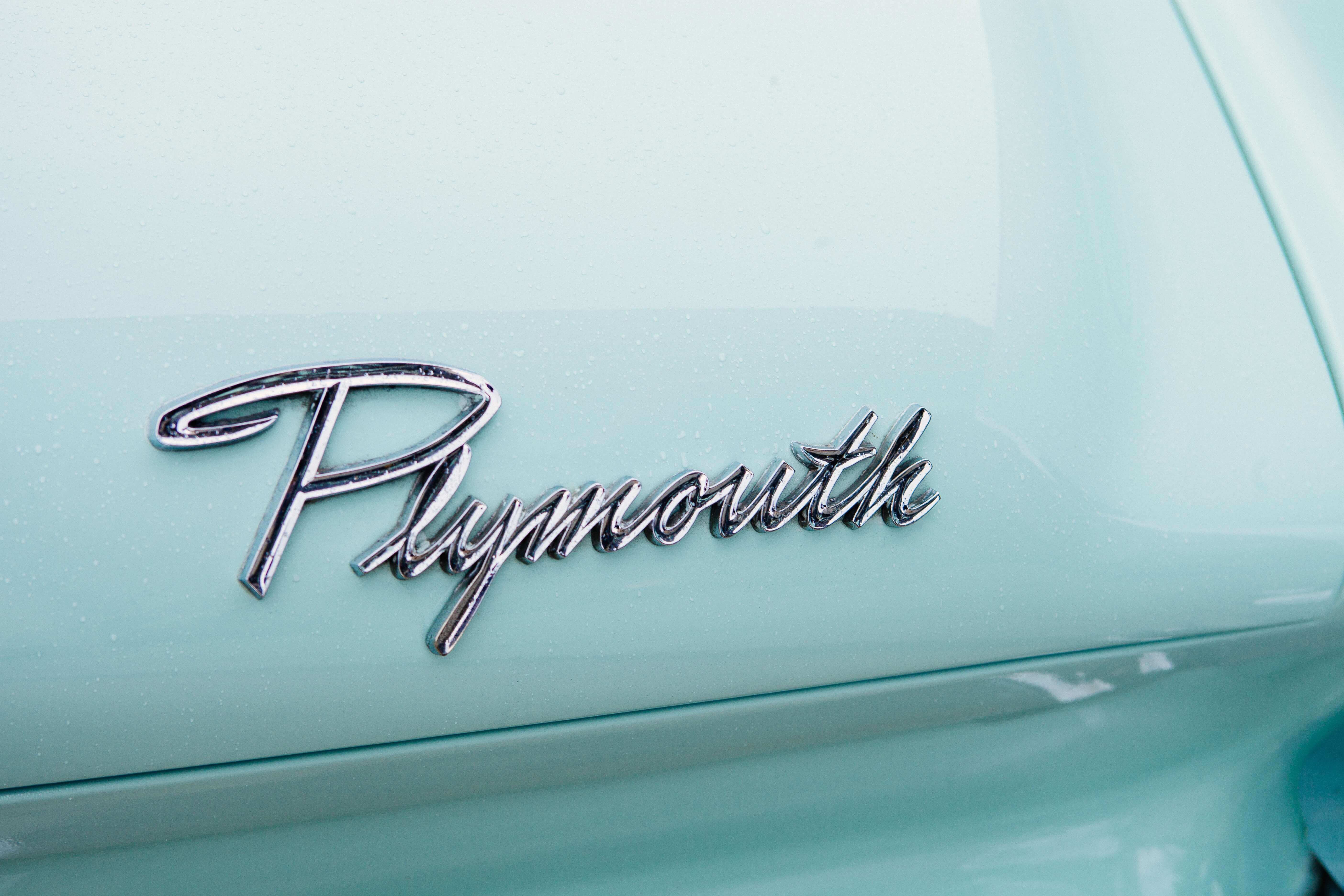
Typographic logos are the next timeless logos. There are many fonts around, but the classic cursive fonts never seem to go out of style. It breaks away from the modern digital era and has the ability to also invoke those feelings of nostalgia.
Making the font the focal point of your design will get the message across in style. The wonderful thing about typographical logos is that the designer doesn’t have to stay within the bounds of the rules of grammar. In fact, breaking away from the norm will often make your logo stand out because it looks different.
For cool punchlines, logo text, marketing collateral, and business reports, you should always choose professional writing services. This will add a punch to the ideas and give you better options. Review the best essay writing services 2019 and you’ll find many good writing services.
Subject-specific and to the point
Single-word logos are superb. They can incorporate so many timeless elements into one design. When your company’s service or product revolves around a single word or concept, you can put all that focus on your logo.
People love reading pictures and will easily make the association with your product or service if it is designed into the logo.
Animals are used to a large degree with a lot of success and quickly gets the message over to your audience regarding the main purpose of your business. Give it a minimalist twist and you’ll have a timeless logo that will last for decades.
Detailed and complex
Just because the world is getting faster and fuller, it doesn’t necessarily mean that you also have to follow the trend. Instead of building something that is made to be absorbed in record time, you could go the other route and aim to slow your customer down by designing something complex and detailed.
In this case, your logo becomes a piece of art and when it is spread around enough, it becomes unmistakable. This detail signifies craftsmanship and a quality standard that the company is built on. For the most part, these logos are particularly effective in the fashion industry.
Muted and natural
The world is full of colour and for the most part, there have been a couple of colour pallets that have stood the test of time. Sure, there are trends that come and go, but then you get colour schemes that never seem to go out of style.
Muted and natural colours have remained popular throughout the years and based on recent trends, it doesn’t look like it is going out of style. These colour schemes send a message of health, wellness, and tranquility. Anyone in the health industry would do good to take notice of these trends when designing their logos.
The versatile monoline

The monoline graphic logos were very popular for a while and although their popularity has gone down a bit, they are still very much favored designs. These logos are very versatile in the sense that one can create complex or minimalist designs. You can also give your design a vintage or modern twist and make it either casual or fancy.
Old school badge or crest
The old school badge has been a stalwart in the logo design world and is still going strong. It speaks about tradition and longevity. Although it is a trend that can be found everywhere, it is one that will last a lifetime if the product or service has the same qualities as the design feature.
When your service or product is of superior quality, people will notice your badge even if it’s stuck between a hundred others.
Conclusion
Branding sets your business stand out and helps in reaching new heights. A timeless logo to make imprints on the mind of both the internal and external stakeholders is one of the top business strategies. All of these cool ideas will serve as a great inspiration to create that ‘perfect logo’ that your business needs.
 Author Bio
This article was contributed by Jack White.

