Your logo is often the most ubiquitous element of all your branding efforts and communications. It appears on products, brand assets, marketing collateral, official communications… the list goes on. Join us in this article, as we give you 10 Precious Tips on Creating Amazing Logos That Make an Everlasting Impression – Decoding the Logo Code.
When it comes to designing a logo, it’s important that it accurately reflects who the company is, what they do, and what they value.
After all, the logo is a core component of the branding strategy which is all about awareness. And 89% of marketers say brand awareness is their highest priority.
Still, many logo designs are either all wrong or in serious need of an update. It’s not enough for your logo to look perfectly fine. You want it to make an impact and be memorable.
Table of Contents
1. Start with a Concept or Message You’re Trying to Convey
To understand the entirety of the message that one logo has to convey, try swapping out a logo’s actual business for something totally different.
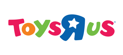
Imagine this logo was for an insurance company. Or a government agency. Or a funeral parlor.
We can all agree that it would look pretty strange. But what is it about the logo that wouldn’t make sense for those types of businesses?
Well, everything really. But more specifically?
- The happy, fun colours
- The curvy, irregular typography
- The whimsical vibe
This logo says “innocent fun”, but an insurance company should probably be going for something more like “serious dependability”.
While this is an extreme example, there are lots of logos out there that don’t look terrible but also don’t look quite right. Chances are that not enough thought has been given to the actual message the logo should be sending or the emotional response it should be evoking.
Before anything else, get a deep understanding of the brand values, products/services, and target audience. Keep them in mind at all times during the logo design process.
2. Keep the Design Simple
The logo design should be simple because it should be easy to take in, and therefore, easy to remember.
Some of the best logos have the simplest design. But they’re instantly recognizable perhaps because of their simplicity rather than in spite of it.
Another thing to note with a simple design is that it doesn’t have to be all or nothing. You can still have a more complex element to your logo as long as the rest of it is simple.
For example, Disney uses a very distinctive font for its logo, but there are no background graphics and it’s usually all black. Add too much colour or clog up the design too much and Disney’s logo would be nowhere near as impactful.
The Coca-Cola logo would not be as well-known and memorable if it was not for its use of the colour red, same as the coffee chain Starbucks use of green, and the same can be said for MacDonald’s bright yellow golden arches logo.
They are still well-known logos without colour, but you can’t deny that colour plays a vital role in their memorability with consumers.
3. Use Colours Strategically
We could talk about the psychology of colour all day. Use blue, don’t use blue, use anything except orange… it’s difficult to get a straight answer on what colours definitely do or do not appeal to consumers.
So instead of focusing on what colours to use, let’s look at some other advisable colour strategies for your logo design.
- Pick a dominant colour
If you’re using a combination of colours, try and keep one dominant over the others. Sometimes it’s an equal combination of multiple colours that takes away from the design, rather than the fact that there are multiple colours used.
- The hue is just as important as the colour
Blue is blue, right? Any designer will be shouting “obviously not” at a statement like that. But when you’re choosing the shade of your logo colours, don’t forget to keep that all-important brand message and target audience in mind.
- Just make it look pretty
At the end of the day, sometimes colours just come together to look “right”. Experiment as much as you can to get exactly the right combinations and shade for your design, or Create the Perfect Colour Palette for Your Brand
If you’re using a combination of colours, try and keep one dominant over the others, according to Guitar Junky.
4. Make It Scalable and Versatile
Your logo is going to appear in all kinds of places, both print, and digital. It will need to be all kinds of sizes to be suitable for different types of assets. The logo could appear on products, print brochures, event booths, posters, digital ads, etc.
Not only will it need to be scalable to fit those needs, but it will need to be versatile, too. Some logos include the company name along with a symbol, so the logo can be used in its entirety or just the symbol if that fits in better with a specific design or smaller logo area.

The Slack logo includes both the company name and a symbol. You’ll often see Slack branding marketing communications and other items with the symbol alone due to its versatility, but it remains highly recognizable.
This solution also solves the issue of visibility on smaller surfaces, so the brand doesn’t lose the opportunity for an impression simply because the logo size was too awkward.
5. It Should Look Great in Black and White
We’ve spoken about the use of colour, but the lack of colour is equally important.
Just like the sizing and placement issue, there could be many instances where the logo colours will clash with a background, so a black/white/or grey version will be needed.
In that instance, typography and other design elements of your logo will need to stand out just as much as the colours.
Lots of designers start with black and white for logo design to ensure that they’re not missing important design aspects by focusing too much on colour.
6. Make It a Memorable Design
It’s a primary goal of branding for any business to achieve instant recognition with their target audiences. You want people to know exactly who you are and what you do just from a quick glance at your logo.
Memorability for a brand is a lot about the messaging and touchpoints the business creates, as it takes multiple brand impressions before someone can recall a brand. But the logo should be like a stamp on the brain that helps to store everything else they are learning about the brand.
A study called Branded in Memory asked consumers to recreate some of the most famous logos in the world on paper. Turns out, even the most well-known and established logos aren’t quite as memorable as we think!
Most of the reproductions in that study ranged from closely similar to the logo to a vague representation. But it was the simple designs and icons that were best recreated.
7. It Should Be a Timeless Design
When companies rebrand, it can take up to 10% of their marketing budget. Slight variations or updates to an iconic logo are fairly common, but you should definitely be aiming for longevity when it comes to branding and logo design.
Google took an interesting and clever approach to their logo when they started inviting people to design variations for public holidays and observances. In this way, they created a talking point around the logo that allows them to play with the design while remaining true to the timeless nature of their core logo.
Some logos have literally been around for hundreds of years with only slight tweaks and updates. One example is the logo for Belgian beer Stella Artois, which has been in use since 1366. Now that’s the kind of longevity to aim for!
8. Make It Appropriate for the Industry Without Being Stale
There’s staying true to brand values and messaging and then there’s being a little boring. While it’s important to respect the industry and the business, you can stick to brand values while still putting an interesting twist on the logo design.
If the industry seems a little boring and stale, it’s just a good opportunity to create a logo that really stands out from the crowd.
Habito is a mortgage broker in the UK who have managed to make their branding memorable and totally at odds with the usual connotations of the financial industry.

Their logo and branding aim to make the brand feel carefree and light while dealing with a serious subject matter. It’s a great example of taking a different approach to industry norms for logo design.
9. Don’t Be Too on the Nose
There is sometimes a real pull for designers to be too literal when it comes to logo design. The best logos take elements of the company history or values and use them within the design without being too “on the nose”.
For example, the mermaid in the Starbucks logo references the namesake “Starbucks”, a nautical siren that the founders of the coffee chain decided to take on as part of the branding and logo design.
Does it scream “coffee” at first glance? Maybe not. But it does invoke a sense of allure and, like a figurehead on a ship, seems to stand as a beacon. After years of exceptional branding strategy from Starbucks, she now stands as a beacon for coffee.
10. Leverage the Brand’s Interesting Heritage
Corporate history can be a brilliant source of inspiration for your logo design. Tons of companies still leverage an interesting past as part of their current branding, whether consumers are aware of it or not.
For example, the BMW logo is an interpretation of the Bavarian flag as a nod to their origins in that part of the world.
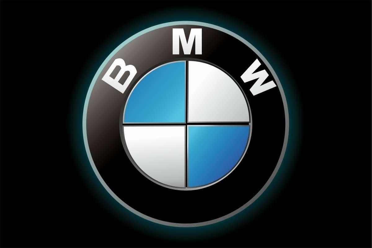
If you’re designing a logo, dig deep into the origins and history to find out if there is an interesting twist to be used for the design.
Logo design can be pretty difficult to get right the first time, but don’t lose heart! Follow these steps and you’ll soon be creating meaningful, memorable logos.
We hope these 10 Precious Tips on Creating Amazing Logos That Make an Everlasting Impression – Decoding the Logo Code has been helpful, and if you are looking to learn logo design you can do it in your own time and at your own pace online with the online master class below its a great course that you will learn so much from and have lifetime access to click on the banner below to start learning,
Useful Links & Great Deals
- The Equipment We Use & Recommend
- Quality Design Bundles
- Get 2 Months free Skillshare
- Get an Exclusive 20% off Logo Package Express
- Learn Logo Design Online
Author Bio
This article was contributed by Ananya Sinha at infinity-digital.in

