If you are thinking of hiring a logo designer to create your company’s logo, there are several things you need to understand, so here are 10 Things Your Graphic Designer Wants You to Know About Logo Design.
For example, it’s great to have an understanding about typography, color theory, fonts, and size. You should also be aware of the color schemes, which should be consistent across all web and printed materials.
Ideally, you should also be aware of your company’s brand identity and the colors used. Let’s discuss the few essential points of logo design.
Table of Contents
1. Color Theory
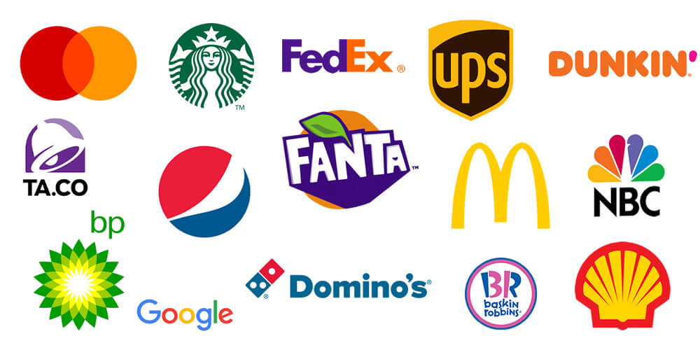
Whether you’re a professional graphic designer or just a hobbyist, color theory can help you make your next logo stand out. Colors can indicate different meanings or ideas and selecting the right colors can be a game changer.
Let us teach you the basics of color theory. Here are the benefits of learning color theory:
- Understanding color psychology and how to use it in your logo design is an important part of creating a successful logo. The key to color harmony and contrast is understanding how each color is related to the other.
- Try not to go overboard with color.
- The goal is to create a design that people will remember, but without overwhelming them with too much color.
- Use color theory to your advantage, and start experimenting with colors today!
2. Typography
If you want a great logo design that uses typography, you need to understand the basic principles of typography. These concepts include typographical scale, hierarchy, and concepts such as kerning and line-height.
It is important to study typography not just in logos but in general content because it influences how people read and process information. It can also be an important element of brand recognition.
- A successful logo should be legible and be able to be read at a distance.
- If the logo contains graphic elements, the typography should be in balance with the icon, which makes it more visually appealing.
- In addition, if the typeface is complicated, it might not work well on smaller formats. Therefore, ask your designer about the font styles to see which ones are the best fit for your business.
3. Fonts
Before you hire a graphic designer for your brand’s logo design, you should know a few basic things about various types of typefaces, typographical scale, and hierarchy, and concepts like kerning and line-height.
If you’re not familiar with the subject, it’s important to learn about it, because it can affect the way people perceive the content you put on your website or business card.
Script fonts are great for more ornate logos. They tend to be fancier than their serif counterparts and may evoke feelings of creativity.
You can also find them related to the art of calligraphy, which may help your customers identify with your brand more with handwritten letters.
If you’re using a script font for your logo, it’s important to choose one that is easily readable, as poorly aligned letters make your design look cluttered.
4. Font Size
A font’s size is important for your logo design. It should reflect the feeling you’re going for. For instance, if your company sells mechanical supplies, you may want to choose a rustic font that evokes a feeling of nostalgia.
On the other hand, if you’re a software company, you might want to choose a more contemporary, sleek font. Choosing the right font for your logo design is a subjective process, and you should consider your preferences and the expectations of your target consumers before selecting a typeface.
In Astrill vpn, as users are being guaranteed privacy to surf freely, it’s reflected in its uniquely styled logo.
The font style you choose will affect your customer’s experience. For example, if you’re trying to attract younger users, it might be better to choose a San-serif font.
For older users, it’s a good idea to use a serif font, which is a lowercase font with stems. Serif fonts are considered classic, while sans serif fonts are deemed more modern.
5. Word Marks
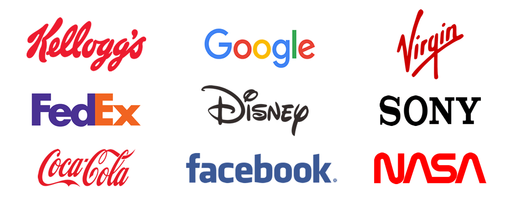
Wordmarks in logo design are very different from logos that use only the brand name. However, they both capture the essence of a brand and build brand recognition.
Whether you decide to use a word mark or a logo with a unique design, you must keep in mind the fundamentals of both types of logos.
Here are some things your graphic designer should know about wordmarks in logo design.
- Firstly, wordmarks tend to work best with shorter names. These are easier to read and visually more impactful than long-brand names.
- Longer brand names may benefit from a combination of a letter and a symbol.
- Likewise, wordmarks can be used for both short and long names.
- Wordmarks that use the entire name of a brand are generally less legible on mobile devices, so they are not a good choice for digital-first businesses.
6. Letterforms
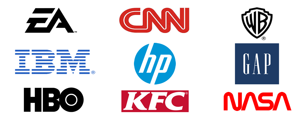
A letterform logo is a great choice for a number of reasons. Not only is it easily scalable, but it will also remain easily recognizable even when reduced in size. This makes it ideal for small-scale applications like app icons and favicons.
It can also be used as a profile picture on social media. While this type of logo is popular for large-scale businesses, it is also appropriate for brands with long names.
The monogram is a more complicated option for small businesses. It consists of multiple letters, usually the acronym of the brand. Some brands use monogram logos because they make it easier to remember and read.
However, acronymic names are already difficult to remember and can only make them more difficult. Small businesses should avoid acronymic names.
7. Memorability
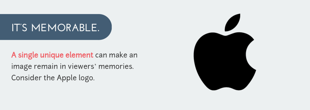
The effectiveness of a logo is directly related to its memorability. Memorability is a balance between familiarity and uniqueness. The best logos are instantly recognizable, even if they’ve been seen only once or twice.
These are the brands like Apple, Starbucks, Coca-Cola, and Nike that have cultivated a high level of memorability. Here are some of the best ways to achieve memorability for your logo.
- The key to effective logo design is that it appeals to your audience. This can be achieved through simplicity or minimalism.
- In the end, your logo should convey your business’s message.
- It should be easy to identify, while still remaining simple enough to be appropriate to its target audience.
- The goal of an effective logo is to be instantly recognizable.
- Regardless of the size, color, or surface of its design, it should be adaptable to the environment in which it will be used.
8. Sizing & Res
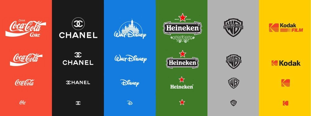
If you’re making a brand logo, sizing it properly is crucial for a variety of reasons. First, it should be readable at all sizes and orientations, which will benefit both you and your customers.
Second, your logo should be adaptable – ideally, it should switch from a vertical to a horizontal layout. This is important for printing, as the size and orientation of logos can vary significantly between products.
While a vector file is more scalable than an image, it’s still a good idea to get the biggest possible logo.
For online uses, sizing your logo properly is extremely important. Generally, most websites require that you use a scalable format for your logo.
But if you need to use an icon on a site or page, you need to make sure the favicon is small enough to fit into the space without losing details.
For example, you can use an icon from a social network site, such as Facebook, to illustrate what a logo is. It’s important to use the right size for your logo to be visible on websites, as well as on social media accounts.
9. Contract
Before you choose a logo designer, you should understand what you want from them. Logo contracts should clearly spell out the scope of the project and specify the designer’s responsibilities.
- A good logo design contract also outlines the client’s specifications.
- Include a comprehensive description of the logo design and the specifics you’d like to see included in the finished product. This will enable the designer to properly finish the logo.
- You should also outline any changes or additional requirements you might have.
- Before you start designing logo contracts, review other logo designers’ contracts to find out which ones are most useful.
- In addition, the template must include form fields that make it easy to fill in information. When you have completed a logo contract, you can send it to your client.
10. Research
Before you hire a graphic designer, it is important to research your competition. This is because knowing your competitors’ logos can prevent you from making grave mistakes.
Never, ever copy an existing logo or brand name; it will only create a poor impression. Instead, research your competitors’ logos and choose a design that stands out from theirs.
Listed below are tips for researching your graphic designer’s logo design.
- Ask for a logo concept questionnaire from the designer. You should ask him or her to design a logo based on the information you provide. For instance, if your logo needs to be adapted to a new market or product, you should ask your graphic designer for several different concepts. This will help the designer understand your business.
- Then, you can finalize the concept. If your designer does not follow through with this process, it is a red flag, and you might end up with a bland logo.
For further reading checkout: The Art of Logo Design
Join The Logo Community
We hope you have enjoyed these 10 Things Your Graphic Designer Wants You to Know About Logo Design. If you would like more personal tips, advice, insights, and access to our community threads and other goodies, join me in our community.
Learn from our Founder Andrew who personally writes our community newsletter. You can also comment directly on posts and have a discussion.
*TIP – Looking to learn logo design? We recommend the Logo Design Online Masterclass, it will teach you how to plan, design and execute logo designs. The course has also had great feedback from the design community.

