When it comes to timeless logo design principles, getting it right can mean the difference between a brand that fades into the background and one that becomes iconic. What makes a logo stand the test of time? these 10 logo design principles will guide you through the essentials of creating a logo that’s not just memorable, but truly enduring. Ready to discover the secrets behind timeless logos? Let’s dive in.
Table of Contents
10 Timeless Logo Design Principles Every Brand Should Know
In the ever-evolving landscape of visual branding, certain logo design principles stand the test of time. Whether you’re a fledgling startup or a well-established corporation, understanding the foundational elements of iconic logos can elevate your brand identity to new heights.
From creating memorable designs to ensuring brand consistency, these timeless logo design principles are essential for any business looking to make a lasting impression. Let’s dive into the world of logo design and uncover the secrets behind designs that captivate, endure, and leave an indelible mark on the collective consciousness.
1. Simplicity Reigns Supreme

In the realm of logo design, less is often more. The most memorable logos strip away unnecessary complexity, distilling the essence of a brand into its purest form. Think of the golden arches of McDonald’s or the simple apple silhouette that represents one of the world’s most valuable tech companies. These designs prove that simplicity isn’t just a trend—it’s a timeless approach that ensures your logo remains effective across various mediums and sizes.
But achieving simplicity isn’t as simple as it sounds. It requires a deep understanding of your brand’s core values and the ability to communicate them through minimal design elements. The challenge lies in creating a logo that’s both simple and distinctive, capable of standing out in a crowded marketplace without resorting to elaborate graphics or intricate details.
2. Versatility: The Chameleon Effect

A truly timeless logo possesses chameleon-like qualities, adapting seamlessly to different contexts while maintaining its core identity. This versatility is crucial in today’s multi-platform world, where your logo might appear on everything from a tiny app icon to a massive billboard. The key is to design with scalability in mind, ensuring your logo remains legible and impactful whether it’s printed on a business card or emblazoned across the side of a building.
Consider the Nike swoosh—a prime example of versatile logo design. It’s simple yet dynamic shape works equally well in monochrome or color, at any size, and across all marketing materials. This adaptability has played a significant role in Nike’s brand consistency and recognition worldwide.
3. Timelessness Over Trends

While it’s tempting to jump on the latest design bandwagon, truly iconic logos transcend fleeting trends. They draw inspiration from classic design principles that have stood the test of time. This doesn’t mean your logo should look outdated—rather, it should strike a balance between contemporary appeal and enduring style.
To achieve timelessness, focus on clean lines, balanced proportions, and timeless typography. Avoid overly trendy elements that might look dated in a few years. Remember, a logo is a long-term investment in your brand’s visual identity. It should feel as relevant and fresh a decade from now as it does today.
4. Meaningful Symbolism

Behind every great logo lies a story waiting to be told. The most impactful designs incorporate symbolism that resonates with the brand’s values, history, or aspirations. This deeper layer of meaning adds substance to the visual appeal, creating a more profound connection with your audience.
Take the FedEx logo, for example. At first glance, it appears to be a straightforward wordmark. But look closer, and you’ll spot the clever use of negative space to create an arrow between the ‘E’ and ‘x’—symbolizing speed, precision, and forward motion. This hidden element adds an extra dimension to the logo, making it more engaging and memorable.
5. Color Psychology: The Silent Communicator

Colors speak volumes without uttering a word. Understanding color psychology is crucial in logo design, as different hues evoke specific emotions and associations. The colors you choose for your logo can significantly impact how your brand is perceived.
For instance, blue often conveys trust and professionalism, which is why it’s a popular choice for corporate logos. Red, on the other hand, can signify passion, energy, or urgency. Green might represent growth, nature, or health. The key is to select colors that not only look aesthetically pleasing but also align with your brand’s personality and values.
However, it’s important to remember that a truly versatile logo should also work well in black and white. This ensures that your logo remains ef fective in situations where color isn’t an option, such as in certain print applications or fax transmissions.
6. Typography Matters

When it comes to logo design, typography is far more than just picking a pretty font. The right typeface can convey your brand’s personality, whether it’s modern and sleek or classic and authoritative. Custom typography can set your logo apart, creating a unique visual identity that’s instantly recognizable.
Consider the iconic Coca-Cola logo. Its distinctive script has become synonymous with the brand, evoking feelings of nostalgia and tradition. On the other hand, a tech company might opt for a clean, sans-serif font to project a modern, forward-thinking image.
Remember, legibility is key. No matter how beautiful or unique your typography, it should be easily readable at various sizes and from a distance.
7. Negative Space: The Unsung Hero

The clever use of negative space can elevate a logo from good to great. This design technique involves utilizing the background space around and between the main elements of your logo to create additional meaning or visual interest.

The World Wildlife Fund (WWF) logo is a masterclass in negative space usage. The simple black-and-white panda design is not only instantly recognizable but also makes efficient use of negative space to create the animal’s form. This approach results in a logo that’s both visually striking and deeply memorable.
8. Balance and Proportion

A well-designed logo exhibits a sense of balance and proportion that’s pleasing to the eye. This doesn’t necessarily mean perfect symmetry—asymmetrical designs can be equally effective when executed skillfully. The key is to create a harmonious relationship between all elements of the logo, whether it’s the interplay between text and graphics or the distribution of visual weight across the design.
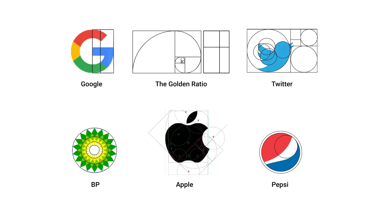
Consider the golden ratio, a mathematical proportion that’s been used in art and design for centuries. While not a hard and fast rule, this principle can guide you in creating logos with naturally appealing proportions.
9. Distinctiveness in a Crowded Market

In today’s saturated market, standing out is more crucial than ever. Your logo should be distinctive enough to set your brand apart from competitors. This doesn’t mean it needs to be outlandish or overly complex—remember, simplicity is key. Instead, focus on creating a unique visual hook that captures the essence of your brand.
Think about the Apple logo. A simple apple silhouette with a bite taken out of it has become one of the most recognizable symbols in the world.
The same can be said for the Nike swoosh logo it represents motion and speed, and also the wing of the Greek goddess of victory Nike, symbolysing her power, motivation and speed.
Athleticism, innovation, and motivation, this simple logo embodies the spirit of these qualities that Nike aim to represent.
They are both distinctive without being complicated, proving that sometimes the simplest ideas can have the biggest impact.
10. Emotional Resonance

Last but certainly not least, a timeless logo should evoke an emotional response. It should connect with your audience on a level that goes beyond mere visual appeal.
This emotional resonance is what transforms a logo from a simple graphic into a powerful brand ambassador.
Consider how the Nike swoosh evokes a sense of motion and achievement, or how the Amazon smile creates a feeling of satisfaction and positivity. These emotional connections are what make logos truly stick in people’s minds and hearts.

The Adidas logo is also a good example representing challenge, the three stripes are levels you climb as you achieve success like climbing a mountain to reach the top. The stripes are angled 30 degrees to represent different levels and also represent the shape of the shoe.
Conclusion: The Art and Science of Timeless Logo Design Principles

Creating a logo that stands the test of time is both an art and a science. It requires a deep understanding of logo design design principles, brand strategy, and human psychology. By adhering to these ten timeless principles, you can create a logo that not only looks great but also effectively communicates your brand’s essence and values.
Remember, your logo is often the first point of contact between your brand and potential customers. It’s a visual shorthand for everything your company represents. By investing time and thought into creating a logo that embodies these timeless principles, you’re laying a strong foundation for your brand’s visual identity.
In the end, the most iconic logos are those that manage to be both simple and profound, timeless yet contemporary, versatile yet distinctive. They tell a story, evoke emotions, and stand out in a crowded marketplace. By keeping these principles in mind, you can create a logo that not only serves your brand well today but continues to do so for years to come.
So, as you embark on your logo design journey, remember: great logos aren’t just designed—they’re carefully crafted to embody the very essence of the brands they represent. With patience, creativity, and a solid understanding of these timeless logo design principles, you can create a logo that truly stands the test of time.
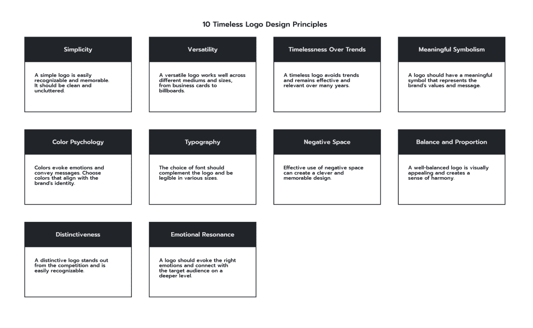
10 Timeless Logo Design Principles Diagram
To recap below is a diagram displaying and outlining the 10 Timeless Logo Design Principles for easy reference. You can click on the image to enlarge it.

Further Reading:
- Famous Logo Redesigns and Why They Worked
- What Are The Top 20 Most Recognizable Famous Logos?
- The Role of Storytelling in Logo Design: How to Make Your Logo Speak
- Famous Logos & Their Hidden Meanings Revealed
- 10 Examples of Powerful Global Branding
- 10 Common Logo Design Mistakes to Avoid for Stronger Branding
- Best Global Rebrands and Logo Redesigns of Major Brands
- Logo Evolution: How Famous Logos Evolved Over Time
- Most Expensive Logos In The World
- 14 design principles of good logo design
Join The Logo Community
We hope these 10 Timeless Logo Design Principles Every Brand Should Know have been helpful. If you would like more personal tips, advice, insights, and access to our community threads and other goodies, join us in our community.
You can comment directly on posts, access our community threads, have a discussion and ask questions with our founder Andrew.
If you’re looking to learn more about brand strategy, we highly recommend eRESONAID with our friend and acclaimed brand strategist and author Fabian Geyrhalter, it’s packed full of knowledge and insights you will need to learn to become a brand strategist or apply what you learn within your own business.

The Logo Creative – LogoTalk Podcast Ep.3 – 10 Timeless Logo Design Principles
FAQ: Timeless Logo Design Principles
What are the most important principles of timeless logo design?
The most important principles of timeless logo design include simplicity, versatility, meaningful symbolism, appropriate use of color psychology, balanced typography, clever use of negative space, and creating emotional resonance. These principles help create logos that remain effective and memorable over time.
How can I make my logo design stand out in a crowded market?
To make your logo stand out, focus on creating a unique visual hook that captures your brand’s essence. Aim for simplicity with a twist, use negative space creatively, choose distinctive colors, and ensure your design is meaningful and memorable. Remember, standing out doesn’t mean being complex—often, the simplest ideas have the biggest impact.
Why is versatility important in logo design?
Versatility is crucial in logo design because your logo needs to work across various mediums and sizes—from tiny app icons to large billboards. A versatile logo maintains its impact and legibility regardless of its application, ensuring consistent brand recognition across all platforms and materials.
How does color psychology affect logo design?
Color psychology plays a significant role in logo design by evoking specific emotions and associations. For example, blue often conveys trust and professionalism, red can signify passion or urgency, and green might represent growth or health. Choose colors that align with your brand’s personality and values to create the right emotional impact.
What role does typography play in creating a timeless logo?
Typography is crucial in logo design as it conveys your brand’s personality and ensures legibility. The right typeface can make your logo modern and sleek or classic and authoritative. Custom typography can set your logo apart, creating a unique visual identity. Always prioritize readability across various sizes and contexts.

