Even the biggest brands with ultra-recognizable logos are not afraid of revamps. Ultimately, they need to keep up with the trends of design and align their logos to the changing mission and vision of the company. In this article we look at 11 Famous Logo Design Evolutions.
Students who decide to pay for essay could notice examples of such changes on the websites they use. Yes, logos on academic writing websites need to be updated, too. Some fonts get outdated, new marketing strategies are invented and call for more appealing colors. All these details matter.
That’s why, throughout the history of corporation and brands, logos have been changed – and will continue to change. Usually, the changes are minor; companies only go so far as to still maintain the recognisability of their previous logo but some really do a 180 and try something completely new.
In this article, we’re looking at the evolution of some of the most famous logos and the reasons behind their change. Also for fun we have included some Log Animations!
Table of Contents
1. Apple
What’s one of the most recognizable logo icons in the world had a much less straightforward path to becoming just that.
In 1976, Apple started with something completely different – a black and white drawing of Isaac Newton under the apple tree. Just one year later, the logo changed to something more similar to what we know as Apple’s logo today: an icon of an Apple in rainbow colors.
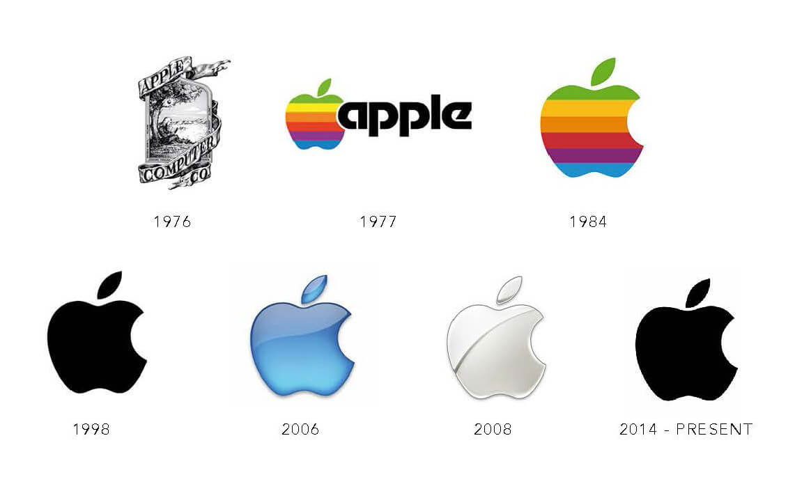
It wasn’t until 1998 that the logo was changed to a simple black apple with a part missing on the right side of the fruit.
The story of Apple’s logo is mostly about playing with gradients, exploring different color schemes and slightly tweaking the overall look and feel of the logo to nail the perfect thing.
2. Facebook
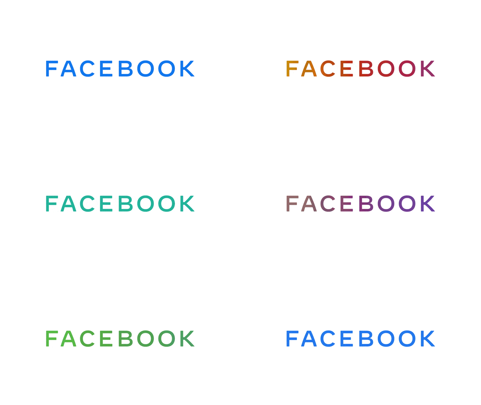
Just like Apple, Facebook has played around with different logo versions quite a bit, but the most famous story behind the brand name and logo of this social media titan is best known from the movie Social Network. In this movie, based on true events, it’s described how Facebook started as The Facebook and dropped the ‘the’ based on a single piece of advice.

Facebook’s logos are connected to the overall design and user experience of the site, so the company often tweaks logos every time there is a redesign of the platform.
3. Instagram
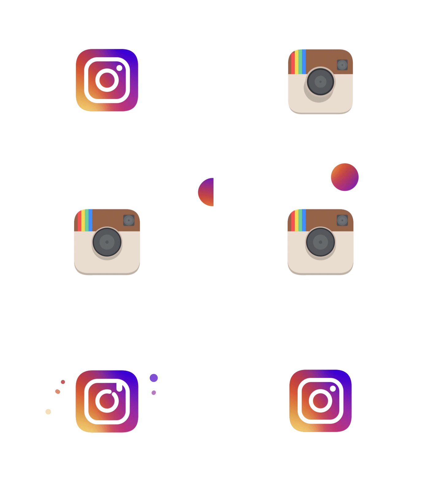
For a tech giant that we now know is a strong opponent to any of the major social media networks today, Instagram had quite a rocky logo design story. In total, Instagram had 4 logo redesigns, but they were quite massive compared to the tweaks Facebook and other networks were known to make. In 2010, Instagram’s logo started as a camera image with quite a lot of details and different colors. Designers simplified it in 2010 and produced the brown-beige camera you probably remember if you’ve been using Instagram for a longer time.

In 2011, it was decided that the camera logo should be 3D a little bit and shadows and 3D effects were included. Finally, in 2016, Instagram had its biggest logo revamp since the beginning. Instead of a brown-beige camera icon with a rainbow stripe, Instagram is now a rounded square shape with a gradient of 3 colors.
4. Google
Unlike some of the other names on this list, Google had a rather non-aggressive logo changes history, but you wouldn’t believe where it all started. Remember WordArt from Microsoft Office that we used in elementary presentations and posters? Well, you guessed it, that was the actual Google logo. For modern designers, just a glance at this logo might be very cringe-y, but hey, it worked for the first year, at least.
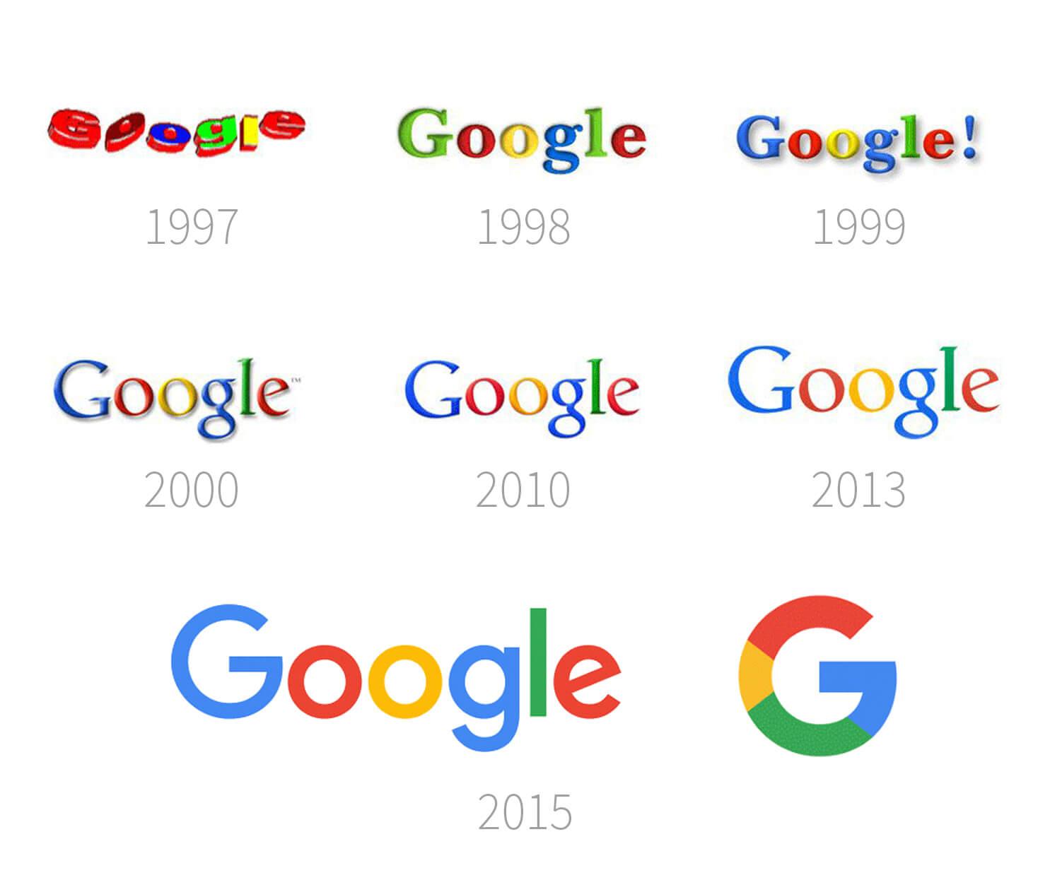
Then, ever since 1998 to today, Google had 7 redesigns, but they were hardly noticeable because the designers kept them very minimal and hard to stop. Just like Apple, they mostly played around with the shading and the coloring on the logo.
5. Starbucks
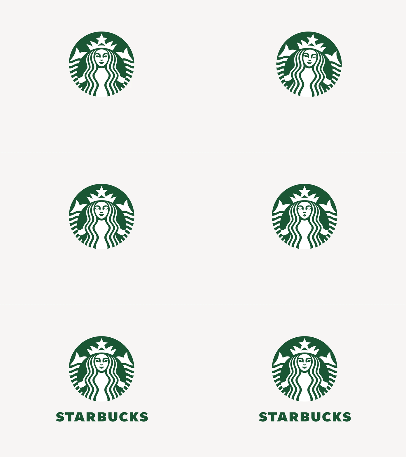
How is it that the Starbucks brand is so recognizable that it can easily be linked to an image of a mermaid on a green background? Well, it wasn’t always so. At first, Starbucks had a massive Starbucks lettering on their logo, both in the original version and the second revamp.

Starbucks maintained its original idea of a siren on their logo but changed just about everything else. Interestingly, the logo was brown at the beginning (which is logical because… coffee), but later it was changed to green. Usually, designers stay away from these kinds of full-blown color changes, so this was a really brave move.
6. Burger King
Many people don’t know this, but Burger King had one of the most significant transformations when it comes to logo (re)designs. Unlike some other logos on this list, the initial Burger King logo looks nothing like the one we know today.

In 1954, it started out in black and white, with a minimalist sun icon and ‘Burger King’ written below it. In the same year, the company issued a revamp, this time no sun, but still in black and white and in a funky font that would be banned from any designer’s arsenal today.
Then, we arrive at the Burger King logo that surprisingly stuck around for 12 years. Believe it or not, it was a literal burger king – a man with a crown sitting on top of a burger.
In 1969, the logo first started resembling what we know today, Burger King text placed inside of two burger buns.
7. Twitter
Finally, we come to one of the most recognizable logos in today’s world, the Twitter birdie, which is absolutely mind-blowing given the fact that the logo exists only for 8 years. Yes, you heard that right, in this universe, there actually was a Twitter without its famous birdie.

Fun fact: Did you know that Twitter’s bird has a name? It’s Larry the bird. Before Larry, Twitter experimented with purely textual logos and even had some cringeworthy green logo attempts in 2005.
8. Pepsi
Pepsi’s an old company which was bound to have more logo redesigns than some of the tech baby-companies on this list, but nevertheless, these changes were radical and there was definitely plenty of them.
Back when it all started, in 1898 (wow!), the logo of Pepsi Cola was a red, embellished-like text with a Tim Burton vibe. However, we have to give those designers a break. After all, it was still the 19th century, the new soda presented something absolutely new and disruptive, and it meant something entirely different for then’s drinkers.
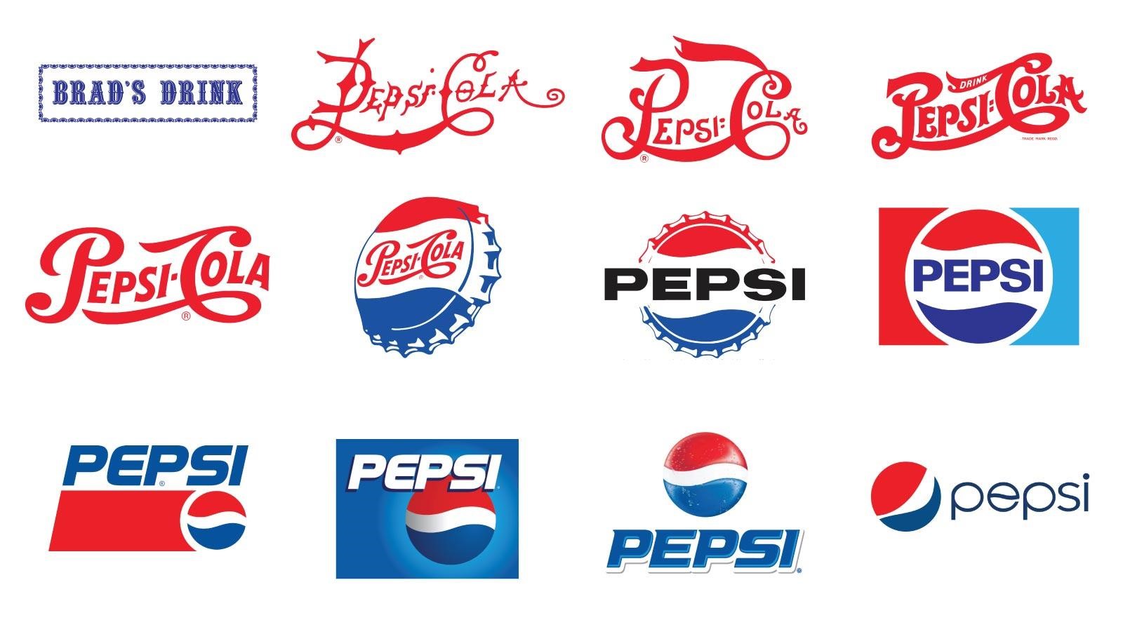
The company continued to push these types of logos up until the 1950’s when it took a turn and started using the symbol of the bottle cap which Pepsi bottles were famous for. This same symbol, although in a stylized version, appears on all Pepsi logos ever since.
9. KFC
For the food chain Kentucky Fried Chicken, one of the most memorable parts of their identity is the company’s logo. And unlike some of the other companies on this list, the KFC logo always featured similar elements – with massive tweaks over the years.

The person on the logo is Colonel Harland David Sanders, the founder of the company. His image is the foundation of the company’s logo ever since its founding in 1952. Since then, the logo had six redesigns, with the latest one being launched recently, in 2018.
10. Lego
Lego’s logo is perfect, right? It just screams “toys”, “fun” and “childhood”! Sure, that may be the case with this one, but Lego logos throughout history have been radically different. Since its founding in 1932, Lego had a whopping 20+ changes in logo design, making it the ultimate champion in famous logo redesigns, Pepsi included.
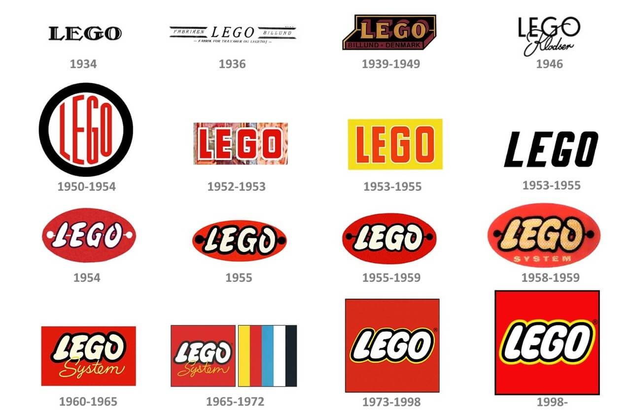
Surprisingly, it all started with a plain black logo in a typeface that resembles a cigarette brand rather than legos. After that, the company aimed to make the lego a bit more approaching and attractive, with various versions being launched into the public from 1936 to 1954.
In ’54, the Lego logo starts looking somewhat like the Lego logo we know and love. The company finally decided on red and yellow being the basis colors for the corporate visuals, which was an absolute bingo.
11. Mozilla Firefox
The browser Mozilla Firefox doesn’t necessarily have the most dramatic revamps compared to some of the other companies on this list, but what’s most stunning about their biggest logo change is the complete shift from one theme to another!
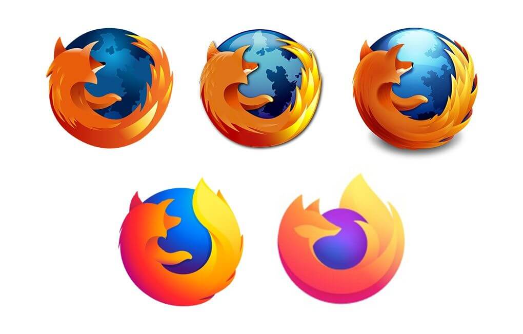
In 2002, Mozilla started off as a red image of a phoenix. No, the browser wasn’t called ‘Firefox’ at the time (and they certainly haven’t used a phoenix for a Firefox company), but the owners actually discovered that there was already a registered Phoenix company, so they changed both the name and the logo to Firefox.
This was changed in 2004 to the well-known fox wrapped around a blue globe. Throughout the years, designers made several small tweaks such as introducing lighter colors.
Conclusion
Change is inevitable and brand logos are definitely no exceptions – even if they are multi-billion multinational companies. Trends and design tendencies change, and it’s their job to stay ahead of the curve and adapt their visual identity accordingly. For us, it’s just fun to look at how some of the most amazing brands started with from truly less-than-amazing logos!
We hope you have enjoyed these 11 Famous Logo Design Evolutions, and be sure to leave your comments below as we love to hear from you the reader.
Useful Links & Great Deals
- The Equipment We Use & Recommend
- Quality Design Bundles
- Get 2 Months free Skillshare
- Get an Exclusive 20% off Logo Package Express
- Learn Logo Design Online
Author Bio
Marques Coleman is a blog writer at TopEssayWriting and specializes in marketing and copywriting. Moreover, he is an avid traveler and always tries to learn something new.

