In this article we are going to take a deep dive into 14 design principles of good logo design.
Creating a compelling logo design is like putting on a superhero cape for your brand. It has the power to captivate and leave a lasting impression on your audience. A logo serves as the visual ambassador of your brand, representing its values, personality, and essence.
In this section, we will delve into the importance of logo design in branding and establishing a strong visual identity, while highlighting key logo design principles that contribute to a logos effectiveness.
Table of Contents
Why Logo Design Matters
A well-crafted logo is more than just a pretty picture; it is the face of your brand. It is the first thing that comes to mind when people think of your business.
A memorable logo instantly connects with your audience, evoking emotions and forging a sense of trust and familiarity. It becomes a symbol of your brand’s promise, distinguishing you from your competitors in a crowded marketplace.
The Power of Visual Identity
A strong visual identity is crucial for brand recognition and recall. It is the visual language that communicates who you are, what you stand for, and why you matter.
And at the heart of a powerful visual identity lies a thoughtfully designed logo. It serves as the anchor point, harmonizing all other design elements to create a cohesive and memorable brand experience.
Design Elements that Make a Logo Design
When it comes to crafting a remarkable logo, it’s essential to understand and master the key design elements that contribute to its impact. These elements work together to create a visually captivating and cohesive logo design.
Let’s explore each of these elements in detail, keeping in mind the logo design principles that drive their effectiveness.
1. Colours
Colours have the power to evoke emotions and convey meaning. They play a vital role in logo design as they help establish the personality of your brand. When choosing colours for your logo, consider the following:
- Brand Identity: Select colours that align with your brand’s identity, values, and target audience.
- Contrast: Ensure there is enough contrast between the elements of your logo for clarity and legibility.
- Psychology: Understand the psychological associations of different colours to elicit the desired emotional response.
2. Typography
Typography is the art of arranging typefaces to enhance visual appeal and legibility. It adds personality and communicates the tone of your brand. Here are some considerations for typography in logo design:
- Font Selection: Choose a font that aligns with your brand’s personality and effectively communicates your message.
- Readability: Ensure the chosen font is legible, even at smaller sizes or when reproduced in different mediums.
- Hierarchy: Use font weights, sizes, and spacing to create a clear visual hierarchy within your logo design.
3. Line
Lines serve as the building blocks of a logo design, creating structure and defining shapes. Pay attention to the following aspects of lines in your logo design:
- Thickness: Experiment with different line weights to achieve the desired visual impact and balance.
- Curves vs. Straight Lines: Decide whether your logo design will benefit from organic curves or sharp, straight lines.
- Consistency: Maintain consistency in line style and direction to create a unified and cohesive logo.
4. Shapes
Shapes contribute to the overall visual composition of a logo and can convey specific meanings. Consider the following when incorporating shapes into your logo design:
- Geometry: Experiment with geometric shapes to achieve balance, harmony, and a sense of order.
- Abstract vs. Literal: Decide whether your logo will incorporate abstract shapes or represent literal objects.
- Negative Space: Utilize negative space cleverly to create hidden meanings or enhance visual interest.
5. Negative Space
Negative space in logo design refers to the empty or unmarked areas surrounding or within the elements of a logo. It can be leveraged to create visual illusions and clever symbolism. Keep these points in mind when working with negative space:
- Symbolic Potential: Explore the possibilities of using negative space to convey hidden meanings or double entendre.
- Balance: Use negative space to balance the positive space in your logo and create a harmonious composition.
- Simplicity: Clever use of negative space can add an extra layer of interest while maintaining simplicity in your design.
6. Graphics/Icons
Graphics and icons are visual representations that can add depth, meaning, and recognition to your logo. Consider the following when incorporating graphics or icons into your logo design:
- Simplicity: Ensure that the graphics or icons are simple and easily recognizable, even at smaller sizes.
- Relevance: Choose graphics or icons that align with your brand’s values, industry, and target audience.
- Uniqueness: Strive for originality in your graphic or icon design to avoid blending in with competitors.
7. Layout
The layout of a logo determines the arrangement and positioning of its various elements. Pay attention to the following aspects of logo layout:
- Hierarchy: Establish a clear visual hierarchy that guides the viewer’s eye through the logo.
- Proportions: Maintain proper proportions among the elements to achieve balance and harmony.
- Adaptability: Design a layout that can scale well and adapt to different sizes and applications.
By understanding and skillfully incorporating these design elements, you can create a logo that visually captivates and effectively communicates your brand’s identity.
Remember to keep the logo design principles in mind throughout the process to ensure a cohesive and impactful result.
14 Design Principles of Good Logo Design
To create a logo that packs a punch, you need to keep certain design principles in mind. These principles guide the process of crafting a logo that captures the essence of your brand and resonates with your target audience.
Here are the fundamental logo design principles that contribute to its effectiveness:
1. Originality: Making Your Logo Stand Out
In a sea of logos, standing out is crucial for your brand’s success. To make a lasting impression, it’s important to design original logo concept ideas that are unique, memorable, and aligned with your brand’s identity.
In this section, we’ll explore the significance of originality in logo design, discuss the pitfalls of cliché ideas and trends, and provide strategies to help you generate original logo concepts while avoiding plagiarism.
Importance of Designing Original Logo Concept Ideas
Creating an original logo is like crafting a masterpiece that represents your brand’s individuality.
It sets you apart from competitors and makes a bold statement about your brand’s values and offerings. Here’s why originality is paramount in logo design:
- Distinct Brand Identity: An original logo helps establish a distinct and recognizable brand identity. It allows you to communicate your brand’s unique personality, values, and story.
- Memorability: Original logos have a better chance of being remembered by your audience. When your logo stands out from the crowd, it becomes easier for people to recall and associate it with your brand.
- Differentiation: In a saturated market, originality helps your brand differentiate itself from competitors. It signals innovation, creativity, and a fresh perspective.
Avoiding Cliché Ideas and Focusing on Trends
While trends can be tempting, they often lead to cliché and generic logo designs. To create a logo that truly stands out, it’s important to avoid falling into the trap of clichés and overused ideas. Here’s why:
- Lack of Authenticity: Cliché ideas tend to lack authenticity and fail to capture the essence of your brand. They can make your logo blend in rather than stand out.
- Limited Shelf Life: Trendy designs quickly become outdated, forcing you to redesign your logo sooner than desired. Aim for a timeless logo that can withstand the test of time.
- Loss of Individuality: Following trends can result in a logo that looks like countless others in your industry. To make a lasting impact, it’s important to be unique and showcase your brand’s individuality.
Designing Original Logo Concepts and Avoiding Plagiarism
To design original logo concepts that reflect your brand’s personality and avoid plagiarism, consider the following strategies:
- Thorough Research: Conduct in-depth research to understand your brand, industry, competitors, and target audience. This knowledge will help you generate ideas that are unique to your brand.
- Brainstorming Sessions: Engage in brainstorming sessions with your team or creative collaborators to explore a wide range of ideas. Encourage out-of-the-box thinking and embrace unconventional approaches.
- Sketching and Doodling: Let your creativity flow by logo sketching and doodling freely. This helps you explore various design possibilities and discover unexpected logo concepts.
- Feedback and Iteration: Seek feedback from trusted sources and iterate on your designs. Constructive criticism can help refine your logo concepts and ensure they remain original.
- Avoid Direct Replication: Plagiarism is a serious offense in logo design. While you can draw inspiration from other designs, never directly replicate or copy someone else’s work.
Remember, the goal is to create a logo that is original, authentic, and a true reflection of your brand’s identity. By focusing on originality, avoiding cliché ideas and trends, and following ethical design practices, you can develop a logo that captivates your audience and sets your brand apart.
2. Logos Should Work Well in Black and White: The Power of Monochrome
In the world of logo design, colours often take the spotlight, but it’s crucial to remember that a logo should also shine in black and white.
The ability of a logo to be effective and visually appealing in monochrome format holds immense significance. In this section, we will delve into why a logo needs to work well in black and white, emphasizing the importance of monochrome compatibility.
The Importance of Monochrome Compatibility
When designing a logo, it’s essential to consider its versatility and adaptability across various mediums, including print, digital platforms, and even promotional items.
Here’s why ensuring that your logo works well in black and white is crucial:
- Practicality and Flexibility: A logo that can be reproduced in black and white without losing its impact provides practicality and flexibility in various scenarios. It allows your logo to be used in situations where colour reproduction may not be feasible or effective.
- Print and Reproduction: Black and white logos are commonly used in print materials such as newspapers, invoices, business cards, or faxed documents. Ensuring your logo maintains its visual appeal without colour helps maintain brand consistency across different printing techniques and materials.
- Accessibility and Legibility: Some situations, such as photocopies or grayscale displays, may render colours less distinguishable. By having a monochrome version of your logo, you ensure that it remains accessible and easily recognizable in any context.
- Distinctiveness and Simplicity: Stripping away colours allows the focus to shift solely to the fundamental elements of your logo—shapes, lines, and typography. This emphasis on simplicity and distinctiveness enhances the logo’s impact and memorability.
Designing for Monochrome Compatibility
To ensure that your logo translates well into black and white, consider the following design principles:
- Contrast: Create contrast between the elements of your logo, ensuring that they stand out clearly when color is removed. This helps maintain visual hierarchy and legibility.
- Shape and Form: Pay attention to the shapes and forms within your logo, as they become more pronounced in monochrome. Simplify and refine your design to ensure it remains visually compelling.
- Negative Space: Clever use of negative space becomes even more crucial in monochrome logos. Utilize it effectively to create depth, balance, and hidden symbolism.
- Typography: Select a font that remains legible and distinctive when converted to black and white. Pay attention to the weight and spacing to maintain clarity.
By considering monochrome compatibility during the logo design process, you ensure that your logo maintains its impact, clarity, and recognisability across various mediums and contexts.
A strong black and white rendition of your logo will not only enhance its versatility but also demonstrate a thoughtful approach to design.
Checkout our logo design portfolio to see how we design in black and white (monochrome).
5. Simplicity and Clarity: The Power of Minimalism
When it comes to logo design, less is often more. Simplicity and clarity play a pivotal role in creating effective logos that leave a lasting impression. In this section, we will explore the significance of simplicity in logo design, emphasizing the need for easy recognition and scalability.
We will also discuss how clarity in design helps convey the intended message and avoids confusion. Prepare to be inspired by examples of successful logos that demonstrate the power of simplicity and clarity.
The Significance of Simplicity in Logo Design
Simplicity is the secret ingredient that allows a logo to be instantly recognizable and memorable. Here’s why simplicity is a fundamental principle in logo design:
- Easy Recognition: Simple logos are more likely to be recognized and remembered by your audience. By reducing complexity, you create a design that can be quickly processed and understood.
- Scalability: A simple logo retains its clarity and impact, whether it’s scaled down to fit a small app icon or blown up on a billboard. Complex designs can lose their integrity and become unrecognizable at different sizes.
- Timelessness: Simple logos have a timeless quality that allows them to withstand the ever-changing design trends. They can remain relevant and effective for years to come.
The Role of Clarity in Conveying the Message
Clarity in logo design ensures that the intended message is communicated effectively. Here’s how clarity contributes to a successful logo:
- Avoiding Confusion: A clear logo leaves no room for misinterpretation or confusion. It communicates the essence of your brand, product, or service in a concise and straightforward manner.
- Conveying Brand Personality: Clarity allows your logo to reflect your brand’s personality and values. It captures the essence of your brand’s story and creates a visual connection with your target audience.
- Memorability: Clear and well-defined elements within a logo make it easier for people to remember and recall. A cluttered or complicated design may be quickly forgotten.
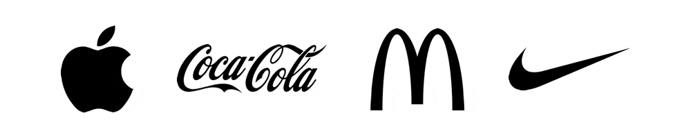
Examples of Successful Logos Demonstrating Simplicity and Clarity
Now, let’s take a look at some remarkable logos that embody the principles of simplicity and clarity:
- Nike: The Nike swoosh is a perfect example of simplicity and instant recognition. Its clean, fluid lines convey movement and energy, aligning with the brand’s athletic image.
- Apple: The bitten apple logo is iconic and instantly associated with the technology giant. Its simple silhouette and minimalistic design convey innovation and elegance.
- McDonald’s: The golden arches of McDonald’s are a universally recognized symbol. The simplicity of two golden arches conveys familiarity, while the boldness ensures easy recognition.
- FedEx: The FedEx logo incorporates an arrow cleverly hidden within the negative space between the “E” and the “x.” This simple yet ingenious design conveys movement, speed, and efficiency.

These examples illustrate how simplicity and clarity can create powerful, memorable logos that stand the test of time. By distilling your logo to its essential elements and ensuring clarity in design, you can create a visual identity that resonates with your audience.
6. Well Balanced: The Art of Harmonious Logo Design
Balance is a key principle in logo design that greatly influences how a logo is perceived. In this section, we will explore the significance of a well-balanced logo, discussing how humans are naturally inclined to recognize balanced images.
We will also delve into the Golden Ratio, a powerful tool for laying out a logo design. Additionally, we’ll explain the difference between mathematical and optical balance, revealing the intricacies of achieving visual harmony in logo design.
Humans’ Natural Affinity for Balance
As humans, we have an inherent inclination to seek balance and harmony in the visual world. Balanced images are visually pleasing and instill a sense of order and stability. When it comes to logo design, creating a well-balanced composition is essential. Here’s why:
- Visual Appeal: A balanced logo captures attention and engages viewers. It exudes professionalism, polish, and a sense of aesthetic appeal.
- Perception of Quality: A logo with balanced elements is often associated with high quality and attention to detail. It reflects a well-thought-out design and adds credibility to your brand.
The Golden Ratio: Creating Proportional Harmony
One powerful technique for achieving balance in logo design is by utilizing the Golden Ratio. This mathematical concept has been used in art and design for centuries. Here’s how it can be applied to logo layout:
- Divine Proportion: The Golden Ratio, often represented by the value of approximately 1.618, is a proportion that is visually pleasing and harmonious to the human eye. It is found in nature, architecture, and even human anatomy.
- Logo Composition: Applying the Golden Ratio involves dividing the logo’s canvas into sections based on the ratio. This guides the placement of key elements, such as typography or graphics, creating an aesthetically pleasing and well-balanced composition.
Mathematical vs. Optical Balance
Achieving balance in a logo can be approached in two ways: mathematical and optical balance. Understanding the difference is crucial for creating visually harmonious designs:
- Mathematical Balance: Mathematical balance refers to the equal distribution of weight or visual elements in a logo. It relies on precise measurements and symmetrical arrangements.
- Optical Balance: Optical balance, on the other hand, is achieved through careful visual assessment. It considers the perceived weight and visual impact of elements rather than strict measurements. Optical balance allows for more flexibility and can create visually balanced compositions, even with asymmetrical arrangements.
By understanding the principles of mathematical and optical balance, you can create logo designs that are visually pleasing, captivating, and harmoniously balanced.
7. Memorability and Distinctiveness: Making Your Logo Unforgettable
Creating a memorable logo is a crucial aspect of successful branding. In this section, we will explore the importance of crafting a logo that stands out from competitors. We’ll discuss the use of unique and distinctive elements to make your logo easily recognizable and memorable.
We will also delve into the role of colour, typography, and imagery in enhancing memorability and distinctiveness. Prepare to be inspired by examples of remarkable logos that have left an indelible mark in the minds of audiences.
The Importance of Memorable Logos
In a crowded marketplace, a memorable logo can be the difference between being noticed and being forgotten. Here’s why creating a logo that sticks in people’s minds is vital:
- Brand Recall: A memorable logo helps customers recall your brand effortlessly. It leaves a lasting impression and fosters a connection with your audience.
- Differentiation: In a sea of competitors, a distinct and memorable logo helps your brand stand out. It sets you apart from the crowd and communicates your unique selling proposition.
Creating Distinctive Elements
To make your logo easily recognizable and memorable, it’s essential to incorporate distinctive elements. Consider the following strategies:
- Unique Shapes: Utilize shapes that are distinct and not commonly seen in your industry. This can create intrigue and make your logo more memorable.
- Symbolism: Incorporate symbolism or visual metaphors that reflect your brand’s values, products, or services. Symbolic elements can evoke emotion and make a lasting impact.
- Creative Typography: Experiment with custom or unique typography to give your logo a distinct personality. The typography should align with your brand’s tone and values.
The Role of Colour, Typography, and Imagery
Colour, typography, and imagery play a significant role in enhancing the memorability and distinctiveness of your logo:
- Colour: Choose colours that evoke the desired emotions and align with your brand’s personality. Memorable logos often employ bold, vibrant, or unexpected colour combinations that leave a lasting visual impression.
- Typography: Select fonts that are distinctive, legible, and reflective of your brand’s character. Custom typography can add a unique touch to your logo, making it more memorable.
- Imagery: Incorporate imagery that is relevant, striking, and memorable. Imagery can convey your brand’s story, evoke emotions, or create visual associations that resonate with your audience.
Examples of Memorable and Distinctive Logos
Let’s take a look at some notable examples of famous logos that have achieved memorability and distinctiveness:
- Apple: The bitten apple logo of Apple is instantly recognizable and has become synonymous with innovation and sleek design.
- Twitter: The iconic bird silhouette in the Twitter logo is a simple yet memorable symbol that represents the platform’s essence of connection and communication.
- WWF: The World Wildlife Fund logo cleverly incorporates a panda silhouette, instantly associating the logo with the cause of conservation and environmental protection.
- FedEx: The hidden arrow within the FedEx logo not only represents movement but also creates a memorable and distinctive element that captivates viewers.
These examples demonstrate how effective use of distinct elements, symbolism, colour, typography, and imagery can create logos that leave a lasting impression on the audience.
For more information about how some of the world’s famous logos have evolved over time check out our article about logo evolution.
8. Versatility and Adaptability: Making Your Logo Shine Everywhere
Designing a versatile and adaptable logo is essential in today’s multi-channel world. In this section, we’ll explain why it’s necessary to create a logo that can be used across various mediums and platforms.
We’ll discuss the importance of adaptability to different sizes, colour schemes, and backgrounds. Also, we’ll provide valuable tips on how to create a logo that maintains its impact and legibility in different contexts.
Get ready to unlock the secrets of a logo that shines no matter where it’s displayed!
The Necessity of Versatile Logo Design
A versatile logo is like a chameleon—it seamlessly adapts to different mediums and platforms. Here’s why designing a versatile logo is crucial:
- Consistent Brand Identity: A logo that maintains its visual integrity across various mediums reinforces your brand identity, making it instantly recognizable and memorable.
- Enhanced Reach: With the proliferation of digital platforms, a versatile logo ensures your brand can make a consistent impact across websites, social media, mobile apps, merchandise, and more.
Adapting to Different Sizes, Colour Schemes, and Backgrounds
To ensure your logo looks its best in every context, it’s important to consider adaptability in various aspects:
- Size: Your logo should be legible and visually appealing at different sizes, from a tiny favicon to a large billboard. Simplify intricate details and test your logo’s scalability to guarantee clarity and recognition.
- Colour Schemes: Your logo should be adaptable to different colour schemes, including full colour, grayscale, and monochrome. This allows for flexibility in printing, online display, and diverse branding requirements.
- Backgrounds: Your logo should stand out and remain recognizable against various backgrounds. Consider creating versions with transparent backgrounds or adaptable colour treatments to ensure optimal visibility.
Tips for Creating a Versatile Logo
To create a logo that shines in any context, keep these tips in mind:
- Simplicity is Key: Opt for clean, uncluttered designs that translate well across different mediums. Avoid intricate details that may become lost or distorted when scaled down.
- Strong Silhouettes: Focus on creating a strong silhouette or recognizable shape that remains distinct even when the colour is removed. This ensures your logo maintains its impact in different colour schemes and backgrounds.
- Consider Multiple Layouts: Design variations of your logo in different orientations (horizontal, vertical, square) to accommodate various design layouts and ensure flexibility in different spaces.
- Test Across Platforms: Evaluate your logo’s legibility and impact on various devices and platforms, including desktop, mobile, and social media profiles. Make necessary adjustments to optimize its appearance.
Remember, a versatile logo not only adapts to different mediums but also reinforces your brand’s visual identity and strengthens its recognition.
By prioritizing adaptability and considering various design aspects, you can create a logo that shines bright in every setting.
9. Relevance and Timelessness: Creating a Logo with Longevity
In this section, we’ll explore the significance of aligning your logo design with the brand’s values, industry, and target audience. We’ll explore the need to avoid trendy elements that may quickly become outdated.
Provide examples of timeless logos that have stood the test of time, remaining effective and relevant even after years of existence. Get ready to discover the secrets of creating a logo that transcends trends and remains impactful for years to come!
Aligning Your Logo with Brand Values and Audience
Designing a logo that aligns with your brand’s values, industry, and target audience is crucial for long-term success. Consider the following points:
- Brand Identity: Your logo should visually represent your brand’s essence, values, and personality. It should evoke the right emotions and resonate with your target audience.
- Industry Relevance: Understanding your industry’s visual language and trends is important, but avoid directly imitating competitors. Instead, find unique ways to communicate your brand’s position within the industry.
- Target Audience: Your logo should appeal to your target audience and reflect their preferences and aspirations. Consider their demographics, interests, and cultural nuances when designing your logo.
Avoiding Trendy Elements for Longevity
While incorporating current design trends may initially seem appealing, they can quickly become outdated. Here’s why you should exercise caution when it comes to logo trends:
- Longevity: Trends come and go, but your logo should withstand the test of time. A logo that relies heavily on current trends may lose relevance as trends evolve, leading to the need for frequent redesigns.
- Brand Consistency: Consistency is key in building brand recognition and recall. By avoiding trendy elements, you can maintain a consistent brand identity that resonates with your audience over the long term.
- Timeless Appeal: Focus on creating a logo with timeless appeal that transcends short-lived trends. Timeless logos have a classic and enduring quality that continues to engage and attract audiences.
Examples of Timeless Logos
Let’s explore some examples of logos that have stood the test of time, remaining effective and relevant throughout the years:
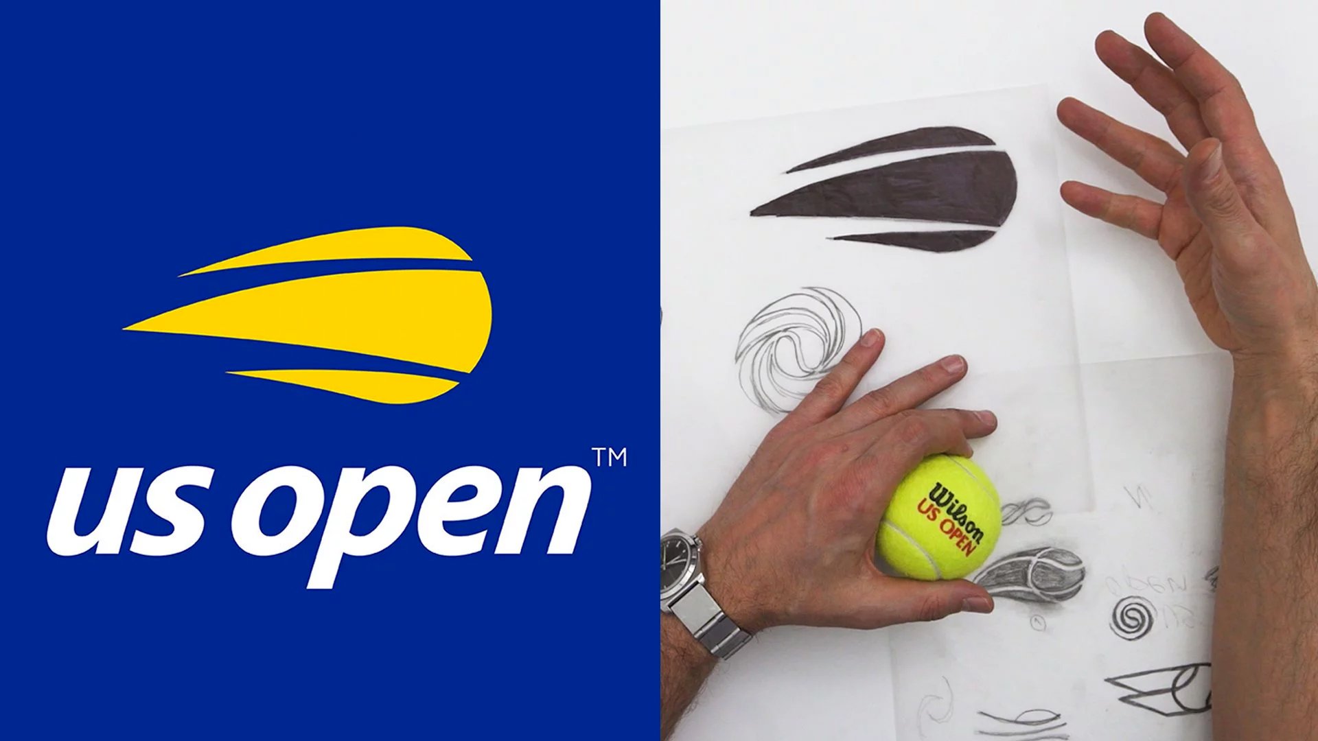
- Coca-Cola: The Coca-Cola logo has remained virtually unchanged for over a century. Its classic script typography and distinct red colour continue to be instantly recognizable and evoke a sense of nostalgia.
- Nike: The Nike “Swoosh” logo is simple yet powerful. Its clean and fluid design has remained relevant since its creation in 1971, representing movement and athleticism.
- Mercedes-Benz: The Mercedes-Benz logo, featuring a three-pointed star, exudes elegance and sophistication. It has maintained its allure and brand identity since its inception in 1926.
These examples demonstrate the power of timeless design principles that prioritize relevance, simplicity, and enduring appeal.
10. Consistency and Cohesion: The Key to a Strong Brand Identity
In this section, we’ll explore the importance of maintaining consistency in logo usage across various brand touchpoints. We’ll discuss the need for a cohesive design that reflects the overall brand identity.
We will also provide valuable tips on how to ensure consistent application of the logo in different marketing materials. Get ready to discover how consistency and cohesion contribute to a strong and recognizable brand identity!
Maintaining Consistency in Logo Usage
Consistency in logo usage is crucial for building brand recognition and establishing a strong visual identity. Here’s why it matters:
- Brand Recognition: Consistently using your logo across different touchpoints—such as websites, social media, packaging, and advertisements—helps customers recognize and associate it with your brand, fostering familiarity and trust.
- Professionalism: Consistency in logo usage demonstrates professionalism and attention to detail. It shows that your brand is committed to delivering a cohesive and unified experience to customers.
Creating a Cohesive Design
A cohesive design ensures that your logo aligns harmoniously with the overall brand identity. Consider the following aspects:
- Visual Elements: Your logo should seamlessly integrate with other visual elements, such as colour schemes, typography, and graphic styles, used throughout your brand materials. This creates a cohesive and unified visual language.
- Brand Personality: Ensure that your logo reflects the personality and values of your brand. Whether it’s modern and edgy or traditional and reliable, the design should convey the essence of your brand’s identity.
Tips for Consistent Logo Application
To maintain consistency in logo usage across various marketing materials, follow these tips:
- Logo Usage Guidelines: Create a comprehensive brand style guide that includes guidelines for logo placement, minimum size, clear space requirements, colour variations, and usage on different backgrounds. Share this guide with all stakeholders to ensure consistent application.
- Template Creation: Develop templates for different marketing materials, such as business cards, letterheads, email signatures, and social media graphics. These templates should incorporate the logo and other brand elements in a consistent manner, simplifying the design process.
- Regular Audits: Regularly review your brand materials to ensure consistent logo usage. Check for any variations, improper scaling, or unauthorized alterations that may dilute the brand identity.
By maintaining consistency and cohesion in logo usage, you establish a strong and recognizable brand identity. Consistent application across touchpoints enhances brand recall and fosters trust in the minds of your customers.
11. Stay on Brand: Aligning Design Decisions with Brand Story and Values
This section emphasize the importance of staying on brand and how every design decision made in logo design should align with the brand’s story and values.
We’ll also highlight the significance of having a brand design strategy that considers the brand’s purpose, personality, and offering when visually communicating with the audience. Get ready to explore the key principles of logo design and their connection to maintaining a strong brand identity!
The Importance of Staying on Brand
When it comes to logo design, staying on brand is essential. Here’s why it matters:
- Consistency and Coherence: By aligning your logo design with the brand’s story and values, you create a consistent and coherent brand identity. Every design decision should reinforce the brand’s personality and evoke the desired emotions in your audience.
- Brand Recognition: A logo that accurately represents your brand’s story and values becomes a recognizable symbol of your business. It helps customers connect with your brand on a deeper level and differentiate you from competitors.
Understanding Brand Design Strategy
Brand design strategy involves aligning the visual communication of your brand with its purpose, personality, and offering. Consider the following points:
- Brand Purpose: Clearly define your brand’s purpose, mission, and values. Your logo should reflect these elements, whether it’s conveying a sense of innovation, trustworthiness, or sustainability.
- Brand Personality: Determine the personality traits that define your brand, such as playful, sophisticated, or authoritative. Ensure your logo design captures and communicates these traits effectively.
- Brand Offering: Understand your products or services and how they provide value to customers. Your logo should visually represent what your brand offers and create a positive impression in the minds of your target audience.
The Impact of Visual Communication
Visual communication through logo design plays a crucial role in conveying your brand’s story and values. Here’s how it makes a difference:
- Instant Recognition: A well-designed logo that aligns with your brand’s story and values creates instant recognition and recall. It becomes a visual cue that triggers positive associations and emotions related to your brand.
- Consistency Across Touchpoints: By staying on brand, you ensure consistency across all brand touchpoints. From your website to packaging and advertising, a cohesive visual identity strengthens your brand’s overall message.
Remember, every single design decision made in the logo design process should align with your brand’s story and values. By understanding your brand’s purpose, personality, and offering, you can create a logo that visually communicates your brand’s essence to the world.
Conclusion: Creating Effective Logos with Key Design Principles
In this blog post, we’ve explored the key design principles of good logo design and their impact on brand recognition and recall. It’s time to summarize these principles, emphasize the significance of a well-designed logo, and encourage readers to implement them when creating or redesigning their logos. Let’s recap what we’ve learned!
Key Design Principles of Good Logo Design
- Simplicity and Clarity: A simple and clear logo facilitates easy recognition and scalability. Avoid complex designs that may confuse or fail to convey your message effectively.
- Memorability and Distinctiveness: Create a memorable logo that stands out from competitors. Use unique and distinctive elements, such as colour, typography, and imagery, to enhance recognition and leave a lasting impression.
- Well Balanced: Humans are naturally inclined to recognize balanced images. Utilize the Golden Ratio to achieve visual harmony and consider both mathematical and optical balance in your logo design.
- Originality: Design original logo concepts to ensure your brand stands out and avoids cliché ideas and trends. Protect your creativity and avoid plagiarism by conducting thorough research.
- Versatility and Adaptability: Design a logo that can be used across various mediums and platforms. Ensure adaptability to different sizes, colour schemes, and backgrounds, maintaining the logo’s impact and legibility in different contexts.
- Logos should work well in black and white: A logo should be effective even in monochrome format. Test its readability and visual impact without relying on colour.
- Relevance and Timelessness: Align your logo design with your brand’s values, industry, and target audience. Avoid trendy elements that may quickly become outdated. Seek inspiration from timeless logos that have stood the test of time.
- Consistency and Cohesion: Maintain consistency in logo usage across various brand touchpoints. Create a cohesive design that reflects your overall brand identity, reinforcing brand recognition and reinforcing your brand’s message.
- Stay on Brand: Every design decision should align with your brand’s story and values. Consider your brand’s purpose, personality, and offering when visually communicating your brand to create a meaningful connection with your audience.
The Impact of a Well-Designed Logo
A well-designed logo has a significant impact on brand recognition and recall. A logo serves as a visual representation of your brand, evokes emotions, and creates a lasting impression.
A strong logo communicates your brand’s identity and differentiates you from competitors, contributing to increased brand awareness, customer loyalty, and business success.
Implementing the Logo Design Principles
As you embark on creating or redesigning your logo, remember to implement these key design principles:
- Keep your logo simple, clear, and memorable.
- Strive for balance and originality in your design.
- Test your logo’s versatility and adaptability.
- Align your logo with your brand’s values and target audience.
- Maintain consistency and cohesiveness across brand touchpoints.
By following these principles, you’ll create a logo that captures the essence of your brand and leaves a lasting impression on your audience.
So, are you ready to unleash your creativity and design a remarkable logo that represents your brand in the best possible way? Start implementing these principles, and watch your logo become a powerful symbol that resonates with your audience and contributes to the success of your brand.
Thank you for joining us on this logo design journey. Happy logo designing!
Join The Logo Community
We hope theses 14 design principles of good logo design has helped. If you would like more personal tips, advice, insights, and access to our community threads and other goodies, join us in our community.
You can comment directly on posts, access our community threads, have a discussion and ask questions with our founder Andrew.
If you’re looking to learn more about brand strategy, we highly recommend eRESONAID with our friend and acclaimed brand strategist and author Fabian Geyrhalter, it’s packed full of knowledge and insights you will need to learn to become a brand strategist or apply what you learn within your own business.


Author Bio
Andrew Marriott is the owner and founder of The Logo Creative™. He is an award-winning designer with over two decades of experience designing logos and specialising in branding for companies worldwide.