The year 2020 is undoubtedly is a year of loads of expectation regarding different trends especially within technology in many ways. Graphic design is one of them. Every year there are surprising changes are coming to experience in this field. Join us in this article as we take a look at the 2020 Graphic Design Trends.
Here you can find a variety of research about new trends in graphics expected to be implemented on a high scale in 2020.
This year’s trend designs are proving the sense of limitless boundaries of ideas that are constantly revolving around the age of the digital world.
Basically, with fast-moving technology, people want something new now and then. 2020 will be expected to be the year of colors and those designs where
people can experience their imagination in reality.
Here we go and have a look at some new trends going to be considered best in this ongoing year.
Table of Contents
Gradient Illustrations
Since gradients were introduced, it always considered as the center of attraction due to its unique color mixing scheme. To help in designing its illustrations gives a plus every time and as the passage of time, it has already upgraded to an amazing extent.
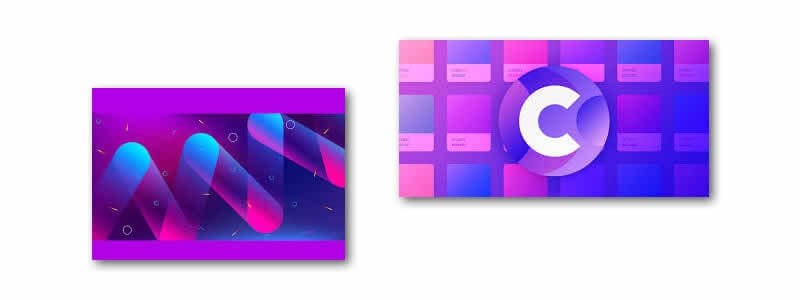
Flat design is evolving, and gradients are making their modern-day comeback as a flat design enhancement. This enhancement is part of a design update often referred to as “semi-flat design”. Their reappearance in industry leaders like Instagram has proven their popularity once again, and you’ll be seeing them in the form of vibrant UI, branding, backgrounds, illustrations, and overlays.
This year graphic designers have used gradients to add depth to user experience, experimented with color combinations to make their projects look more professional. Although in 2019, creating gradients requires a lot of work. We also know how challenging it can be to find the right color combination for your project, especially if you are “suffering” from perfectionism. The basic level refers to one of the 2019 graphic design trends: duotone gradients.
The intermediate pushes you to experiment and master your skills through achieving a smooth combination of three colors. Meanwhile, the advanced one is definitely for those who are more ambitious and can easily work out the blend of four or five colors.
The infographic features gradient examples and the solid colors you can extract with the eyedropper tool in any app and create your color combinations.
Typography Design
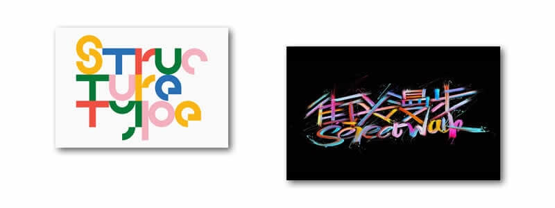
As an important element of graphic design typography is defined as the style or appearance of text. The art and technique of arranging type, including type design, lettering, and calligraphy.
Font design is a long and involved process. Typefaces are created by craftspeople over a substantial period, using talent honed over many years.
It is also defined as the theory and practice of letter and typeface design. In other words, it is an art concerned with design elements that can be applied to the letters and text (as opposed to, say, images, tables, or other visual enhancements) on a printed page.
Asymmetrical layout
Asymmetry can be one of the most useful concepts in your design toolkit. It is a source of attraction technique that is interesting and eye-catching. It’s a process of dealing with imbalanced designs. By giving a complete balance look to any object in such a designing manner this is giving a beautiful look is an art created by a graphic designer.
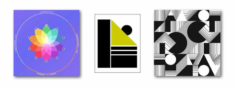
For mix and matching symmetrical and asymmetrical concepts within a design project, you can break the design into smaller sections every part has different measurements of its balance.
Knowing what you want to accomplish with the visuals will help determine how to best use techniques to accomplish it. Asymmetry is active and grabs attention; it can be heavy but natural. And once you have something on the canvas, trust your gut.
Achieving balance is that magic in-between. The good asymmetrical design includes balance so that no one part of the project is too heavy for the rest. You can create balance by offsetting elements with space, creating emphasis with motion, understanding weight, adding focus with color and using a grid for alignment and organization.
Textured 3d design
3D computer graphics, or three-dimensional computer graphics (in contrast to 2D computer graphics), are graphics that use a three-dimensional representation of geometric data.
3D graphic designers are digital artists who create visual images to communicate messages. These images may be in the form of illustrations, animation, photographs or text.
Graphic designing companies in London collaborate with leading brands & design agencies helping to get their ideas in motion using animations, visualizations & highlights.
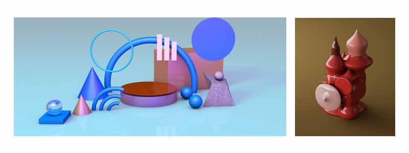
The point of rendering a photo-realistic scene in 3D is not to replicate reality, but to enhance it in ways that catch the eye and spark the imagination.
Today with advancements in technology and techniques make 3D designing smarter and capable of doing crucial ones more convenient. Since many apps and software are introduced which helps an ordinary person to develop something creative and imaginary on its own.
What is striking about this object is its small details and the highly life-like sheen on the object’s surface.
Fluid shapes
There are numerous tools available now which have already built-in fluid shape designs for your further designing. To design a fluid or liquid pattern by your own choice, you can easily access software for this like Adobe Photoshop or Adobe Illustrator. Designers apply their expert techniques for colorful and unique outcomes.
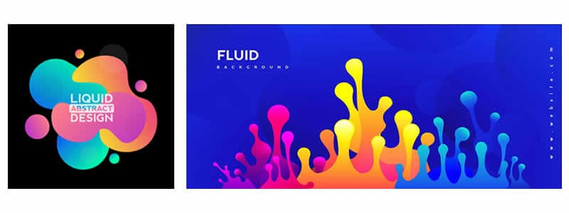
This designing innovation can also be implemented using motion graphics that give an extremely professional touch to your work.
Tailor-made illustrations
These days multiple designing schemes are now introducing and become a part of new trends. In this newly started the year 2020 one predicts this tailor-made illustration as a new trendsetter for new generation, the idea came from the 80’s and 90’s era when people used to draw vectors and other geometrical shapes but now this takes place by using technology. we can expect to see more and more custom-branded illustrations to become one of the key ways brands convey friendliness as well as become an integral part of the brand identity system.
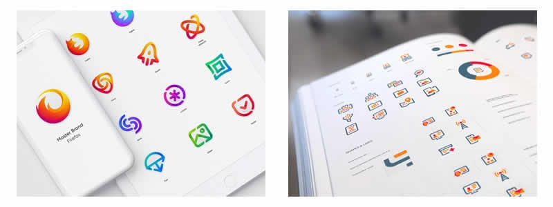
Furthermore, these new ideas indeed can be helpful in SEO. Since it’s new in the market, so it is expected to be a responsive resource in terms of SEO.
Isometric compositions
Now a day, it can be frequently seen that isometric illustrations are used in digital products because of their easiest accessible characteristic. Many of us don’t know that isometric drawings are not genuine 3D drawings, those are made in 2D, but they look like 3D.
You can draw impressive and complex isometric designs effortlessly once you learn the trick. The “Geometric Technique” is a method preferred by many, to create eye-catching isometric illustrations.
What are the three distinct geometric plane structures you need to know before drawing an isometric illustration?
A Plane is a two-dimensional (2D) flat surface that extends to the infinity.
All the isometric artworks are created by using 3D Geometry composed of three distinct geometric plane structures: XY, YZ, and ZX.
In XY, the object is placed in X and Y planes. The object’s size can be changed in X and Y planes and his depth in the Z plane.
In YZ, the object is placed in Y and Z planes. The object’s size can be changed in Y and Z planes and his depth in X plane.
In ZX, the object is placed in Z and X planes. The object’s size can be changed in Z and X planes and his depth in Y plane.
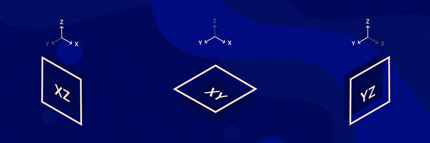
The easiest way to work on isometric illustrations is with Adobe Illustrator even if it’s a 2D illustrating tool. If you’re not familiar with this program, check below some other software options that you can use for isometric artworks.
Easiest method – The „Geometric Technique”
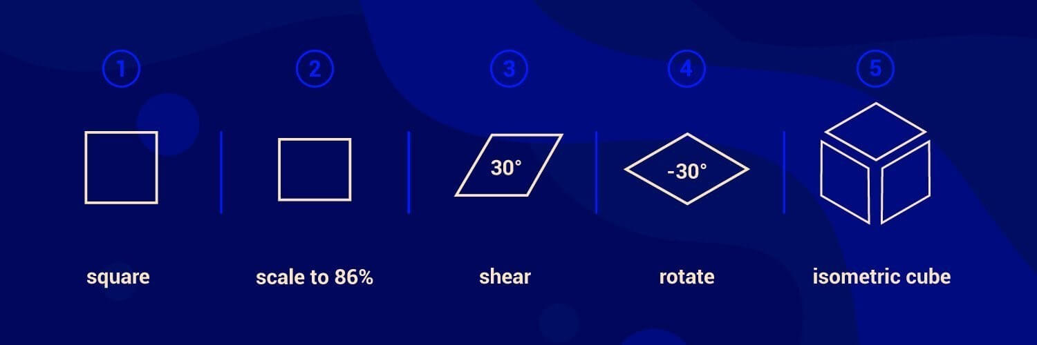
- Draw a square
- Scale vertically, about 86%
- Shear to 30 degrees
- Rotate it at -30 degrees
- You have a top side now!
- Make the other side by change the rotation angle to 30 degrees
- Congrats, you have a cube!
For intermediate Illustrator users, this is a faster technique that makes the perfect isometric cube
- Draw a square, with the color preferred
- Go to Menu, choose Effect > 3D > Extrude & Bevel
- Change the position: Isometric Left / Right / Top / Bottom
- Increase or decrease the extrude depth until you reach your wanted shape
Mixed media
This is something extraordinary and beyond expectations. Designers create mixed media using numerous ideas. This is full of colors and art. The actual art can be easily seen in this sort of graphics as multiple types of choices related to designing are merged and composed together to create amazing output.
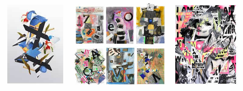
Collages are one of the most popular media choices selected usually by youngsters and gradually more people are focusing on this trend in the present year. People usually use different pictures, patterns, designs, filters, wallpapers, image colorization, effects and scenes to make a perfect collage. All of these graphics techniques make people’s life extremely interesting, they are easily available in all the app stores in a huge variety. People can enjoy at any sort of occasion or place anytime.
Line art
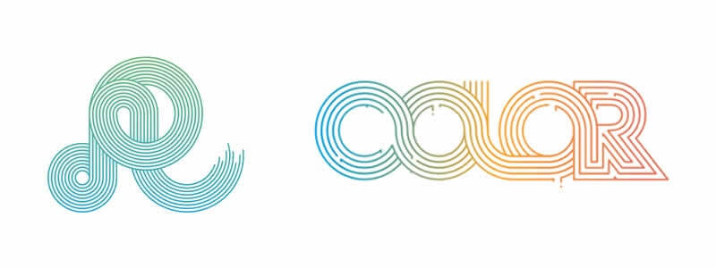
The line art design is increasingly more integrated into the design and is a great tool for creating something truly unique. It is everywhere right now, and particularly in web and mobile, illustration and graphic design projects. With line art design becoming more popular, 2018 is sure to be a year filled with multiple techniques and aesthetics all mashed together resulting in a whole lot of awesome. So in this post, we’ve rounded up 40 Beautiful Examples Of Line Art Designs to give your ideas for your next project.
Metallic Illustration
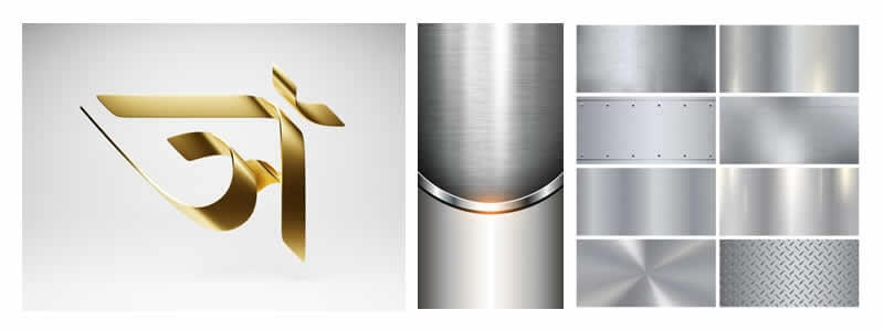
Gold and silver have its importance around the world which never comes out of the trend, but in graphic design 2020, we’ll see even more metallic elements embedded in designs. Especially when it comes to 3D designs, metallic elements take over the entire composition, it gives the entire entity’s look expensive and exclusive.
Displaying different metals with an iris color effect is also quite trendy. Such models look lovely and fascinating because they feature a beautiful palette of shiny colors when light touches their surface.
We hope you have enjoyed the 2020 Graphic Design Trends article, and be sure to leave your comments below. Checkout DesignCuts for some fantastic graphic design bundles at amazing prices.
Useful Links & Great Deals
- The Equipment We Use & Recommend
- Quality Design Bundles
- Get 2 Months free Skillshare
- Get an Exclusive 20% off Logo Package Express
- Learn Logo Design Online
Author Bio
Danish Mendez is a writer by passion. Currently writing for logo champ, where he has written a tremendous amount of stuff. He has a soft corner for humanity and has taken part in many welfare activities. Therefore he is a well-known philanthropist.

