When you think of films which Iconic Movie Logos come to mind? Let’s explore some of these legendary movie logos and see if you agree that they are the best film logos around!
Table of Contents
The Psychology of Iconic Movie Logos 
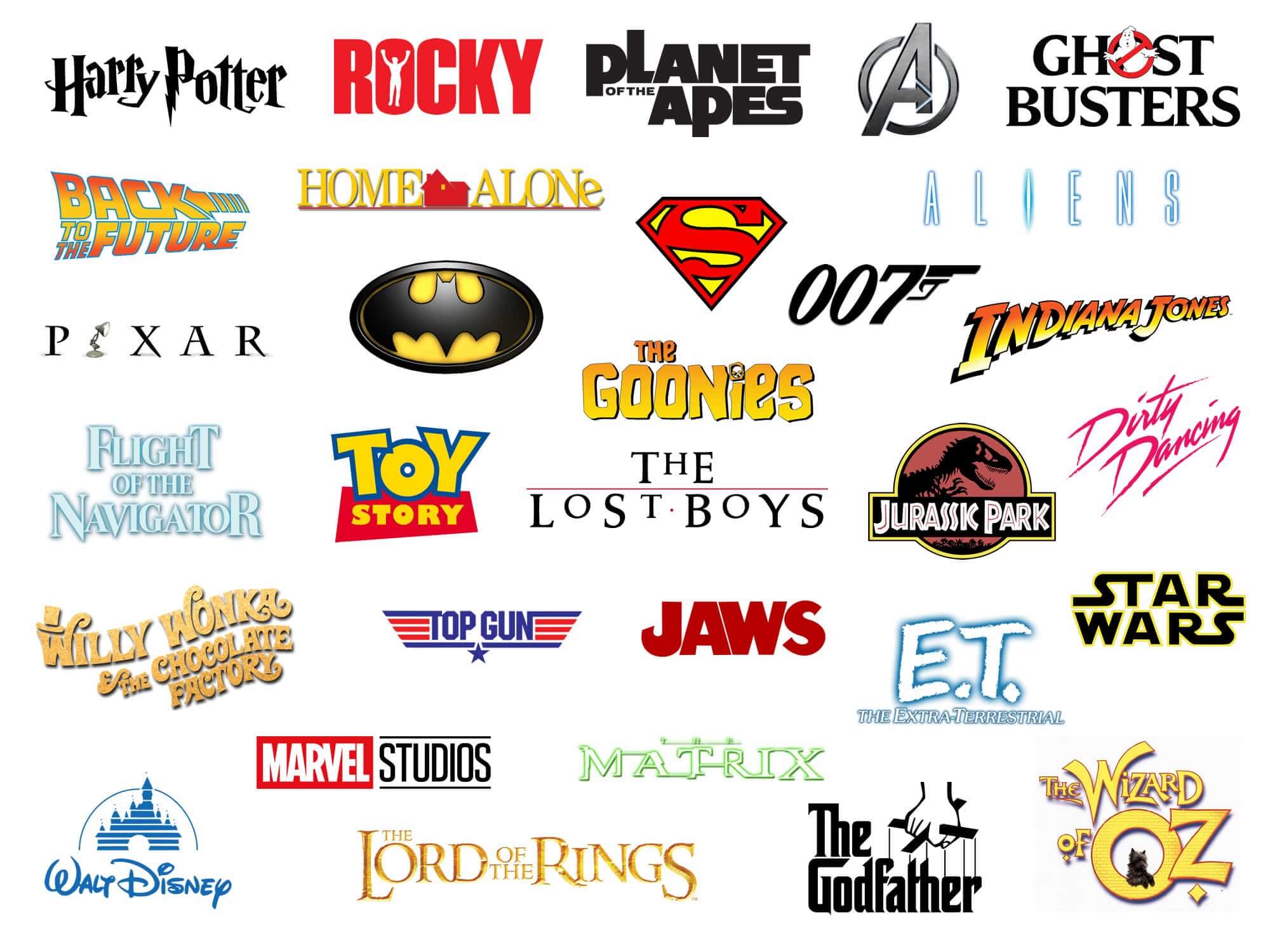
Let me tell you something wild about movie logos – they’re like visual wizards that cast an instant spell on our imagination! I’ve spent years geeking out about logo design, and nothing fascinates me more than how a few carefully crafted lines and colours can communicate an entire universe before you’ve even seen a single frame of film.
Take the Marvel logo, for instance. It’s not just a graphic – it’s a portal to interconnected storytelling. When those sleek letters shimmer onto the screen, something magical happens. Your brain instantly connects with years of superhero narratives, epic battles, and complex character journeys. That’s the power of thoughtful logo design!
Iconic Movie Logos Introduction Storytelling 
Emotional triggers in logo design are no joke. Designers understand that our brains process visual information exponentially faster than text. A great movie logo doesn’t just identify – it promises an experience. One of my favorite movie trilogies is Batman, but the most impressive thing about each film’s opening is how the Batman symbol is presented creating a story through all 3 films.
The first movie is the beginning and to represent this is a swarm of bats to form the bat symbol, the symbol Bruce created to strike fear to his enemies, then we move to the second film which is a continuation with more chaos for Batman this is represented with fire, and fire has unpredictable movements just like the Joker.
The last film is ice breaking this represents the pain and struggle Batman has had to endure through previous pains, such as the loss of Racheal, greaving over Alfred, Talia’s betrayal, and Harvey Dents death, this also represents how Bain a much stronger enemy broke him litterally (his back) the foundations beneath him and Gotham were also breaking and this victory was earned at a very high cost!
The dark, sharp-edged Batman logo screams intensity differently from the playful, animated Pixar lamp that hops across the screen.
Colour plays a massive psychological role here. Deep reds might signal action and danger, while soft blues could hint at adventure or mystery. Ever noticed how the Star Wars logo’s stark yellow text against a black background immediately transports you to a galaxy far, far away? That’s intentional design magic.
Typography is another crucial storytelling element. Jagged, aggressive fonts might suggest a thriller, while elegant, flowing scripts could indicate a period drama.
Another facinating element of movies is their opening sequence the James Bond classic gun barrel sequence is a classic signature opening to the 007 movies as explained on the wikipidia page “foregrounds the motif of looking, which is central to the spy genre” and has remained virtually unchanged for decades – a testament to timeless storytelling in movie design that speaks volumes about the franchise’s identity.
Some fascinating stats to blow your mind: studies show that humans form first impressions in just 50 milliseconds, and a significant portion of that comes from visual branding. Movie logos have mere seconds to communicate genre, tone, and emotional promise. Talk about design pressure!
Pro tip for design enthusiasts: Next time you watch a movie, pay attention to that logo and opening sequence. It’s not just a corporate mark – it’s the first chapter of the story, told before a single word of dialogue.
Vintage Hollywood: Iconic Movie Logos That Defined an Era 
Hollywood’s golden age wasn’t just about glamorous actors and epic storytelling – it was a visual branding revolution! Those classic studio logos weren’t just markers; they were statements of artistic identity.
The MGM lion, roaring triumphantly, wasn’t just a logo – it was a promise of epic entertainment. Designed in 1924, this iconic emblem has survived technological shifts, changing audience tastes, and multiple studio transformations. Can you imagine any modern logo maintaining such incredible staying power?
Paramount’s mountain logo is another masterpiece of vintage branding. Created in 1914, it’s remained remarkably consistent, symbolizing the studio’s aspiration and grandeur. Designers back then understood something profound: a logo should be timeless, not just trendy.
Interesting design evolution fact: Many vintage logos were hand-drawn, reflecting the artisan approach of early 20th-century graphic design. Each curve, each line was meticulously crafted, unlike today’s often computer-generated approaches.
These logos weren’t just corporate marks – they were artistic statements that reflected the technological and cultural shifts of their times. From Art Deco influences to emerging modernist design principles, each logo told a story far beyond simple identification.
Modern Cinematic Universes: Iconic Movie Logos Evolution 
The landscape of movie logos has transformed dramatically in the era of interconnected cinematic universes. Take the Marvel Cinematic Universe (MCU) – its logo isn’t just a brand mark, it’s a visual symphony of storytelling innovation.
When the Marvel logo first appeared, it was a simple, static graphic. Now? It’s a dynamic, shape-shifting marvel (pun absolutely intended) that adapts to each film’s unique personality. The way the logo morphs – sometimes metallic, sometimes cosmic, sometimes gritty – tells a story before the first scene even rolls.
Star Wars takes logo design to another level entirely. That iconic yellow text crawling against the starry backdrop? It’s more than a logo – it’s a cultural ritual. Designed by Dan Perri in 1977, the logo has become so ingrained in our collective imagination that it transcends mere branding. It’s a promise of epic storytelling, of mythic adventures that span galaxies.
Pixar’s logo evolution is a masterclass in playful branding. Remember the iconic jumping lamp? It’s not just a cute animation – it’s a statement of the studio’s creative spirit. Each iteration tells a story of technological innovation, creative risk-taking, and the magic of animation.
Modern cinematic logos are no longer static. They’re living, breathing entities that interact with storytelling, reflecting the dynamic nature of contemporary filmmaking.
Typography: The Silent Storyteller in Iconic Movie Logos 
Typography is the unsung hero of movie logo design. It’s like the subtle background music that sets the entire emotional tone of a film before a single scene plays.
Consider the James Bond logo. Those sleek, sharp-edged letters communicate sophistication, danger, and timeless cool. The typography doesn’t just spell out a name – it creates an entire character profile in milliseconds. It’s linguistic design at its finest.
Different font choices speak volumes about genre and tone:
- Serif fonts suggest tradition and classic storytelling
- Sans-serif designs communicate modernity and innovation
- Handwritten styles hint at personal narratives or indie productions
- Geometric fonts often indicate sci-fi or technologically-driven stories
Custom typography takes this storytelling even further. The Star Wars logo’s distinctive font was created specifically to evoke a sense of distant, epic adventure. It’s not just letters – it’s a portal to another world.
Colour Psychology in Iconic Movie Logos 
Colour is the emotional language of design, and movie logos are fluent storytellers. Each hue carries psychological weight, triggering instant emotional responses.
Red screams action and intensity. Think Marvel’s bold crimson tones or the dynamic reds in action movie branding. Blue suggests depth, mystery, and technological innovation – perfect for sci-fi franchises. Green can symbolize growth, nature, or sometimes supernatural elements.
The Disney logo’s classic blue and white? It’s not random. Those colours communicate trust, imagination, and magical possibility. Every colour choice is a strategic decision that speaks directly to our subconscious.
Fascinating Design Fact: Studies show that up to 90% of snap judgments about products can be based on colour alone. In movie logos, that split-second impression is everything.
Behind the Design: Memorable Iconic Movie Logos
Logo design is part art, part psychology, part technological wizardry. Designers are like visual alchemists, transforming complex narratives into single, powerful images.
The best logo creators understand something profound: a logo isn’t just about looking good. It’s about capturing an entire universe in a single, memorable mark. It’s about creating an instant emotional connection that transcends language and culture.
Most Iconic Movie Logos: Cinematic Legends in Design 
Every great movie logo is a visual time capsule, capturing the essence of a film’s spirit in a single, powerful image. Here are the most unforgettable logos that have defined cinema’s visual language:
Jurassic Park
A logo that roared into cultural consciousness! The iconic T-Rex skeleton silhouette combines prehistoric power with scientific precision, instantly communicating the film’s blend of adventure and scientific wonder.
Rocky
Those bold, triumphant letters explode with the same raw energy as the film’s protagonist. The typography captures the underdog spirit – rough, powerful, and unapologetically determined.
Indiana Jones
The angular, adventure-inspired typography suggests exotic journeys and historic mysteries. Those sharp letterforms practically whisper tales of archaeological excitement and global exploration.
Toy Story
Pixar’s playful logo design speaks directly to childhood imagination. The dynamic, hand-drawn style suggests movement, creativity, and the magical world of animation.
Harry Potter
A logo that’s pure magic – literally! The lightning-bolt typography and intricate letter styling capture the mystical, transformative world of wizardry in a single, enchanting mark.
Lord of the Rings
Tolkien’s logo is a masterpiece of fantasy branding. Those elegant, slightly mystical letters suggest an epic journey, ancient languages, and mythical realms waiting to be explored.
Aliens
Dark, industrial, and utterly menacing. The sharp-edged logo communicates sci-fi terror, technological danger, and the film’s ground-breaking approach to space horror.
Planet of the Apes
A logo that challenges perception from the first glance. The typography suggests both scientific precision and primitive power, perfectly capturing the film’s complex narrative.
Superman
The ultimate superhero logo – bold, confident, and instantly recognizable. Those powerful letterforms communicate heroism, hope, and extraordinary potential.
Batman
Dark, brooding, and razor-sharp. The logo captures the character’s complexity – part hero, part shadow, entirely captivating.
Avengers
A logo that represents an entire cinematic universe. Sleek, dynamic, and interconnected, it suggests epic storytelling and heroic collaboration.
Ghostbusters
Playful and slightly irreverent, the logo combines humour and supernatural excitement. That ghost symbol is both comedic and slightly menacing.
Back to the Future
A logo that suggests time, motion, and scientific adventure. The dynamic typography hints at the film’s ground-breaking narrative approach.
Jaws
Minimalist and terrifying. Those simple letterforms communicate pure, primal fear – proving that sometimes, less is absolutely more in design.
Dirty Dancing
Elegant and romantic, the logo captures the film’s sensual, passionate spirit. Soft typography suggests movement and emotional depth.
The Godfather
Classic, powerful, slightly threatening. The logo speaks of family, tradition, and the dark undercurrents of power.
E.T.
Childlike and magical, the logo suggests wonder, friendship, and the extraordinary hidden within the ordinary.
The Matrix
Cutting-edge and digital, the logo suggests a world where reality bends and technology reigns supreme.
The Lost Boys
Rebellious and slightly dangerous, the logo captures teenage angst and supernatural rebellion.
The Goonies
Adventurous and playful, the typography suggests childhood excitement and unexpected journeys.
Flight of the Navigator
Futuristic and imaginative, the logo hints at scientific adventure and childhood wonder.
Top Gun
Bold, military-inspired typography that screams speed, power, and masculine adventure.
Home Alone
Playful and slightly mischievous, the logo captures the film’s comedic spirit and childhood perspective.
Wizard of Oz
Who doesn’t love the Wizard of Oz a classic childhood movie for most adults, it’s magical, whimsical, and full of possibility – a logo that transports you to a world of colour and imagination.
Willy Wonka & the Chocolate Factory
Just like the Wizard of Oz it’s also a typographic wonderland that captures pure imagination! The playful, whimsical lettering dances between childhood fantasy and typographic magic, with swirling, chocolate-like curves that hint at the delicious adventure waiting inside the film.
This addition perfectly complements the other iconic logos and legendary film designs. The description follows the established style of blending design insight with narrative emotion, highlighting how the logo itself tells a story of creativity and wonder.
Conclusion: The Enduring Magic of Iconic Movie Logos 
Movie logos are far more than corporate branding – they’re visual time capsules that capture the evolving language of cinema. Each logo represents a complex intersection of art, technology, psychology, and storytelling.
From the roaring MGM lion to the sleek Marvel emblems, these visual markers do something extraordinary: they communicate entire narrative universes in a single, breath-taking moment. They’re not just designs; they’re portals of imagination, inviting us into worlds waiting to be explored.
As technology and design continue to evolve, movie logos will remain our first glimpse into the stories that shape our cultural consciousness. They remind us that great design is never just about looking good – it’s about creating instant, emotional connections that transcend time and language.
Design Insights to Remember:
- Logos are visual storytellers, not just corporate marks
- colour and typography carry profound psychological weight
- Each logo is a carefully crafted narrative invitation
- Great design creates emotional connections in milliseconds
We want to hear from you! Share your favourite movie logo let us know in the community chat and tell us what story it tells you. What memories or emotions does it evoke? Let’s celebrate the incredible art of cinematic visual storytelling together!
Join The Logo Community
We hope you have enjoyed these Iconic Movie Logos. If you would like more personal tips, advice, insights, and access to our community threads and other goodies, join us in our community.
You can comment directly on posts, access our community threads, have a discussion and ask questions with our founder Andrew.
If you’re looking to learn more about brand strategy, we highly recommend eRESONAID with our friend and acclaimed brand strategist and author Fabian Geyrhalter, it’s packed full of knowledge and insights you will need to learn to become a brand strategist or apply what you learn within your own business.


Author Bio
Andrew Marriott is the owner and founder of The Logo Creative™. He is an award-winning designer with over two decades of experience designing logos and specialising in branding for companies worldwide.
FAQ – Iconic Movie Logos
What makes a movie logo truly iconic?
An iconic movie logo is more than just a design – it’s a visual storytelling device that captures the film’s essence in a single, powerful image. The most memorable logos combine unique typography, strategic color choices, and an ability to evoke instant emotional connections. Think of how the Star Wars logo immediately transports you to a galaxy far, far away, or how the Jurassic Park logo suggests prehistoric adventure with just a few carefully crafted lines.
How do movie logos impact audience perception?
Psychological research shows that humans form first impressions in milliseconds, and movie logos play a crucial role in this instant communication. A well-designed logo can suggest genre, tone, and narrative promise before a single scene plays. The Marvel logo, for instance, doesn’t just identify a film – it promises an entire interconnected universe of storytelling.
Do movie logos change over time?
Absolutely! Logo evolution is a fascinating journey of design, technology, and cultural shifts. Take the Disney logo – it has transformed multiple times, yet always maintains its core DNA of magic and imagination. Modern cinematic universes like Marvel now create dynamic logos that adapt to each film’s unique personality, turning the logo into an interactive storytelling element.
How much does a movie logo typically cost to design?
Professional movie logo design can range from $5,000 to $50,000, depending on the complexity, designer’s reputation, and studio involved. Major franchises like Marvel or Star Wars invest significantly in logo design, treating it as a critical component of their visual branding strategy.
What are the most important elements of a great movie logo?
The key elements include:
Ability to create an instant emotional connection
Memorable typography
Strategic color psychology
Symbolic representation of the film’s narrative
Versatility across different media platforms
How long does it take to design a movie logo?
Professional logo design can take anywhere from 2-6 months. The process involves extensive research, multiple design iterations, focus group testing, and alignment with the film’s overall marketing strategy. Studios like Pixar are known for spending considerable time perfecting even the smallest design details.
Can a bad logo hurt a movie's success?
While not the sole factor, a poorly designed logo can negatively impact audience perception. Logos are the first point of visual communication for a film. An unclear, unmemorable, or misaligned logo can create confusion or fail to generate the necessary excitement for a movie’s release.
How do digital platforms impact movie logo design?
Digital platforms have revolutionized logo design, requiring logos to be adaptable across multiple screens and formats. Modern logos must look equally compelling on a massive cinema screen, a smartphone, or a social media thumbnail. This has led to more minimalist, versatile design approaches.
Are hand-drawn logos still relevant in the digital age?
Absolutely! While digital design has become predominant, hand-drawn logos continue to offer a unique, personal touch that resonates with audiences. Many iconic logos still maintain elements of hand-crafted design, blending traditional artistry with modern digital techniques.
How do international audiences impact movie logo design?
Global marketability is a crucial consideration. Designers must create logos that transcend language barriers, cultural differences, and regional design preferences. Successful movie logos communicate through universal visual language, making them instantly recognizable worldwide.


