There are only a few trends in graphic design which have been as popular and lasting as minimalism. In this article we share 4 Reasons Why Minimalism in Logo Design is Such a Hot Trend.
If you go back two or three decades, you will realize that minimalist brand identity designs began making waves with the expansion of brands such as Nike and McDonald’s. Today, minimalism is one of the hottest trends in logo design and continues to dominate the field of graphics.
If you take the example of a sportswear company, the brand originally featured its wordmark with the now iconic swoosh. Presently, the symbol is used on its own to represent Nike’s products.
This goes to show that minimalist brand icons can have quite a strong impact on a global audience if they are well-designed and relevant to the business.
Here are some of the reasons why minimalism remains such a hot trend in logo design.
Table of Contents
Minimalist Logos are Easy to Recall
This is something that most designers and business owners try to bring to their logos. Those designs which are simple in appearance yet meaningful can be recalled easily and stay in the memory for a long time.
If you are looking to come up with a logo for your business or thinking about a redesign your logo, then consider a design with minimalist elements.
You can take inspiration from of the most well-known and recognized brand identity designs which have gone through a rebrand and adopted the trend of minimalism effectively.
Apple, Animal Planet, and Airbnb are a few of the brands which introduced minimalistic logos that most of us can recall instantly.
Consider the logo evolution of the tech giant Apple here.
Steve Jobs, the founder of the company, set up a meeting with a design agency to introduce a brand symbol which would represent their new line of computer, Apple II.
The machine was one of the first to introduce color in their display which inspired the idea behind the brand identity design.
Rob Janoff, the designer, created the half bitten icon with rainbow stripes to promote the launch of Apple’s personal computer.
The logo was used for branding on all products and in advertisements as well. It lasted for 22 years until Jobs decided to go with something more minimalistic.
He wanted to boost the visibility of the logo design and feature it in places where it could be seen easily. This is when the current logo of Apple was launched.
It is sleek, modern and minimalistic which are all factors that made it easier to remember and recall anywhere.

With an impressive one or two-colour palette, geometric shape or clear and defined lines, you can launch a brand symbol which is memorable and doesn’t overwhelm the viewer.
Adaptable Across all Mediums
If you think about it, standalone wordmarks, pictorials or images can be modified quickly without losing their meaning or value and are highly adaptable across different mediums.
Take the example of Netflix for a moment here. The company launched a variation of their wordmark in 2014 which went from the name of the streaming service to a simple ‘N’.

The wordmark remains the logo of the entertainment company with its modified version also very much visible in all the videos.
So in a way, both the variations of the minimalist design are currently being used by Netflix currently.
The lettermark is mainly for its mobile and social media presence, and makes it easier for the company to catch the attention of the audience on these platforms.
Minimalism is one trend in logo design that has made the process of making such changes quite smooth.
Since there are fewer elements to move around, you can modify the logo for any print or digital medium without confusing the consumers.
Minimalist Logos Have Global Appeal
If you think about some of the most recognized brand identity designs in the world, you will be surprised by how many of them are minimalistic.
Mastercard, Slack and Uber are just a few that come to mind here. These companies have made use of minimalism in their logos to attract a global audience and appeal to people across several countries and continents.
Look at it this way. With minimalism, you don’t have to do a lot of explaining in your logos and can communicate with people through shapes, colours, fonts and typography.
This makes it easier for people to understand what you have to say even if they are from different cultures or speak another language.
With minimalist logos, you can appeal to people everywhere emotionally. Since these designs mostly have abstract icons, objects and commonly recognized colours, you can promote your brand across cultures without worrying about offending the audience.
Take the MasterCard logo for instance here.
The company’s logo went from two circles with a wordmark and tagline to just the interconnected shapes.
With its bright yellow, orange and red colour scheme, the brand connected with a global audience and conveyed its message of open communication and acceptance.
In 2019, Mastercard dropped its name from the design permanently and increased its appeal further.
The credit card business made the change to showcase their move into the future where digital currency is set to become widely acceptable.

Apart from the US, Japan, China, Philippines and El Salvador are just a few countries shifting towards this digitalization.
With their revamped logo, MasterCard was able to highlight that they were not a company to be left behind and can change with the preferences of consumers anywhere.
Similarly, most minimalist logos have the power to attract audiences around the globe.
By sticking to a minimalist logo design, you can also gain an advantage over your competitors within the international market and experience growth in a short time.
Easier to Maintain Consistency
As per a survey, consistent branding can lead to an increase in revenue by almost 22 percent.
With an elaborate or illustrative design, maintaining consistency can be slightly tricky and cost even more.
If your logo is minimalistic and has fewer elements, you can easily use it across print or digital mediums without making any huge changes.
Sometimes, graphics that are too crowded can lose their meaning or get disrupted in small spaces such as business cards or brochures.
They are also more expensive to feature on marketing materials. The trend of minimalism in logo design has given a simple solution to these problems.
With a minimalistic color palette and one or two shapes or images, you can reduce your promotional costs and be consistent with your branding.
It is also easier to feature simplistic wordmarks, lettermarks or abstract marks on billboards, magazines, web pages and social media networks in a similar form.
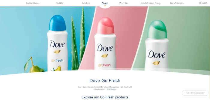
Take the example of a powerful brand like Dove here. If you consider the products of the beauty company, you will realize how they have maintained consistency in their branding with a minimalist logo.
The dove symbol is recognized instantly in print, TV ads, Youtube videos, Facebook, Instagram websites and on different packaging as well.
Consider the brand’s web page and one of their advertisements below. You can see how the company uses its logo with a white, blue and gold colour palette consistently when marketing their brand.

Below is an advertisement for Dove which also clearly emphasises the brand’s colours and products.

While you might find the ‘less is more’ statement quite clichéd at this point, it does have a huge role to play in minimalist designs.
By keeping the logos minimalistic and avoiding clutter or complex designs, you can keep the focus on the message of your brand and connect with them instantly.
According to a report, it takes around 5 to 7 impressions for people to remember a brand identity design. This is not a lot of time to build a positive perception of your brand.
In order to make sure that the consumer understands the values you want to convey, it is important to be as clear as possible about the message.
Ultimately, it can help you maintain consistency across various marketing materials.
To Sum Up
These are some of the reasons why minimalism is one of the hottest trends in the graphic design industry. It has been making the lists of designers everywhere since quite a few years now and will likely be seen in future logos as well.
As the world increasingly shifts towards digitalization, more and more businesses could switch to minimalistic logos for their flexibility and versatility.
Join The Logo Community
We hope you have enjoyed these 4 Reasons Why Minimalism in Logo Design is Such a Hot Trend. If you would like more personal tips, advice, insights, and access to our community threads and other goodies, join me in our community.
Learn from our Founder Andrew who personally writes our community newsletter. You can also comment directly on posts and have a discussion.
*TIP – Looking to learn logo design? We recommend the Logo Design Online Masterclass, it will teach you how to plan, design and execute logo designs. The course has also had great feedback from the design community.
Author Bio
Tarif Kahn is Head of Design at LogoDesign.Net who loves sharing his diversified pool of knowledge in graphic design, web design, development, and print design. He enjoys experimenting with new technologies and has a knack for photography.


