While many small business owners believe logo design is not something to be considered from the very start, great entrepreneurs know that it should definitely be a top priority for any new company on the market. “But what makes logo design creation so important? Why should I care?” If you’re already reflecting on this question, it means you are definitely on the right track. In this article we take a look at 5 Best And 5 Worst Logo Designs You Could Have Imagined.
Here are some quick arguments why you should care –
- First, a logo design catches your attention from the very start. Instead of using intense advertising to grab the public’ attention, you might as well want to opt to create your own logo.
- Second, your logo will make a strong and lasting impression upon consumers. According to Tailor Brands, the first impression communicates ownership over one’s product, making customers and investors aware of who’s in charge of your products.
- Third, visuals are always a catchy way of making people interested in your brand. If it’s visual, it stays in your memory. If it stays in your memory, there’s a high chance you will – at some point –buy it.
- The fourth and last point I will make is that your logo will make your company stand out from the crowd and thus raise awareness of your brand. A logo is the signature of your firm, it fosters brand loyalty, and gives the audience exactly what they need (which is, as you might already know it, a feeling of belonging).
Over the years, different companies have tried various methods of logo design. The target was always capturing the customer’s eye.
Some of them succeeded better than others and are still using the same logo, while many of them went on and designed even better logos than their first attempt.
The key is to never give up but to keep on searching for the best-valued option. Here are five of the best logo designs of all time. Watch and learn.
Table of Contents
Top Five Logo Designs and Why They Rock
Apple
One of the most popular since 2013, Apple logo underwent many changes over the years until it became what it is today. At first, its logo resembled an illustration more than anything else, which would have probably killed the company’s sales had their designer not been smart enough to change it.
As you can easily point out, today Apple’s logo is simple but substantial, which is why customers buy the products. It points out that their items are accessible to the least technology-skillful individuals and that they are simple to make use of.
FedEx
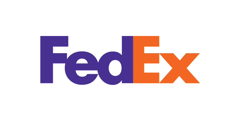
A logo born in 1973, FedEx hides one of the most subliminal messages within its logo. If you look carefully, you will notice a white arrow between the E and the X in FedEx, the symbol of speed, promptness, and accuracy. Another smart move was coloring the letters “Fed” in purple and maintaining it unchanged while changing the letter’s color “Ex” to symbolize different services.
For instance, the yellow “Ex” signifies “trade networks,” while the blue one symbolizes “office.” So, keep in mind that changing fond color is a useful tool in business because colors have meaning beyond aesthetics and affect consumers directly, whether they know it or not.
Mercedes-Benz
This logo needs no further introduction – when we see the three-edge star encompassed in a circle, we know it’s Mercedes-Benz. The simple and classy design has been used since 1909, which says a lot about the brand’s powerful message on the market. Mercedes-Benz is widely recognized and needs no further advertising. Its elegant style along with its chic but catchy blueprint make it stand out from any crowd.
Coca Cola
Coca Cola logo design is not smart – it’s brilliant! Why? Because it’s simple, original, and reflects an exquisite American style.
The brand is deeply rooted in the States – when we think about Coca-Cola, we think about the 80’s diners and vice versa.
“The brand does not only appeal to the customer’s eye, it literally brings back nostalgic memories of the past, which play a vital role in increasing consumer trust and boosting emotional response and behavior,” writes Dr. King Jay, a psychologist and author of four widely-known books.
Nike
No matter where you travel, Nike’s checkmark will always bring back the same motto in your head. You’ll just do it. It’s been advertised and promoted so much that there’s no way you could ever get it out of your system. Well played, guys. Well played.
Now let’s learn from them. Why is the checkmark so cool and why are people loving it so much? Well, a) because it’s simple and very easy to remember and b) because it’s always accompanied by a powerful, strong message.
In any customer’s mind, seeing the two elements together – motivational quote + checkmark – equals power, ability, and capacity to succeed, which is exactly what the company wanted to express in the first place. How do I know this? Because Nike stands for “victory” in ancient Greek mythology. They wanted a victory from the start – so they designed a logo to make that happen.
How About Learning from Their Mistakes?
To spice things up for you, we came up with a top-five of the worst logo designs of all time (and, of course, reasons for why they are the worst). Check them out and let us know if you have any comments. Feedback is high – and always – appreciated.
Verizon
Let’s put it bluntly: Verizon’s new logo is terrible. The choice of colors (combining red and black) has no meaning whatsoever and looks quite washed-out.
It pales in comparison to other mobile network operators’ logos, take, for instance, T-Mobile. Avoid dullness and make sure you express something with your logo – you don’t want your company to be remembered as having “that logo which doesn’t make any sense.”
Also, that “Z” in old VeriZon logo looked totally out of sense. The new one may look more modern and cleaner but lacks any meaning or emotion.
Doughboys
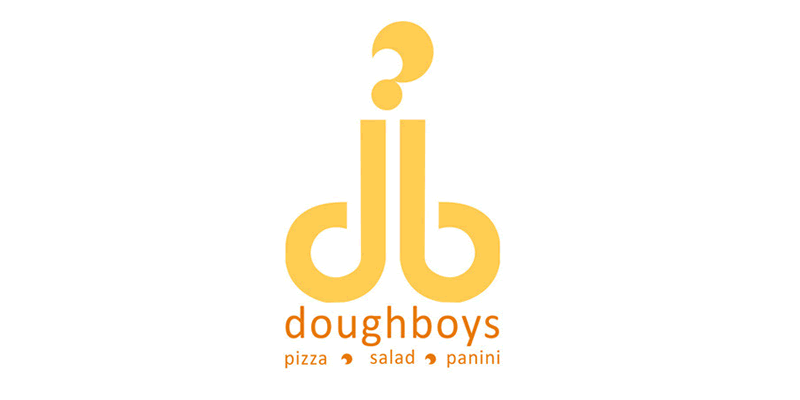
Doughboys is an American-Italian company selling pizza, salads, and panini. The food is quite great, and their menus are well-written, but when you look at their logo, buying food from them seems impossible to digest (see the pun?). Take a look at their logo and see for yourself.
Hilton Worldwide
As amazing as the Hilton Hotel Chain is, their Worldwide logo does not provide any insight into what the company is about. It expresses nothing, it shows nothing, it’s just there.
The biggest problem with their logo is the arrangement issue, which is out of order. Its oblique style does not communicate any message and does not convey any meaning. Hilton, get your logos straight.
Pepsi
As you probably know, Pepsi is a widely recognized and successful company. However, their logo lacks something – maybe it’s originality, maybe it’s clarity, but the first thing I think about when I see their logo is the (sigh sigh) fat American culture. Yes, it sounds rough, but it’s dang true.
A-style Clothing
The imagination plays quite an important role here, does it not? A style is a clothing company that, from the first look, apparently advertises an intimate relationship at its best.
You cannot help but laugh at the “ingenuity” of the company’s designer. Although they want to convey a message (whichever that would be), they do nothing but amuse the public and decrease confidence in their products.
This is another example of what your company’s logo should not display.
Conclusion
You can choose to design your logo in any way you want to, but make sure you follow your guts and intuition. If you do not like it, your customers won’t like it either, because if the entrepreneur lacks confidence in her brand, customers will too.
Make sure you pick your colors carefully, make use of the right fond, and express simplicity and power through the logo you’ll pick. You could think about the message you want to deliver before coming up with it, not the other way around. It is going to be easier to do so. Good luck, you got this!
Useful Links & Great Deals
- The Equipment We Use & Recommend
- Quality Design Bundles
- Get 2 Months free Skillshare
- Get an Exclusive 20% off Logo Package Express
- Learn Logo Design Online
 Author Bio
Michael Gorman is a high skilled freelance writer and proofreader from the UK who currently works at the best dissertation writing service. Being interested in everyday development, he writes various blog posts and discovers new aspects of human existing every day.

