One of the big questions that is asked on a regular basis by logo designers is how do i structure and present my logo designs to clients? There is no right or wrong answer every designer has their preferred way. In this article we share 5 Tips to Structure Your Logo Design Presentation.
Okay, so the design part is done.
You have created a great-looking, versatile logo for a client.
You think it’s exactly what they’re looking for. It has a rich, bold font to create a strong personality for the brand and awesomely communicates its values.
But that’s how you, the designer, feel about it. Are you sure that the client will feel the same way?
If you don’t present the logo the right way, the client won’t buy it. All those hours you spent researching their brand and designing will be wasted.
As many experienced designers say, the logo is the product, its presentation is the packaging.
In this article, you’ll learn how to make that packaging really good and get your logos accepted.
Table of Contents
1. Prepare to Explain Your Design Choices
The work of a logo designer requires so much more than Photoshop skills and creative ideas.
To design something a client would proudly call their logo, you spent hours communicating over email, phone, video chat, listening and collecting their recommendations.
All of those notes you took during those long hours are incredibly important. Besides being helpful during the actual design phase, they can be super useful for structuring your logo presentation.
For example, clients typically explain the history, vision, mission, and values of their brand they want to be conveyed in the logo.
Did you take these notes?
If yes, great! (I know you did, you’re a skilled designer and it’s your job).
You’ll need those notes to explain the whole story behind the final design.
For example, maybe there was something in a brand’s history that inspired you to choose a particular font, shape, or color.
Really, anything that helped you arrive at the final design could be useful here.
Now, I want you to take those notes and think about how to start the presentation. Yes, we’re going to begin it with you explaining your vision of the client’s requirements.
Make a list of the aspects that proved to be key in your creative process and tie them to design choices.
2. Start by Recapping Customer Pain Points and Logo Objective
Now we can start building your presentation.
There are two ways to do so: a bad one and a good one.
The bad way would be to start by throwing up your logo almost as soon as the presentation begins. Really, you’ll be surprised, but many designers choose to insert the logo on the first or second slide.
This is a terrible way to present a logo.
Here’s why:
- it makes the designer look like an amateur
- it doesn’t build anticipation and kills the excitement
- it makes it harder to explain your design choices.
Then, there’s a good way that makes you look professional.
Start your presentation by summarizing the reason why the client asked for a new logo.
It could be a pain point (the logo didn’t represent the brand’s values, etc.) or a specific goal (“to build a new visual identity for the brand,” etc.).
The best way to explain this technique is it gets the client in that original mindset, or “buying” mentality.
By hearing the pain point or their objective once again, they’ll also be sure that:
- you’ve done your homework
- you didn’t drift away from their main goal.
Briefly restate the pain point or brand objective in the presentation.
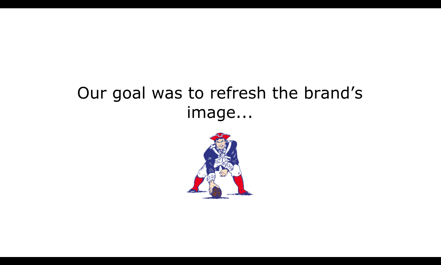
As an option, you can show the old logo version (the logo of NFL’s New England Patriots shown in the photo).
So, to sum it up, share the original goal behind the project with the pain point or logo goal.
When you finish talking about that, you need to remind the client about those long hours you talked with them (in a friendly and meaningful way, of course).
Read more: What’s the Difference Between Brand and Branding?
3. Remind The Client About Their Decisions
The wonderful notes you took during those long hours will come in handy once again!
On the next slide, you’re going to summarize the main points/decisions the client communicated before the design process.
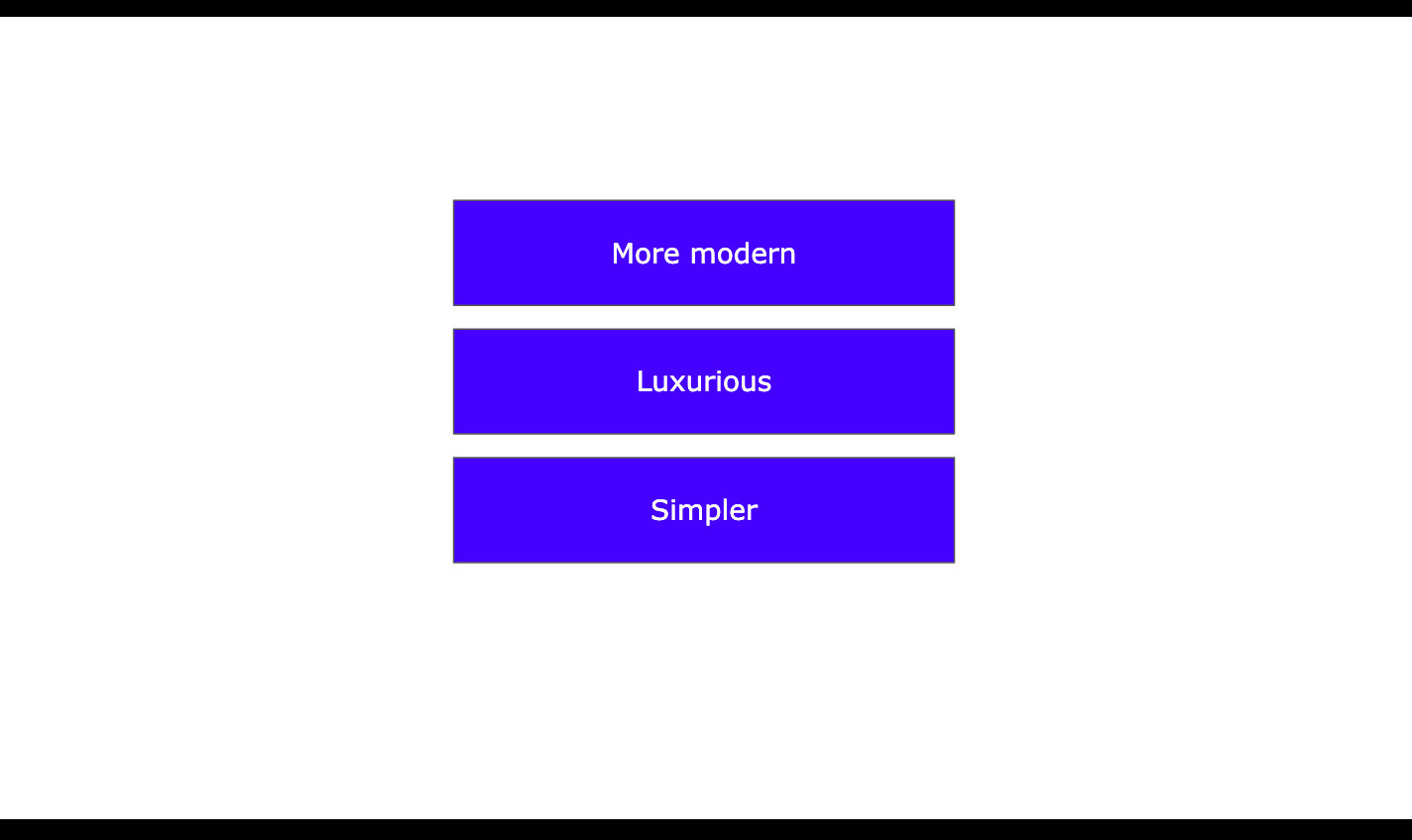
For example, let’s say that your client wanted the brand’s logo to be:
- more modern
- luxurious
- Simpler
This is exactly what you listed on the slide.
The clients typically have more requirements, but let’s stick with those for demonstration purposes).
It’s really important to use the words used by the client on this slide. This technique will make them feel in complete control over the process.
To introduce the slide, you can say something like:
“Guys, let’s now take a step back and remind ourselves how we wanted to present the brand. On this slide, I’ve compiled the list of words you used to describe the desired brand identity and logo.”
Spend about five minutes talking about these points to prepare the client for the reveal. At this point, you’ll remind them about the position they were in when they gave you the feedback.
When you feel like everybody in the room is on the same page – they should be really soon, you’re literally using their words – it’s time to display the logo.
4. Show Logo Options to the Client
Before we get to the actual presentation of your work, let me say this.
Never send your work to a client via email if you present it in person or over the phone.
By presenting the logo, you’re actually giving the project overview and getting them in “the right mood.” This is impossible if you just attach the logo as a .jpg file and send it to the client in an email.
Okay, now drum roll, please!
On the next slides, you’re displaying logo options.
The best way is to present it in three options. By providing multiple logo versions, you’re making it easier for the client to choose the best one.
Besides, if they simply don’t like one or two versions, there’s always the third one.
Important! Make sure that all options are closely related because the thoughts behind each one will be similar.
Okay, so display each logo version on one slide and explain why you did what you did.
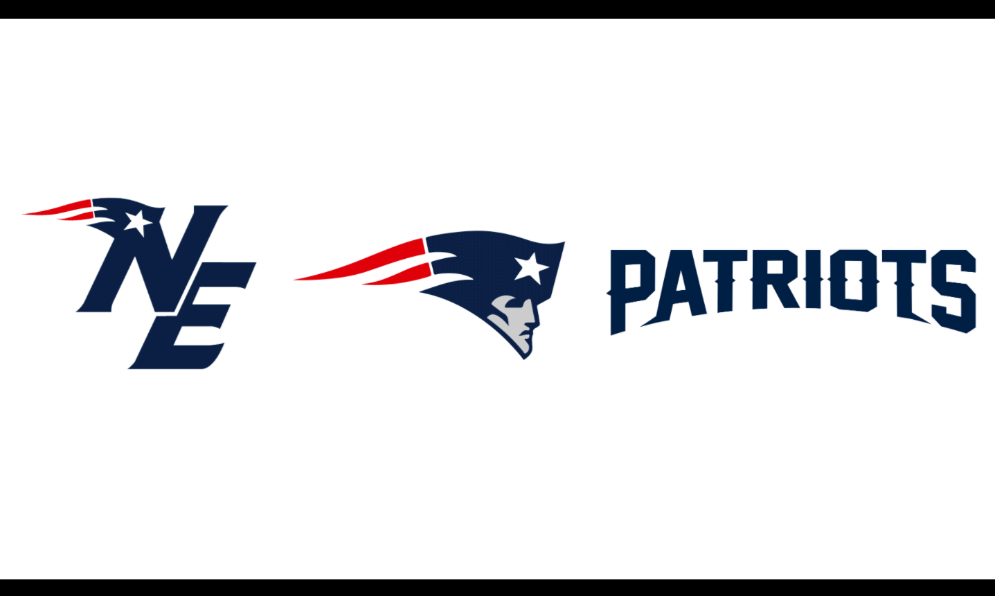
The logos here are displayed on one slide just for demonstration services (silly me, trying to be efficient).
The real logos used by the Patriots today.
At this point, it’s very important to let the client know how each logo element relates to the brand, pain point, or goal.
Don’t ask the client anything just yet. Keep in mind that you’re supposed to do the talking and not ask questions.
So, talk about logo features and explain why they’re useful to achieve the original goal. This way, you’re also giving the client some starting points for the discussion that follows.
Important! I just can’t stress it enough: don’t put all three logo options on one slide. It may confuse the client, so please keep them apart and show them one by one.
Read More: How to Explain Logo Color Choice from a Sociological Standpoint.
5. Make the Client See the Logo in Practical Situations
Okay, at this point, your client should be interested in at least one version. It’s time to help them be sure about their choice by presenting all logos in practical situations.
For example, if your client is a clothing brand, you can show it on:
- product packaging
- typical clothing products
- business cards.
One way to show the Patriots logo is on branded hats, so here we go. Please remember that you’ll need to show each logo option on a separate slide.
Showing the logos in real-life situations like that is a must. To place them on products, use Photoshop. No need to print the logo on real items, obviously.
Read more: Looking at The Best Logos of All Time & The Stories Behind Them.
Recap: Logo Presentation Design Takeaways
- Generate interest. Start with a slide that takes the client back to their original goal or pain point
- Create simple slides. Logo presentation is not about your presentation design skills, so say no to fancy designs and keep things simple and minimalist
- Keep one slide focused on one thing. This technique prevents you from overwhelming the client and keeping things clear.
- Show logo options in real-life situations. The client would see how the logo looks in practical situations, which helps with making the best decision.
Okay, so now that we’re clear on the most important points, here’s the structure for your presentation:
- Side 1: Recap of the customer’s pain point or logo objective
- Slide 2: Reminder of the client’s decisions and goals
- Slide 3: Logo reveal: logo option #1
- Slide 4: Logo reveal: logo option #2
- Slide 5: Logo reveal: logo option #3
- Slide 6: Logo option #1 in practical situations
- Slide 7: Logo option #2 in practical situations
- Slide 8: Logo option #3 in practical situations
- Thank you slide
Final Thoughts
Logo presentation is as important as creative work. As a designer, you need to know how to really sell your creations in a really cool and client-centered way.
My last piece of advice to you: please, never send your designs to clients over email. It’s impersonal, boring, and makes you look like an amateur.
Try doing it in person or, at least, over the phone. This way, you can explain everything and answer all questions right away.
For the client, listening to a passionate designer presenting the logo would also be a better option. You start your logo design project by talking to them, and you finish with that, too.
Join The Logo Community
If you would like more personal tips, advice, insights, and access to our community threads and other goodies join me in our community. You can comment directly on posts and have a discussion.
We hope these 5 Tips to Structure Your Logo Design Presentation have been helpful, when your client has decided on a concept you will need to export a logo package for them we use and highly recommend Logo Package Express as you can generate and export hundreds of logo files automatically in 5 minutes. Save an exclusive 20% off with our link.
Author’s Bio
Daniela McVicker is a blogger with rich experience writing about UX design, content planning and digital marketing. Currently, she is the chief contributor at Topwritersreview where she helps individuals and organizations improve their web content writing, design, and planning skills. Her posts are always packed with examples and actionable content that readers can put straight into the action.


