Brand image should be a major concern for any business owner. In essence, your brand image is the personality of your company, and using it correctly won’t only enhance employee engagement but will attract potential clientele. In this article we share 5 Top Tips to Design an Outstanding Brand Image.
Just as your own personality entices people to have a conversation with you, your brand encourages clients to do business with your company.
With so many of your competitors selling the same product as you, branding is one of the only factors to distinguish you from the rest. An effective brand image will make consumers want to be associated with your brand.
People are eager to wear Ferrari shirts despite never even having seen a Ferrari up close. That’s the power of a successful brand image.
Table of Contents
Unforgettable brand Image

When you hear the term brand image, it’s important to not confuse it with brand identity. Brand Identity refers to the way you want potential consumers to perceive your actual product.
Brand image, on the other hand, is the visible element of your brand. These include design, color and use of a logo. Let’s look at a few of these points in detail.
Make Logo Design Work For Your Brand
An effective corporate brand logo is the incorporation of several points, all culminating in one magical design that makes your brand memorable. Your logo design should also reflect your brand personality and be the best reflection of your company.
Consider your target audience when you’re designing a logo. By nature, consumers are drawn to images and visuals. If you’re creating a brand for a cocktail bar you’d want to avoid boring colors and fonts.
A medical practice on the other hand, will have a more professional font and color choice.
When it comes to logo design, take the time to design something that’s classic. Classic design is more likely to be relevant years down the line as opposed to you needing to reinvent your logo as trends change.
Choose Bold Images and Designs
The one thing you don’t want is to blend in with your competitors and become “just another company.” You have to dare to be different.
Create unique and bold designs for your logo and your branding in general. Choose a design that’s quirky and stands out.
Your brand design needs to mirror your brand goals. Remaining consistent in your brand design will allow your brand to grow in strength.
When it comes to logo design, take the time to create something that’s classic. Classic design is more likely to be relevant years down the line.
We need to test your logo, images and designs for scalability. Your logo and all the images, fonts, and designs on it need to look good at any level of scalability.
You don’t want your image to appear cramped and illegible when viewed on a smartphone screen.
Your client also shouldn’t have to zoom in multiple times just to read your product list!

When you’re trying to find the design that’s right for you, consider examples like Nike, Chanel, Lego, LG, MacDonald’s, and even Apple.
All of these designs have one thing in common, they’re simple and on the mark.
Whether you love or hate any of these products, you know what each brand looks like!
Embrace Minimalism
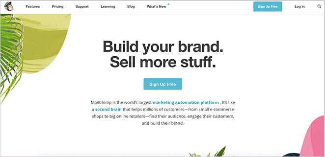
When it comes to designing your brand as a whole, less is always more. Just because your design palette comes with hundreds of images, doesn’t mean you need to use them all at once.
A powerful image can get a stronger message across than five mediocre ones.
Minimalistic design options in your brand image aim to give the consumer a sense of simplicity and objectivity. It gets the consumer straight to the point.
They don’t have to sift through different layers of colors and imagery to get to the root core of the brand.
Consumers are more likely to remember your brand’s simple design rather than trying to remember a series of complicated images.
For example, think of brand tycoons like Nike, Coke and KFC. Their images are simple, streamlined, and recognized by people worldwide.
In fact, even people who use the product don’t know these brands.
Limit Colors
When you’re designing logos the general rule of thumb is to limit your color choices to a few colors. The average is three colors or less.
The most popular colors used by successful companies throughout the world are blue, red and grey. Choose a color that complements your product and blends in with your business image as a whole.
Just like the minimalistic images, consumers are more likely to remember and associate single color uses. An example of that would be Coca-Cola.
Two basic colors are etched into everyone’s mind.
Another reason to minimize colors is your profit margin. Imagine the printing costs when you’re printing thousands of multi-colored leaflets? You’ll also save costs on promotional material.
White Space is Your Friend
White space on a design is often referred to as negative space or even blank space. But, whatever you choose to call it, it’s your friend.
Your design doesn’t have to fill the entire frame of your screen.
From a visual perspective, this white space allows potential clients to get a break from the distraction of your design.
The white color also allows the consumer to focus on the key points rather than become distracted by a flow of colors and images.

Visually it’s easier to absorb the message inside a white frame than it is to try and remember messages in a solid color page filled with images.
A Final Thought about Brand Image
Designing an outstanding brand and then backing it up with exceptional service is the secret recipe to a successful business.
Choosing practical methods to create and update your brand will make clientele want to use your product or invest in your company.
Your brand image is a visual image of what you have on offer. Design a killer brand. Make it count! Stay relevant!
Join The Logo Community
We hope these 5 Top Tips to Design an Outstanding Brand Image. If you would like more personal tips, advice, insights, and access to our community threads and other goodies, join me in our community. You can comment directly on posts and have a discussion.
*TIP – We use and recommend DesignCuts for all your fonts, mockups and design bundles.
Author Bio
Life starts when Alex Smith is at the keyboard spewing out meaningful words and paragraphs, weaving stories for his customers and their brands. He loves to learn about different linguistic expressions in different languages, know about cultures of the world, and how people interact in different countries. He quenches his thirst via the Internet and shares this knowledge through his writing.


