Let’s take a look at 6 Best Internet Service Provider Logos.
Logos are eye-catching pieces of art that are vital in helping us recognize brands. Logos also help companies with publicity and marketing and show customers an overall cohesiveness to a brand. Without branding and logo design, companies would be rather bland and uninviting. Standing out from your competitors is crucial in the business world.
While you probably think of restaurants or stores when it comes to logos, internet service providers are not strangers when it comes to eye-catching branding. Many people typically have multiple options to choose from when it comes to internet service providers, making internet companies fight for your attention with interesting and appealing designs.
Currently, there are 1,337 internet service providers available to United States residents. So, out of all the internet service providers available, which companies have the best logos? EarthLink, Dish, and AT&T are a few good ones, but there are many more.
Let’s take a look at six of the best internet service provider logos that are out there.
Table of Contents
The 6 Best Internet Service Provider Logos to Pay Attention To
Here are some of the best internet service provider logos worth examining.
1. EarthLink
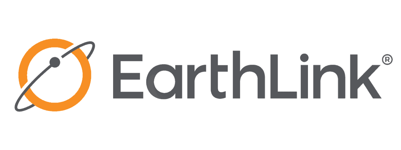
You can get internet from a variety of connections with satellite, Wi-Fi hotspots, and cable being some of the options. EarthLink’s logo tends to focus heavily on the basics of satellite internet connection.
Their logo takes a simple approach depicting satellite internet connections by displaying a circle with an ellipse around it. The circle represents the Earth, the small dot represents a satellite, and the ellipse represents the orbiting track that the satellite takes. The logo almost looks like Saturn, which helps keep the logo memorable because it is a familiar shape.
EarthLink also uses orange as one of its primary logo colors, which is a warm color on the color wheel. Warm colors, like orange, tend to provoke energizing and happy feelings, inviting us to check out the brand and possibly provoke us to do business with the company.
2. Dish
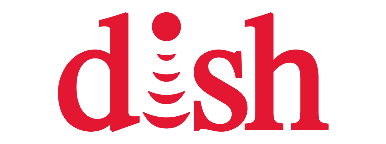
Dish creatively uses the Wi-Fi symbol as the “I” within the name/logo of its company. They simply inverted the symbol so the dot would be at the top while the waves extend downward.
The company also uses a vibrant, eye-catching red for the entirety of its logo. Research proves that 62 to 90 percent of our perception of things comes from color, making it an essential component for a business to utilize. Red can create feelings of power, excitement, and dominance, which are all attention-grabbing to us as customers.
Dish uses color psychology to its advantage with its logo while still clearly depicting that its company is an internet service provider.
3. Verizon
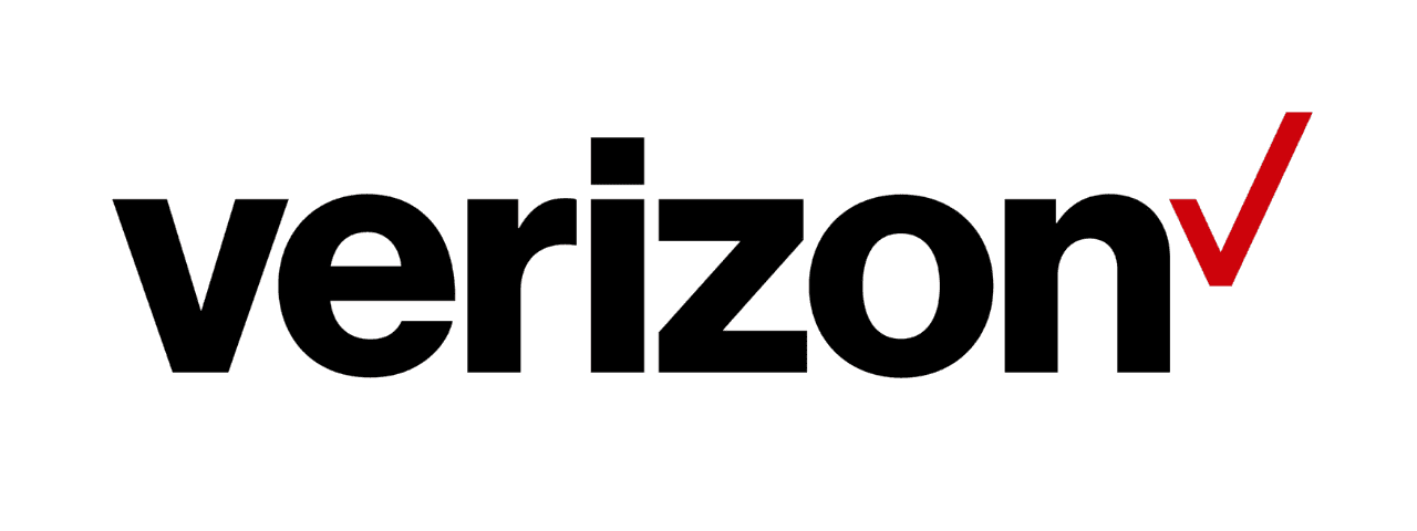
Verizon is another internet service provider that takes advantage of the color red. However, the company primarily uses black in its logo, which can give you feelings of sophistication, power, and boldness. The bold, chunky lettering also helps with these feelings.
Verizon uses a pop of vibrant red with its signature checkmark, showing us that the company may have power and dominance in the industry.
The check mark that Verizon uses in its log is also key to marketing to customers, as the check mark is something that many of us, and Verizon, associate with getting tasks done on our to-do lists. Verizon most likely uses the symbol to show customers that they can trust the company will get them the internet service help they need without any issues.
4. AT&T
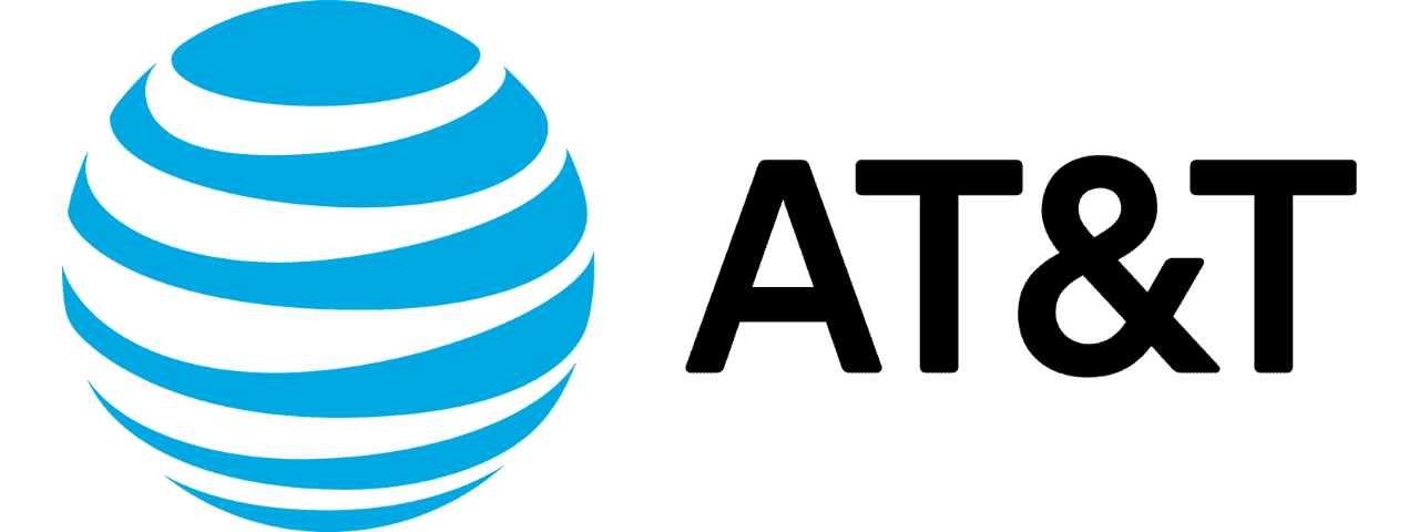
AT&T uses a simple approach to its logo with its take on a globe or the Earth. The logo uses six lines that vary in thickness to create a three-dimensional look, which is a great attention grabber. The globe essentially represents the fact that the company offers internet services worldwide to millions of customers.
The internet company also chose to use blue as its primary color. Blue is the perfect color to promote feelings of calmness, stability, and productivity. You always want stability when it comes to internet services, so the blue almost makes us feel that we can feel calm allowing AT&T to take care of our internet needs.
5. Viasat
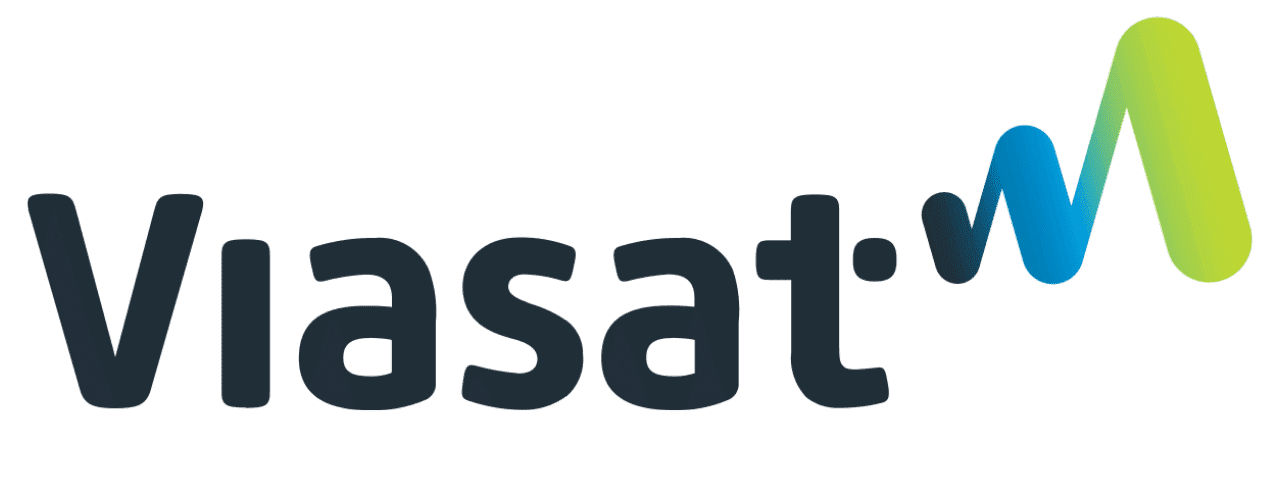
Viasat uses clean, slightly bubbly black lettering for its logo. It’s a little less in your face when compared to Verizon due to the rounded edges of the letters, creating a calmer look while still offering sophistication and power.
The company also uses a blue and green gradient to create a signal symbol, clearly implying that the company offers internet services. Green is often associated with money, safety, and luck. This color, combined with blue, creates the feeling that customers can feel safe and confident that their expectations will get met by using Viasat.
6. Frontier Communications
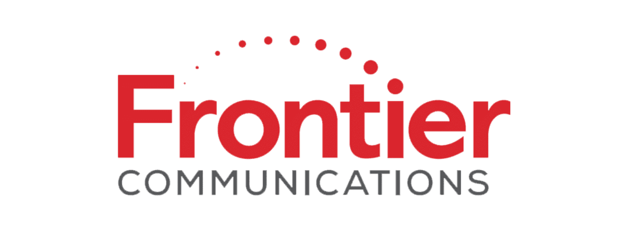
Frontier Communications takes full advantage of red, as this is the only color they use in its redesigned logo. It’s a very bright red as well, leaning us toward feelings of excitement and power.
The company seems to conveniently incorporate the “F” into its logo with various separate lines, and the circular, modern design is a little reminiscent of a power button symbol and overall connection. These aspects subtly show customers that the company is within the internet industry.
What Makes a Logo Considered “Good”?
Logos need to be eye-catching, creatively designed, practical, and long-lasting throughout time. To achieve this, a logo should incorporate the following elements:
- Color. They need to use specific colors to provoke certain feelings from customers.
- Text or typography. If the logo uses text, it needs to be simple, clean, and easy to remember.
- Graphics and Symbols. While a good logo doesn’t require graphics, using them in the design is very attention-grabbing. An example is the Dish logo.
Concluding Thoughts
If a company wants to be successful, its marketing materials, such as a logo, need to be crisp, clean, and clearly reflect what the company does. Use this list of some of the best internet service provider logos to understand what a good logo looks like and how they use design elements to catch attention.
Keep the elements of typography, color, and graphics in the back of your mind when you come across any logos to determine if a company did well or fell a little short.
Join The Logo Community
We hope this article has been helpful. If you would like more personal tips, advice, insights, and access to our community threads and other goodies, join me in our community. You can comment directly on posts and have a discussion.
*TIP – We use and recommend DesignCuts for all your fonts, mockups and design bundles.