You get only one chance to make a first impression and in e-commerce, that impression can make or break a deal. In this article we share 6 Smart Tips to Boost Sales with the Perfect Logo Design .
Your logo should be a representation of your brand, a recognizable visual that lets your customers know which products and services are yours.
A logo is a communication tool that shares a variety of information with potential customers. It would be very easy to differentiate which brand creates products for children and which creates high-end watches just by looking at their logo design, and that’s just the surface level.
Your visual identity should make you stand out but also let people know which industry you’re a part of. Great logos can also communicate their price range and buyer personas, but the best logos provoke specific emotions.
With all of that being said, let’s jump in and see 6 ways you can design your logo to boost your sales.
Table of Contents
Make Sure to Differentiate Yourself From the Competition
Start by putting your brand values on a piece of paper and once you finish, venture into your desired audience. Research is important for this phase because you don’t want to just put out something that looks pretty.
Your logo should be a reflection of the things your brand stands for. If you run a family business with a long tradition, you want to lean into that. However, if you’re a new solution that’s more eco-friendly than any of your competitors, make sure to spotlight that.
A lot of brands lean into their USP as they create their brand identity. This is by far one of the best ways to influence people into buying your product.
Here’s how to do it.
Create a table like the one below and rate all of your competitors to figure out your standing on the market.
| Price | Quality | Shipping | Customer service | Special factor | |
| Competitor 1 |
Once you finish that, dive into a detailed SWOT analysis and give yourself time and resources to cover everything and truly understand your competition and the type of people who would prefer them over your brand.
If you’re in an overly saturated market, this will be a harder task but remember – people are not loyal to brands for their whole lives, so if you know what bugs people about your competitors’ product or service, work on those features in order to lure more people into your sales pipeline.
Don’t Overthink it
Once you collect all the necessary information and find your placement on the market, figure out your buyer persona, what your brand messaging should be, and look for a way to condense it into a simple visual representation.
We have seen a lot of brands going overboard and creating logos that have too many different fonts, elements, colors, pictures and more.
Your logo should be understandable at a single glance. Don’t confuse people with too many elements. After all, you want to build brand recognition.
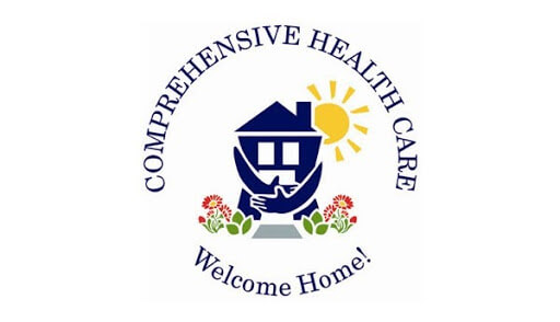
This is one example of a logo that has too many things going on all at once. At the centre, we have a house that looks like it’s giving itself a hug, making us think we’re looking at a brand that is somehow connected to real estate.
The letters above, however, tell a whole different story.

Minimalistic logos have a lot of benefits. They are scalable, which we’ll talk about later and they’re mobile-first. These logos nowadays are flat, simplified and work in all types of situations.
Logos that are minimalistic can easily be implemented in memorandums and promotional material without taking the focus away from the content, while still fulfilling their role.
Let’s Talk Colours
Colours can play a crucial role in the design of a brand’s logo. If you think about it, you’ll realize that brands from the same industries usually use the same colour scheme.
For example, you’ll rarely see food brands using the colour blue since it’s not a colour you would associate with groceries or food in general.
Blue as a colour represents cleanliness, trust and a sense of calm. It is often used in the visual identities of cosmetic brands, medical brands, corporate businesses and social media.
It is the colour most people pick as their favourite, so it’s a great pick for your brand colours.
Red is a colour that evokes strong emotions and stimulates appetite, which is why so many restaurants use it in their branding.
It is exactly the first colour babies see and the theory behind that is that we evolved the ability to see red better than other colours because it allowed us to identify fruit on the trees more easily.
That is why red is a great colour to use in branding since it captures people’s attention quicker than other colours.
Yellow is the colour of a sunny disposition, it emotes energy and positivity. It’s not usually associated with maturity or a luxury brand, so it’s a perfect pick for affordable brands.
It screams youthful energy so a lot of brands aimed at young people use it in marketing.
Purple on the other hand is the colour of luxury, exclusivity, spirituality and femininity. It is often used in branding for high-end retail companies and hair care.
It will easily find its target audience, no matter the shade.
Green is one of the most versatile colours. It can symbolize an eco-friendly brand, a brand that deals in money and other assets as well as gardening supply brands.
Black logos are very modern and versatile, just like green ones. It can look professional, serious and luxurious. It prevails in high-end fashion as the go-to colour for branding.
Once you figure out your prevailing colour, you can play around with secondary colours, which will give you even more of an edge on the market.
Design Psychology
A good understanding of the human mind and psychology can help you design the best logo for your brand. A logo is not something your audience is going to study or look at closely, so we’re not going to dig deep into this.
However, there are a few tips that will help you capture attention.
We’ve already delved into colours, now let’s look at shapes. Circles, ovals and ellipses suggest a feeling of community, friendship, marriage and femininity.
They represent partnerships that last for a long time and bring you a sense of calm.
Squares and triangles represent stability, strength, efficiency. Triangles are often associated with power structures, law and other culturally masculine values.
You can build your shapes with different elements like lines, words, numbers and such, so make sure to take all of this with a grain of salt.
Test it Out With Focus Groups
Once you narrow down a pick for a logo down to a few different versions, ask people inside and outside of your industry for their opinion to see if it’s universally understood.
Start with people from your industry.
Share your picks for a logo with your peers via Google forms and ask them to pick their favourite without going into too much detail about your vision behind it.
Your logo should speak for itself.
Make sure to include an open-ended question where they can share their opinion and give remarks on your picks.
Use that information to make changes to your design if necessary. Once you do that, share your Google form with people outside of your industry, just to see if they think it resembles any other logo and how they would describe your brand’s values based on the logo.
Make it Scalable

A good logo needs to be scalable and easily readable. If your logo loses its proportion once it’s blown up and put on a billboard, it needs to be changed.
The same goes for a small surface, like a business card. Your logo should always be visible and all the details should be readable.
To ensure this happens, make sure to create your logo in vector format. Also, always use that format for all your visual marketing campaigns.
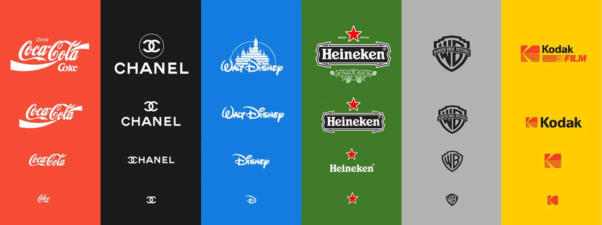
If your logo consists of letters and numbers, it can be harder to scale it, which is why brands usually create different variations. Most notably, Instagram has pushed brands into creating square versions of their logos.
Conclusion
Our 6 actionable tips on designing a logo that will do far more than just mark your products and services but also differentiate you from your competitors, bring you brand recognition, attract your target audience, and work for all types of businesses.
Before you start designing it, you should do extensive research that will help you in your marketing efforts and sales pipelines. The logo isn’t just a representation of your values, it also tells audiences how affordable your brand is and what your USP is.
Make sure to do the work, but keep things simple. Don’t go overboard with too many elements and colours, because you want to keep your logo readable and scalable.
Join The Logo Community
We hope you enjoyed these 6 Smart Tips to Boost Sales with the Perfect Logo Design. If you would like more personal tips, advice, insights, and access to our community threads and other goodies, join me in our community.
Learn from our Founder Andrew who personally writes our community newsletter. You can also comment directly on posts and have a discussion.
*TIP – Are you looking to Learn Adobe Illustrator CC? Look no further.
This Illustrator CC MasterClass course will set you up with a solid foundation to become a confident Illustrator CC designer. Join over 900 students who have already signed up for this course.
Normally £399 – Now only £20 for a limited time. Don’t wait – Claim Your Seat!
Author bio
Petra Odak is the Chief Marketing Officer at Better Proposals, a simple yet incredibly powerful proposal software tool that helps you send high-converting, web-based business proposals in minutes. She’s a solution-oriented marketing enthusiast with more than 5 years of experience in various fields of marketing and project management.


