In this article we share 6 Tips for Designing a Website with Your Ideal Customer in Mind (+Examples)
Designing a website can feel like a real challenge, especially when you’re trying to make it appeal to your ideal customer. If your site doesn’t resonate with them, even the most stunning design won’t move the needle.
But it doesn’t have to be that way.
We’ve tapped into the expertise of seasoned digital marketers who’ve helped hundreds of businesses create websites that truly meet the expectations of their target audience. Now, we’re going to share our top six tips with you.
It doesn’t matter if you’re planning a redesign or starting from scratch – here you’ll find advice that’s easy to apply and focused on results.
Let’s go through some good stuff you can use to take your online presence to the next level.
Table of Contents
1. Captivate with a Powerful Value Proposition
When it comes to your website, you’ve got about 15 seconds to capture your visitors’ attention and convince them to stick around. That’s why crafting the perfect value proposition is so critical.
This is your chance to clearly communicate what you offer and why it matters to your target audience.
A strong value proposition taps into the underlying emotions and desires of your ideal customer. Think about the specific problems you solve, the benefits you provide, and how your product or service makes your visitors’ lives easier. Distill all of that down into a concise, compelling statement that immediately resonates.
For a masterclass in value proposition design, look no further than Going, a premium platform that helps travelers find airfare deals.
This landing page cuts right to the chase, promising “Real deals with real prices” in bold text. They follow that up with a brief explanation of the key value they offer – an opportunity for members to save an average of $550 on economy flights.

Source: going.com
By crafting a value proposition that clearly communicates your unique value, you’ll captivate your ideal customers from the moment they land on your site.
Don’t settle for generic claims or fluffy language – get laser-focused on what makes you special, and let that shine through.
2. Build Trust and Credibility with Social Proof
Studies show that websites that prominently display customer reviews and testimonials can see a jaw-dropping 67% boost in their conversion rates. That’s why highlighting social proof and the positive experiences your customers have had is essential to your success.
When potential customers see that others have had a great experience with your product or service, it instantly reassures them that you’re the real deal. Showcasing these testimonials, ratings, and reviews gives them the confidence to take that next step and become a customer themselves.
But it’s not enough to just slap a few generic reviews on your site. To get the most mileage out of your social proof, make sure the examples you use are specific, detailed, and relatable.
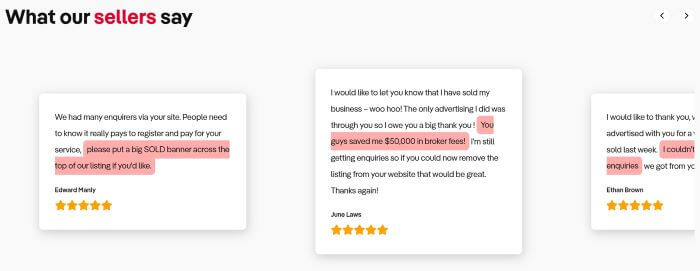
Business For Sale does this brilliantly on their landing page focused on selling businesses.
Featuring five-star testimonials from actual customers, they provide personal insights into the benefits of using their business listing services. Visitors can instantly see how working with this brand helped other entrepreneurs like them achieve their goals.

Source: businessforsale.com.au
So, don’t be shy about highlighting your hard-earned social proof. By making it a central part of your website’s design and messaging, you’ll build trust, quash objections, and guide more of your ideal customers down the path to conversion.
3. Make It Easy for Visitors to Find What They Need
No one likes sifting through endless options, especially when they’re trying to find a specific product or service that meets their needs. As an online business, it’s your job to make that discovery process as seamless and effortless as possible.
By implementing smart filtering and sorting capabilities on your website, you can empower your visitors to quickly zero in on the right solution for them.
This not only enhances the user experience but also dramatically increases the chances of them converting into paying customers.
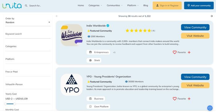
Just look at Unita, a comprehensive directory of business communities. With over 1,200 business communities across a wide range of sizes, niches, locations, and more, Unita knows that their users need robust filtering options to find exactly what they’re looking for.
That’s why their communities page offers a suite of advanced filters – allowing visitors to narrow down the selection by criteria like country, language, business type, membership fee, size, etc. This ensures that each user can easily discover the communities that are the best fit for their unique needs and preference

Source: unita.co
This will allow your visitors to appreciate the seamless experience, and you’ll enjoy the benefits of higher engagement, lower bounce rates, and more customers crossing the finish line.
4. Feature Prominent Trust Signals
Trust is the foundation for any successful website. After all, if your visitors don’t believe your business is credible and reliable, they’re highly unlikely to take the leap and become paying customers.
That’s why it’s so important to prominently display trust signals and badges throughout your site.
These visual cues act as instant social proof, reassuring potential customers that you’re a legitimate, trustworthy operation. From security seals to customer review icons, trust signals demonstrate that others have had positive experiences with your brand. This goes a long way in overcoming objections and driving conversions.
Golf Cart Tire Supply, a supplier of high-quality golf cart tires and accessories, does an excellent job of leveraging trust signals on their website.
They’ve strategically positioned an array of payment and encryption badges right at the top of their golf cart wheels and tires collections page. They’ve also included icons highlighting their free shipping and thousands of certified customer reviews, giving visitors an immediate sense of confidence in their brand.

Source: golfcarttiresupply.com
So, don’t be shy about showing off your hard-earned credentials and accolades. Display these badges in your header, footer, and key conversion areas to quickly establish your credibility and put your customers at ease.
5. Let Customers Show off Your Products in Action
There’s pretty much nothing quite like allowing your existing customers to showcase your products in real life. Just think about the effect of that practice when you learn that 88% of consumers rely more on peer recommendations than traditional advertising.
By incorporating user-generated content (UGC) like photos and videos into your website, you tap into that innate human desire to see how others are using and benefiting from your offers.
UGC also adds dynamic, engaging content to your product pages, which can improve both user experience and SEO.
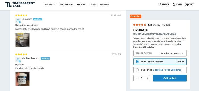
Transparent Labs, a premium sports nutrition brand, is a prime example here. On their Electrolyte Powder product page, they encourage customers to leave reviews complete with their own images and videos of the supplements in use.
This helps generate trust with new visitors while providing valuable social proof that brings the product benefits to life in a way that generic stock imagery simply can’t.

Source: transparentlabs.com
To turn casual browsers into devoted customers, make it easy for them to show off your products by seamlessly integrating UGC submission into your site. Whether it’s a simple photo upload or a video testimonial, these real-world examples will resonate far more powerfully than any staged marketing content.
6. Make Customer Support Easy to Find and Use
No matter how well-designed and user-friendly your website is, there will always be times when your customers need a little extra help. And when that moment arises, the last thing you want is for them to feel frustrated or unsupported.
That’s why making your customer service options highly visible is such a critical element of any high-converting website.
By making it a breeze for visitors to connect with your support team, you demonstrate your commitment to their satisfaction and reinforce the trust they’ve placed in your brand. Whether it’s a click-to-chat function or a boldly displayed phone number, these accessible touchpoints reassure customers that you’ve got their back – before, during, and after the sale.
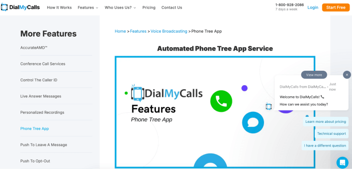
DialMyCalls, a leading mass text messaging service, truly nails this on their phone tree app landing page.
Right at the top of the screen, they showcase their CS phone number, ensuring it’s the first thing visitors see. But they don’t stop there – they’ve also integrated a message button that instantly opens a chat window with preset questions, so that users can get the support they need without delay.

Source: dialmycalls.com
It’s important to make it a priority to prominently display your customer service options throughout your website.
From the header to the footer and every key conversion point in between, these touchpoints will give your visitors the confidence they need to commit to a purchase, knowing that you’ve got their back.
Wrapping Up
Each of these strategies is designed to guide your target audience down the path to conversion.
The common thread running through all of these tips is putting your customers first. When you make their needs, desires, and pain points the focal point of your website, you’ll create an experience that cuts through the noise and speaks directly to what matters most to them.
So, don’t be afraid to get laser-focused on your target audience. Implement these tips, and you’ll be well on your way to designing a website that drives real results for your business.
Join The Logo Community
We hope this article has helped. If you would like more personal tips, advice, insights, and access to our community threads and other goodies, join us in our community.
You can comment directly on posts, access our community threads, have a discussion and ask questions with our founder Andrew.
If you’re looking to learn more about brand strategy, we highly recommend eRESONAID with our friend and acclaimed brand strategist and author Fabian Geyrhalter, it’s packed full of knowledge and insights you will need to learn to become a brand strategist or apply what you learn within your own business.


