Your brand logo is not just a symbol. It is the face of your company. It is your brand identity that distinguishes you from other brands and people identify your brand from it. That is why it is important to put your best foot forward with your brand logo. In this article we take a look at 7 Clear Signs that it is time for your Brand to Redesign your Logo.
Unfortunately, most brands just create their logo and leave it to become obsolete. The pace at which the logo design industry is evolving, it does not take long for their brand logo to look stale and outdated.
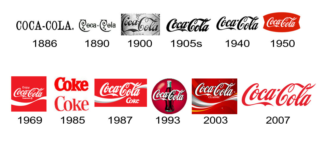
Just like every other product, your brand logo also has a shelf life. Yes, there are timeless logos such as Coca-Cola that stayed almost the same for 100 years. I mentioned almost because even the timeless logos need some tweaking to stay relevant. Take a look at how Coca-Cola logo evolved over the century and you will clearly understand what I mean.

If your brand logo has fallen behind the times and start looking from the past century, then you need to redesign your logos. This is only one sign, there are many more signs that you should look out for.
In this article, Branex shares clear signs that tell you that it is time to redesign your brand logo.
Table of Contents
It’s Too Simple and Old
Take a closer look at your brand logo. Does it look too simple and plain when compared to the competitor’s brand logo? If yes, then it is because you have not updated it for decades. You can easily find the disparity between your logo which looks old school while the competitor’s logo might look modern and more stylish hence more appealing. Additionally, if your brand logo stays the same since you started the business, it sends negative vibes about your business. It creates a perception that your business is not evolving and is at a standstill, just like your brand logo. As a business, you don’t want your customers to perceive your brand like this. That is why it is important to revamp your old and boring logo and add some zing to it to make it look modern.
Not Relevant to Your Brand Anymore
There are times when brands turn on a completely new leaf and change everything from visuals to their branding material, just to look fresh and get a new brand identity. They do this because their target audience might have changed or shifted or due to any other reason. Irrespective of what the reason might be behind your brand pivot, don’t forget to update your logo in such a situation. Just like everything else, make sure that you change your logo as well. Use the iterative approach to make changes to your logos so that the final outcome is a refined version of your new logo.
Your Logo Does Not Tell A Story
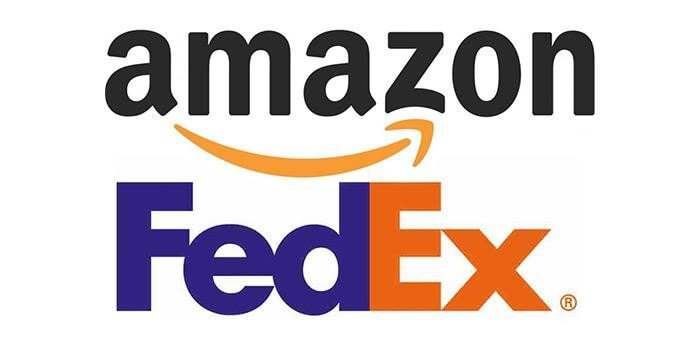
Your brand logo acts as a bridge that connects your brand with your customer. That is why it is important for your brand logo to tell your brand story. That is the reason why FedEx logo is always featured and praised in almost every best logos list. Same goes for Amazon logo. The arrow between the letter “E” and “X” in FedEx logo tell you it is a courier company. Similarly, the arrow that starts from the letter “A” and points to the letter “Z” depicts that Amazon sells all the products from A to Z.

Good logos provide design cues to anyone who looks at it and has a brand philosophy to back up the design. With brand storytelling being a top priority for both marketers and brands, it is important that your brand logo tells your unique story. A strong brand narrative assist brands engage new customers, retain old ones, build trust and drive more sales.
Complexity
When it comes to designing your brand logo, it is important to strike the right balance between simplicity and complexity. Your brand logo should not be too complex that it is difficult for your customers to remember and identify your brand from it nor it should be so simple that it starts to look boring. Did you know that it only takes consumers 10 seconds to form a first impression of a brand’s logo, but it takes 5-7 impressions for consumers to recognize the logo?
If you closely analyze some of the most famous logos such as Nike Swoosh or McDonald’s Golden Arches, you will notice that all these logos have been scaled back with simplicity based on their primary design principle. This makes the logo more versatile which means that brand can use it on all mediums and it looks good everywhere. Secondly, the minimalistic design also helps with brand recognition and makes it easier for customers to remember your brand logos.
Lack of Context
Logo design trends change quickly. One logo design trend that is here to stay is contextual and responsive logos. What is a responsive or contextual logo? Is that what you are thinking? A responsive logo responds to their medium and adapts according to the medium just like a responsive website which fits perfectly based on screen size and resolution.
With so many different mediums and channels out there where your brand logo will be placed, it is important to have a different brand logo for each. For instance, you have to create a different logo for your website and business cards and a different one for product labels. A contextual logo is usually guided by the environment it is placed in and adapts according to the requirements. Meanwhile, it is important to ensure that different versions you created for using it on the different medium don’t vary too much from each other as it can destroy your brand image and personality. There should be harmony amongst all your logos irrespective which mediums you are using them on.
New Competition
Your brand enjoys a large market share in your industry and is amongst the top five brands. Suddenly, a new brand emerges and starts to give top brands a run for their money. In no time, the new brand starts to climb up the ladder and start to challenge your dominance in the market while eating up on your market share. It has managed to grab the attention of your target audience with a refreshing brand identity and a new, unique logo. What would you do in such a situation? Redesign your brand logo. It will help you steal all the limelight and get all the customer attention back on your brand. Moreover, it also paints a good picture of your brand, telling the customer that your brand is adaptive to change and not one to sit around idle.
Use of Outdated Fonts
When you created your brand logo, you used the latest fonts. As the logo design starts to evolve and new fonts and typefaces are introduced, your brand logo starts to look antiquated. Compare your logo side by side with a brand logo that uses modern and stylish fonts and you can see the difference. Breathe new life into your old brand logo by using new fonts so it can compete with competitor logos.
How long do you wait before updating your brand logo? We hope these 7 Clear Signs that it is time for your Brand to Redesign your Logo have been helpful and as always feel free to share your opinion with us in the comments section below.
 Author Bio
Muhammad Osama a qualified professional with ground-breaking experience in developing SEO campaigns, analytics, and monitoring the ranking in Google search pages. A clear communicator with an experience of digital marketing and improving brand search ranks.

