It takes a lot to set a business apart from the crowd nowadays. From an eye-catching logo to an earworm-inducing jingle in an advert, businesses have to try all the marketing tricks in the book (as well as often penning new ones) to grab their audience’s attention, but these are just the icing on the cake that is a business’s image, it’s philosophy; it’s branding. Lets take a look at 7 Funniest Branding Fails.
Branding is the fuel to the marketing machine and identity of a business, so it’s vital to get it right. There’s a lot to consider when it comes to branding including, but certainly not limited to, what kind of adverts are produced, where they’re showcased and how a business handles their audience’s reaction to them.
Suffice to say, not all branding attempts are made equal and some are straight-up disastrous. Tone-deaf, ridiculous and even offensive branding is all very possible, especially on a global marketplace, and a little bit of hindsight can go a long way when things go awry in the marketing department.
Then there are those legendarily atrocious efforts at branding that simply have to be seen to be believed. Below are Rombus Packaging’s favourites that, honestly, defy comprehension.
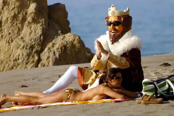
Table of Contents
Burger King: ‘The King’
Kicking things off with both a perplexing bang and a terrified whimper is the infamous Burger King ‘King’, otherwise known as ‘Creepy King’. Although mascots seem to belong more in the 90s than in modern days, Burger King decided to really power through the years with a baffling marketing campaign revolving around the enigmatic (& possibly supernatural) ‘King’ character.
Many will remember ‘The King’ (possibly attributing his presence to nightmares or fever dreams) but few know of Burger King’s decision to team up with video game developer Blitz Games. Together, Burger King and Blitz Games created a trilogy of challenge-based video games for the Xbox and Xbox 360, titled Pocketbike Racer, Big Bumpin’ and Sneak King.
The former two-starred the Playboy model Brooke Burke (naturally) and the latter was a deeply confusing game that let you play as ‘The King’ himself, jumping out at random people and presenting them with burgers.
Admittedly, these games did apparently raise sales for a month by 40%, but the overall impact of ‘The King’ was not so positive. He was seemed creepier than Ronald MacDonald (an impressive feat, in some ways) and was retired in 2011 because, and this is a direct quote from Burker King themselves, “he scared away women and children.”
It doesn’t get much more damning than that.
Pepsi: Kylie Jenner’s Revolution Ad
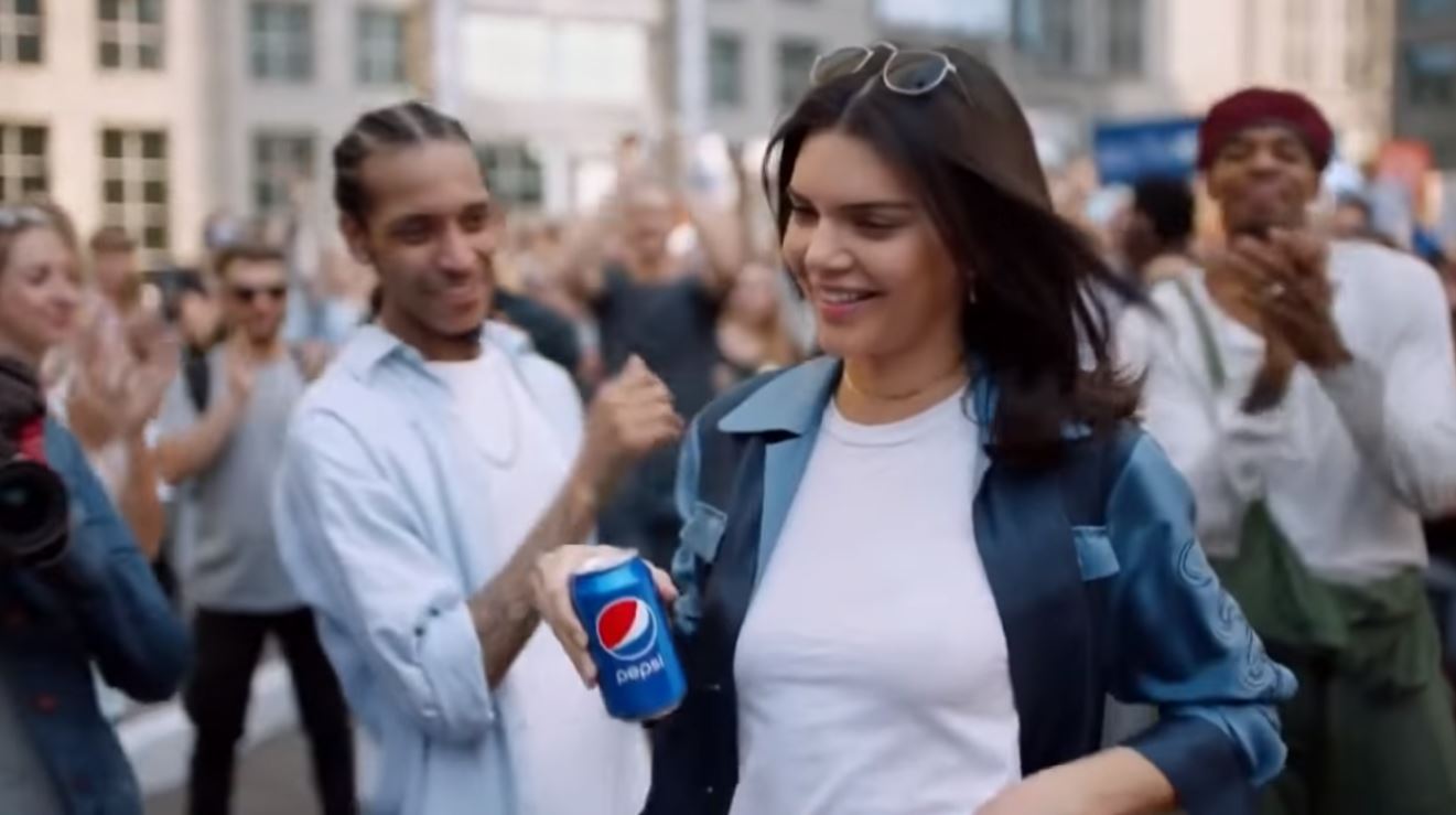
A list such as this one really can’t go very far without pointing out how utterly tone-deaf Pepsi’s 2017 short film-commercial hybrid was.
A transparent attempt to ‘cash in’ on the momentum of the Black Lives Matter movement, the commercial followed a cello player minding his own business (then enjoying a can of Pepsi), noticing a crowd of protesters outside from his balcony (and enjoying another can of Pepsi) and then taking to the streets to join them in their march that sported vague messages of peace (whilst bring his cello in an oddly light blue cello case).
Kylie Jenner is also there, in the middle of a photoshoot (in which no one seems concerned that a protest march is happening mere feet from them) that she promptly abandons when Cello Guy walks past. In a daring move, she tears a wig off of her head (revealing even more immaculate hair) and rubs her photoshoot lipstick off (again, revealing perfectly applied lipstick) and joins in the protest.
She grabs a can of Pepsi and gives it to one of the riot police stationed and, well, he drinks it. That’s clearly enough for the protesters to celebrate and so, they do. Advert over, leaving the audience very confused.
As a short film, it was tasteless, confusing and almost cartoonish in how it depicted people, (let alone protesters) as an advert it was simply offensive and conceited; so much so that it was pulled after only appearing for one day.
Acclaim: Virtua Tennis 2
In the grand scheme of things, the video game industry is relatively new, so a few branding mistakes here and there are understandable. There are the likes of John Romero’s infamously hubristic claim that he’d make gamers his, well, his female dog, as well as the bizarre collaborations with companies like Nintendo and Mercedes Benz for a Mario Kart release, but these pale in comparison to the utter lunacy of one company; Acclaim.
Acclaim has never been one for conventional marketing, of this no one can deny, yet it’s the extreme lengths they went to that brought quizzical expressions to many faces. Their unorthodox approaches to branding have ranged from deeply offensive, such as offering money to have their game advertised on gravestones, to straight-up felony inducing, such as offering to pay for speeding tickets.
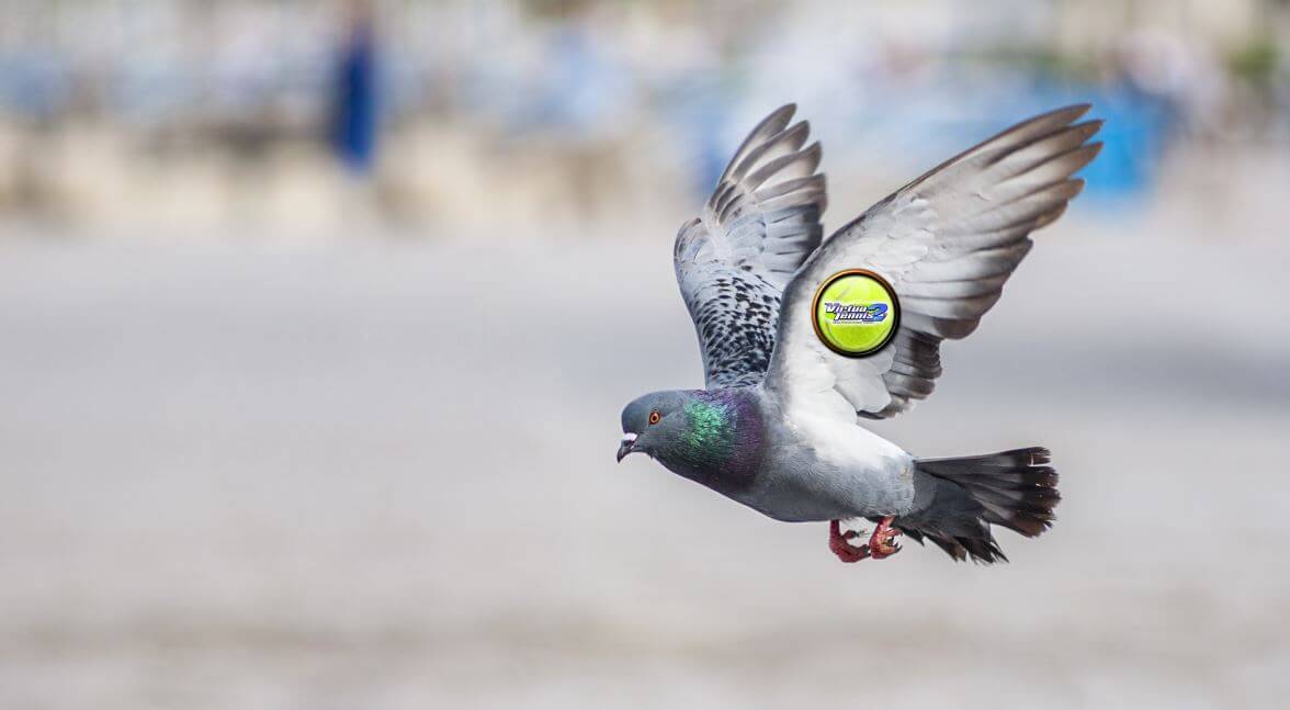
However, none of their efforts have been nearly as insane as their plan for the release of Virtua Tennis 2. They concocted an insane plan that involved training pigeons to fly to Wimbledon, pigeons that they had painted the Virtua Tennis logo onto their wings
Not only would this have disrupted the Wimbledon Tennis Championships in the UK, but it also made them actually consider training hawks to intercept the pigeons. What was probably the worst thing about this potential stunt was that, like most games by Acclaim, Virtua Tennis 2 wasn’t particularly well-received.
Nestle: The ‘Pedobear’ Incident
Social media is an undeniably powerful tool in marketing and establishing a brand identity nowadays; some would even argue that it’s the most important platform for a business. This is why it’s always important to treat the medium with caution and understanding; something that Nestle was clearly lacking.
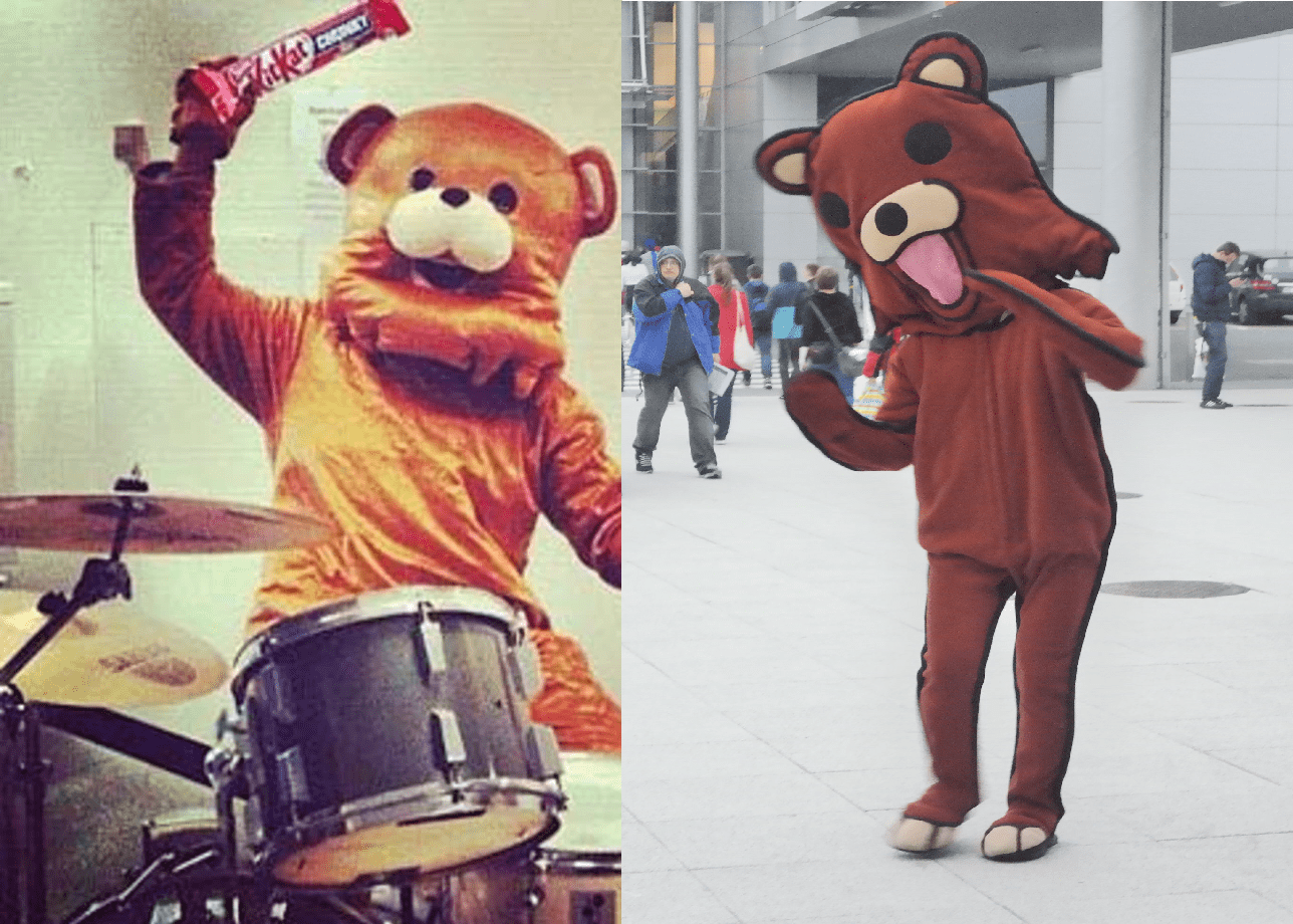
Entering the world of Instagram with a splash, Nestle’s very first image on the platform was of a playful bear performing one a drum kit, using Kit Kats instead of drum sticks. What should have been a slightly whimsical photo quick drew the internet’s mockery for the bear’s uncanny resemblance to an already established internet-famous character?
Anyone who has frequented 4chan or lives their life adhering to meme culture in the last decade will recognise ‘Pedobear’, an icon that started it’s life as ‘Safety Bear’ only for 4chan to begin associating it with loli hentai boards (for those unaware of what either of those words mean, don’t google them).
As the name suggests, Pedobear is closely tied to jailbait and paedophile jokes, which probably isn’t the kind of image Nestle was looking for. It goes without saying that they swiftly removed the image, but not before incurring a lot of ridicule.
Sainbury’s: The 50p Challenge
Anyone who’s worked in retail will know just how hard managers can try to push employees to increase sales, which is why Sainsbury’s 2014 blunder shouldn’t surprise many. What is amusing about this incident is the accidental nature of it and how they unwittingly broadcasted their passive efforts to squeeze money out of customers.
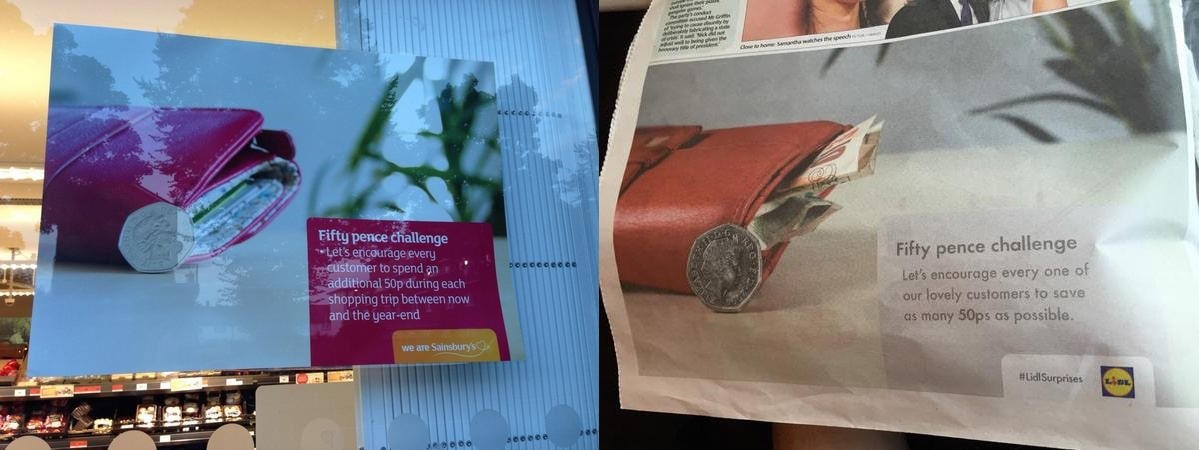
What should have been an internal motivational poster (not unlike the classic hanging cat, except the cat’s a 50p coin) was accidentally displayed in the windows of an East London supermarket, requesting that the passing customers try to get the customers to spend more money. The ‘50p Challenge’ was swiftly removed but not before a few people took to Twitter to get a few jabs in.
The poster read “Let’s encourage every customer to spend an additional 50p during each shopping trip”, which provided a prime ‘win-win’ opportunity for one of Sainsbury’s competitors, Lidl. Simultaneously mocking the supermarket chain whilst boasting of their own lower prices, Lidl showcased their own posters that said: “Let’s encourage every one of our lovely customers to save as many 50ps as possible.”
A genius tactic for Lidl, an embarrassing example of branding from Sainsbury’s, and customers were called lovely; all in all a good example of bad marketing.
LifeLock: Todd Davis’ Stolen Identity
2007 presented the company, LifeLock, with a valuable lesson in humility and hubris; so valuable that it almost cost the company, and it’s CEO, everything. Dedicated to keeping personal & business information secure, LifeLock’s CEO, Todd Davis, proposed a plan so crazy for a marketing campaign that it could just work.
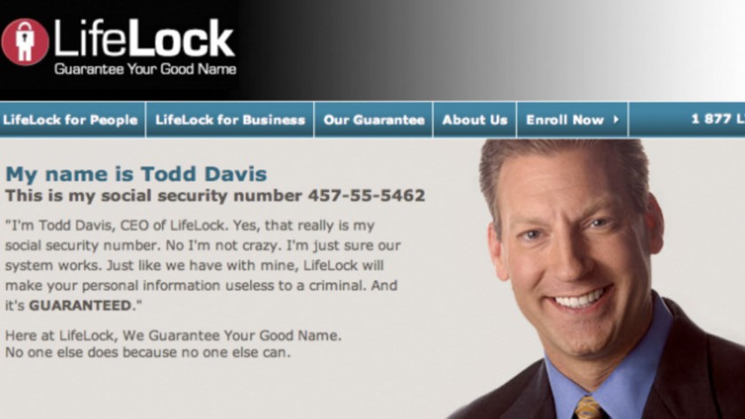
Sadly for Davis, yet hilariously for the rest of the internet, the plan did not work because it genuinely was crazy, despite Davis stating on the ad that he wasn’t crazy. The irony was too much for the internet to take, and the challenge he offered was too tantalising to pass up as he posted his social security number on the advert and inadvertently challenged people to break into LifeLock’s systems.
Like Icarus flying too high to the sun, Davis’s confidence in his product would be his undoing as not only did hundreds of people actually manage to steal his identity but in doing so they revealed that his claim of security was almost paper-thin. LifeLock remains in business to this day, but the embarrassment of this campaign lingered with them for years.
Domino’s (Russia)
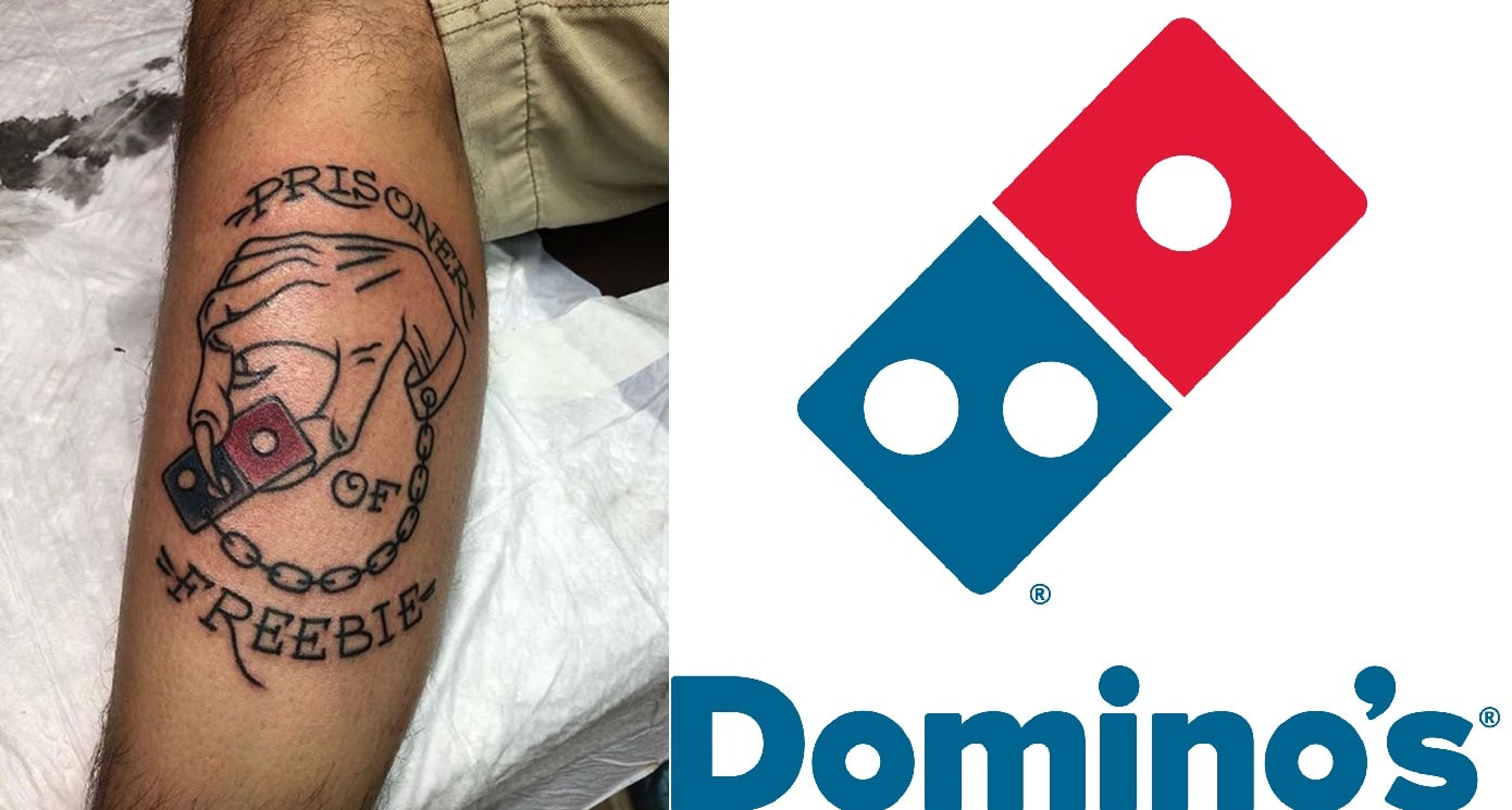
Last but certainly not least is the lesson of how you should never question what people are willing to do for free pizza. In 2018 Domino’s Russian branch launched an ambitious campaign dubbed ‘Domino’s Forever’ that promised 100 free pizzas a year, every year, for 100 years to anyone who got a tattoo of the Domino’s logo.
In a move that surprised no one (except for Domino’s, that is) hundreds of people flocked to their nearest tattoo studio to get the logo inked onto them. Domino’s was swiftly overwhelmed by pictures of patrons clad with their logo, some simple, others humorously poking fun of their own willingness to brand themselves with the brand.
Domino’s quickly scrambled to impose ‘stricter’ rules to stem the torrential flow of willing participants, stating that only specific, visible areas of the body would be valid to bear the brand image and that it needed to be at least 2cm tall. This did little to stop the pictures coming in, so Domino’s has to cut off the number of entries to a mere 350.
Once again, this didn’t do much to impact the numbers and so Domino’s had to stop the campaign after a few days, instead of the planned months. The lesson to be learnt here is that even an incredibly successful campaign can easily morph into a huge failure for the brand.
We hope you have enjoyed these 7 Funniest Branding Fails, and be sure to leave your comments below.
Useful Links & Great Deals
- The Equipment We Use & Recommend
- Quality Design Bundles
- Get 2 Months free Skillshare
- Get an Exclusive 20% off Logo Package Express
- Learn Logo Design Online
 Author Bio
Tom Simpkins has written everything from books to business proposals but has found a love for working on articles for a host of different clients. When he’s not writing, Tom’s an avid mixologist, an enthusiastic cook and a hopeless lover of corgis.

