Design is an important part of any business. Whether you’re designing a book cover, creating a new brand, or simply trying to draw people to your website, it’s crucial that you get the right look for your business. But equally important is making sure that your designs stay relevant over many years — and that means being willing to give your logo a facelift every so often. Join us in this article as we take a look at the 8 Biggest Logo Redesigns of 2019 That You Should Know.
As such, 2019 was a big year for rebranding initiatives. All year, companies turned their sights toward the future, ready to strike out and make their mark on the new decade.
With that in mind, let’s look at 8 of the biggest logo redesigns from the final year of the 2010s.
Table of Contents

No, not Facebook the social media app — Facebook the brand.
If you’re asking What’s the difference?, that’s precisely what this new branding effort is trying to address. Over the past 15 years, Facebook has grown to acquire several other apps and products, such as Instagram and WhatsApp, and the new logo is part of an effort to provide branding cohesion.
The new design features a shift from lowercase letters to uppercase, as well as a slim new font. The color varies depending on the app where the logo appears, allowing each product its own identity while still tying into the larger Facebook family. It’s a sleek scheme that will carry forward well enough into the 2020s, though it’s anyone’s guess whether it will foster a more positive perception of Facebook in the public eye.
Slack
Wow, did this one cause a stir.
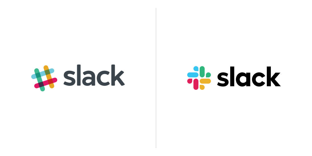
Who would have thought that switching away from a hashtag would generate such intense discourse? Not the folks behind Slack’s new logo, that’s for sure. The chat program, used worldwide by groups ranging from hobby enthusiasts to corporate headquarters, has been a standard in workplace communication since 2013, giving the old logo a lot of brand recognition.
So why the change? For one thing, eliminating of the iconic hashtag was part of an attempt to simplify the color palette, getting rid of the multiple shades appearing where those overlapping bars blended together. Yet it’s hard to understand why they thought the new look was simpler. Yes, there are now only four basic colors, but the symbol itself is a lot more detailed.
Still, it’s a clean, distinctive design. Aside from the symbol, the new font is slightly thicker and squatter, with a different styling for the “a” and “k.” The edges are sharper, and the whole thing is rendered in pure black instead of a dark gray.
VW
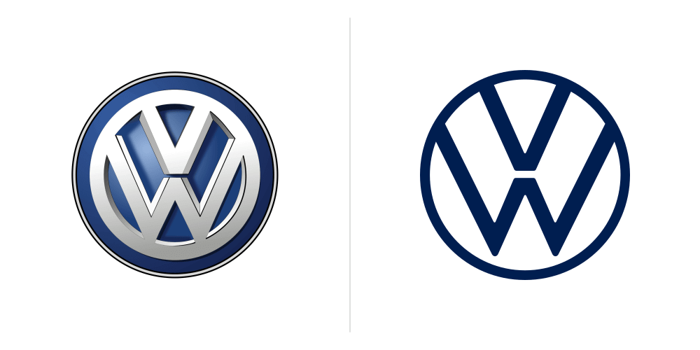
Although it’s been updated a lot in the 80-some-odd years since it was first introduced, the core concept of the Volkswagen logo has remained the same: the stacked V and W contained within a circle. The branding is instantly recognizable, whether on the front of an all-new electric car or the dented grill of an old bus-style van.
In the modern era, the new logo leaves behind the 3D chrome look, replacing it with a flat version of the iconic design. The lines are thinner, and they’ve opened up space around the bottom of the W for the first time ever.
Along with the new visual, VW released its first-ever “sound logo,” a woman’s voice that will not just accompany ads, but also provide the start-up sound of their new electric engines. Is it gimmicky? Sure. A new marketing trend? Only time will tell on that one.
Firefox
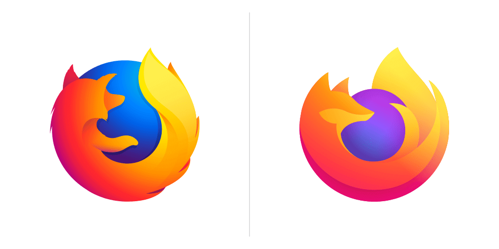
Firefox has long been on a quest to simplify their logo. Originally, there was so much detail — too much, really. Visible continents on the planet, flecked fur, black nose… it was all adorable, but busy and largely impossible to make out in smaller icons.
Our beloved fox has gotten much more streamlined over time, and now he takes it a step farther, tucking his paw in and hugging the planet more fully with his whole body. Though this logo actually manages to bring back the distinction in his fur between the “bib” and the rest of the body — a sweet touch, to be sure.
I’m not sure that I love the hue of the planet shifting toward purple, though. Especially since the last design did away with continental outlines, it makes the whole thing look less like the planet and more like a… marble? A ball? Which does lose a bit of the logo’s “concept,” and muddy the whole imagery somewhat.
Still, it’s a clean and modern update with plenty of room for growth in the future.
Android
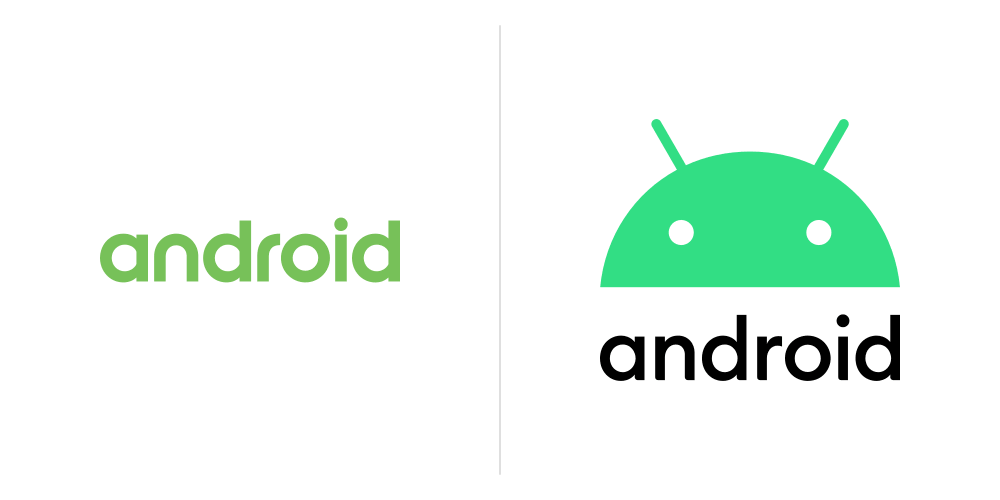
Ten years after the release of the first Android phones, the mobile OS is getting a branding overhaul.
At a surface glance it might not seem that different, but in fact the small changes are numerous. First, the droid was brought into the logo directly to strengthen the branding imagery, albeit reduced to a head rather than the whole body. Next, his color was updated from a lime green to a minty green, and small tweaks were made to the positioning of his eyes and antennae. Finally, the font was shifted from green to black, and the shape of the letters updated to be both more modern and cohesive with the curves of the droid’s head.
In this design update, accessibility was the driving factor. Green is a tricky color for color-blind consumers, especially in the shade of the original designs. By updating to a bluer hue for the robot, Android can connect better with its global marketplace, as well as give themselves a logo that shows up more clearly on a wider range of background colors.
The tweaks to the android’s head also lend it a softer, more human touch, with the small adjustments allowing it to convey a shockingly wide range of expressions and emotions. It’s a positive step forward for the tech conglomerate, and one that will be interesting to watch unfold in the new era.
Yahoo
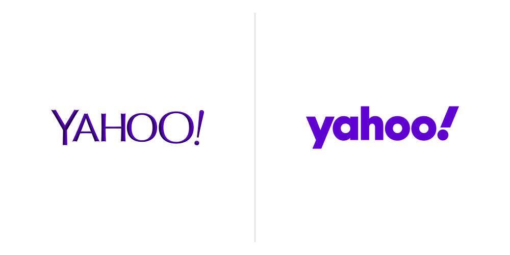
Yes, they’re still around. Every few years, Yahoo redesigns their logo to remind you of that fact.
I was never fond of the logo they just replaced, so I’m more than happy to see it go. The thin, beveled fonts and slightly larger second “o” just screamed old-fashioned to me, and not in the nostalgic way.
The new design does kind of the opposite of Facebook: shifting from uppercase to lowercase, and going with a thick font instead of a thin. Yet somehow, both redesigns manage to look fresh and modern. The playful slant of the exclamation mark harks strongly back to the original branding, but this time without making it feel outdated.
Shockingly, it… kind of makes me want to see what their site has to offer these days? Which means that if we were to rank the redesigns based purely on effectiveness, this would have to be the winner.
Warner Bros
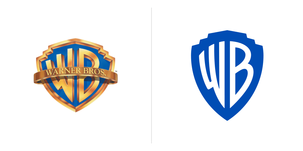
In the most unexpected change of 2019, Warner Bros has ditched the golden shield they’ve been brandishing for what feels like forever in favor of a simple blue-and-white emblem.
Like Volkswagen, they’ve left behind a raised, metallic design in favor of flat colors that translate better to usage in a wide range of media. They also dropped the banner running across the logo, and the shield itself has narrowed, aligning better with the golden ratio. Alternate versions include one with a custom font face displaying the name “Warner Brothers” beneath the shield, as well as a slightly embossed version for when they want something a little fancier.
Similar to several other redesigns this year, Warner Bros’ biggest reason for the update is to make their design more versatile. By going monochromatic, they allow themselves the flexibility of changing up the colors to match whatever franchise they’re promoting. Early images also showed them using the outside shield shape as a “window” into which characters from their various movie and TV properties can look out.
Overall, it’s a fresh change that should allow them to achieve exactly the sort of cohesion they’re looking for as they move toward their 100th anniversary.
Reebok
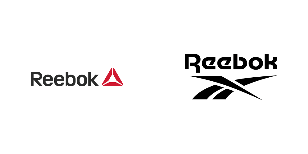
I have to admit, as someone who grew up in the nineties and hasn’t been very aware of athletic shoe brands since, it was difficult for me to even realize that Reebok had updated their logo. Even once I did find out, it took me a while to realize the logo they just introduced wasn’t the old logo they were replacing.
That’s not a criticism of the branding, however, but a testament to just how much the new design is kicking it old school. With a slight tweak on a font first introduced in the late seventies and the sweeping motif I recognize from my own childhood, Reebok is throwing their branding back to an era when they were among the kings. It’s a classic look that screams Reebok to the millennial demographic, though I do wonder how it will play with younger audiences. Still, it’s interesting to see a company reversing a previous logo change, and a perfect encapsulation of the cyclical nature of design trends.
We hope this article featuring 8 Biggest Logo Redesigns of 2019 That You Should Know has been helpful, and if your a logo designer and would like to up your logo design process in 2020 be sure to get Logo Package Express which will save you hours of time saving client logo files as this package is super quick and only takes 5 minutes.
Something we use ourselves and highly recommend! save 20% off with the ad below!
Useful Links & Great Deals
- The Equipment We Use & Recommend
- Quality Design Bundles
- Get 2 Months free Skillshare
- Get an Exclusive 20% off Logo Package Express
- Learn Logo Design Online
Jenn Gott is an indie author and a writer with Reedsy, a marketplace that connects authors and publishers with editing and book design professionals. Jenn basically spends all her time either writing books or helping people learn how to write books. She firmly believes there is no writing skill you cannot learn with practice and the right guidance, and that there’s always room for improvement, no matter where you are in your writing career.

