Skip to content
Home
Menu Menu
  • Home
  • About
    • The Logo Creative
    • Logo Design
    • Our Process
    • What’s Included
    • Testimonials
    • FAQ
    • Terms of Service
  • Contact Us
    • General Enquiry
    • Hire Me
  • Case Studies
    • Logo Portfolio
  • Blog
  • Community
    • Contribute & Advertise
    • Mindful Creative Insights
    • Logo Design Resources
    • Shop
    • Designer Interview
    • LogoTalk Podcast
    • Book Review: Logo Design
    • Designer Spotlight
    • Freelance & Marketing
    • Brand Spotlight
    • Famous Logos
    • Instagram
Allsorts Black & White Edition

Allsorts Black & White Edition Packaging Spotlight

  • 31/08/201720/02/2025
  • by The Logo Creative
  • Today Designer Spotlight: Allsorts Black & White Edition Packaging Spotlight

    Confectionery makers, Cloetta, owners of liquorish brand Allsorts, teamed up with Finnish design agency Bond, to design the packaging for their new ‘Allsorts Black & White Edition’.

    Allsorts Black & White Edition Packaging Spotlight

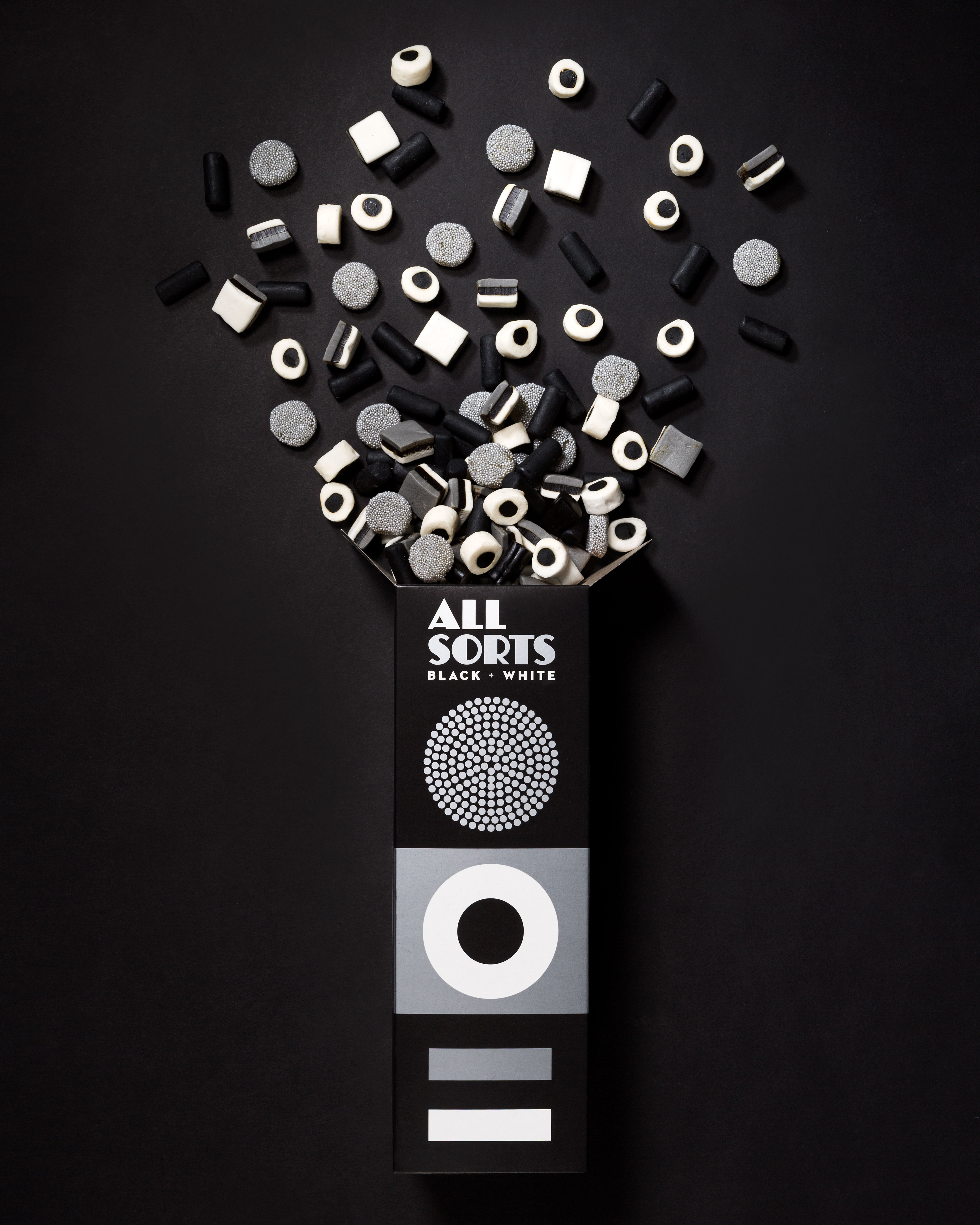
    Bond have worked with Cloetta before, designing the packaging for the Allsorts Originals Range, using bright, vibrant colours with simple geometric shapes against black-backed packaging.

    Using the simple but effective concept of the original packaging they have stripped away the colours to instead use black and white for the Limited Edition confectionery.

    You could even lose the text on the packaging and know immediately what you are looking at, it’s that effective, using simple shapes and lines to visually describe the contents in a way that photography never really could.

    Allsorts Black & White Edition Packaging Spotlight

    Allsorts Black & White Edition Packaging Spotlight

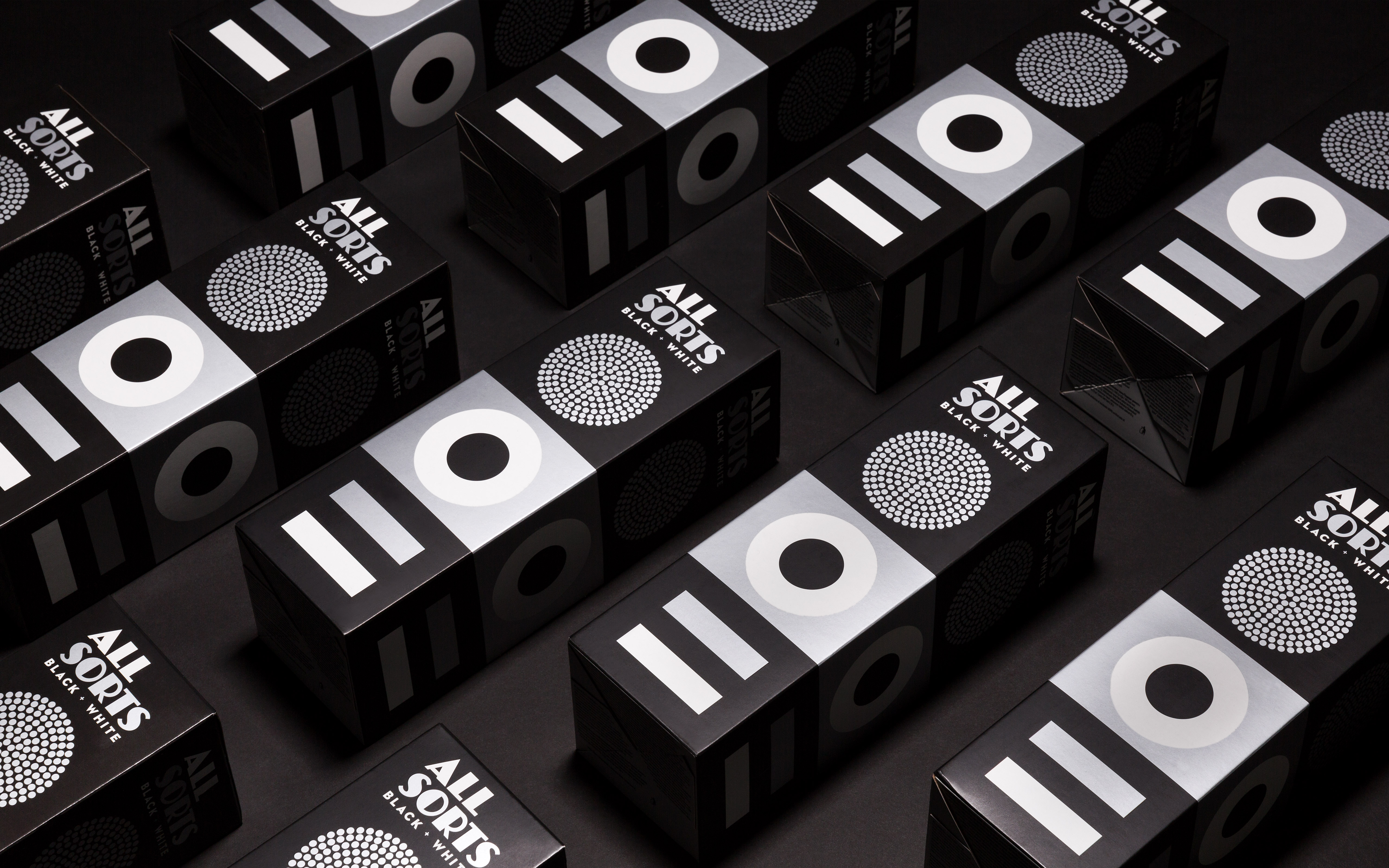
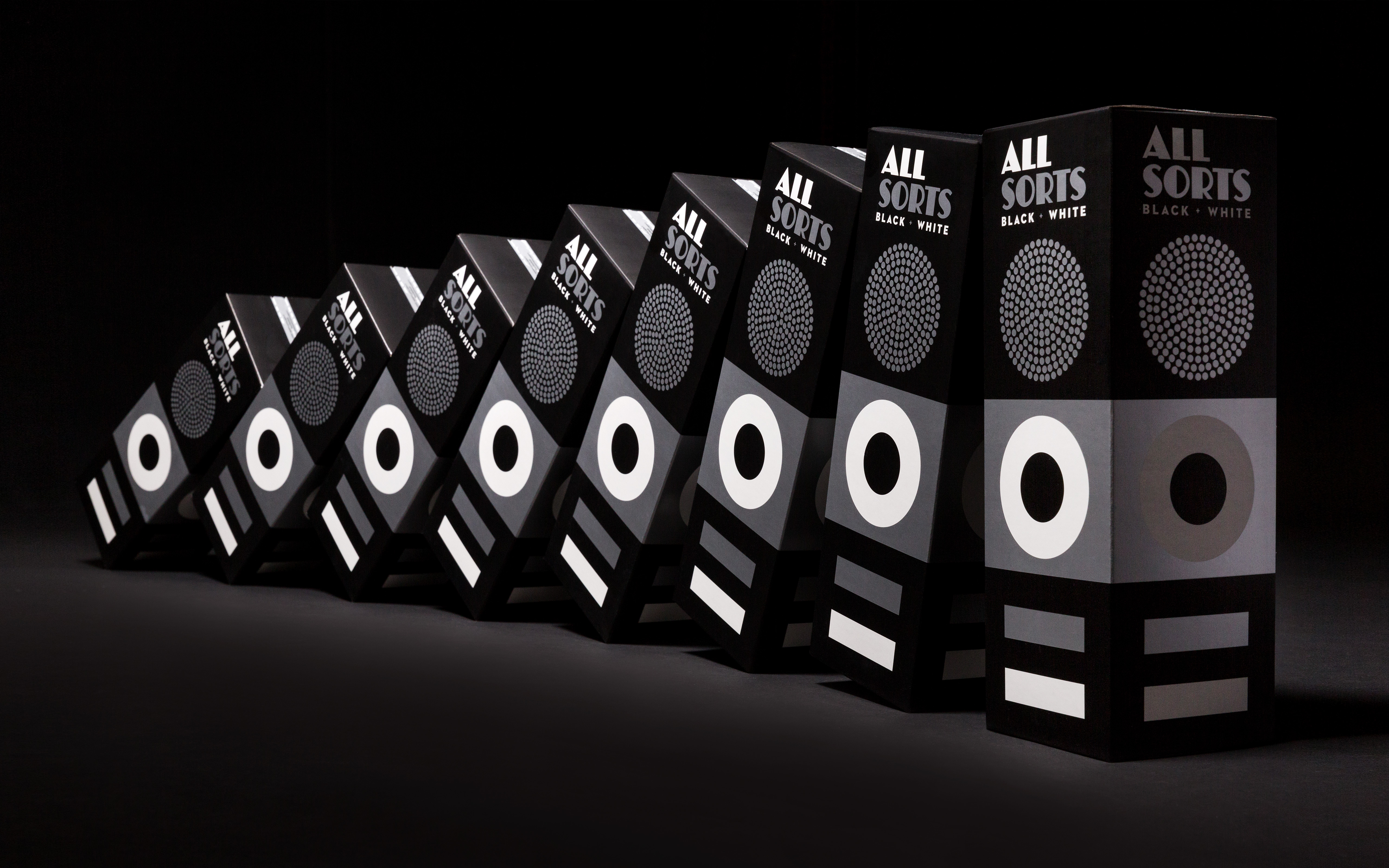
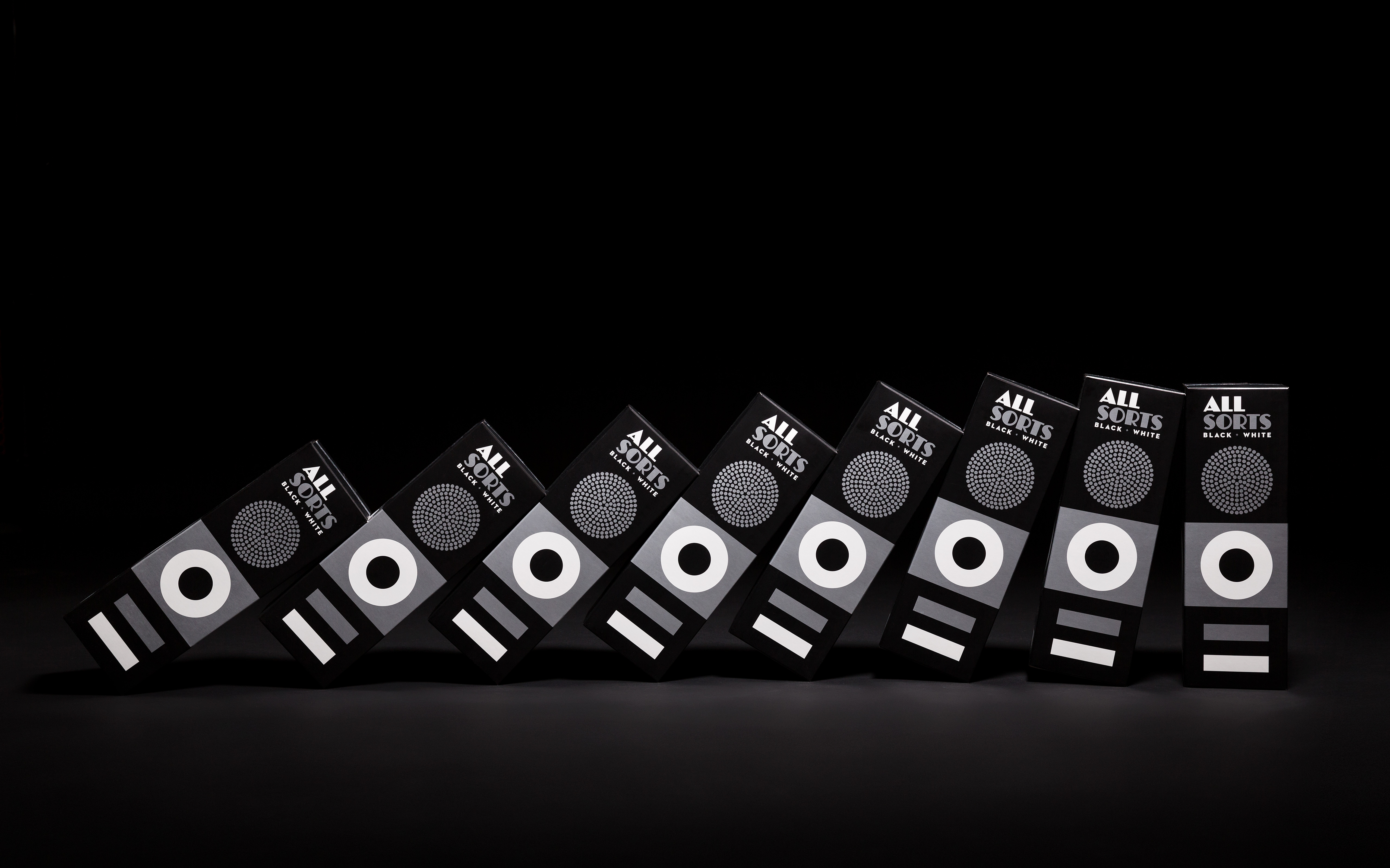
    The packaging concept used for the Original Range was simple, but it’s because of the simplicity and effectiveness it gave Bond the opportunity to re-use it by giving it a ‘premium’ feel. By swiping back colour when designing it gives the artwork a purity. When creating a concept it’s common for a designer to artwork in mono and I would guess that the mono version used for this packaging was probably the basis for the Originals Range to start with.

    The designers at Bond have used a concept that works and enhanced it. The silver ink used for the Allsorts packaging brings out the icons and makes the product one of quality. By a simple turn of colour the shapes blend from a high quality product to an exceptional one.

    Allsorts Black & White Edition Packaging Spotlight

    Allsorts Black & White Edition Packaging Spotlight

    Allsorts Black & White Edition Packaging Spotlight

    Are you impressed by Bond’s packaging for the Limited Edition confectionery? Let us know your thoughts in the comments below.

    Posted in Designer Spotlight, Inspiration
    BrandBrandingDesignDesignerGraphicgraphic designidentityLogoLogo DesignpackagingPrint DesignSpotlightTypographyvisual

    Post navigation

    YouTube Brand Spotlight
    Medium Brand Identity Spotlight

    Categories

    Interactive Email With Insights

    Weekly Blog Digest


    Best Logo Design Blogs

    Best Branding Design Blogs

    LOGO DESIGN NEWS

    Tweets by thelogocreative

    Video Converter

    mazzine.com


    The Logo Creative - International Strategic Logo and Brand Identity Design Studio

    The Logo Creative™
    Logo & Brand Identity Studio

    Part of The AJR Group™

    International Design Studio
    info[at]thelogocreative.co.uk
    Phone: +44 (0) 7807 085 003

    INSIGHTS FROM THE BLOG

    • Is Your Tech Undermining Your Brand? IT Fixes You Can’t Ignore 10/05/2025
    • What Is DLP And Why Should Your Brand Care In 2025 09/05/2025
    Copyright © 2025 The Logo Creative | International Logo Design & Branding Studio | ♡ In Loving Memory Dad (Ray Marriott) | The Logo Creative.
    Scroll to top
    Interested In Writing an Article To Be Featured On The Logo Creative™ ? Contribute!
    0000d
    0000h
    0000m
    0000s
    Coming Soon - Designer Interview With Von Glitschka View Previous Interviews