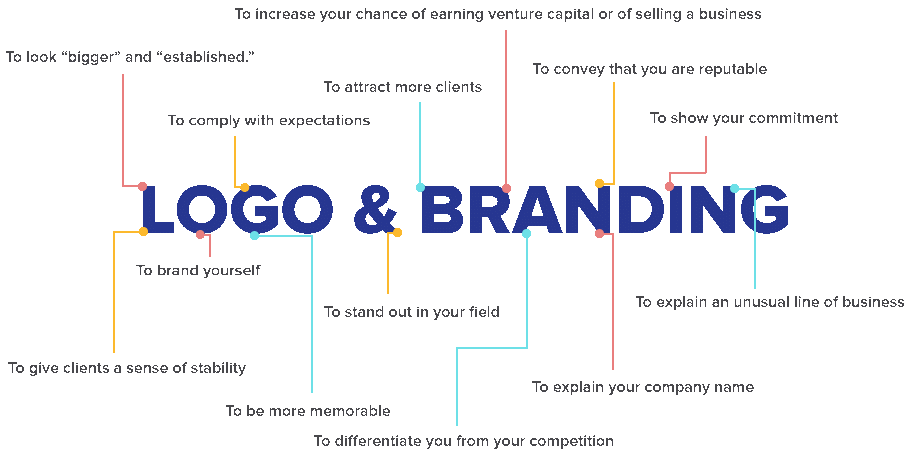
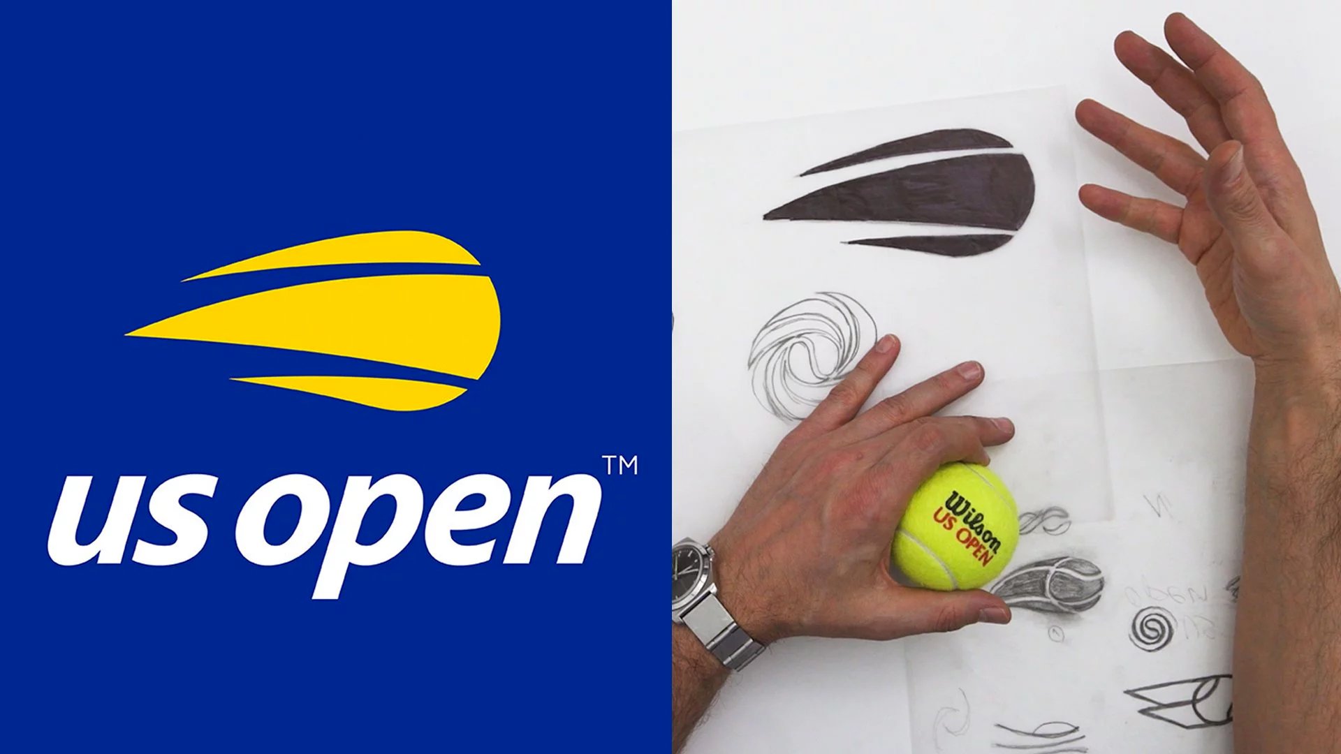
A logo is more than just a design; it’s the visual cornerstone of your brand.
Your logo is more than just a pretty design—it’s the visual cornerstone of your brand identity. Aligning logo design with brand strategy is crucial for building brand recognition and trust.
In this guide, we’ll explore how to create a logo that goes beyond aesthetics and aligns with your overall brand strategy, ensuring it resonates and encapsulates the essence of your brand identity while reflecting and communicating your brand’s core values with your audience.
Table of Contents
Why Brand Strategy Matters in Logo Design

Before diving into the design process, it’s important to understand why brand strategy plays a key role in logo creation. A brand strategy defines the long-term goals that will shape your brand’s identity, its values, and how it wants to be perceived by its target audience.
A well-thought-out brand strategy should provide a clear framework, guiding every branding decision—from the tone of your messaging to your visual identity.
Your logo is the face of your brand. When potential customers see your logo, they should instantly understand what your brand stands for. This is why aligning logo design with your brand strategy is so crucial. A logo that misrepresents your brand or is simply designed for aesthetic appeal can confuse or alienate your audience.
Understanding Brand Identity: The Foundation of Your Logo

Your brand identity is the collection of all brand elements that a company creates to portray the right image to its audience. This includes everything from your name and logo to your tone of voice and values. Therefore, your logo should be a distilled representation of your entire brand identity. A few things to consider when creating a brand-aligned logo are:
- Core Values: What principles does your company stand for? Whether it’s innovation, trustworthiness, creativity, or sustainability, your logo needs to reflect these values.
- Mission Statement: A strong logo should subtly reference your brand’s mission. For example, a company that focuses on eco-friendly products might incorporate earthy tones like greens and browns to convey sustainability.
- Target Audience: Who is your audience? Understanding their preferences and behaviour is essential in designing a logo that resonates with them.
Aligning Logo Design with Brand Strategy: Step-by-Step

1. Define Your Brand’s Core Message
Before designing a logo, get clarity on your brand message. What do you want your audience to feel or understand when they encounter your brand? The key to aligning your logo with your brand strategy is to make sure it reflects this message.
For example, if your brand represents innovation, your logo might include dynamic shapes or futuristic typography. A company focused on reliability and tradition, on the other hand, may choose a more classic design.
2. Choose the Right Colours to Reflect Brand Values
Colour psychology plays a critical role in conveying your brand’s message. Different colours evoke different emotions and perceptions, so choosing the right palette for your logo is important for brand alignment.
- Red often signifies passion, energy, and urgency, which is why it’s popular with fast-food companies and tech brands.
- Blue represents trust, professionalism, and dependability, often used by corporate entities like IBM and Facebook.
- Green evokes feelings of nature, health, and sustainability, making it a great choice for brands focused on eco-friendly products.
Ensure your logo colours align with your brand’s core values. This is a simple yet powerful way to reinforce your brand identity through your logo.
3. Select Typography that Matches Your Brand’s Personality
Typography can speak volumes about your brand, often before a potential customer even reads the name. A sleek, modern font suggests a forward-thinking brand, while a classic serif font can signify tradition and trust.
- Sans-serif fonts are typically seen as modern, clean, and approachable.
- Serif fonts tend to be more formal, classic, and trustworthy.
- Script fonts add an air of elegance or creativity.
The typography used in your logo should mirror your brand’s tone of voice and values. A luxury fashion brand might choose an elegant, cursive font, while a tech start up could go for a more minimalist, modern typeface.
4. Make Your Logo Scalable and Adaptable
A successful logo isn’t just about looking good—it needs to be functional across a variety of platforms and sizes. Your logo should be easily recognizable whether it’s on a large billboard or a tiny social media icon. To ensure scalability:
- Opt for simple, clean designs that are adaptable.
- Test the logo at different sizes and across various devices to ensure it remains legible.
- Make sure your logo looks good in both colour and black and white, as it will be used in various formats.
This versatility is essential for maintaining a consistent brand identity across all touchpoints, from packaging to digital platforms.
5. Incorporate Symbols and Shapes that Reflect Your Brand
The use of symbols and shapes in logo design can greatly influence how your brand is perceived. Different shapes evoke different emotional responses:
- Circles represent community, unity, and protection.
- Squares and rectangles signify strength, professionalism, and balance.
- Triangles are dynamic and suggest movement or growth, which is why they are often used in tech and finance logos.
Choose shapes that align with your brand’s message and values to ensure that your logo is communicating the right visual cues to your audience.
6. Focus on Memorability and Simplicity
A great logo should be memorable and easy to recognize at a glance. Logos that are overly complex can be difficult to remember and reproduce, diluting your brand message. Think of iconic logos like Apple or Nike—both are simple, yet they convey powerful messages that resonate with their audience.
In the design process, ask yourself:
- Is this logo easy to recall?
- Does it clearly convey what my brand is about?
- Will this design stand the test of time, or is it too trendy?
Memorability in logo design is a key aspect of effective logo and branding alignment. When your logo sticks in the minds of consumers, they are more likely to remember and engage with your brand.
Testing and Feedback: Ensuring Brand Consistency

Once you’ve crafted a logo that reflects your brand strategy, it’s time to test it. Show the logo to different groups, both internally and externally, to get feedback on how it’s perceived. Ask questions like:
- What emotions does this logo evoke?
- Does this logo align with the brand’s message and values?
- Is the logo easy to recognize and remember?
Collecting feedback will help ensure that your logo resonates with your audience and aligns with your brand identity.
Long-Term Considerations: Adapting Your Logo Over Time

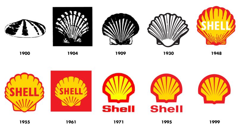
As your business evolves, so too might your logo. However, any updates should be done carefully to maintain brand consistency.
A logo redesign might be necessary when your brand’s values shift, but it should always be done with consideration to what the existing logo represents. Make sure the new design doesn’t alienate loyal customers by keeping key elements intact, while modernizing others.
Conclusion
Designing a logo that goes beyond aesthetics and aligns with your brand strategy is key to building a strong, recognizable brand. From choosing the right colours and typography to ensuring scalability and memorability, every design choice should be rooted in your brand’s core values and goals.
A logo is not just a visual element; it’s a representation of your entire brand identity. When done correctly, it will communicate your message, resonate with your audience, and stand the test of time. By aligning your logo design with your brand strategy, you ensure that your visual identity works in harmony with your overall business goals, positioning your brand for long-term success.
Further Reading:
- The Different Types Of Logo Design
- 10 Examples of Powerful Global Branding
- Learning from the World’s Most Famous Logos
- Best Global Rebrands and Logo Redesigns of Major Brands
- Unlocking the Magic of Logo Design: A Guide to Creating Memorable Logos
- Branding Beyond Borders: Elevating Your Global Presence through Impactful Logo Design
- Logo Design Trends to Watch Out for in 2023: Stay Ahead of the Curve!
- Most Expensive Logos In The World
- Every Good Logo Tells a Story! 40 Famous Brand Logos & Their Hidden Secrets
- Famous Logo Designers and Their Distinctive Style
- Using the Golden Ratio in Logo Design
- 20 Famous Brand Logos Constructed in Grid Systems
- 14 Design Principles of Good Logo Design
Join The Logo Community
We hope this article Beyond Aesthetics: How to Align LogoDesign with Your Brand Strategy has given you a better understanding of how to Align logo design with brand strategy. If you would like more personal tips, advice, insights, and access to our community threads and other goodies, join us in our community.
You can comment directly on posts, access our community threads, have a discussion and ask questions with our founder Andrew.
If you’re looking to learn more about brand strategy, we highly recommend eRESONAID with our friend and acclaimed brand strategist and author Fabian Geyrhalter, it’s packed full of knowledge and insights you will need to learn to become a brand strategist or apply what you learn within your own business.


