Skip to content
Home
Menu Menu
  • Home
  • About
    • The Logo Creative
    • Logo Design
    • Our Process
    • What’s Included
    • Testimonials
    • FAQ
    • Terms of Service
  • Contact Us
    • General Enquiry
    • Hire Me
  • Case Studies
    • Logo Portfolio
  • Blog
  • Community
    • Contribute & Advertise
    • Mindful Creative Insights
    • Logo Design Resources
    • Shop
    • Designer Interview
    • LogoTalk Podcast
    • Book Review: Logo Design
    • Designer Spotlight
    • Freelance & Marketing
    • Brand Spotlight
    • Famous Logos
    • Instagram
Blend Packaging Design by Siegenthaler &Cob

Blend Packaging Design by Siegenthaler &Cob

  • 16/02/201711/08/2017
  • by The Logo Creative
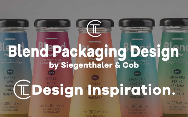
  • In this article The Logo Creative looks at some really nice branding and packaging design i stumbled across – Blend Packaging Design by Siegenthaler &Cob We tweeted about this earlier this month and it got some good likes and re-tweets so it’s definitely worth its own featured post for design inspiration and a job well done and the fact that i personally as McDonald’s would say “Im Lovin it!”

    Blend #Packaging #Design by Siegenthaler &Co

    Really love the colour bends, name goes well!https://t.co/zweIBP6u6P#colour #branding pic.twitter.com/QguuEKefOQ

    — The Logo Creative™ (@thelogocreative) February 5, 2017

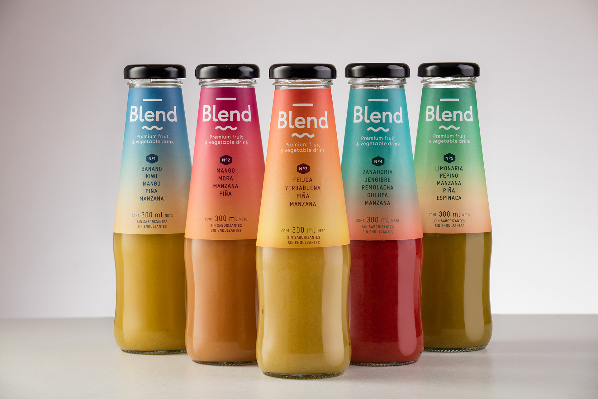
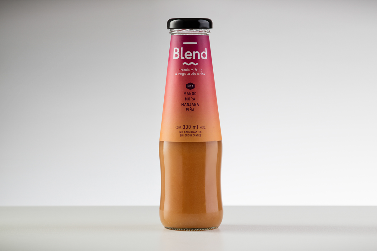
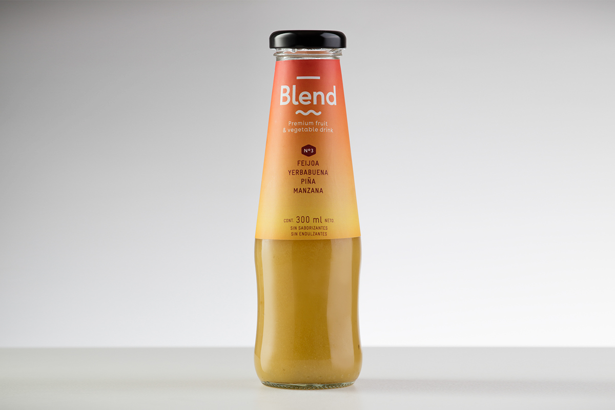
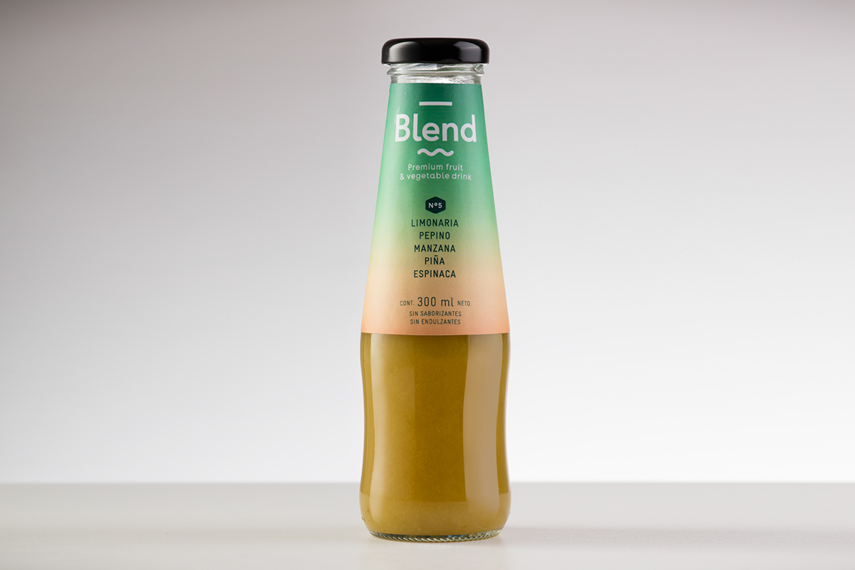
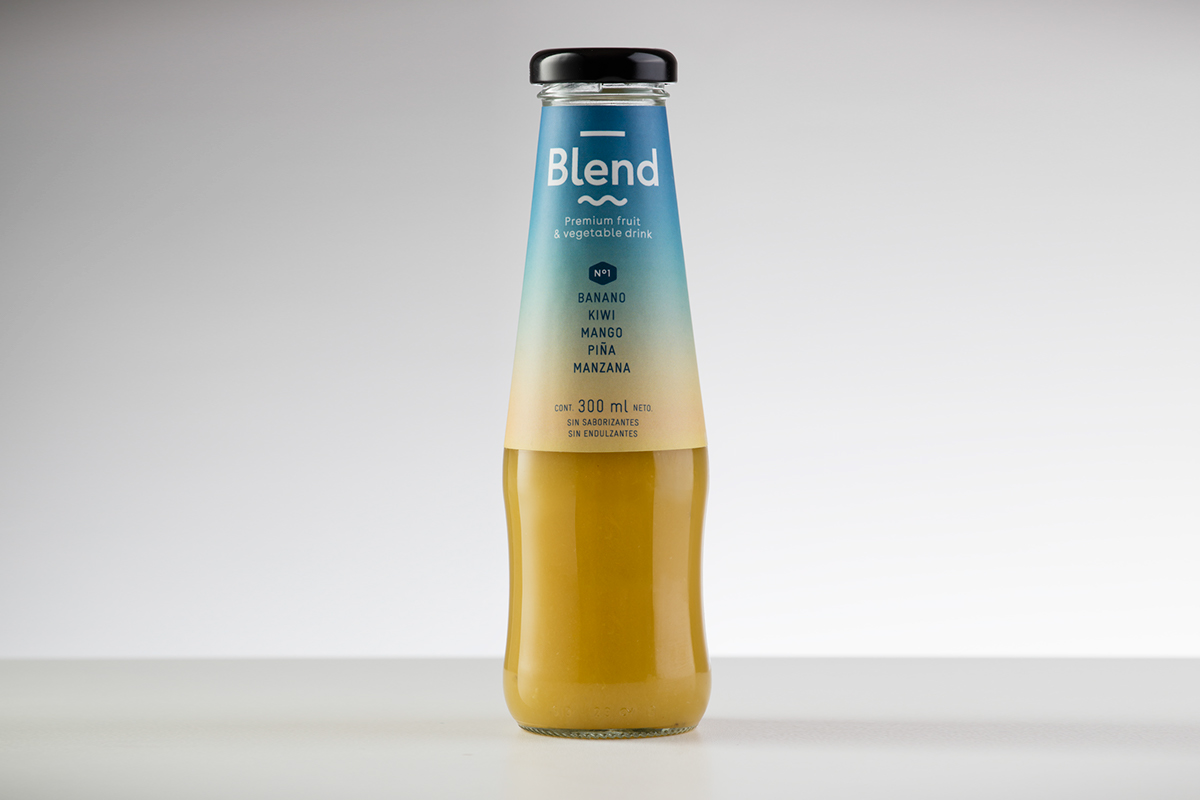
    “Blend is a premium quality fruit and vegetable drinks brand. Siegenthaler &Co a colombian design agency was responsible for this wonderful and very colourful branding and packaging design. The reason i love this design is how the name “Blend” really matches the powerful blend of colours they have created, its such a simple design that’s so powerful in its presentation and message.

    More packaging design via Behance


    S&Co Said

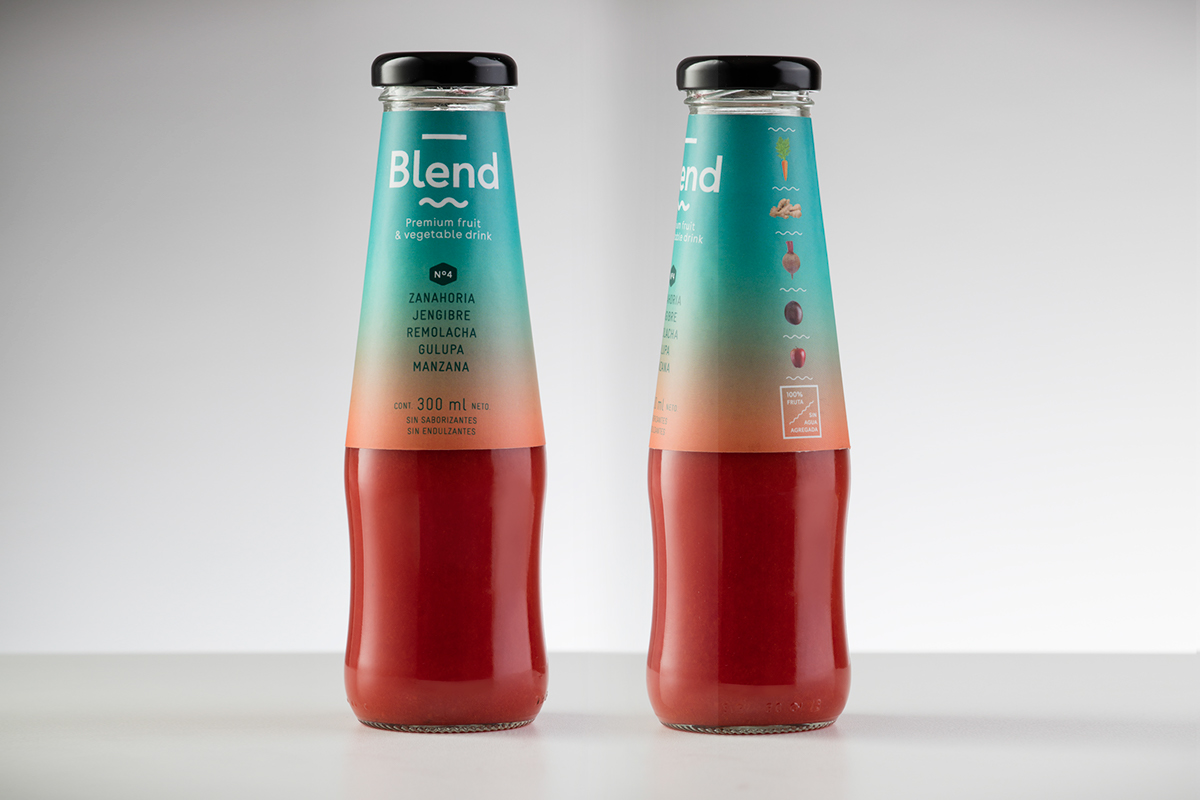
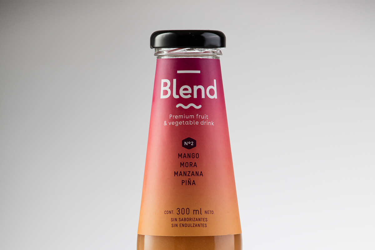
    We were asked to create a brand and packaging for a juice whose content was 100% fruits and vegetables, no flavourings or sweeteners and no water added. They are 5 different mixtures, inspired by the tropical flavors of Colombia.
    Drinking one of these juices means to us to be transported to the tropics, but we didn’t want to fall into the obvious way of illustrating the fruits. So we decided to represent the skies over the tropical sunrises and sunsets.

    More via Behance

    More packaging design via Behance

    More packaging design via Behance

    More packaging design via Behance

    More packaging design via Behance

    More packaging design via Behance

    More packaging design via Behance


    Posted in Branding, Designer Spotlight, Graphic Design, Inspiration
    BlendBrandingDesigndrinkfruitgraphic designidentityLogopackagingS&CoSiegenthaler &Cobvegetable

    Post navigation

    Brand Mix Illustrations By Mike Stefanini at Atomike Studio
    Top Study Resources for Cisco CCNP R&S 300-115 Exam

    Categories

    Interactive Email With Insights

    Weekly Blog Digest


    Best Logo Design Blogs

    Best Branding Design Blogs

    LOGO DESIGN NEWS

    Tweets by thelogocreative

    Video Converter

    mazzine.com


    The Logo Creative - International Strategic Logo and Brand Identity Design Studio

    The Logo Creative™
    Logo & Brand Identity Studio

    Part of The AJR Group™

    International Design Studio
    info[at]thelogocreative.co.uk
    Phone: +44 (0) 7807 085 003

    INSIGHTS FROM THE BLOG

    • Is Your Tech Undermining Your Brand? IT Fixes You Can’t Ignore 10/05/2025
    • What Is DLP And Why Should Your Brand Care In 2025 09/05/2025
    Copyright © 2025 The Logo Creative | International Logo Design & Branding Studio | ♡ In Loving Memory Dad (Ray Marriott) | The Logo Creative.
    Scroll to top
    Interested In Writing an Article To Be Featured On The Logo Creative™ ? Contribute!
    0000d
    0000h
    0000m
    0000s
    Coming Soon - Designer Interview With Von Glitschka View Previous Interviews