In this article The Logo Creative discusses Brand Awareness From an Early Age
I have been amazed lately by my three-year-old daughter Amelia as she can recognise certain brand marks (logos) she sees regularly. It all started when i got a new logo design book Marks of Excellence: The History and Taxonomy of Trademarks its full of brand marks and logo designs of famous well know companies.
Brand Awareness From an Early Age https://t.co/qZgwhdNcpL#branding #brand #ATsocial #design #graphicdesign #uksopro #logodesign pic.twitter.com/1HE5j0ZrdU
— The Logo Creative™ (@thelogocreative) April 20, 2017
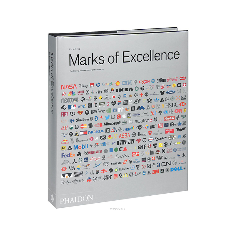
She asked if she could sit on my knee and look at the book with me so we sat together looking through the book when we turned to the page displaying the Shell Logo and she said “petrol” i was stunned at how she identified the brand mark with what it sells.
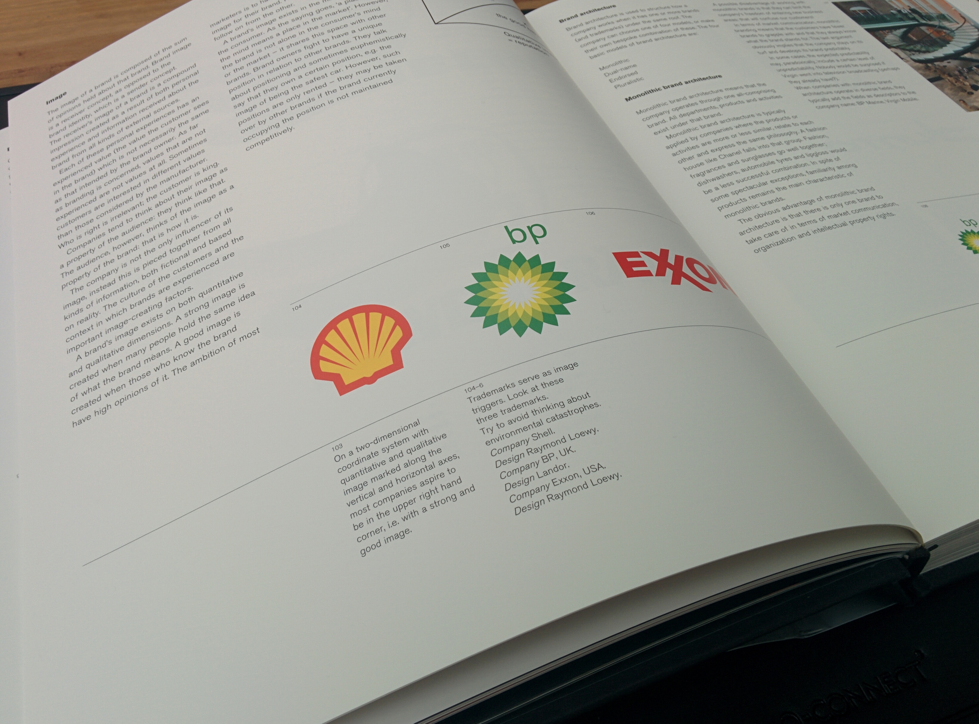
I said to her good girl what’s petrol for and she replied “For daddy’s car” I have a diesel her mummy has a petrol car but she still identified the logo with what it sells and at 3 years old I think that’s fantastic but it doesn’t end there.
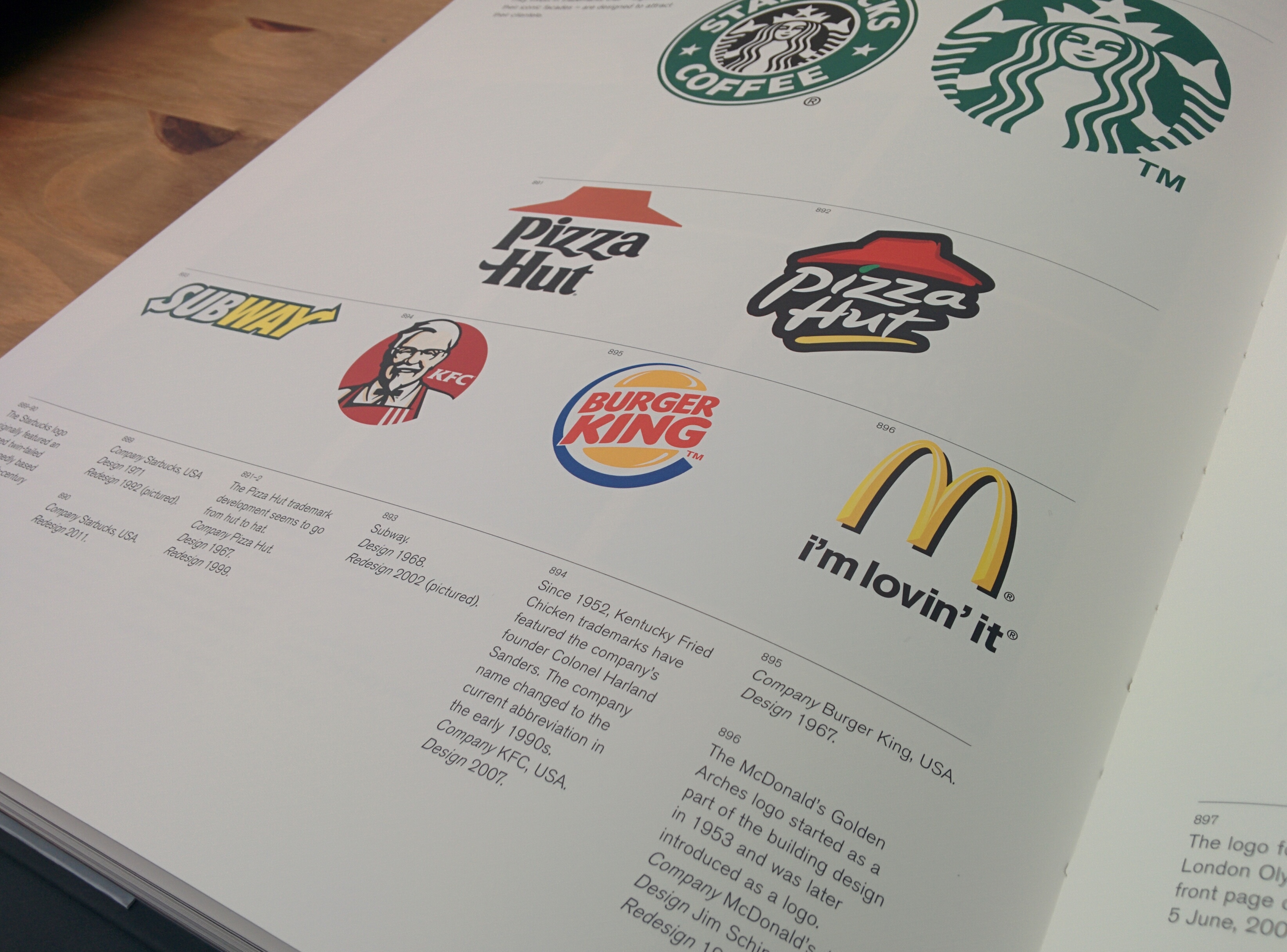
Another example is the McDonald logo she also recognised it in the book and said “Chippy Shop” and that’s where we get the happy meal from with the toy in it.”
When driving past a McDonalds she has said a few times that’s where the barbecue is referring to the beef burgers.
My daughter Amelia also has an iPad Air and whenever she sees the Apple logo she will say “iPad” and “my iPad has that apple”
I think it’s amazing how someone so young can recognise and remember logos without the ability to read? There’s a scientific explanation.
The sequence of visual perception
The science of perception examines how the human brain receives and processes sensory stimuli
We acknowledge and remember shapes first, colour comes second and thirdly form/words. While visual images are processed directly, processing language requires a more complex brain activity.
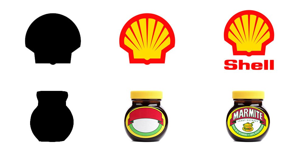
It’s not just a child’s brain but also an adult’s brain that follows the same sequence.
Over time and with constant repetition (advertising, marketing, PR, graphic design, word of mouth, etc.) the logos of successful brands become recognisable and convey their message at the speed of light. For example, if I see a round green mermaid logo on a busy street I will know that it’s Starbucks – where fresh coffee is sold. The bright red and yellow shell logo will tell me that I can fuel my car.
I don’t know if you’ve noticed, strong brands such as Starbucks, Shell, Apple and Nike have removed the logo-type from their logos.
Simplified brands
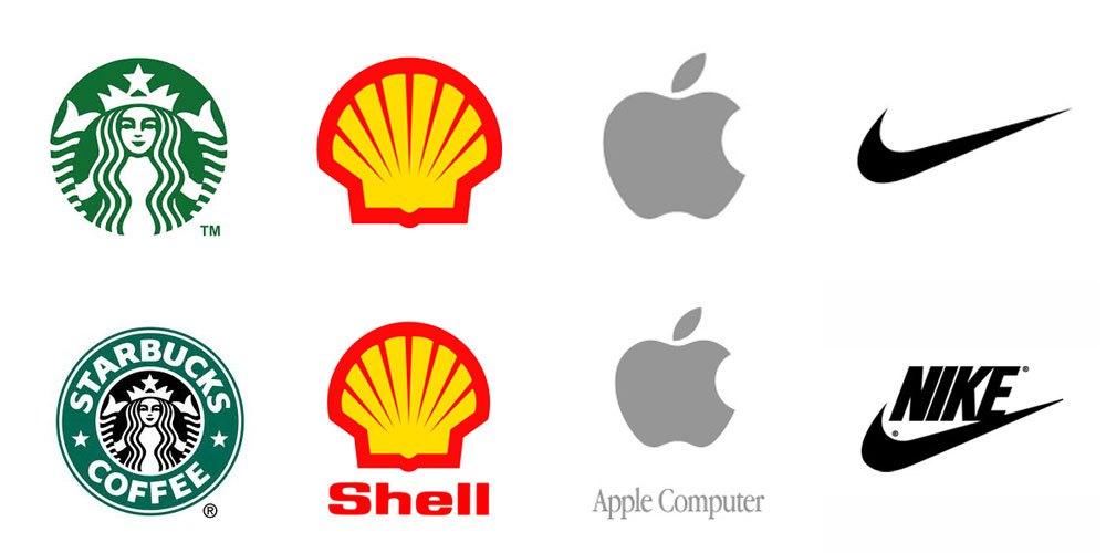
They’re known all over the world, even by children! And a simple strike of the Nike swoosh is enough to communicate everything about the company.
Understanding how the human brain processes visual stimuli gives brand identity designers insight into what works best when it comes to managing our perception, for example, using colour theory to create emotion and express personality of a brand.
How about your logo? What does your logo tell your audience about your business? What are the first three things that come to mind? Do you think that your logo represents your brand and lets your audience know who you are?
If your like me and you love logo design and branding be sure to follow me on twitter where i share all the latest news and insights.

