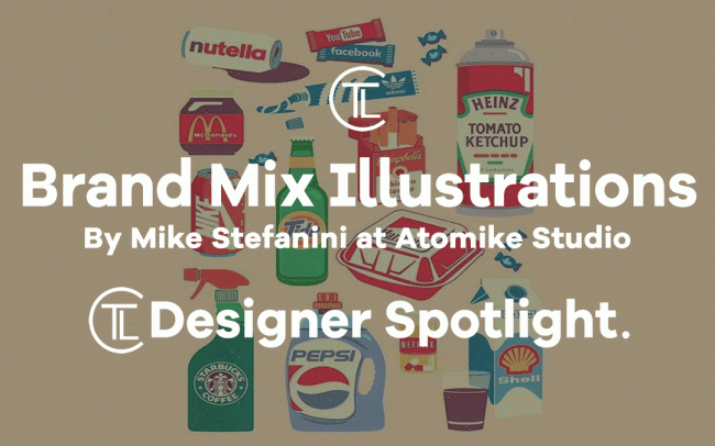
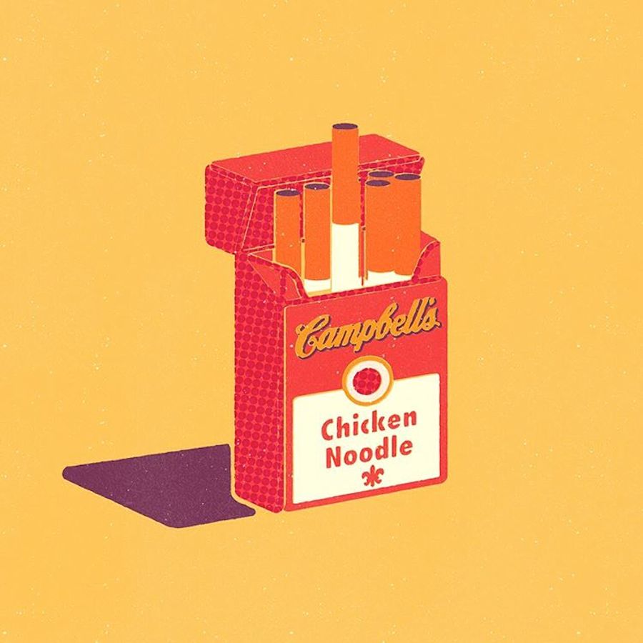
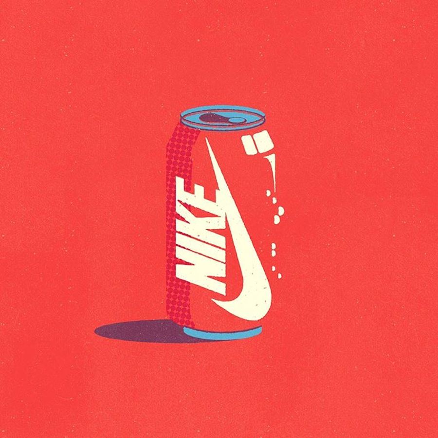
In this article and Designer Spotlight The Logo Creative takes a look at Brand Mix Illustrations By Mike Stefanini at Atomike Studio who is a french illustrator and Graphic Designer and with his project Atomike Studio he has uniquely designed a bunch of illustrations that question consumer habits Logos are indeed drawn on products which are totally different from the real one. A Coca-Cola can therefore sees its paint ornamented with a Nike logo, a toothpaste tube is decorated with an Adidas sign, and samewith Pepsi, Heinz, Starbucks and McDonald’s. An original way to convey the therapeutic aspect of Netflix or the addictive one of some fast-food restaurants?
Can you imagine Drinking a can of Nike bushing your teeth with Adidas, spraying an aerosol can of ketchup on your chips or better still lets pour Pepsi in the washing machine, I even like how Netflix has been displayed in a tablet tub to give off the impression that its addictive or to convey the theraputic aspect of Netflix as you can relax while watching and this makes you feel better.
I personally love what has been done here and it deserves a designer spotlight from me.
Mike Stefanini: “Almost inadvertently I had approached the design of a Coca-Cola can of the Nike logo… I found it nicely subversive, so I decided to apply this principle to other consumer products…”
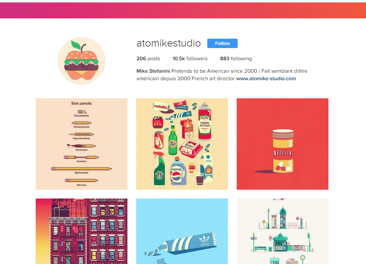
You can also check out Mikes Instagram account which is very colourful @atomikestudio


