As part of our collaboration with Birmingham-based digital design agency KIJO, we’ve delved into the world of ironic typography. This imaginative, often hilarious project can really get your creative juices flowing as you try to come up with disconcerting combinations of messages and fonts.
Table of Contents
What Is Ironic Typography?
Ironic typography is an entertaining concept that lets you say one thing but subvert it in the way it’s presented.
Sometimes the aim is just to create an amusing juxtaposition of form and content. Imagine the term ‘Lad’s Night Out’ written out in bright pink, glitter-speckled lettering and you’ll be on the right track.
A similar effect can be achieved with the phrase ‘Ice Cold’ etched in a flame-wreathed font, then overlaid on an image of a tropical beach. It’s all about setting up expectations and knocking them down in one fell swoop.
Sometimes the intention is to draw attention to problems within the industry as a whole. Craig Ward’s 2008 poster for Buckinghamshire New University is a great example of this, emblazoning the phrase ‘Bad Typography Is Everywhere’ in red across the common design motto ‘Good Typography Is Invisible’.
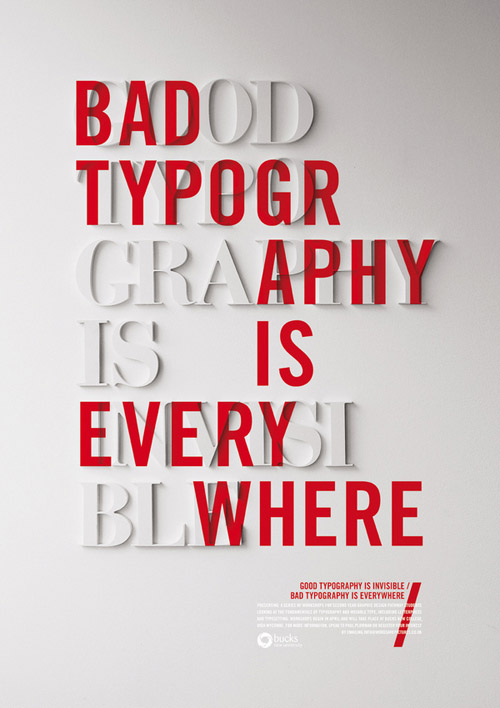
This shows the true power of ironic typography; it can make you laugh, but also make you think. At its best, it goes much deeper than the surface simplicity suggests.
The Aim Of The Collaboration
The main reason that we are collaborating with KIJO is to help draw attention to some of the exceptional design work which is going on in the digital sector at the moment. Talent is worth celebrating and you might not always have the opportunity to receive recognition for your skills.
It’s great to work with people that inspire you, and you can learn a lot just by getting together and tackling problems from a fresh angle. Sometimes it’s useful to get that creative spark from elsewhere, rather than sticking to the safe and narrow.
We also want this collaboration to appeal to other designers and creatives, influencing your own thinking and challenging your assumptions with innovative ideas. So if you have a few logic-twisting interpretations of ironic typography knocking around, feel free to submit them to us.
KIJO Creative Design
Over at KIJO, their lead designer Mike came up with a concept which epitomises the idea of ironic typography.
He took an artistically shot monochrome snap of two ballet dancers mid-performance. But rather than adding text which relates to their elegance and grace, he splashed the word ‘Trashy’ across the top.
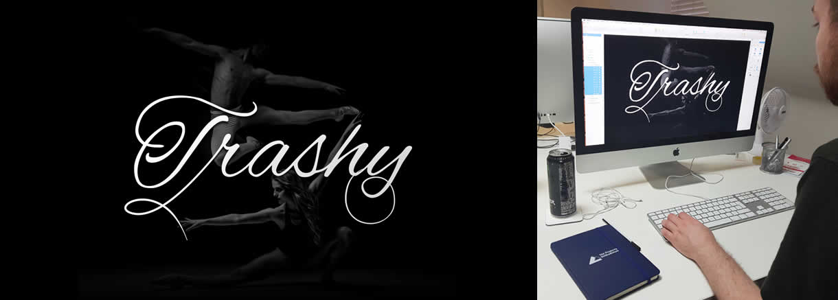
What makes this truly ironic is that the typography is curly, cursive and completely at odds with the message that’s being conveyed. In fact, it’s a double dose of irony, with the inclusion of the image enhancing the impact of the accompanying text.
You can watch Mike work through this concept in a cool time-lapse video which lets you see how other professional designers can put their own unique mark on an initial concept.
The Logo Creative Design
We brainstormed a couple of interesting takes on the idea of ironic typography for this collaboration, both of which flips the script on message and presentation.
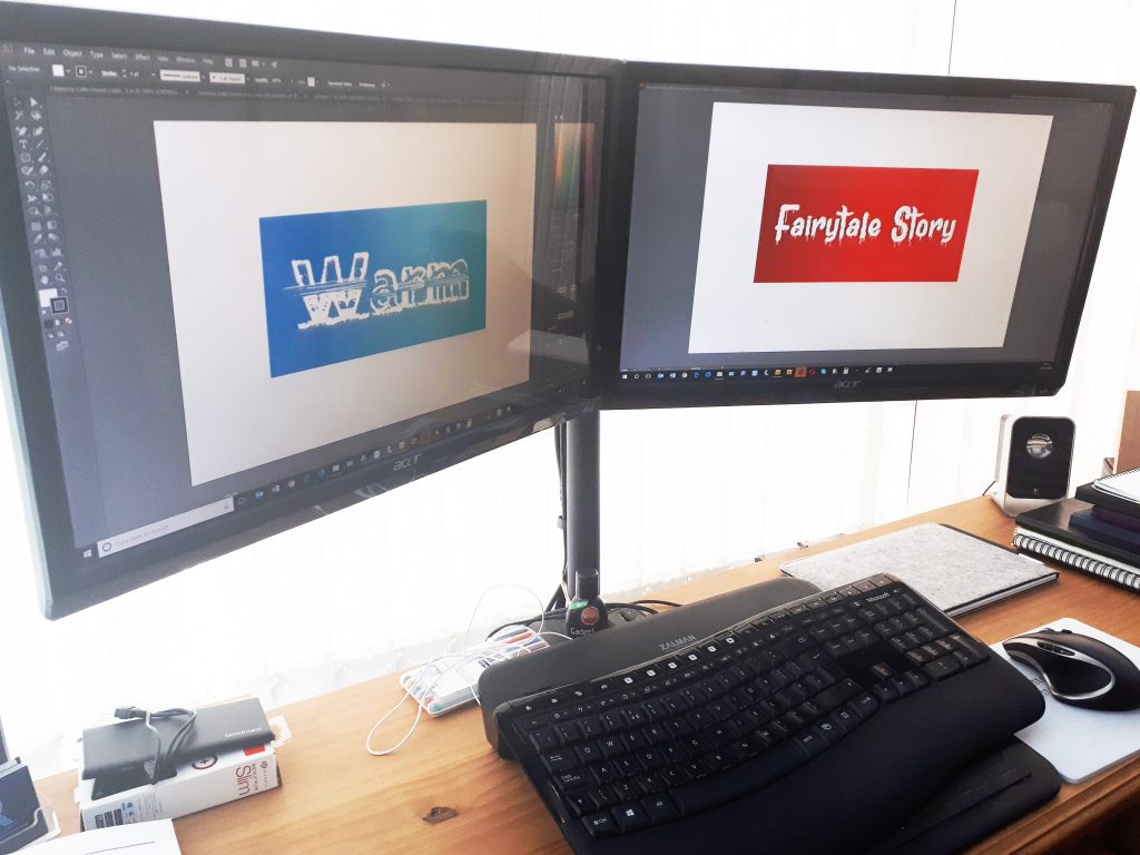
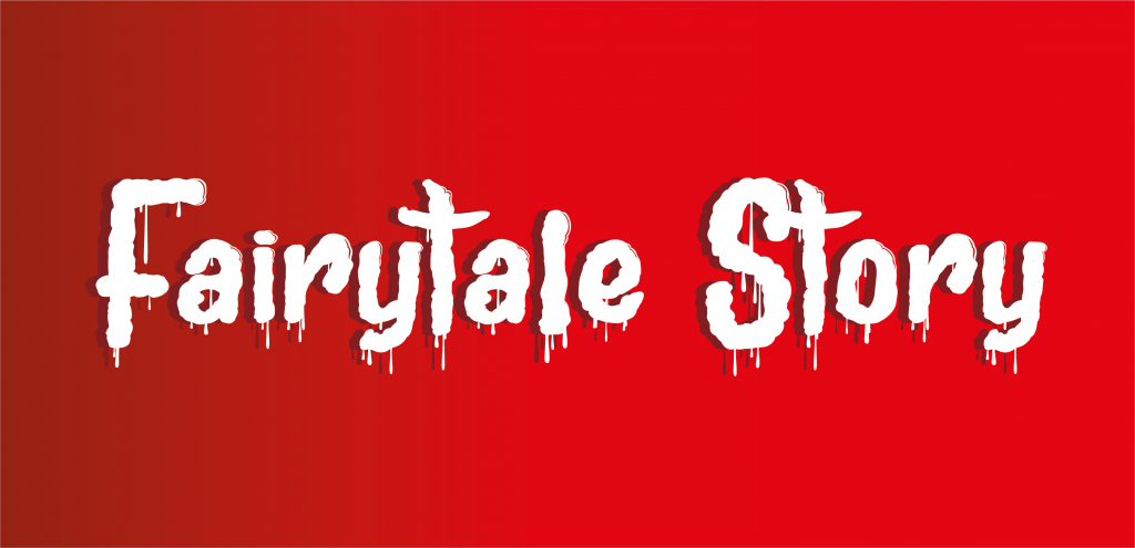
First up is ‘Fairytale Story’, a phrase that might usually be associated with doe-eyed damsels and dashing princes. Instead, we chose a gore-slathered typeface to modify and set it against a deep red background which looks more like something from a poster for Friday the 13th.
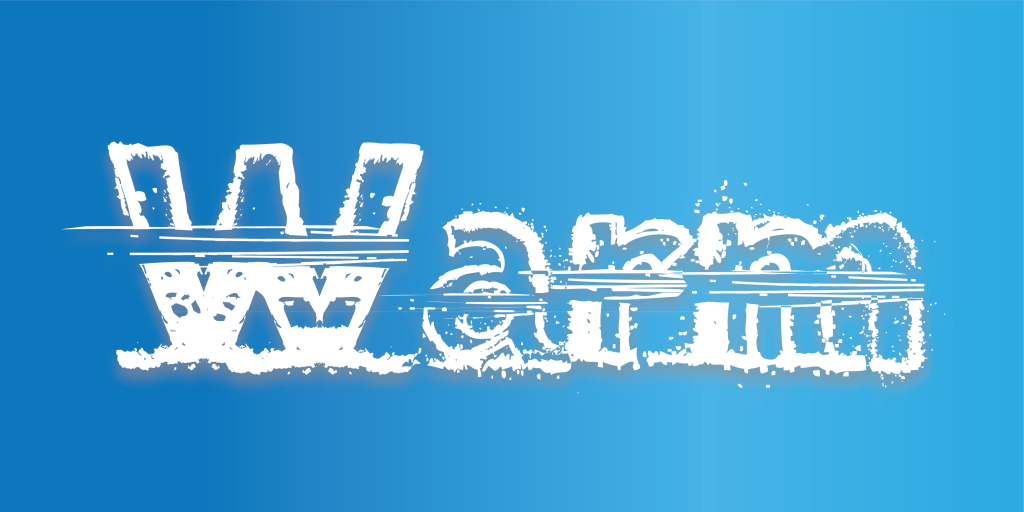
Next is ‘Warm’, a word that brings to mind roaring fires and steaming cups of coffee. When written in a snow-smeared wintry modified typeface, the effect is quite jarring. It draws attention to how much typography can influence and engage the viewer’s senses.
These are two examples that should give you a good grasp of what ironic typography is all about. Use them as a jumping-off point and you should be able to find lots more combinations that will amuse and engage in equal measure.
Attention All Designers! Get Involved
This project is open to everyone, whether you are a solo designer with an eye for the ironic or a digital design agency with a few unique ideas up your sleeve. Get creative and send your ironic typography designs to mark@kijo.co.
You’ll be joining forces with some of the brightest minds in the industry at the moment. We’re hoping to receive submissions from lots of different logo designers with varied aesthetic sensibilities, so don’t be shy. The KIJO team will be checking out all of the entries and picking the best ones to showcase in a few months.

