In this article, we will be discussing the Common Logo Mistakes in Brand Identity Design. If I was to ask other logo designers what their biggest irritations were with logo design I’m pretty sure they would all come out with quite a few similar ones.
In this article, I thought I would mention a few which I feel affect logo design the most and can basically make a very poor logo design.
Table of Contents
Suitability
Now how often do I see logos that I’ve been designed because it’s what the business owner likes?
I’ve lost count of the number of times I’ve seen this happen, yes it’s your business and you want to like the logo you have which is selling your products and services but the logo is not for the business owner the logo is to attract new customers so your logo should be designed for the consumer.
What you need to do is study who your business is targeting, find out where they hang out what they like and need and how do they spend their Social time.
By building up a picture of your perfect customer you can build a brand identity that specifically targets them. Yes you want to sell your products and services to as many people as possible and having a target and being very specific you’ll have more success with that type of person and you will get residual sales from other people who may be the logo isn’t specifically targeted at but by building an audience then you will start to build your brand sideways creating a solid and wider foundation for growth.

By creating a logo which is designed just for you as a personal preference then it’s going to be precisely that just for you, it’s not going to help you attract and build a customer base so if you’re a designer designing a logo for a customer or your hiring a logo designer make sure that the logo is designed and aimed at the audience and not for the business owner.
Bitmap vs Vector
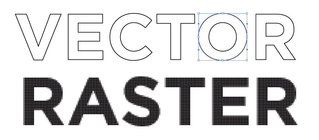
The second issue is designing a logo as a bitmap, if you design your logo as a bitmap graphic it’s going to look great at the size it was designed, but if you need to make the logo bigger for signage purposes or for going on the side of a vehicle you’re going to have issues because the bigger you make bitmaps them the Lower the quality will be as they start to get all pixilated and blurred you can go smaller that would be fine but if you want to go bigger that’s not going to happen!.

You need to make sure that when you have your logo designed that it’s a vector graphic which will be an E.P.S. file designed in Adobe Illustrator or other vector based software like coral draw something like that because with a vector graphic you can resize it to any size you want, the size of the moon if you like! and it would not lose any quality.
Even if it’s a very small size of a stamp it’s still going to remain sharp and you’ll only need that one file as it can be sized/scaled and saved for whatever you want. With a bitmap graphic if you want different sizes then you will need to create the file at different sizes so it’s a lot more work involved as well, so it’s vitally important to make sure when you’re having your logo designed that you specify you’d like it to be designed in a vector file format. Here at The Logo Creative, all our logos are designed as a vector graphic.
Complexity
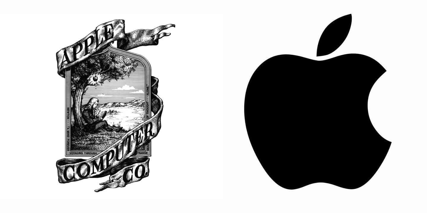
Another issue is making your logo design far too complex with too much graphic detail, So just imagine that you get your logo designed and it looks great, it’s got everything you want on there but if you want to make your logo very small how do you think that complex logo is going to look? it’s going to be really difficult to make out all of that detail at very small sizes.

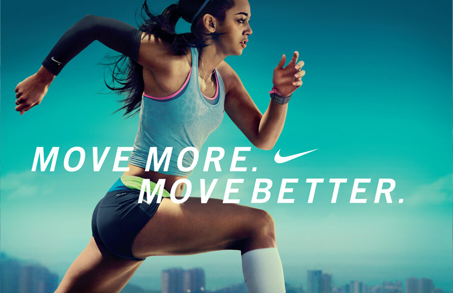
Ideally, your logo should be simple think about all the big brands, for instance, look at Nike and Apple they’re all just so simple! so think simple as simplicity is key! when you’re having your logo created try not to overcomplicate things try to scale down your brand identity to its simplest form and then you could always get in the more complex messaging through your marketing you don’t have to get everything into the logo It doesn’t have to say exactly what you do all in one place.
Get something which is going to be recognizable works well on a page or on a screen and you can build around it.
Stock Images
Using stock images and clip art in your logo and this isn’t something that a professional logo designer would do for there client… well at least I hope not! but you will find that if you go to some of the competition type websites for logo design or cheaper options like Fiverr then you run the risk of the designer using stock clip art or stock images for your logo design and they will download the stock images and add some text to them and pass on to you who is none the wiser and you’re happy!… you love it!… you think it looks great and you want to start using it.
The problem is stock images have very tight guidelines and one of those guidelines is that you cannot use stock photography as part of a logo to trade off so please double check that when you’re having your logo designed that the designer is creating your logo from scratch.

* These images were created for the purpose of this article
Now even from scratch, you want to make sure that they’re not copying someone else’s artwork or a piece of stock because that’s just as illegal. It’s going against copyright if they have that trade marked you’re in serious trouble and you could end up being fined for a serious amount of money, so make sure when your logo is being designed that it is completely one hundred percent original!.
I know not all cases are deliberate copying, but it does happen and this is why professional logo designers do their research and more than likely its already been done before and its a professional designers job to make it original.
DIY Logos
Just take a moment to think about this ok so if you need a repair to your car engine then you go to a professional car mechanic!, or you need repairs carrying out on your property then you go to a qualified trades professional who can handle those jobs for you!.
If you need something designed you use a professional designer! it’s what we’re trained for you may be thinking you’ve got Microsoft Word and paint and you can knock together the design and that will suffice but really you don’t value your brand at all by doing that!.
It may be quick and yes it will certainly be cheaper but you’re just damaging your business image and reputation, you should really be taking the advice and services of a professional designer who will make sure that what you end up with is exactly what you need, there’s a difference between wants and needs but they will make sure they give you what you need for your brand.
Please don’t be tempted to tinker away yourself if it’s not your professional career!
 * These images were created for the purpose of this article
I’d say the same also for using places like Fiverr and competition websites those tend to be populated by amateur designers and you will run into some of the problems which I’ve already mentioned previously because the mijority of designers on there are not entirely up to the grade of creating a professional logo design so please just think carefully before you jump in and try and create your own logo or go down the cheaper route of something like Fiverr.
Reach out and contact a professional designer they will be more than happy to chat with you to find out what it is you’re looking for and give you a quote and let you know what the benefits are of using them as opposed to someone who doesn’t quite know what they’re doing.
That’s a few common mistakes in logo brand identity design there are a lot of others and I’m sure they will have been covered in previous articles and more to come in future article on the site as we explore the world of logo and brand identity design, but if you steer clear of these issues that I’ve mentioned in this article you’re off to a really good start and your brand identity is going to Look awesome!


