When it comes to logos, you want to create a design that feels original, fresh, and relevant. You want a logo that feels both on-brand and on-trend – not generic and dated.
But what is “trendy” these days? What 2017 logo trends are here to stay? And which should you embrace to create a logo that’s not only trendy, but can withstand the test of time and carry your brand into 2018 and beyond?
Here are seven logo trends in 2017 that are showing no signs of slowing:
Table of Contents
Less is more (colour, that is)
Have you heard the old saying “Less is more?” Well, that saying definitely rings true when it comes to logo design in 2017.
More and more brands are going with a minimalist color palette and featuring one or two colors in their logo. Taking this reductionist approach to color works on multiple levels; first, keeping your palette to one or two colors is less visually overwhelming to your audience. And second, using fewer colors can actually make your logo appear to have MORE color (funny how that works!). Because this trend keeps the number of colors in the palette to a minimum, each color makes a bolder statement; since it doesn’t have a thousand other colors to compete with, each color really gets the opportunity to shine.
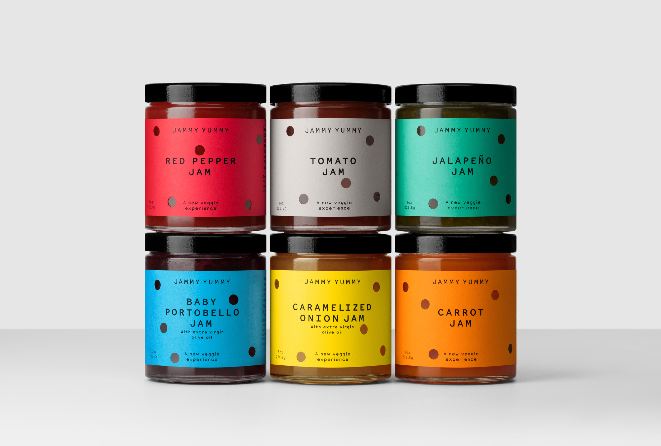


So, how do you apply this “less is more” trend to your own business, branding, and logo design? While it can be tempting to try to squeeze your entire brand color palette into your logo, it’s not always necessary. Sometimes, less color can actually have more of an impact.
When designing your logo, experiment with reducing the number of colors in your design. See if you can create a big impact by letting fewer colors shine. Remember – there will always be opportunities to incorporate color elsewhere (like your website and print material), so when it comes to your logo, keep the colors simple.
Throwback designs
When it comes to trends, everything old will always be new again.
People love throwbacks, and when you incorporate old-school design into your logo that warm, fuzzy, nostalgic feeling they get when they look at your design will transfer to warm, fuzzy feelings about your brand.
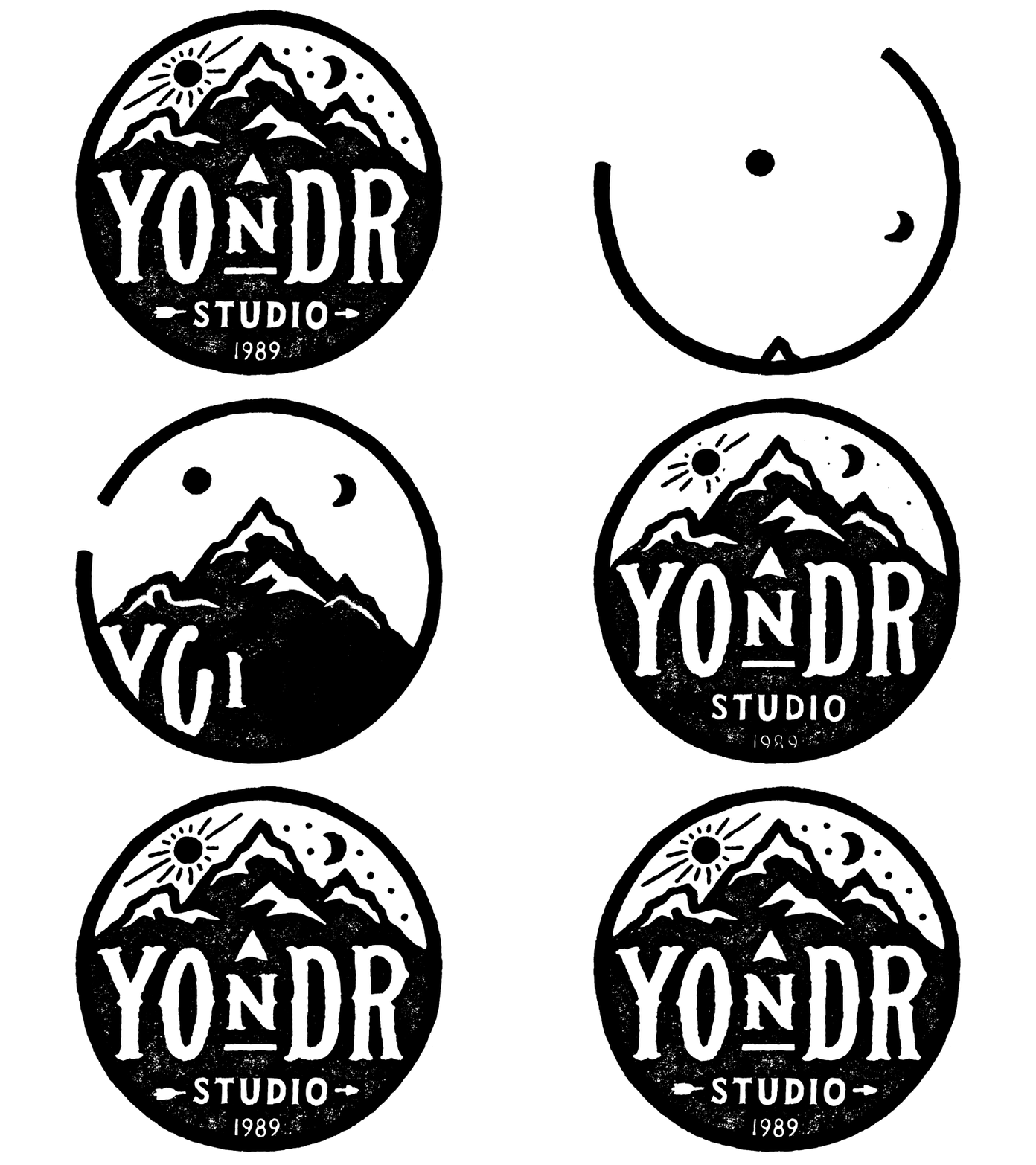
The most popular type of old-school design in 2017 is emblem logos; these designs look like stamps, which were a popular design and branding tool long before the days of Photoshop.
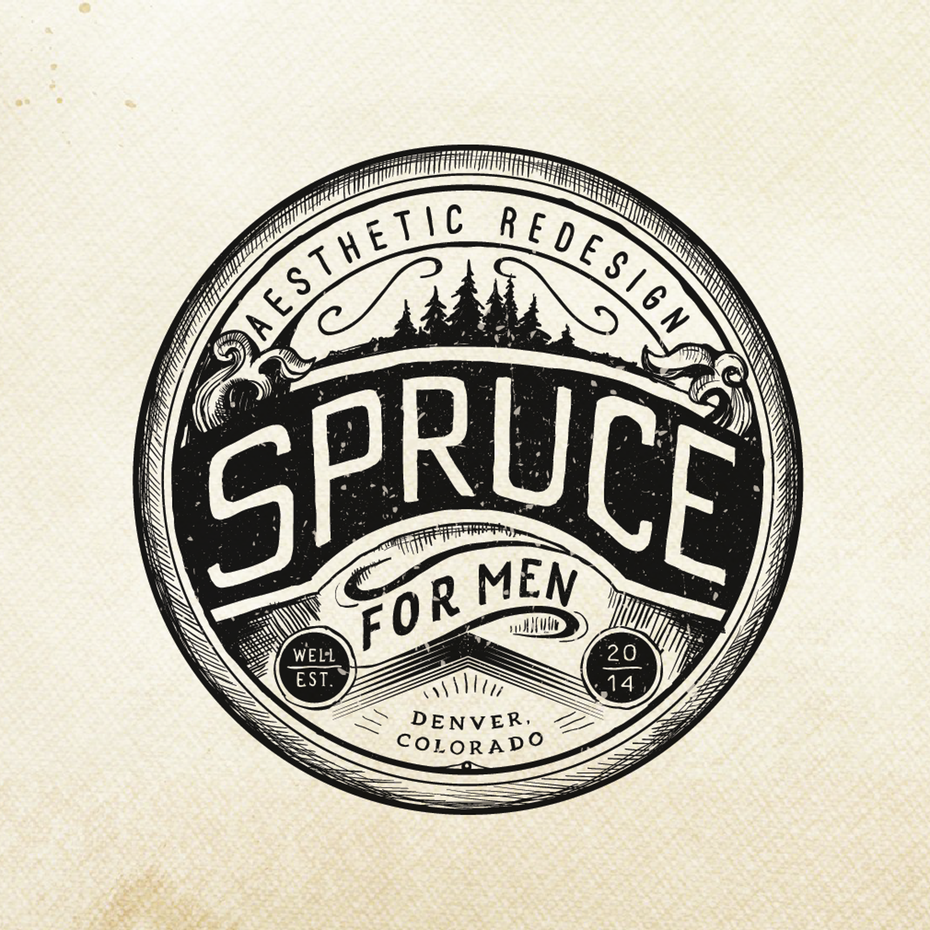
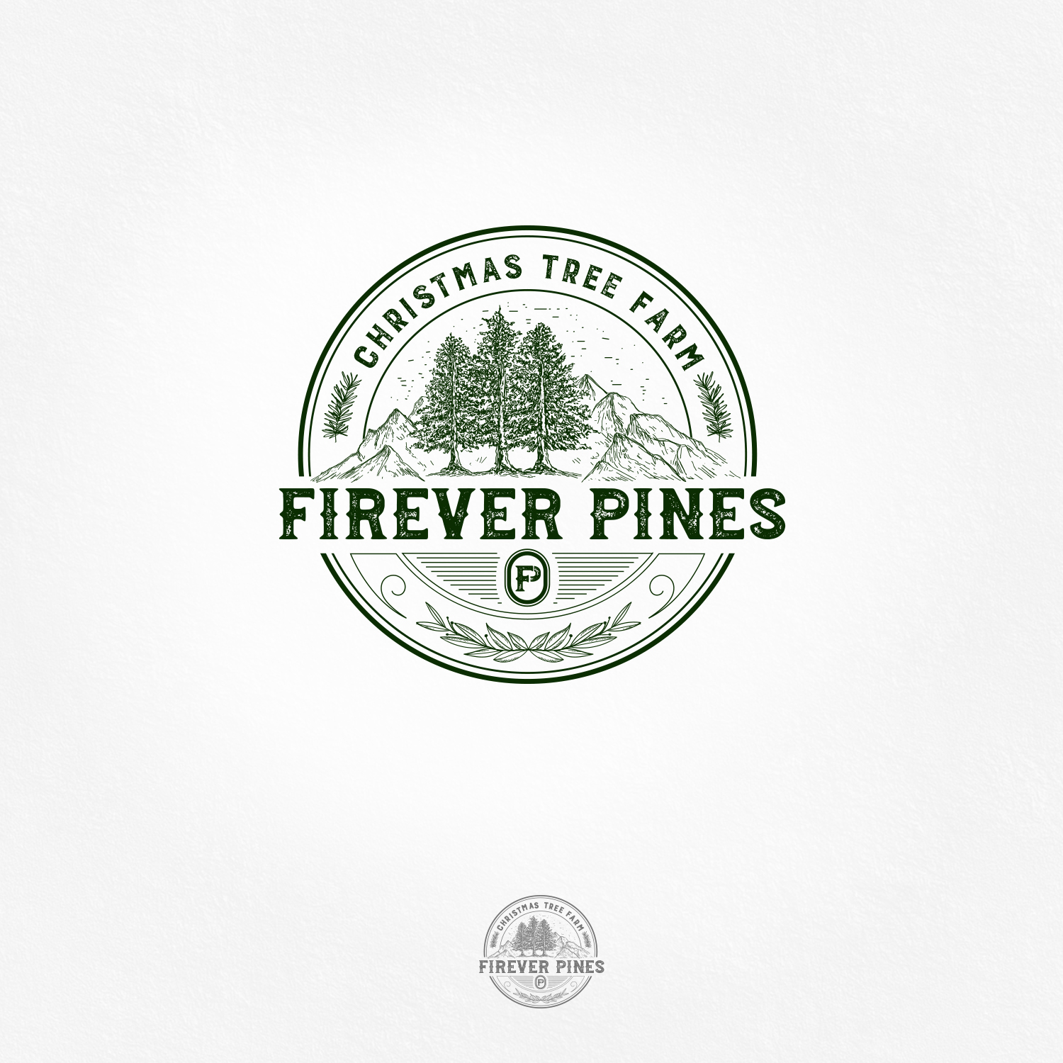
If you want to play on people’s nostalgia in your branding, consider an emblem logo. Design a logo that looks like it could have been stamped onto your website using an old-school press. By taking this throwback approach, not only will you bring up feelings for nostalgia, but you can also position your brand as more authentic; since you’re bringing up a more authentic era with your design (oh, the good old days before Facebook!), people will look at your brand as more authentic as well.
Geometry
Now, to be fair, geometric logos are pretty timeless. But this trend continues to evolve each year as designers create logos that are new, innovative, and push the boundaries of what’s possible in contemporary design.

Incorporating geometry into your logo design is a great idea if your brand image is sleek, contemporary, or modern.
GIF-based
GIFs have been around since the dawn of the internet (remember “Peanut Butter Jelly Time?”). But while these moving images have primarily been used for creating hilarious memes, 2017 has shown an increase in brands using GIFs in their logo design.
Creating a GIF-based animated logo allows you to shift and move the elements of your logo, creating an interactive, dynamic experience with your audience.
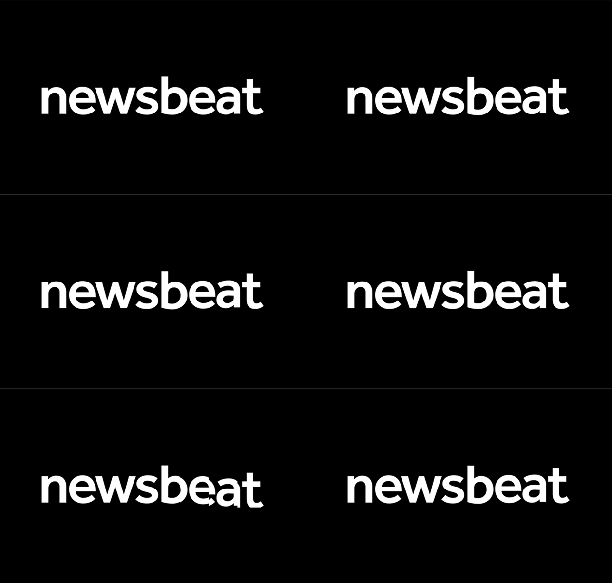
If you want to be on the forefront of cutting-edge logo design – and create a fun, interactive experience for your audience – a GIF-based logo could be the way to go. Just make sure you also design a static logo for print collateral.
Broken letterforms
Just because something’s broken doesn’t mean it needs fixing. And that is certainly the case in broken letterforms.
Broken letters are clean, sophisticated, and much easier to read and understand than more abstract lettering. This fits in with the overall 2017 design trend of simplicity or, in other words, “simple = better.”
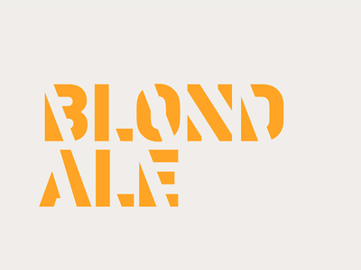
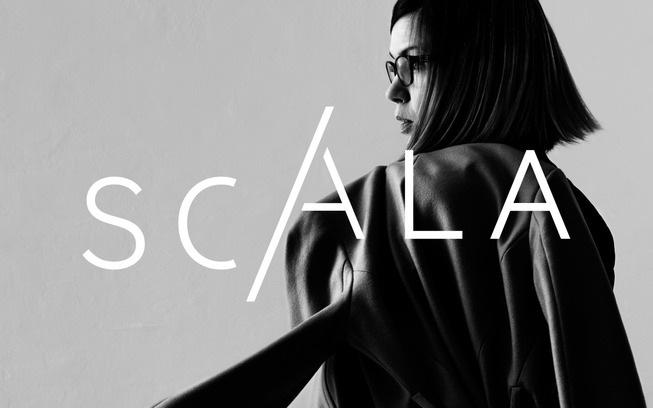
If you want a logo that shows your audience your sleek and sophisticated, try switching things up and using broken letter typography.
Have fun with typography
Logo design is a serious business…. but it doesn’t need to be serious all the time. One of the biggest trends in logos in 2017 is incorporating a little fun into the design – particularly in the typography.
Incorporating different elements like graphics and font rotation into your typography can give your logo a whimsical, youthful feel that’s sure to connect with your audience (at least the fun portion of your audience).

If you want to position your company as youthful and fun, why not hop on this trend and play around with your typography?
Logos drawn by hand
There’s something about a hand-drawn logo that’s just… well, cool. Translating hand-drawn artwork to the computer used to be a real hassle, but recent advances in technology (like tablets that let you drawn right on the screen) has made it significantly easier for designers to create digital creations with a hand-drawn feel. Using the hand-drawn technique will give you a more real, “human” feel that your audience is sure to love.
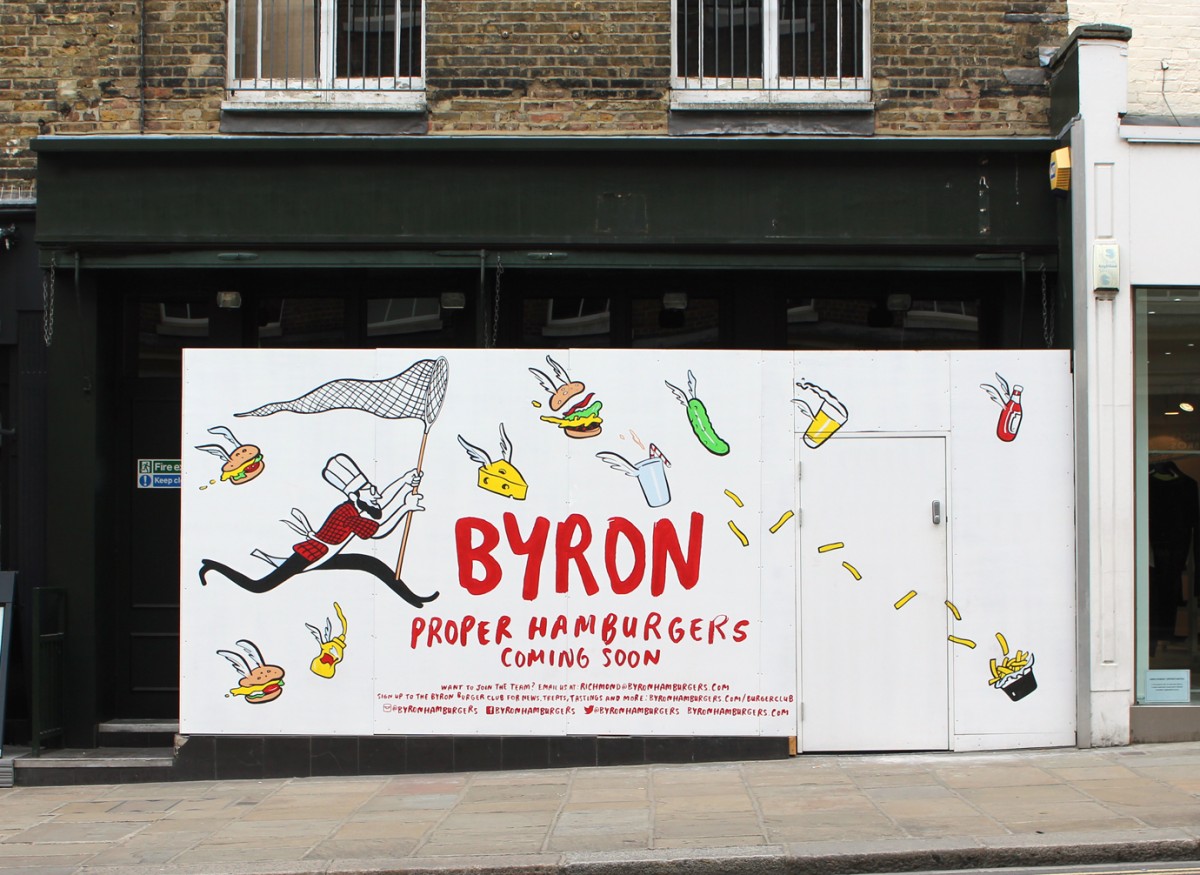
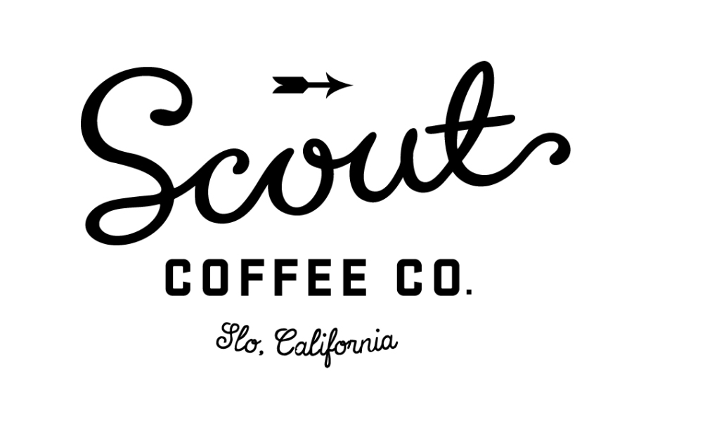
While digital design has come a long way, it can never fully capture the hand-drawn feel. If you want to lend a “real” vibe to your logo design, have your designer draw if by hand.
Keeping with the times
Embracing logo trends is a great way to create logo designs that feel fresh, innovative, and timely. But never sacrifice who you are – your brand identity – just to jump on a trend.
And remember: great design? That never goes out of style.

Author Bio
Kelsey Bryant leads 99designs‘ Designer Marketing team. Born and raised in a small town in Connecticut, she moved to San Francisco in 2009 with a degree in Communications from Elon University. When she’s not working with the designer community, you can find her exploring the city, taking weekend road trips, and soaking up that California sunshine.

