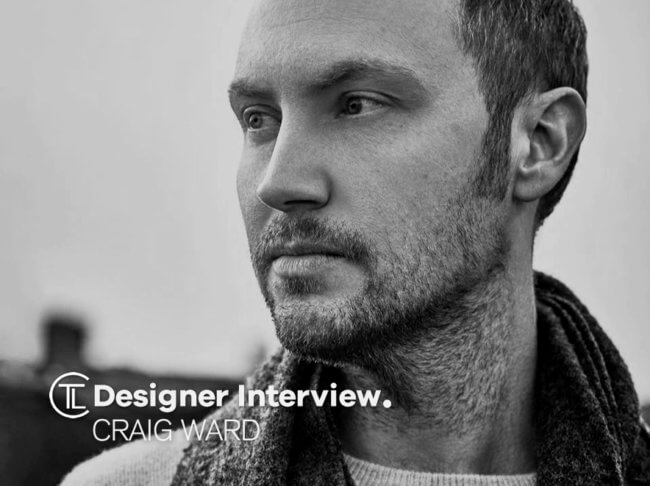
We have a Designer Interview With Craig Ward who is a British-born designer and creative director based in New York; he is an occasional artist; and the author of the book Popular lies about graphic design. – Book available on Amazon – UK, US. Craig is better known for his pioneering typography work.
Fascinated by the process and concept of words and images, Craig established his own design studio in New York in 2011 after stints as head of design at grey (NY) and agencies based in London, UK, including the likes of CHI & Partners and MCBD.
Some of Craig’s previous clients include Calvin Klein, Adobe, Aesop, Google, Hennessy, Nike, Macy’s, Gillette, Peugeot, The New York Times, Wired, the V&A Museum, Mulberry, Dockers, and (RED).
Craig’s work has been recognised by the ADC, the TDC and One Show, among others, as well as being exhibited globally – including at The Museum of The City of New York, The Cooper Union, the Hammer Museum in Los Angeles, Colette in Paris, Minneapolis’ Walker Art Center and London’s Conningsby and A Foundation galleries to name a few.

Craig was named one of the most important designers of all time in 2015, and in 2018 he created a custom typeface for the England World Cup kit in Russia.
As a regular public speaker, Craig has been a guest at Adobe MAX, Soho House, the Apple Store, AIGA, TEDx, and the OFFF Festival in Paris as well as a variety of colleges and universities.
The Logo Creative – Hi Craig thanks for taking part.
Craig Ward – Thanks for the interest Andrew, happy to take part… fire at will.
The Logo Creative – What was the turning point in your life when you decided to become a designer and how did you proceed?
Craig Ward – Back in 1999 I was supposed to be going to university to study journalism. I was on a work placement at my local newspaper when I met my first graphic designer who worked for the printers – I’d never even heard the word typography prior to that but I was fascinated enough by watching him work to defer my university application by a year and take a foundation course in Design.

The Logo Creative – What does your day consist of?
Craig Ward – My day is pretty much bookended by being a dad and anything I can accomplish in-between is a bonus. I consider myself very fortunate to be able to be around so much for my kids, and if I need to fire up my laptop in the evening every now and then it feels like a small price to pay.
The Logo Creative – Are you a morning person or night owl and is there a reason why?
Craig Ward – Definitely morning, even though I wish I weren’t. I’m usually up pretty early – around 6/6:30, I find it helps to get a drop on the day before everyone else is up. Nice coffee, read the news… Lovely.
The Logo Creative – What was the first logo you ever designed?
Craig Ward – The John Lewis Partnership credit card in 2003 while working at a now deceased agency called CHI & Partners (my first job out of university). It looks like they just relaunched it after their recent refresh and it went terribly, I think it’s no longer available?
The Logo Creative – What is your favourite logo you have designed?
Craig Ward – Maybe the logo for Calvin Klein’s CK2 fragrance – it’s so simple — serendipitously I was just able to draw a number 2 perfectly over the top of the ‘c’ into the lower leg of the ’k’.

The Logo Creative – What’s the best logo you’ve designed that the clients DIDN’T go for?
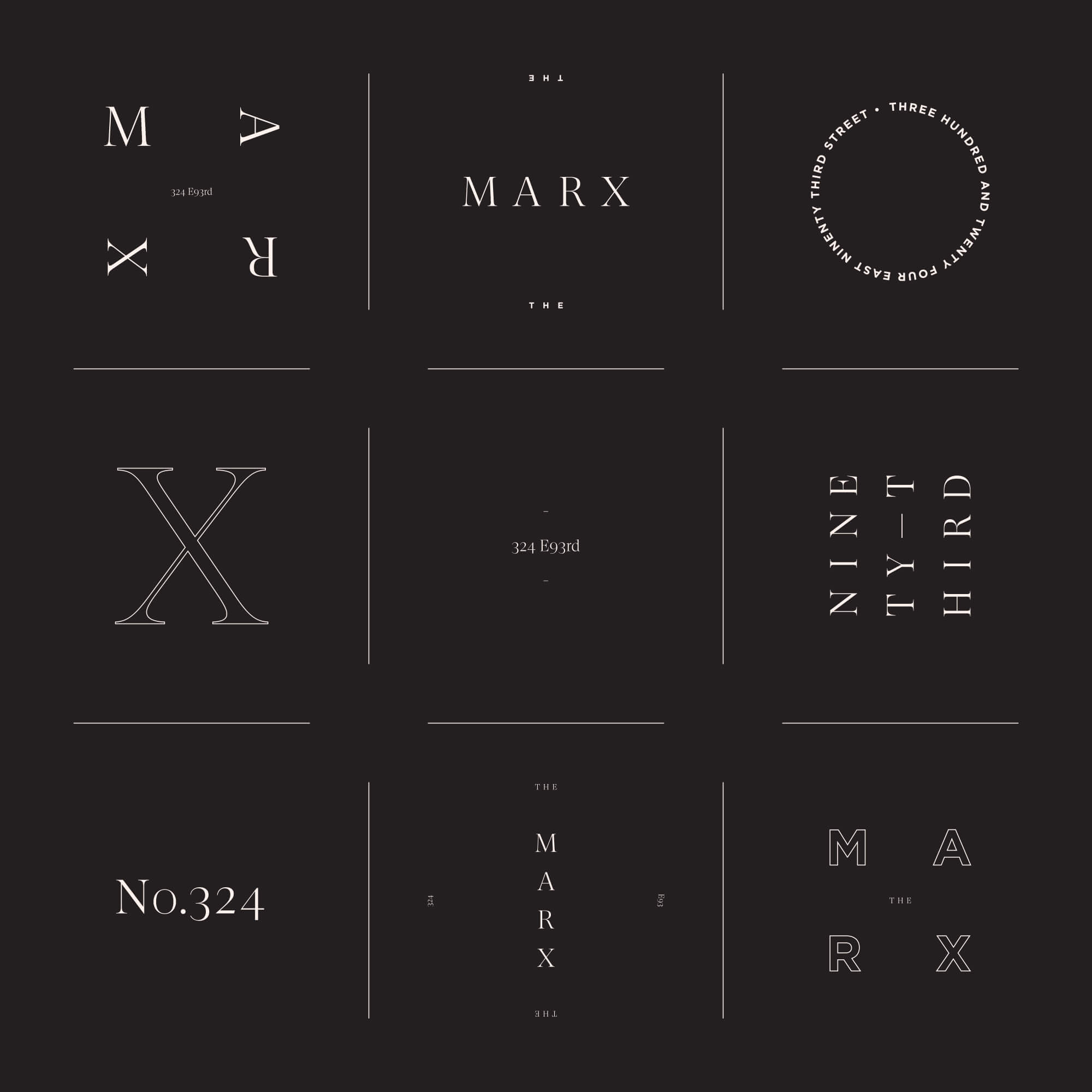
Craig Ward – I’m not sure if it’s the best but I really liked an identity I created for a property development on the Upper East Side in New York last year. It was a bit of a leap for such a traditional industry — they really just wanted ‘a logo’ — and this was much more of a system and maybe a little hard to get their head around.
The Logo Creative – What is your favourite logo of all time?
Craig Ward – I don’t know actually. I always enjoy seeing the Maersk logo as it’s very classic to the point of being old fashioned, and feels like it’s only ever seen 10ft high or larger. I’ve never seen it small (except in the distance), but even so I know it would scale down well because of it’s simplicity.

I think it also inspires something in me so it’s by association – I really love shipping yards and container depots etc, they’re such cool places. Everything is so heavy. What’s in all those boxes and where are they going / coming from?
The Logo Creative – Can you describe or give us an overview of your logo design process?
Craig Ward – It’s probably not so different to the way a lot of designers operate but it’s almost always reductive – starting with shapes and words or letterforms and seeing how much can be taken away while still retaining the core of it. Simplify and symbolise as Alan Fletcher said. I prefer to work with type more than iconography also.
The Logo Creative – What brands do you most admire and how do they influence your creative thinking?
Craig Ward – I’ve worked extensively with Aesop and I really admire their clarity of thought and simple presentation – less is always more with them and they try to distill the essence of concepts to the point of abstraction while never losing their message. I was given the opportunity in 2019 to write their global style guide which was amazing – and surprising that they’d never had one and formalized the brand in that way.
The Logo Creative – What do you consider your most successful design project, and why?
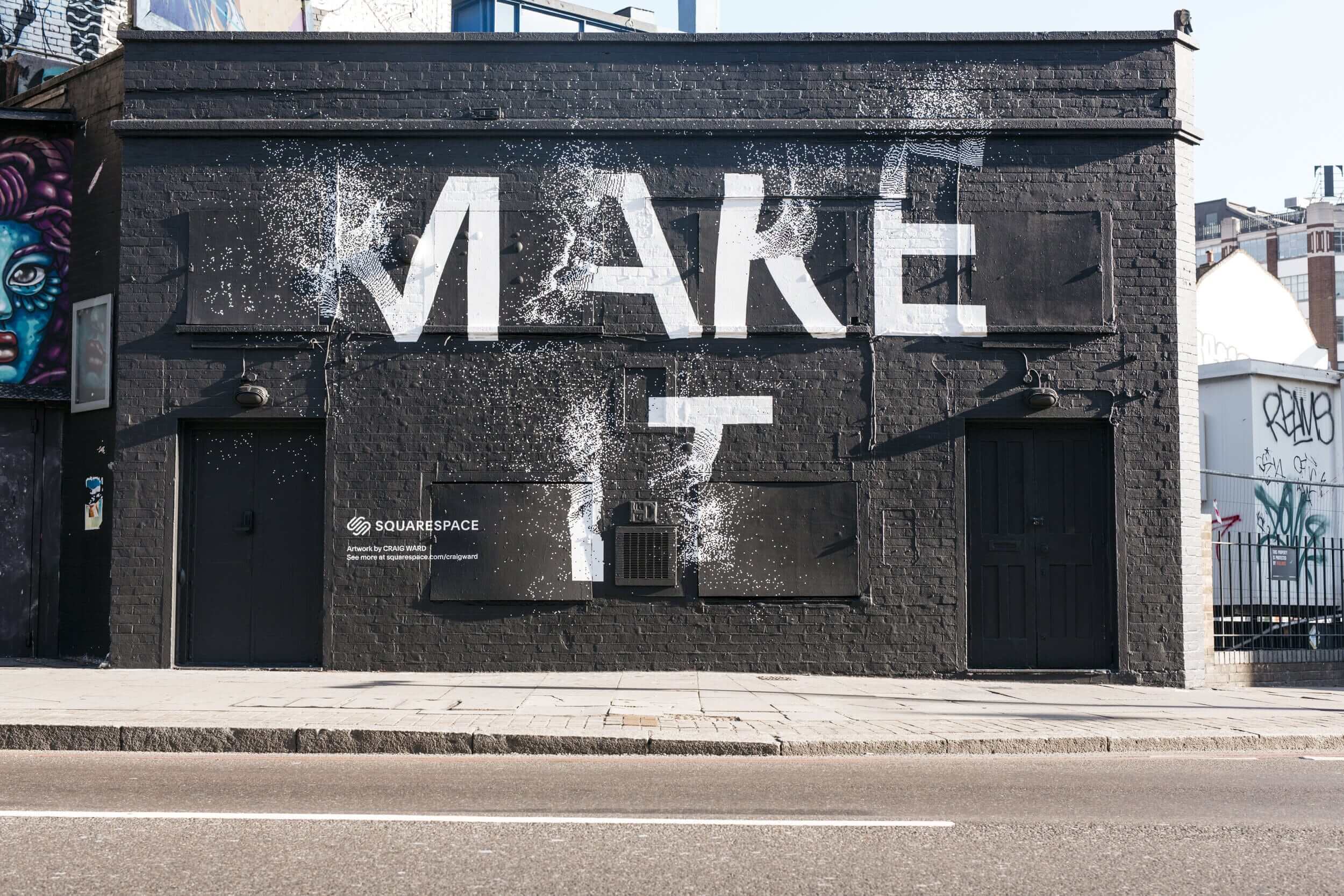
Craig Ward – I suppose in visual terms ‘success’ is something that becomes memorable or iconic. My most well known works are probably my personal pieces – the Subvisual Subway series, while photographic, in it’s own way is still a piece of design and communication. It’s also a project which transcended the design industry and made it’s way into popular culture (in the U.S at least). New York Magazine and WIRED both ran extensive spreads on the images, they were also featured on various news channels and even made their way into a best-selling fiction novel — Touch by Courtney Maum name-checked me and the work, which was pretty surreal.
The Logo Creative – How long does it take to complete the average logo design project from start to finish?
Craig Ward – I’ll let you know when I work that out. It’s been 2 hours and it’s been 18 months. Just the logo? That can happen very quickly I feel, but building a design system around it – and a worthwhile one at that – is something else that can take much longer to evolve and craft.
The Logo Creative – What are your recommended design books to read?
Craig Ward – Well, mine is out of print now so… the Dieter Rams monograph As Little Design As Possible is really great; The Eye by Nathan Williams is very insightful and then Alan Fletcher’s The Art of Looking Sideways was always a favourite for idea generation etc.
The Logo Creative – Which software do you use frequently and is there any you would recommend to designers?
Craig Ward – I’m a simple man and pretty much exclusively use the Adobe Creative Cloud.
The Logo Creative – What is your favourite style of logo design? And why?
Craig Ward – I prefer typographic systems to icon-based designs, but I like to see work that has a nice wink to it – a star visual touch that your average viewer might not catch on first viewing.
The Logo Creative – What is your daily inspiration when you design?
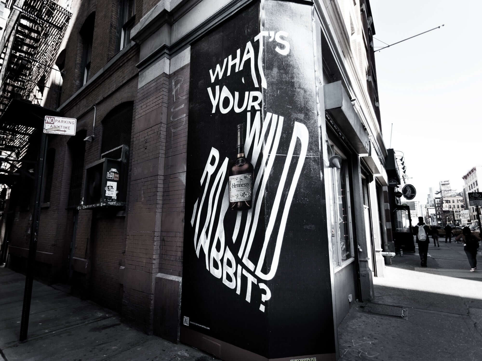
Craig Ward – I’ve always been very process driven. I like to let the process inform the aesthetic of a piece where I can so I’m always looking out for organic (or digital) processes that can be used to breathe life into a static piece of design. Peeling paint, torn posters, flickering signs, offset printing mistakes etc etc these can all be used to tell a story.
The Logo Creative – When you’re not designing do you have a favorite free time activity you like to do?
Craig Ward – Free… time…? I think I remember that…? I’m joking. We do a lot with the girls and try and expose them to as much as possible – outdoor pursuits, galleries, the theatre etc etc – but most of my non-work time is spent being dad – which I love, I should stress.
The Logo Creative – What was the biggest challenge you ever faced on a project?
Craig Ward – For multiple reasons I think that would have to be a project that took place over Christmas one year (2008 maybe?) for Nokia through Wieden + Kennedy in Japan. It was awful.
A nine hour time difference, working on a sub-par laptop from my girlfriend’s parent’s house, designing in a language and alphabet system that I didn’t understand (Hiragana) for a client that was totally clueless about the creative process and had no idea how long the changes they were asking for would take. I got something like 14 rounds of revisions into the project before I totally lost my rag, sacked the project and, shortly after, my agents at the time.
The Logo Creative – In your opinion what’s the best and worst part of your job as a designer?
Craig Ward – I think the best part is that I’ve been able to categorize so many disparate things as ’design’. I take the Vignelli approach – that design is ‘the communication of information in an appropriate visual manner’. With that in mind, whether it’s a business card, a tshirt, a poster or a music video, information is always being communicated and thus it can always be classed as ‘design’.
The worst part is everything else that comes along with being a designer. We’re hard on each other and ourselves. We spend a lot of time in our heads and it can be isolating work if you’re not in a studio environment. We’re jealous of other designers and we get overly hung up on details that regular people don’t notice. I’m actually writing my second book not he subject right now.
The Logo Creative – Who is the most inspiring person to you and why?
Craig Ward – My daughters, equally. They inspire me to not just work hard, but to make work that I’m proud of. They give my day focus – I hate not getting back in time for dinner – and they have this innate curiosity about the world that all children possess.
They choose colors in their paintings and drawings that I never would. They’re not tarnished and restricted by asking themselves if it will look good, or if anyone else will like it, they just make things and they’re just happy in that moment of creating.
The Logo Creative – Who is your favourite graphic designer and why?
Craig Ward – Working today, probably someone like Neil Kellerhouse. I’m consistently jealous of his work, simple as that. Same with Mario Hugo; he just makes it look so effortless.
The Logo Creative – What’s your favourite design quote or quote in general, and do you have a mantra or saying you live by?
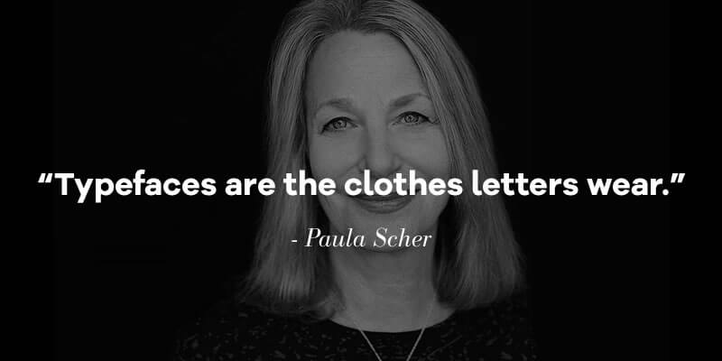
Craig Ward – “Typefaces are the clothes letters wear” by Paula Scher (I think). It’s such a simple and relatable description, and makes what you do immediately apparent to someone that’s not part of the industry.
The Logo Creative – In less than 10 words what is graphic design?
Craig Ward – “…the communication of information in an appropriate visual manner.” – Massimo Vignelli
The Logo Creative – What steps did you take to start your graphic design business? Did you have to make any sacrifices on your journey?
Craig Ward – I think the whole thing is a sacrifice in a way – being self employed, I mean. You forego so much when you set up on your own – consistency, a reliable income, the agency or studio support system etc etc, but the positives (for me at least) outweigh the negatives.
I didn’t honestly give a lot of thought to it when I set out – I’d saved a little and had maybe 6 months rent in the bank, but I really just wanted to stay in the US a little while longer and travel more after a 2 year stint as Head of Design at Grey. I sponsored myself for an artists visa, got it (obviously) and then just started going after work. Typically it’s come in quite organically – in fact I honestly find the more I pursue clients the less likely I am to work with them, or at least that’s the way it feels.
The Logo Creative – Do you have any regrets? Is there anything you would have changed early on in your career?
Craig Ward – Yes and no. I spent a lot of time early on doing work I’m not particularly proud of – menus for Irish bars and crap like that – but, equally, I got other things out of those situations – made great friends for example, or learned a lot about retouching and Photoshop etc etc – and also you kind of have to do work that you don’t enjoy so that you can appreciate the projects that you do when they arise.
There are a few projects I wish I hadn’t taken on, but nothing I’m ashamed of. I’ve never worked with, I don’t know, cigarette companies etc. Typically if something comes out of my studio that I don’t like it’s because a client has ignored me. After three attempts I just give them exactly what they want and the work goes nowhere near my portfolio, simple as that. If they want to pay for ugly work and ignore someone with 16 years’ experience then it’s on them.
The Logo Creative – If you could go back in time, what would you tell your younger self?
Craig Ward – Don’t worry about getting picked last at football – one day you’ll design the England kit.
The Logo Creative – What’s the most important piece of advice you have received as a designer that’s helped you?
Craig Ward – A tutor very early on, told me that you have to be really honest with yourself about your work. It’s no use putting average work out and complaining about not getting more projects. Is it great? And if not, why not? What isn’t working and what can make it better? Put it up next to work that you admire and ask yourself why that work is better. Taste is subjective so very often it comes down to craft and execution.
The Logo Creative – What would be your advice for new Logo and Graphic Designers?
Craig Ward – Make the kind of work that you want to see in the world and keep doing it. Get it in front of the right people – not just other designers – and eventually someone will take notice.
Learn more about Craig Ward | ward.studio | wordsarepictures.co.uk |
Check out the designer interview discussion on Linkedin
Read our other Designer Interviews

