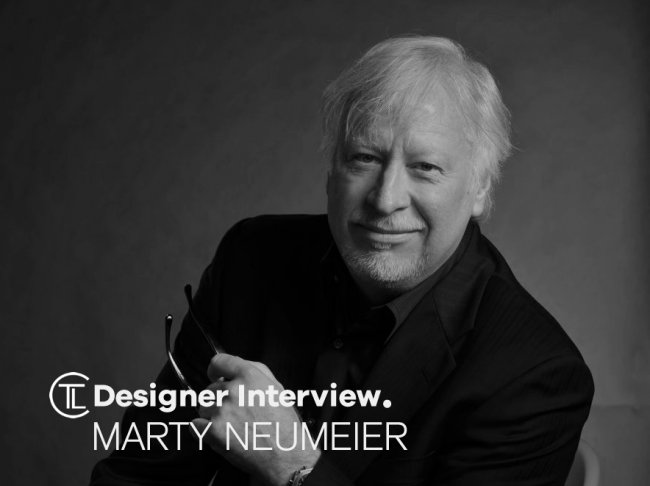
In this edition we have a designer interview with Marty Neumeier who attended Art Center College of Design from 1967 to 1969. For 15 years he worked in advertising and brand design, as a communication designer and writer in Southern California. In 1984 he moved to Silicon Valley to work with clients such as Adobe, Apple, Hewlett-Packard, Microsoft, and Symantec. By 1998 his firm Neumeier Design Team created retail packaging for software products, including Filemaker, Norton Antivirus, Apple system software, and HP LaserJet. During this time he served as a contributing editor for the magazine Communication Arts.
In 1996 he founded the “seminal but now-defunct design magazine Critique”, a quarterly publication about design thinking. Designers contributing to Critique included Robert Bringhurst, Ivan Chermayeff, Milton Glaser, Steven Heller, Stefan Sagmeister, Paula Scher, David Stuart, and Massimo Vignelli.
Designer Interview With Marty Neumeier @MARTYneumeier#designerinterview #branding #logodesign #graphicdesign https://t.co/8jac8El1Ou pic.twitter.com/JMmCnwcqHD
— The Logo Creative™ (@thelogocreative) September 5, 2018
In 2002, Neumeier started Neutron, a San Francisco consulting firm that specialized in internal branding. There he wrote three books on branding: The Brand Gap, Zag, and The Designful Company. Zag was included in The 100 Best Business Books of All Time by Jack Covert and Todd Sattersten. He also served on the Board of Directors of AIGA, known until 2005 as the American Institute of Graphic Arts, developing the organization’s first mission statement. He was president of AIGA Center for Brand Experience, where he edited and published The Dictionary of Brand.

In 2009, Neutron merged with Liquid Agency, which named Neumeier the firm’s Director of Transformation. At Liquid he wrote two books on business creativity, Metaskills and The 46 Rules of Genius, as well as an updated version of The Dictionary of Brand for Google. He currently maintains two blog series, Steal This Idea and The Rules of Genius. He has presented talks and workshops at events such as the UX conference in London and the Design Management Institute’s Remix conference. His slide presentation on The Brand Gap has been viewed over three million times.
The Logo Creative – Hi Marty thanks for agreeing to take part in our designer interviews it’s great to have you onboard. I know you will provide our readers with some great insights.
Marty Neumeier – Thanks Andrew it’s a great pleasure to be involved.
The Logo Creative – What was the turning point in your life when you decided to become a designer and how did you proceed?
Marty Neumeier – I was seven. My mother was trained as a fashion designer, and I saw her draw a face on a notepad. I was hooked. I drew birds, clipper ships, and cartoons, and sold them to the kids at school for candy money. Voilà, a commercial artist is born.
The Logo Creative – What does your day consist of?
Marty Neumeier – These days I have more control over my time than I did as a studio owner. I work 40-50 hours a week on a variety of projects: writing and designing books, giving keynotes, leading workshops, naming brands, consulting with clients, and so on. I support these with the usual housekeeping tasks: emails, scheduling, billing, and lots of reading and taking notes.

The Logo Creative – Are you a morning person or night owl and is there a reason why?
Marty Neumeier – For design, I’m a morning person. For writing, I’m an anytime-day-or-night-anywhere person. But I’m not sure we have control over whether we’re morning people or night owls. Daniel Pink talks about this in his book WHEN.
The Logo Creative – What was the first logo you ever designed?
Marty Neumeier – I can’t remember the first logo I designed—it was probably a drum sign for a high-school rock band. But the first serious logo I designed was for Summit University when I was 25. It won an award in Communication Arts, so that was it for me. I worked hard on every logo after that.

The Logo Creative – What is your favourite Logo you have designed?
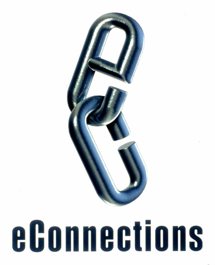
Marty Neumeier – Probably the logo I designed for a startup called eConnections, a company that automated supply chain management. Up until then (2001), most logos were two-dimensional. I started experimenting with three-dimensional logos that could move and turn in space, called avatars.
The Logo Creative – What is your favourite logo of all time?
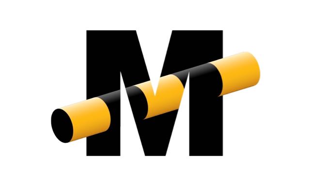
Marty Neumeier – I’m partial to a logo designed by Craig Frazier for Magico. I’m not sure how he did it, but it defies analysis. It just looks like magic.
The Logo Creative – Can you describe or give us an overview of your logo design process?
Marty Neumeier – I alternate between doodling on a sketch pad and researching the logos of competing companies. There’s always a decision to make about much or how little your logo should fit in with its category. For example, bank logos used to always be round or square with a hole in the middle—presumably where you put your money. Tech companies used to always have a swoosh. Internet companies had a globe. It’s normally a bad idea to fit in with these sorts of trends, but not always. I’ll usually spend some time revisiting the great logos in history to set the bar as high as possible. Then it’s draw, draw, draw. Eventually, I’ll move the best ideas to a tracing pad, going over and over them to the shapes just right. I’m old school.
The Logo Creative – What brands do you most admire and how do they influence your creative thinking?
Marty Neumeier – I like companies like Mini, Apple, Medium, Nike, Method, Tesla, MasterClass, Netflix, and Progressive who make design a priority instead of an afterthought. They don’t inspire creative thinking as much as admiration. It’s not easy to keep design in the forefront while battling the short-term demands of the marketplace.
The Logo Creative – What do you consider your most successful design project, and why?
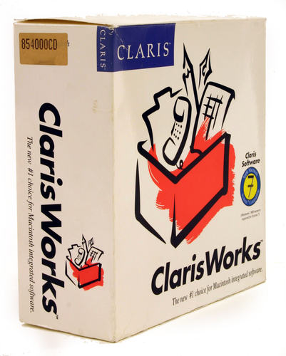
Marty Neumeier – I have a soft spot for Claris, the one-time software division of Apple. We had the privilege of redesigning all the packaging for their 15 products. At the time, their products were packaged in blue and gray with small photos of serious-looking office workers on the fronts. We showed that clean white packages with bright, gestural icons—logos, in essence—were the way to go for Apple. It brought the white look back to Apple, and sales of software shot up. That’s why Apple is still using white to this day.
The Logo Creative – How long does it take to complete the average logo design project from start to finish?
Marty Neumeier – Anywhere from two to six weeks, depending on the amount of research and testing is built into it.
The Logo Creative – What are your recommended design books to read?
Marty Neumeier – For logos, any book by Paul Rand if you can still find them. Then I would collect a lot of books on logos and decide for yourself which ones you think are brilliant. Scan those and keep them in a folder for reference. The kind you admire will be the kind you’ll create. For an overall book on design, I recommend A SMILE IN THE MIND by my friend David Stuart. There’s an updated version, too, but I like the original. For typography, you can’t beat THE ELEMENTS OF TYPOGRAPHY by Robert Bringhurst.
The Logo Creative – Which software do you use frequently and is there any you would recommend to designers?
Marty Neumeier – I don’t use design software, but my production partners use Illustrator, After Effects, Photoshop, and Creative Suite.
The Logo Creative – What is your favourite style of logo design? And why?
Marty Neumeier – I like logos that are simple and strategic, with notes of elegance and surprise. I’m not a big fan of decorative logos. Beyond that, it’s open season.
The Logo Creative – What is your daily inspiration when you design?
Marty Neumeier – One thing I like about designing is that I can listen to music while working. I always try to imbue my work the magic I find in music, so it’s a constant inspiration. When I’m writing, it’s difficult—even destructive—to listen to music. Writing has its own music, and you wouldn’t try write a piece of music with a competing piece of music in the background. One of my pet peeves is restaurants, bars, and airport lounges that have three TVs and two sources of music blaring at the same time. It’s an insult to music. Hey! You! Get off my lawn! Okay, I’m officially a curmudgeon.
The Logo Creative – When you’re not designing do you have a favorite free time activity you like to do?
Marty Neumeier – Cooking badly.
The Logo Creative – What was the biggest challenge you ever faced on a project?
Marty Neumeier – The biggest challenge is always collaborating with clients. It’s so easy to forget that they have a lot of challenges of their own, and design is a second language for most of them. I wake up most days wondering how I’m going to explain an abstract concept to a client or my readers.
The Logo Creative – In your opinion what’s the best and worst part of your job been a designer?
Marty Neumeier – The best part is having a project that requires more of me than I thought I had. The worst part is all the housekeeping tasks required to support projects. I’ve always found that a good month is about one-quarter creative work and three-quarters boring but necessary tasks. That’s life.
The Logo Creative – Who is the most inspiring person to you and why?
Marty Neumeier – My wife. She’s got capacious mind, and opens me up to new thoughts and experiences every day.
The Logo Creative – Who is your favourite Graphic Designer and why?
Marty Neumeier – Most of my peers were heavily influenced by Milton Glaser, and I’m no exception. He’s probably the world’s most erudite designer, and a real mensch to boot. I also have a fellow feeling for the designers at Pentagram, both past and present.
The Logo Creative – What’s your favourite design quote or quote in general, and do you have a mantra or saying you live by?
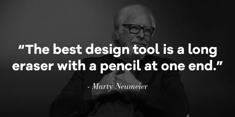
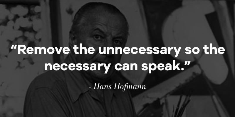
Marty Neumeier – “The best design tool is a long eraser with a pencil at one end.” Okay, I wrote that one. But here’s the inspiration for it, from the painter Hans Hofmann: “Remove the unnecessary so the necessary can speak.”
The Logo Creative – In less than 10 words what is graphic design?
Marty Neumeier – A creative discipline focused on the design of visual communications. But I prefer to think of myself as a communication designer, a combination of visual and verbal design.
The Logo Creative – What steps did you take to start your graphic design business? Did you have to make any sacrifices on your journey?
Marty Neumeier – All success is sacrifice. If you want more, pay more. I started my first business when I was 23, mostly because there were few other options in the small town where I lived. All I did was open a bank account, create a portfolio, and knock on some doors. My wife become our office manager. Before too long we were hiring employees. The hardest part was leaving our little town when we outgrew it.
The Logo Creative – Do you have any regrets? Is there anything you would have changed early on in your career?
Marty Neumeier – Regrets galore. There are always roads not taken and roads should-have-not taken. I was offered a partnership with Saul Bass, and another with Pentagram. I’ve always wondered what those roads might have looked like.

The Logo Creative – If you could go back in time, what would you tell your younger self?
Marty Neumeier – Get an MBA!
The Logo Creative – What’s the most important piece of advice you have received as a designer that’s helped you?
Marty Neumeier – When I was a young designer with a few awards under my belt, I was invited to party with a few dozen internationally famous poster artists. A Swiss designer who had been the first art director of Graphis took me aside. He said, “I have some advice.” I nodded. He continued. “First, do you work at a desk?” I said I did. “And is your desk out in the open or is it pushed up against a wall.” I said it was out in the open. “Good,” he said. “Here’s my advice: When you’re happy with your design, walk around to the other side of the desk.” I looked at him. “That’s my advice,” he said. Ever since that moment I‘ve tried to look at my work from the other side—the audience side—and it’s served me well.
The Logo Creative – What would be your advice for new Logo and Graphic Designers?
Marty Neumeier – Keep your eyes open for work you wished you had done. Photograph it, scan it, tear it out, collect it. Memorize the names of the designers if you can. Look for more work by the same designers. Try to equal or exceed their example. All this collecting and memorizing and designing is the process of becoming who you’ll be. You’ll get there in time. There’s no shortcut.
Bonus Questions
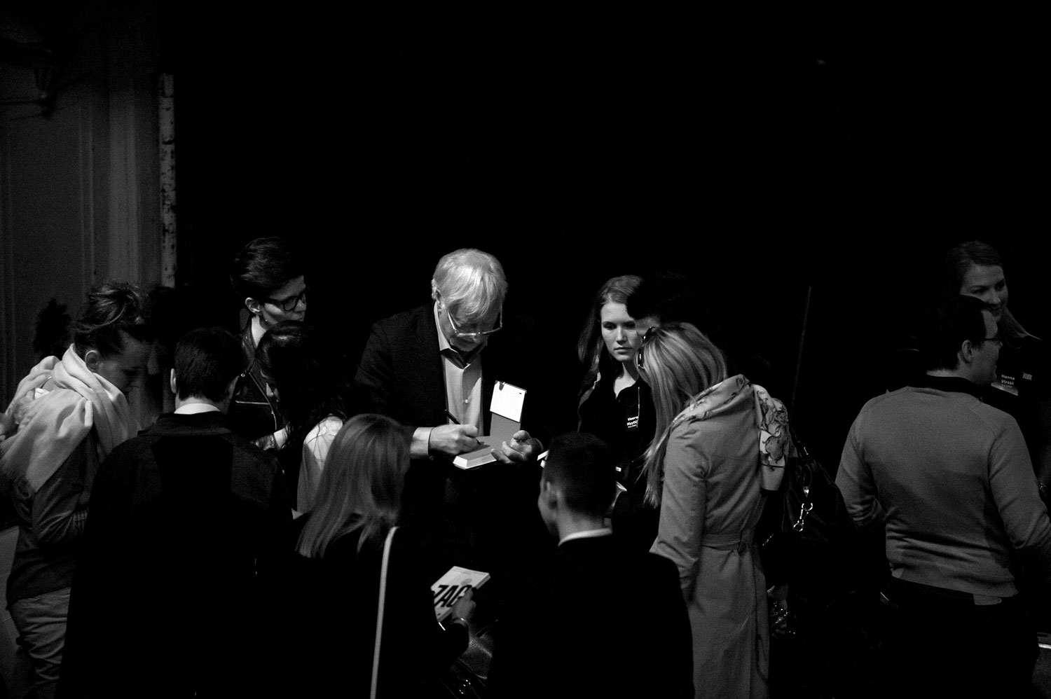
Marty was kind enough to send us three signed books including Zag, The Brand Flip, and The Brand Gap and I would like to thank him once again for sending them, I asked Marty some additional questions based around the areas of branding such as design thinking, design strategy and identity design to go beyond logo design to get Marty’s insights.
The Logo Creative – What impact does design thinking have on the way companies operate today?
Marty Neumeier – It’s making inroads into many parts of business life, from the design of products and communications all the way to processes, organizational structure, strategy, supply chain management, decision making, and so forth—any place where creativity can make a difference. Interestingly, one of the last areas to be transformed by design thinking is traditional design. We designers are creatures of habit, and many of the habits we’ve embraced come from traditional art schools, not business schools or even design schools. I always wince when I hear designers pooh-poohing the discipline of design thinking. We should want everyone we work with, especially our clients, to embrace it. Design-focused clients are always better clients.
The Logo Creative – In your opinion, for those that do not know, what is the difference between logo design and identity design?
Marty Neumeier – Logo design is the development of trademarks. Identity design is the development of entire systems, from trademarks to typography to color palettes to page layouts to imagery to packaging and so on. It can even include ownable sounds, smells, and other sensations.
The Logo Creative – What makes a great logo? And excellent identity system?
Marty Neumeier – A great trademark is unique, appropriate, strategic, well-crafted, and surprising in some way. A great identity system consistent, logical, elegant, fresh, and flexible. It’s free from meaningless gimmicks like stripes, diagonally cut photos, or typography that tries too hard to look different. A good system is not a straightjacket.
The Logo Creative – Why is strategy important when designing a logo design?
Marty Neumeier – Aside from the name itself, the logo the most important weapon in a brand’s arsenal. A logo that doesn’t align with the purpose or culture of a company is wasting a big opportunity. It doesn’t have to be explanatory, but it should “feel right” for the company’s unique position in its category.
The Logo Creative – How can we use strategy as part of our design process?
Marty Neumeier – I always start with a survey of the client’s competitive set. Who are its competitors, and what are their key messages? How do their logos express who they are if indeed they do at all? What are the client’s key messages? How can the logo express the difference between the client’s positioning and that of its competitors? Never, ever, design a logo to “fit in” with the look of competitors’ logos. A company can’t be a leader by following a leader.
The Logo Creative – How do the best designers go about building trust with clients?
Marty Neumeier – Try to use the language of business to frame the challenge. It’s okay to use design words like elegance, boldness, style, contrast, simplicity, etc., but only after you’ve established your business cred. Read a couple of books on business strategy. You’ll feel more powerful almost immediately. Your clients will start asking your opinion instead of telling you what to do. Also, withhold your opinion about your own work. Be matter of fact. And if you can get little extra money for testing your best two or three ideas with the audience, your stock will go way up. There’s a description of how to do this my book THE BRAND GAP.
learn more about Marty Neumeier | www.martyneumeier.com | Wikipedia

