Today’s designer interview is with Michael Raisch who is a CLIO award winning designer and digital content producer.
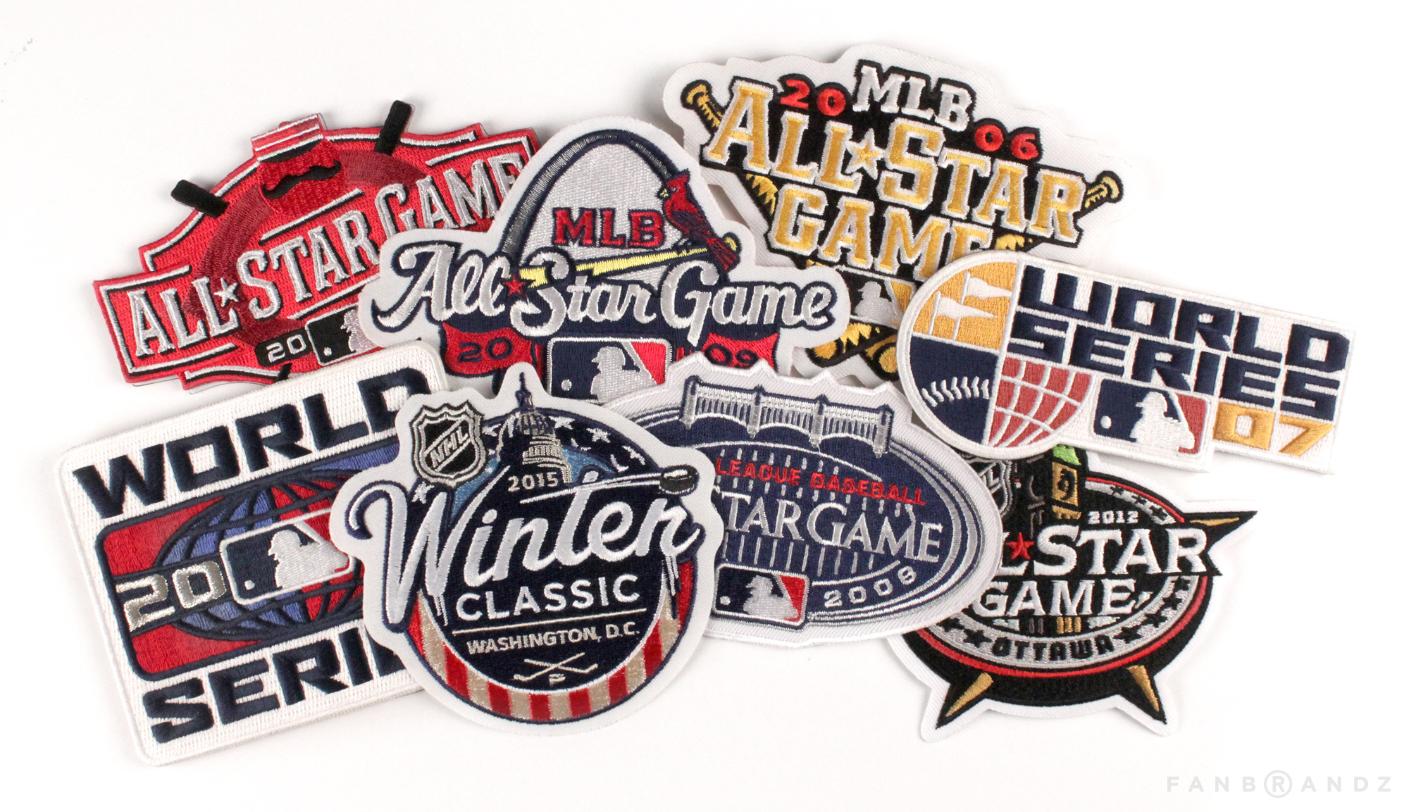
For over 14 years Michael has designed major league franchises and sport event identities with Major League Baseball and the National Hockey League at Fanbrandz. He has designed logos from World Series, Winter Classic to the All-Star Game that resulted in unique event identities that capture the spirit of each host team and city landscape. Michael’s work has received international exposure and has been featured on Brand New, HOW Design, It’s Nice That, Design Week UK, BuzzFeed, People Magazine, Good Morning America.
Designer Interview With Michael Raisch @RaischStudios #designerinterview #designthinking #designerlife #logodesignhttps://t.co/maHi9PL2wI pic.twitter.com/xyRkxVKJaI
— The Logo Creative™ (@thelogocreative) September 6, 2017
At Raisch Studios, Michael developed digital content and storytelling projects with the Smithsonian Channel, CNN, Oxfam UK and the National 9/11 Memorial and Museum. These works range from filming time-lapse of the rise of One World Trade Centre and creating a tribute for Malaysia Airlines Flight 370 told through the lens of international aviation photographers to animated gif social media campaign and narratives.

The Logo Creative – Thanks Michael appreciate you taking part in a Designer Interview.
Michael Raisch – Thanks for reaching out Andrew consider me in!, This sounds fantastic. And i’m pleased to be adding to the creative conversation.
The Logo Creative – What was the turning point in your life when you decided to become a designer and how did you proceed?
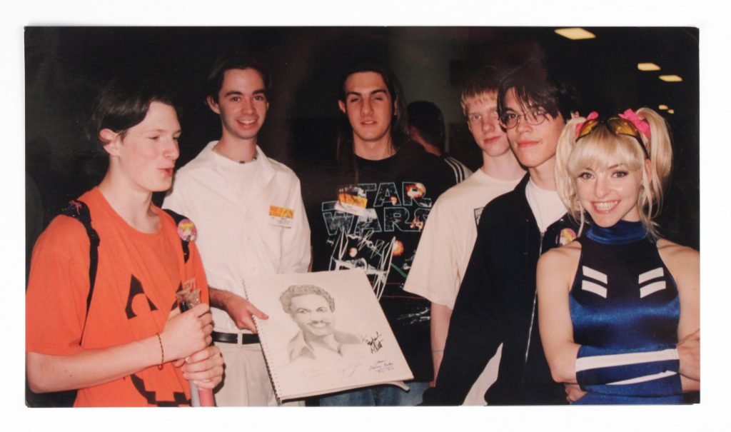
Michael Raisch – At some point in 1999 as my senior year unfolded– it was clear that I would head to art school in some capacity, yet I wasn’t sold on my future as a portrait artist. Through my high school career I developed my talents as a portrait artist. It certainly help talking to girls as well, and yes– I got a lot of jokes and comments when Titanic came out, and No. I never did that thing in the movie.
One day in AP Art, a recent graduate of our high school returned to show us his college course work in design. Our reaction was, This is a thing? this is amazing. I recall the guy showing a inked lower case ‘g’ for his typography class. Pretty cool stuff back then. As things were rapidly shifting digital into by 1999/2000, the was an emerging path forward in design.
While it probably occurred into my first year of art school, I quickly realised that design would be a sustainable future in the creative field.
In short, I used my illustration skills to get into art school, I then transitioned into the design program, as I realised this was the shape of the future in 2000.
The Logo Creative – What does your day consist of?
Michael Raisch – Day consists of looking at my phone too much, like most of us.
After I get my 5 year old daughter off to school, I’m back at my sports branding agency, Fanbrandz. We’re located within the greater New York City area, in Montclair NJ. This week we’re on the next NHL All-Star game event identity and then the 2018 Winter Classic.
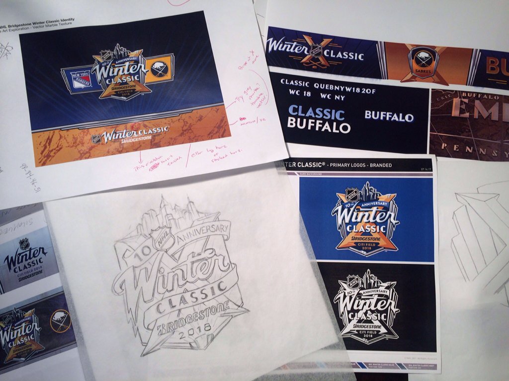
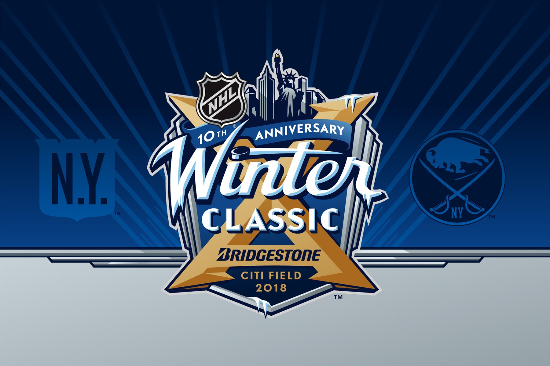
For a project with this kind of scope, we like move the creative direction into position ahead mark itself before we design. We’re always looking for a sense of place, and point-of-view to latch onto to visualise these outdoor celebrations of vintage hockey.
Otherwise it’s occasional back and forth with various creatives I’ve made connections with within my niche of sports branding. Always keep fresh with my creative network, we’re always bouncing stuff back and forth look ahead to possible collaborations.
The Logo Creative – What was the first logo you ever designed?
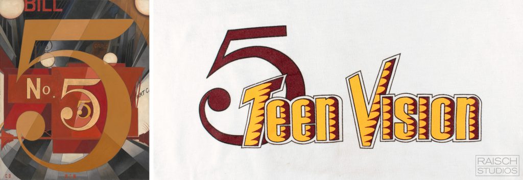
Michael Raisch – I consider this ‘5 Teen Vision’ type treatment I did for one of English teachers at my high school. Like I mentioned before I was known as a portrait artist. Yet somehow, I asked to do this design. I had set up ‘een’ and ‘ision’ on a computer and redrew the rest by hand, given this 1998 I wasn’t doing creative things full on digital yet.
I was clearly impacted by the No. 5 painting (“I Saw the Figure 5 in Gold by Charles Demuth) that hung in the art room. So as all artist do– I just complete took that design and went for it.
So there it is, my first logo was a late 90’s High School News t-shirt. Half digital and half analogue one foot in both worlds– much of my cusp generation’s experience.
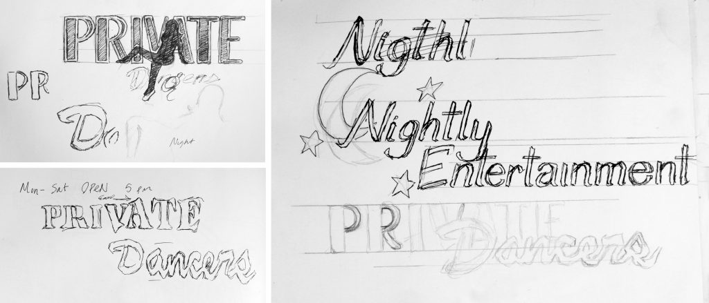
On a move humorous note and one that shows my naivety and age. In around 2001, through a neighbour– I was asked to do what at first I thought was a dance studio logo that turned out to be strip joint logo. No seriously, it was called ‘Private Dancers’. Mind you this was during the height of HBO’s Sopranos in northern New Jersey.
We’ve all been approached by work we didn’t ask for and I’m glad that one didn’t pan out. It’s funny to look back on my naivety and nerdy (before nerdy was cool) 19 year old art student self.
The Logo Creative – What is your favourite Logo you have designed?
Michael Raisch – I think back on all the experiences and the circumstances on how they came to be, get approved and end up on the field and in the market.
Currently I’m very pleased with the design I did along with the Fanbrandz team for the 2017 World Series, Coming out the of the Euro 2016 program last summer, I was hugely inspired by the excitement, atmosphere and essence of mark hosted across France. They made the game fun, they made the mark fun and they brought together the nations of Europe. I wanted to bring that same feeling into the World Series in the United States. So I did. I enjoy looking at other sports markets and seeing their creative approaches. It’s hugely refreshing to me. We’ve also received some really nice comments made from the NHL on their Centennial anniversary logo we design last year to celebrate the 100 years of the league, it’s been noted as timeless, while looking forward and back, suggesting it perfectly matches both historic and current photos.

If I could mention a runner up, I am quite fond of the Winter Classic 2015 with Fanbrandz and the NHL for two fold, I was able to channel my passion for presidential history, specifically that of John F. Kennedy into an event logo and expand on it from the program and that it won me my first CLIO. Apologise from my humble brag.

The Logo Creative – What is your favourite Logo of all time?
Michael Raisch – I have a hard time pining down exactly one mark. I do have a favourite era and industry of logo design, that would be the golden age of airlines, thinking back to the Saul Bass airline logos of United, the tulip design and Continental’s globe.


I’ll throw this detail in- Early 90’s, I recall on a Continental domestic flight noticing that the drink cart had a different embossed logo on the metal front. The memory is more about realising the logos didn’t match the current airline. I now realise this was the former Eastern Airlines logo. (Eastern ended operations in 1991). I found it interesting to realise that logos had histories to themselves and this miss-matched airline equipment represented part of Continental’s past history.
The Logo Creative – Can you describe or give us an overview of your logo design process?
Michael Raisch – Lately I’ve been guided by experiences and various art mediums that inform my creative. I’ve also reconnected with art making processes over the past three years to direct my digital creations. These have been projects ranging from watercolour, Japanese brush script to faux woodblock western inspired printing for a friend and colleague in Arizona.
Recently I was at the MET and viewed the Assyrian and Sumerian art in person with my daughter. Part research for an upcoming Age of Empires 20th anniversary project. The level of detail of these ancient civilisation’s art is incredible. You can’t fully translate that in the digital space.
In short I let experiences, medium, and research inform my creative starting points.

The Logo Creative – In your opinion regarding Logo Design pricing do you prefer working on a fixed rate or customer budget and can you explain why?
Michael Raisch – With brand development it’s budget all the way. There is this idea in design that it’s not exactly the hours spent developing the mark- it’s the blank amount years of experience it took plus design time to reach that final mark. Anything short of that devalues your creative work and years working in the industry.
The Logo Creative – How long does it take to complete the average logo design project from start to finish?
Michael Raisch – Quite a range there, I’ve been on complete major league franchise redesigns that have extended into 10 months with uniform sampling and custom font build outs. and yet have somehow crashed out a marks in a matter of days and weeks. Most of my best work has come from projects we’ve been asked to come in a rescue. Another area of tight turn around are the occasional bake-off projects. Those are the moments you push forward with these narrow deadlines, best work comes forward.
The Logo Creative – Are you a MAC or PC User and is there a reason for your choice?
Michael Raisch – MAC since 2000, no further comment needed.
The Logo Creative – Which software do you use frequently?
Michael Raisch – Beyond the obvious, Illustrator and Photoshop. Oddly enough it’s Adobe Distiller, I can’t tell you how many huge PDFs we crush down to release out to clients for review.
The Logo Creative – What is your favourite style of logo design? And why?
Michael Raisch – Going to skip because I ended up answering it in Question 4.
The Logo Creative – What is your daily inspiration when you design?
Michael Raisch – Inspiration comes and goes, it’s the content and narratives with the marks that help spur that on. Any kind of mark that has sense of place, a deep history to delve into– that’s what we love to see. All these element come into play and shape the creative ahead. Otherwise I find the business of it always keep you pushing ahead. I also find that pressure is always good as a different form of inspiration in the form of motivation.
The Logo Creative – In your opinion what’s the best and worst part of your job been a designer?
Michael Raisch – I misread this as only the worst part, so I’m just going to go with that. I find that a lot of the staged public performance of creative work interesting and tiring all at the same time. The self-congratulatory tweeting? Just as weird. I started my career in a pre-social media era. I probably still hold an old school view about much of this. I couldn’t have imagined the landscape we live in now from the view point of the late 90’s/2000.
As amazing as it is, and believe me, I greatly enjoy social media. A lot of what I see throws me off from time to time. There’s a lot of digital posturing. I’m sure I fall into the trend as well, the sharing of works in progress. Creative Review just published a piece about this current trend: https://www.creativereview.co.uk/sharing-work-online/
Forgive me here, In keeping with the ‘worst part’ of the job, I’m always confused when I see fake design projects mixed with real projects in designer’s portfolios. It’s a weird game of attention played across social media. I worry that it devalues the creative process and financial value of the craft. With my team, I’ve directly designed three major league baseball franchises, In my experience there is so many levels, decision makers, and approvals that go into a final approved logo. So in turn when I watch designers ‘self redesign’ failed franchise logos (with any creative brief or client input) in reaction to public opinion to logo unveiling’s, it trivialises the real process.
The Logo Creative – Who is the most inspiring person to you and why?
Michael Raisch – Jean Jullien, He is that french illustrator that was thrust into the spotlight over his Paris Attacks icon sketch. I find his insights incredibly fresh, thoughtful and amusing. There is something appealing about his talent to visually describe something so efficient and clever manner. A lot there you can pull from for logo design.
The Logo Creative – Who is your favourite Graphic Designer and why?
Michael Raisch – I have a couple of creative agencies that I feel put out fantastic work consistently;
Michael Raisch – Grapheine, Paris and Lyon, France: Clean graphic work –not trend based. It’s fresh,feels like a good balance of contemporary and timeless work.
Hulse & Durrell, Vancouver, Canada: My favourite Canadian Olympic designers, A lot of thankless vector work that goes into their Olympic Heritage Collection work. They’re remastered the visual history of olympic marks with incredible vector detail. I have a huge respective for the work the do. They’ve also taken on some really clean and nice Canadian sport rebrands.
Brandia Central, Lisbon, Portugal: – Euro 2016 branding, What else can I say? You had me at hello. A masterpiece. These guys make sport fun, It’s really a breath of feel air in our industry. Definitely have a huge design crush on their Portugal offices.
The Logo Creative – What’s your favourite design quote?
Michael Raisch – Here’s one from my 5 year old daughter, said this when she was 3: “My Daddy makes stars and ABC’s”
The Logo Creative – In less than 10 words what is graphic design?
Michael Raisch – Save as Final DevR1 —> Save as Final DevR2 —> Save as…
The Logo Creative – What steps did you take to start your graphic design business? Did you have to make any sacrifices on your journey?
Michael Raisch – I always kept connecting and starting conversations. Having access to Manhattan was fantastic in art school. There was so many opportunities to connect with seemingly random strangers in NYC and sometimes they would turn out to be studio owners and creatives. I briefly had design and illustration stints with my University, Rutgers doing various creative jobs. I even did the dinning hall signage in 2001.
15 years ago, I mailed out cover letters for internship opportunities. I had learned of a spot with ABC Network Television in New York. I got in early to interview and landed their next year’s open summer spot. I even came back for the Fall 2004 season.
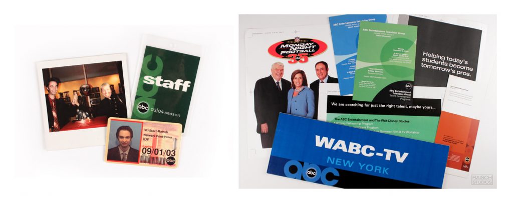
I can’t thank their team enough for shaping the roots of my career in design. Much of the value came from experiencing the work flow and project development from a network level. As with any internships, soaking in as much as possible was fantastic. Was all over Quark, who remembers that? I was able to assist on photo shoots from soap operas like ‘All My Children’ to Dick Clark’s Rockin’ New Years in Times Square. Running into Toni Danza in the halls was fun as well.
The Logo Creative – Do you have any regrets? Is there anything you would have changed early on in your career?
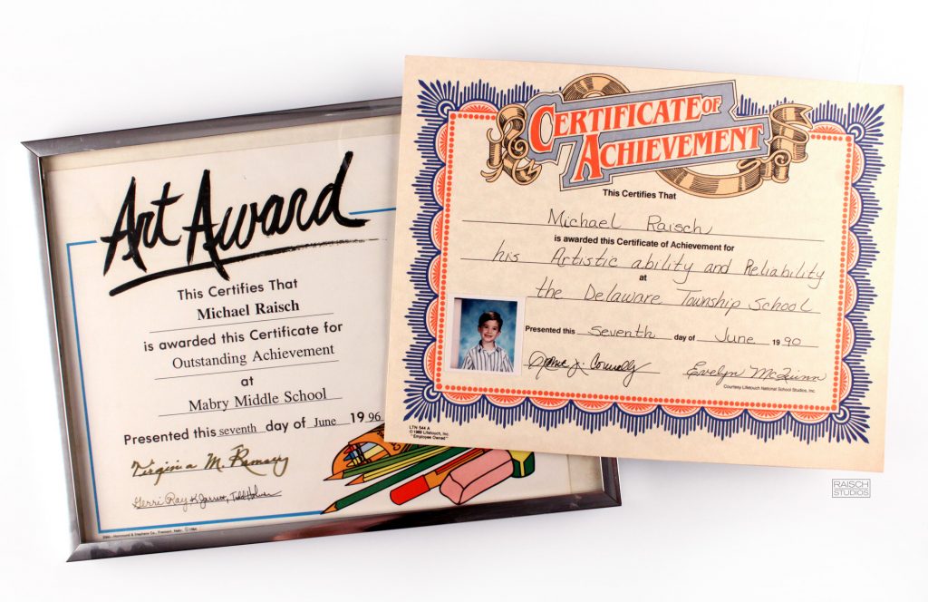
Michael Raisch – No– I’ve done this all my life. Straight path, all the way. I have been fortunate to have come from a family where I could pursue my creative passions. I’m the first in my family to make a career in design and creative. As noted with my “achievement in artist ability and reliably” from 1990 and my artist award from 1996. There it is, little has changed in my life. Worked hard, Straight arrow.
The Logo Creative – If you could go back in time, what would you tell your younger self?
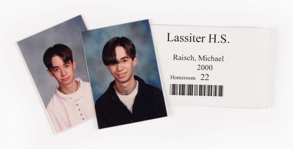
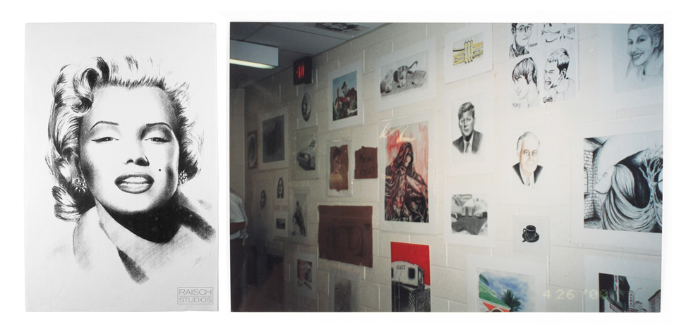
Michael Raisch – Avoid that ’90’s bowl cut from and get over that stolen Marilyn Monroe portrait. One day you’ll laugh about it. That will occur sometime in 2017. (Editors note: I had a portrait stolen in a high school art show in early 1999.)
The Logo Creative – What’s the most important piece of advice you have received as a designer that’s helped you?
Michael Raisch – Hard to pin down a specific phrase or quote over the years, What I would say is that in the 13 seasons of working with MLB at Fanbrandz, I want to credit our studio head and founder, Bill Frederick. He hired me at 22 and since then has completely shared the inner works of the leagues and team business design operations. Details like selling in a designs, staying fresh as an agency and navigating the design creative process with the client are invaluable creative lessons in our field.
Beyond design and creative, It’s the examples set with client relationships and running the agency that I most value.
The Logo Creative – What would be your advice for new Logo and Graphic Designers?
Michael Raisch – I got to say, It feels like a completely different world from which I entered art school in 2000. To start out again would be terrifying.
I would say over figure out an authentic way to stand out. I’ve already dated myself here, but my means of standing out was creating a truly exceptional mailer- It’s wasn’t entirely the work I was showing, but it was how it showed it. I had my print design samples ran on a four colour press, not digital. The quality was off the charts and therefore memorable.
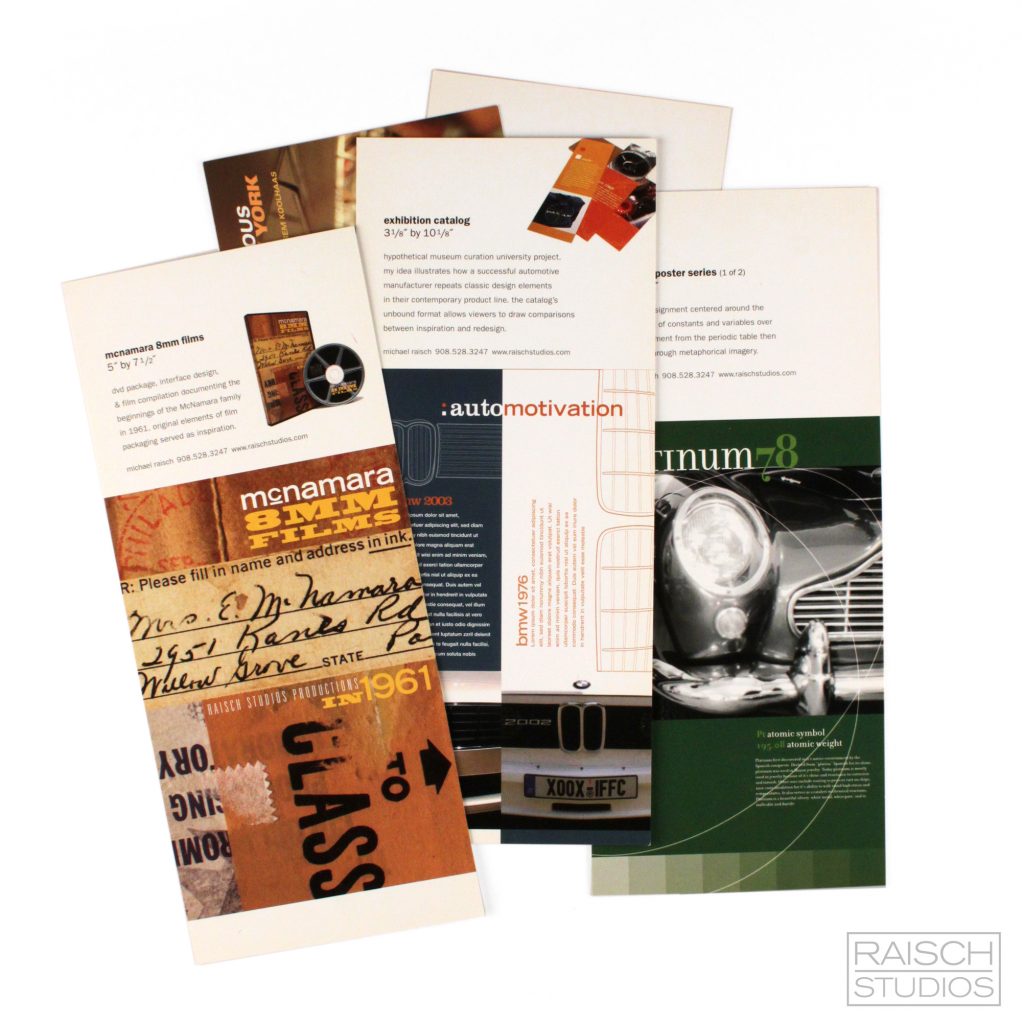
It landed me coffee with Brian Collins at Ogilvy in June 2004.
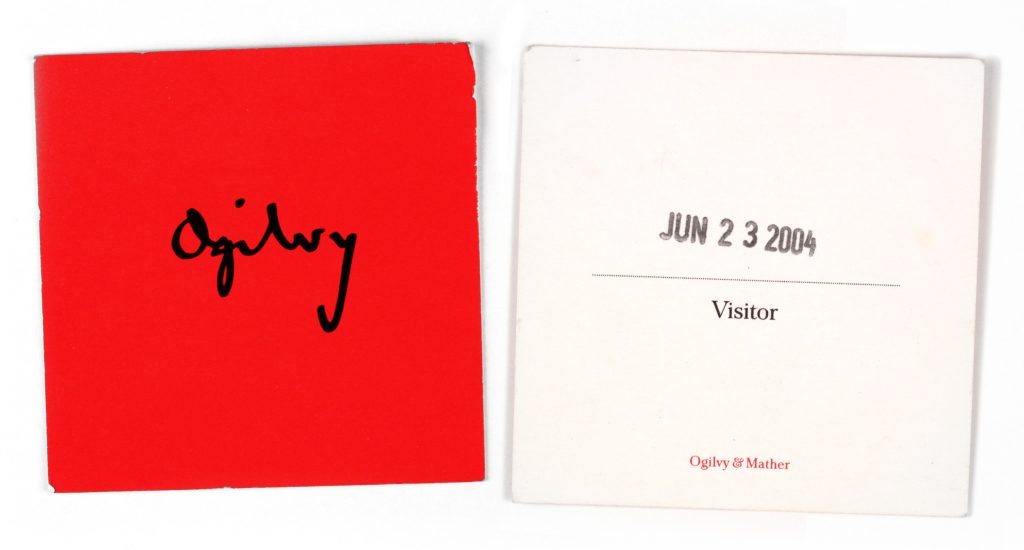
In short, figure out a meaningful way to get targeted attention. you never really know what it could lead to. The trick is to make it genuine, don’t force it.
learn more about Michael Raisch | Raisch Studios

