Mike Sulick, is a graphic designer, occasional illustrator, a color enthusiast, a creator of typography, a collector of books and toys, and he’s probably drawing letters right now. At least that’s what his Instagram profile says about him. Mike graduated from Montclair State University with a BFA in Graphic Design in 2013 already having a reputation as skilled designer winning the NJ Art Director’s Club President’s Award and being granted semifinalist status in the Adobe Design Achievement Awards for his hard work and dedication to what he loves.
Designer Interview With Mike Sulick – @mikesulick #DesignerInterview #thelogocreative https://t.co/UmoDq23MQW pic.twitter.com/P1OZ1S8wgN
— The Logo Creative™ (@thelogocreative) March 20, 2019
Mikes activities in design tend to focus on exploring and uniting a blend of typography, vibrant color, and graphic illustration to create identity systems, package design, and posters. He loves typography, and almost all of his work includes type that he constructs himself specifically for a project.

Mike is a designer at Fanbrandz, a sports branding studio in Montclair, New Jersey. There, he designs and develops franchise identity systems and special event branding programs for the NHL and MLB.
Mike is also the Online Community Leader for the United Design Guild, where he hosts monthly live design workshops through Twitch. Mike also hosts a design podcast called Fireside Podcast with Kevin Greene.
The Logo Creative – Hi Mike thanks for taking the time to take part in the designer interviews it’s great to have you.
Mike Sulick – Hi Andrew, Thanks again for having me be a part of this!
The Logo Creative – What was the turning point in your life when you decided to become a designer and how did you proceed?
Mike Sulick – This is interesting because I feel like there was no single turning point in my life that led me to the path of being a designer, it was more like a chaotic and happenstance series of events that kind of just brought me to where I am now. Just to give a brief overview of this, I was always the “artist” in my family, and I use that term loosely, because mostly I just bought tons of boxes of Crayola crayons and used maybe three colors (something that still applies to me today, I enjoy using a very limited palette). I pretty much saved every drawing I did in my youth until I moved about a year ago when I had to let a bunch of that go.
I attended a high school that offered a wide variety of illustration, graphic design, and commercial art classes that I took but didn’t realize there were even viable careers in those fields. I wised up a bit and stuck with graphic design into college. It was there that it kind of clicked in my head that design is what I wanted to do with my life. I started taking everything a bit more seriously, and really focused in on all my school projects. I started dedicating a lot more of my time to my work. From there I got my BFA in design, graduated with some honors, and got a design internship that eventually led to me being at my current job at sports branding studio Fanbrandz. I guess after typing all this out, I’m realizing maybe the turning point for me was just after graduating college when I started taking my own personal projects just as seriously as my professional work at the studio. I’ve been there for over four years now, which means I’ve been consistently doing my own projects for over four years as well. Doing the two in tandem is really pushing me to explore new areas in design, and forces me to rethink design every year or so.
So that incoherent mess I’ve written is how I’ve become a designer, and I’m still learning and absorbing as much as I can as I continue onwards. Not really sure if that answered the question, but this is just how my mind works when I reminisce..
The Logo Creative – What does your day consist of?
Mike Sulick – It can vary extremely from day-to-day. I wake up at a reasonable time, arrive at work 15 minutes before any work is expected of me so I can browse Reddit, and drink a fair amount of coffee. Too much coffee actually, I’ve been trying to cut back. It’s not working.
At Fanbrandz, there really is no “typical” day. We could be working endlessly on a rebrand project, an event logo, and full style guide, all at the same time, which is kind of what this month has been like. Other days it’s quieter, taking care of miscellaneous odd jobs and requests. There are a nice ebb and flow to the work that comes in, which is nice.
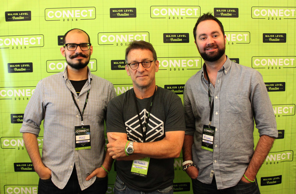
Then I get home and start the “second shift” where I work on personal projects or client work until 1 in the morning. I try to squeeze in some reading and movie watching in there too. Again, this varies widely depending on how much energy I have and what else is going on at night. Sleep is also super important.
The Logo Creative – What was the first logo you ever designed?
Mike Sulick – Oh man, reminiscing again! The first logos I designed were probably made when I didn’t even know what a logo was. I’d write my name in different ways on my notebooks and folders when I was just a kid. Maybe that’s how I got into design? One of my first logo assignments in high school was creating the identity for a fictional winery. Unfortunately, that one has been lost to time…
The Logo Creative – What is your favourite Logo you have designed?
Mike Sulick – I always have a hard time picking favorites, but there’s definitely a few I’m more proud of than others. With Fanbrandz, probably one of the most fun projects I’ve worked on there was the 2015 MLB All-Star Game identity for the Cincinnati Reds. The full package included a lot of fun vintage artwork and typography, and the primary logo had a mustache that matched my own, which gets me laughing more than it probably should…
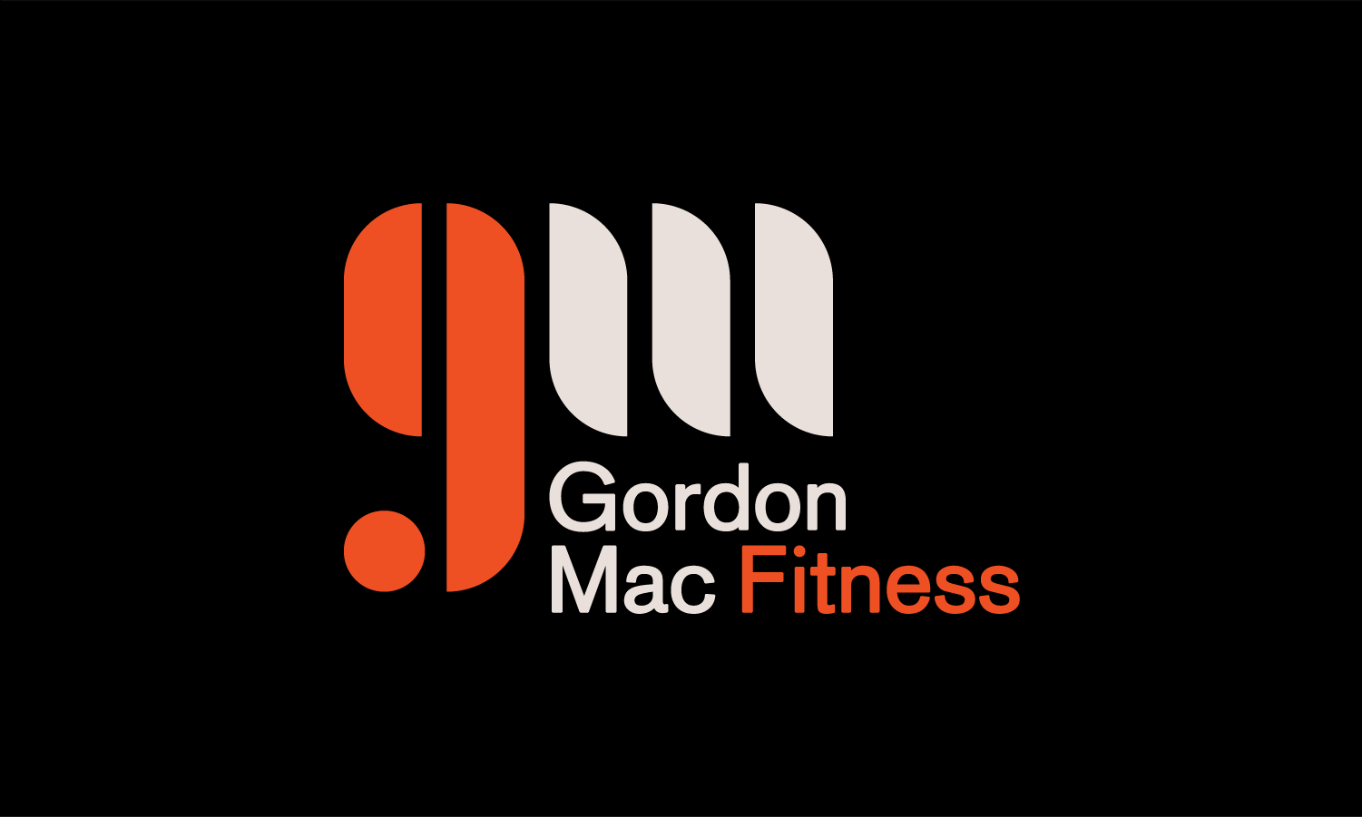
I also did a logo recently for a fitness instructor that I really enjoy (the client never paid for it, so I never sent them the final files, so it exists only in my portfolio at this point). I’m fond of it because it’s just a nice simple flowing monogram, it has a weird motion to it that I enjoy, it’s just nice in its simplicity and it was inspired by the work of Wim Crouwel whom I’m very much a big fan of. Other than that, I tend to not really look back at the work I’ve designed once it’s completed, I’m constantly moving onto the next thing.
The Logo Creative – What is your favourite Logo of all time?
Mike Sulick – Again, I always have a hard time picking favorites, but the best logos are simple, timeless, built on strong typography, and often look better in black and white than in color (that might be my love for restrained palettes talking, but who knows.) The best logos also have a bit of wit to them as well. So, to answer the question, some of my favorite logos are the Victoria & Albert Museum logo by Alan Fletcher, Herb Lubalin and Tom Carnase’s logo for Anthony Hyde (oh! ah!), and Wim Crouwel’s logo for Stadsherstel Amsterdam. Also, it’s not a logo per se, but the “Cool S” might be the best piece of graphic design ever made.

The Logo Creative – Can you describe or give us an overview of your logo design process?
Mike Sulick – I’d like to say I have a standard process that I follow, but really I don’t. Sometimes I’m given a brief or just a vague description of what the client wants, and my mind starts racing. I always keep a notebook handy for these situations. I’ll usually sketch a bunch of uninformed ideas, then hit the books and get into research, and then back into sketching. Sometimes the research is a massive help in creating the final logo, and a necessary part of the process. But sometimes one of my initial type lock-ups that I thought up in the middle of the night or while driving to work will end up being the winning mark.
I’d like to say I have a standardized process and rules, but I don’t, but it works for me, so I’m okay with that! In the end, though, looking through and absorbing books, both design and non-design related, is a huge part of my process. Also, side note, I’ve never started a logo digitally in Illustrator. Designing on a computer is weird to me. All of the design – the thought, the rationale, the interaction of shapes and typography – should all be worked out in a sketch before you touch a computer. Even if you can’t draw, you can get your idea down on paper.
The Logo Creative – In your opinion regarding Logo Design pricing do you prefer working on a fixed rate or customer budget and can you explain why?
Mike Sulick – I think it really depends on the client. In the perfect world, I have my hourly rate and I estimate how long it’ll take to complete a project and start budgeting things from there. But sometimes that doesn’t work for the client. I’m always willing to be flexible though, but never flexible to the point where I’m literally wasting time and money. There are rare cases where you might end off doing a project on the cheap because it will lead to more work later, or because it’s for your friend, or because it sounds really fun. I’m guilty of charging nothing for a logo just because it was a fun idea, and also the client had zero budget. Stick to your guns though, your time and your skills are valuable, which again is why I like to keep my hourly rate pretty set in stone.
The Logo Creative – How long does it take to complete the average logo design project from start to finish?
Mike Sulick – It depends a lot on how intricate the logo needs to be, and if other secondary marks or other parts of the identity need to be created as well. Once my idea is set and I’m happy with it, I think I usually get to a finished piece fairly quickly, but sometimes getting to an idea I’m happy with takes a while, and I spend a lot of time just thinking about it. This especially happens a lot when I’m trying to sleep and I can’t seem to turn my brain off. It’s kind of like a curse but I love it.
The Logo Creative – Are you a MAC or PC User and is there a reason for your choice?
Mike Sulick – I’m a slave to Apple. MacBook Pro, iPhone, Apple Watch, iPad, I have it all. I’m not necessarily thrilled about that, because Apple makes some questionable decisions now and then, but at the same time, I’ll probably never switch. It’s become my happy place. All these Apple products just look so pretty. If I had to design on a PC I’d probably be lost for a while too.
The Logo Creative – Which software do you use frequently?
Mike Sulick – Illustrator is my bread and butter. I use it every day. I dream about it. I’ll use Photoshop every now and then for photo editing, and I recently finished a massive project that was laid out in InDesign, and I’ll dabble in After Effects for motion work every now and then. Every designer at this point should have a Creative Cloud account to get access to all these things, and for the added features like Typekit and the numerous Photoshop brushes.
The Logo Creative – What is your favourite style of logo design? And why?
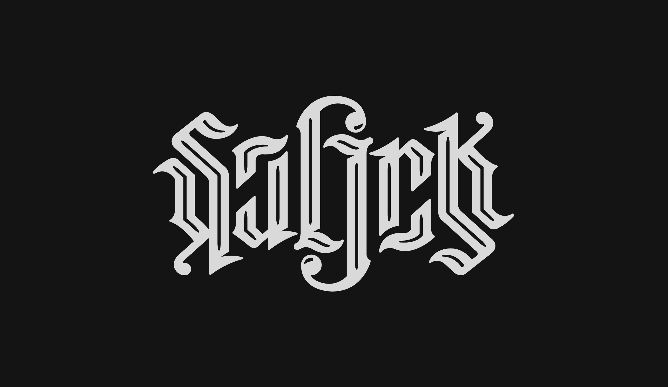
Mike Sulick – I probably half-answered this earlier, but I think the best logos are simple, look lovely in black and white, and have a timeless look. There’s a lot of design styles and trends that are cool right now, and a lot of the work is great, but I always fear that this work will become dated easily, and it’ll enter this zeitgeist of design where everyone’s work starts looking the same until a new popular style comes along. I really don’t think designers should be working in a particular “style” at all. In the end, you need to create work that is a proper solution to a problem. Sometimes design trends will work well for that, but then they might need to be changed in a few years when the new “look” comes along. So yea, the most important thing to me in any aspect of design is timelessness and restraint. We must not forget that a logo is just one element of an identity, it is not the totality of what you are or what your client is. A little bit can go a long way. Look at the logos of Saul Bass and Chermayeff & Geismar and you’ll see logos that can exist forever. Typography also plays a paramount role in any logo. My own logo is an ambigram I must’ve drawn 100 times before I got it right, and all it is is 6-letters.
The Logo Creative – What is your daily inspiration when you design?
Mike Sulick – I have so many books, I try to get some reading in every day, even if it’s just skimming through a design book for an hour. I have this great book on Polish design that I always find something new in every time I look at it. Looking at other design is always a great inspiration, but I also look to things that are not related to design at all for inspiration, and sometimes I find it in the weirdest of places. I listen to music a lot, like a whole lot, and that gets me in a certain mindset to create. The Mars Volta is always good for getting in a creative mood. I also play a few instruments (guitar, bass, and drums) and sometimes switching my focus onto that can help me feel more creative if I’m hung up on something. I do nerdy things like play videos games and watch anime, and that can sometimes be a significant source of inspiration.
I have a model of the Gundam Barbatos from Iron-Blooded Orphans on my desk because I love the sleek design of it. I have a replica of Corvo Attano’s mask from Dishonored because it gives off such a neat vibe on my shelf. I have shelves of action figures, toys, and other collectibles because I appreciate the thought processes and ideas that went into them. I also build Lego models when I need to clear my mind, which for me is important in getting inspired. It’s like clearing out the clutter to allow more in.
The Logo Creative – In your opinion what’s the best and worst part of your job being a designer?
Mike Sulick – Being a designer is great because I can create whatever I want (within my ability). This is the main reason I have so many personal projects I work on. I made a t-shirt that says “Futura Bold” on it, just because I can.
I started an entire series of “logo-ized” type studies, just because I can.
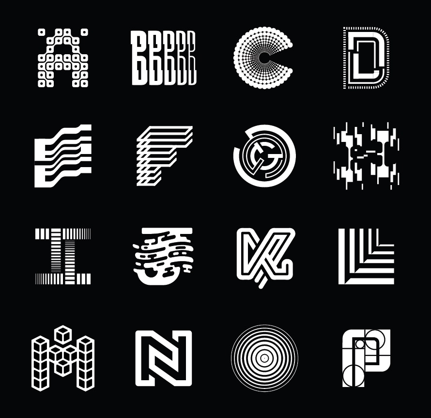
The worst part of being a designer is that I can create whatever I want, but there’s simply not enough time to do it all. That kind of freedom is also a little scary sometimes. Designers are capable of many great things, and we have to use that power responsibly.
The Logo Creative – Who is the most inspiring person to you and why?
Mike Sulick – This one is really tough because the people who inspire me can change on a daily basis. I have my list of favorite designers, but sometimes I need to forget about them to find inspiration from other people and to open new creative channels in my mind. Love your idols and then ditch them. I don’t really know how to answer this, so I’ll just say the “bobby” account on Twitter. That guy is an endless source of inspiration for better or for worse.
The Logo Creative – Who is your favourite Graphic Designer and why?
Mike Sulick – That word “favorite” is so daunting. Ha! Well, I guess I’ll just give my list of favorite designers mentioned in the previous question. Wim Crouwel, Ralph Schraivogel, Karl Gerstner, Armin Hofmann, and Philippe Apeloig are some of my go-to classics. MuirMcNeil is a studio with some fabulous type work. Really I’m a sucker for anyone with a strong focus on typography. I’m a big fan of Becky Cloonan’s illustration, Jessica Hische’s lettering is out of this world, Michael Johnson is a genius, and Hideo Kojima will never stop being a badass. But like I said earlier, have your favorite designers, and then ditch them and see what else there is. There’s always more out there that you’re unfamiliar with just waiting to be discovered. All you have to do is look!
The Logo Creative – What’s your favourite design quote?
Mike Sulick – This isn’t so much a quote as it is a piece of advice I got from a professor in my junior year of college, and I think about it whenever I’m working. The advice is, “If you’re saying to yourself, ‘is this too big?’ it’s probably too big.” It’s genius in how true it is. Eric Baker was the professor, btw.
The Logo Creative – In less than 10 words what is graphic design?
Mike Sulick – A good idea.
The Logo Creative – What steps did you take to start your graphic design business? Did you have to make any sacrifices on your journey?
Mike Sulick – Once I was out of college and set in my full-time job, I still had an eagerness to create and explore more in design. I mentioned this earlier, but there are days where after work, I’ll get home and work on something for myself until 1 or 2 in the morning. Why do I do it? It lets me get into all different aspects of design and gives me total control over everything. When the only thing stopping you is you, there’s pretty much nothing you can’t do. Well, that really just applies to graphic design in my case, I’m not breaking the laws of physics over here. Sacrifices? None yet, really. Sleepless nights, and a bit of my sanity maybe. I’m just trying to justify my own existence through design. But seriously, get enough sleep. Sleep is super underrated to a lot of designers I know.
The Logo Creative – Do you have any regrets? Is there anything you would have changed early on in your career?
Mike Sulick – I feel like I’m way too early in my career to have regrets. But, whoever is reading this, read that from the perspective of a 25-year-old and a 45-year-old, and the sentiment should be the same. Graphic design is fun because I can see myself doing it until I’m dead. Not trying to be morbid here, I just really love what I do. But say I’m 45 or 50 or 60 or whatever. I’ll hopefully still be a designer, and with whatever regrets I may have, there’s always going to be time to adjust and readjust and refocus based on what I want to be doing. I see designers of all ages and in all different parts of the career doing it. It’s never too late to make a change.
The Logo Creative – If you could go back in time, what would you tell your younger self?
Mike Sulick – I don’t know how I feel about time travel, too many works of fiction say it’s a bad idea. If I go back and talk to my younger self, does it create a time paradox? Does it create a split timeline? Which reality do I stay in? To take your question seriously though, I don’t think I’d say anything. I got to where I am based on the experiences I had and the lessons I learned – the easy lessons, and the ones I learned the hard way. I guess I’d tell myself to figure out Bitcoin and get in early on that.
The Logo Creative – What’s the most important piece of advice you have received as a designer that’s helped you?
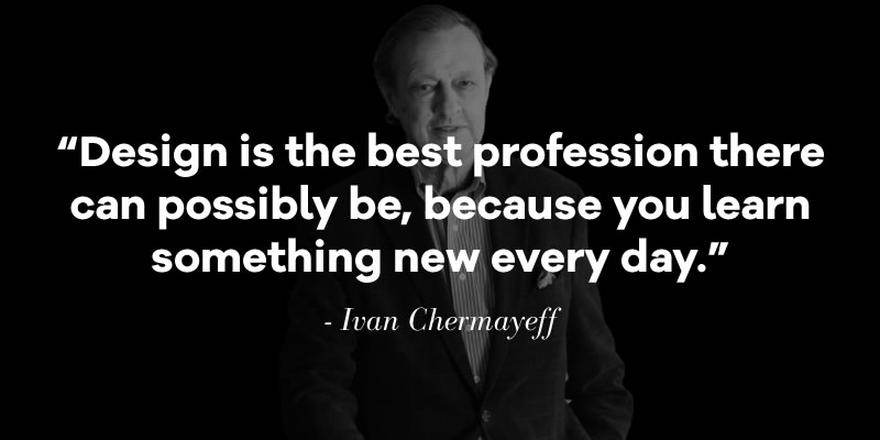
Mike Sulick – I accidentally answered this one already! But I guess I can give more important advice while I have your attention. I can’t remember all the people who have said these things, but these are some of the best pieces of advice I’ve picked up over the years: forget your idols, try new things, being afraid is stupid, don’t underestimate simplicity, be rock and roll when you need to be, good design is about what you leave out, know when to take things seriously and when to be silly, and don’t make your logo accidentally look like a penis (that one was from Andrew Schapiro of Airbnb). In memory of Ivan Chermayeff, I also have this quote for you. “Design is the best profession there can possibly be, because you learn something new every day.”
The Logo Creative – What would be your advice for new Logo and Graphic Designers?
Mike Sulick – Go nuts and make everything you want to make while you can. If you’re a student or just starting your career, do things you wouldn’t be able to do in school or at your job. Make things for things you like. Don’t fall into the traps of trendy or popular styles. And most importantly, if there’s a certain facet of design that you particularly like, become the best at it. Not “be the best you can be,” but literally the best at it in the entire industry. That’s what you should strive for. Also, make sure you get enough sleep.
Thanks for having me.
learn more about Mike Sulick | Jamais Vu | Instagram

