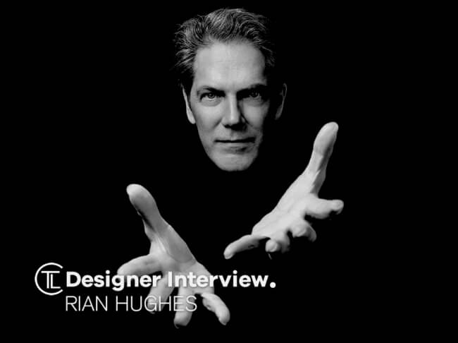
Rian studied at the LCP in London before briefly working for an advertising agency, i-D magazine, Smash Hits magazine and a series of record sleeve design companies. Having cut his teeth drawing comics for Paul Gravett’s seminal alternative press comic magazine “Escape”, for Belgium’s Magic Strip he co-wrote and drew the graphic novel “The Science Service”, published in five languages. Join us as we have a Designer Interview With Rian Hughes.
Designer Interview With Rian Hughes @rianhughes https://t.co/nrIHCaMtqI #designerinterview #thelogocommunity #atsocial #uksopro #typography #logodesign #graphicdesign pic.twitter.com/AgS6n7ePrK
— The Logo Creative™ (@thelogocreative) February 26, 2020
This was followed by “Dare”, an “iconoclastic revamp of the ’50s comic hero Dan Dare” with Eisner-award winning writer Grant Morrison for Fleetway’s experimental Revolver magazine. He then moved to the legendary 2000AD, where he drew Really and Truly (again with Morrison), Tales from beyond Science (with Mark Millar, Alan McKenzie and John Smith) and the classic character RoboHunter with Peter Hogan. These strips and more have recently been collected and republished in the hardback collection, “Yesterday’s Tomorrows”, which was recently launched at the Institute of Contemporary Arts, London. (Knockabout, 2008).

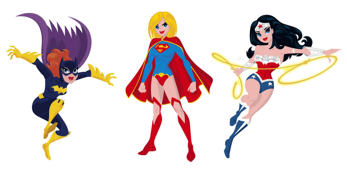
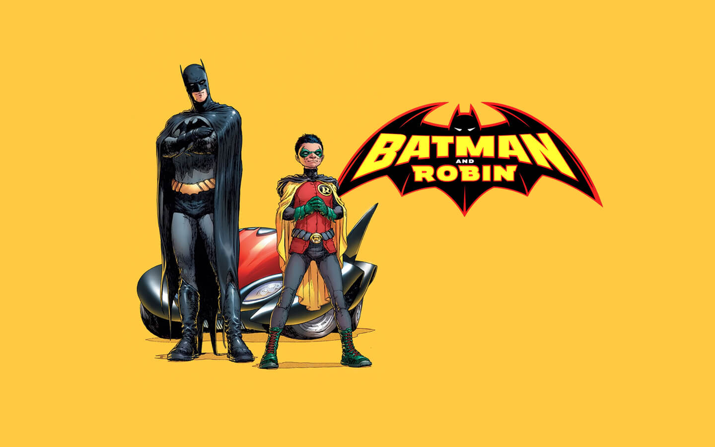
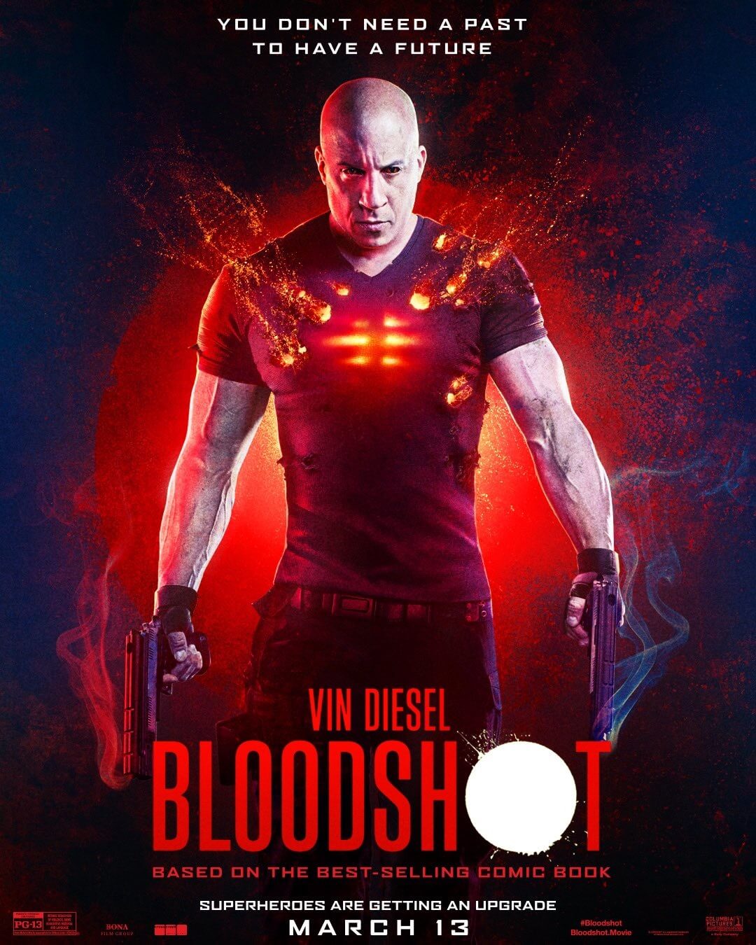
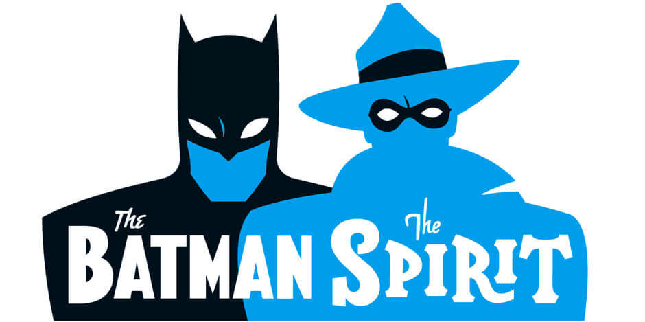
Hughes has since worked extensively for the British and American comic industries as both designer, typographer and illustrator, notably creating many logo designs for DC and Marvel, including Batman and Robin, Batgirl, the X-Men, Captain America, Wolverine, The Spirit, The Invisibles, Shade the Changing Man, The Atom and more. Work also includes title sequences for The Box, poster designs for Tokyo fashion company Jun Co.’s Yellow Boots chain, the animated on-board safety film for Virgin Airlines, Eurostar’s poster campaign, a collection of Hawaiian shirts, a range for Swatch and a BDA International Gold Award and Creative Use of Print Award-winning brochure for MTV Europe’s Music Awards, written by Alan Moore, numerous book covers including the BBC Radio Drama version of Philip Pullman’s His Dark Materials trilogy.
He has designed CDs and vinyl sleeves for indie labels such as Transient and Automatic as well as mainstream acts like Geri Halliwell, with whom he recently collaborated as illustrator on a series of six children’s books. His advertising typography earned a Campaign Press Awards Silver in 1996 and a Merit Award from the New York Art Director’s Club in 2000. He was an early contributor to FontShop’s seminal FontFont range, and now fonts designed for clients such as Mac User, 2000AD, Newquay Steam and PC Format magazine are released via his own label, Device Fonts. He has contributed to numerous design annuals, books and international exhibitions, lectured widely both in the UK and internationally, and a one-man show of his work was held recently at the Conningsby Gallery, London.
The book “Art, Commercial”, is a retrospective monograph collecting his design and illustration work. Recent books include “Cult-ure: Ideas can be Dangerous” and “Lifestyle Illustration of the 60s”, and his comic strips have been collected in “Yesterdays Tomorrows”, which was launched recently at the ICA, London.
?Soho Dives, Soho Divas? from Image features his portraits of the UK Burlesque scene, drawn from life, while recent strips include ?Batman: Black and White? and ?Magenta? for DC Comics, for which he also recently designed the Map of the DC Multiverse, and art for ?Doctor Who? and ?Mad Max: Fury Road?.
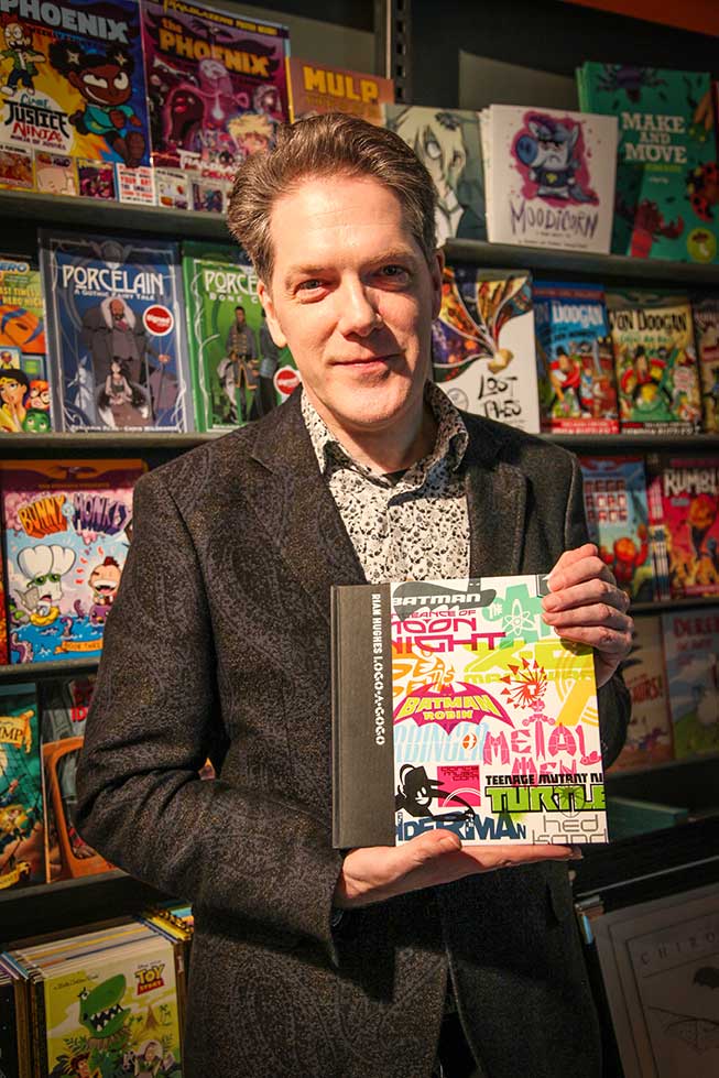
Rian is also the author of Logo-a-gogo published by Korero Press who was kind enough send us a copy of the book to review which is an absolute gem of a book you need to check out.
He has an extensive collection of Thunderbirds memorabilia, a fridge full of vodka, and a stack of easy listening albums which he plays very quietly.
He has been described by Roger Sabin of Eye magazine as “One of the most successful and prolific designer/illustrators of the past 20 years”
The Logo Creative – Hi Rian, Its a real honor to finally be putting this interview out having been a comic book fan as a kid, and being familiar with your Batman and Ninja Turtles logos to name a few. It was also nice to review your book Logo-a-gogo it brought back childhood memories with certain logos it’s a really great book. Also i really appreciate your time taking part in the interview.
Rian Hughes – I’m delighted to be taking part thanks for asking, and super happy you enjoyed the book.
The Logo Creative – What was the turning point in your life when you decided to become a designer and how did you proceed?
Rian Hughes – I was a designer before I’d heard the term graphic design, or realised it was a profession. I’d draw, make books, design board games, invent typefaces. My art teacher told me that there was a degree course you could take called “graphic design”, and that seemed to encapsulate what I was interested in, so I decided to apply.
The Logo Creative – What does your day consist of?
Rian Hughes – There is no typical day. I’ll arrive at the studio sometime between 9 and 10.30, deal with urgent emails and open the post (there’s always a parcel of vintage paperbacks or pulps I’ve bought on eBay waiting for me), then check the schedule and wake the Mac. I switch between several jobs as the inspiration requires, and usually work through till around 8 or 9pm, depending on whether I’ve made arrangements for the evening or not.
The Logo Creative – Are you a morning person or night owl and is there a reason why?
Rian Hughes – Inspiration seems to flow better late afternoon/evening.
The Logo Creative – What was the first logo you ever designed?
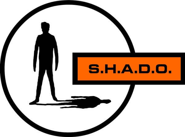
Rian Hughes – Probably something for a school club. I’d trace the SHADO badge from the TV show UFO, or recreate Apollo mission patches.
The Logo Creative – What is your favourite logo you have designed?
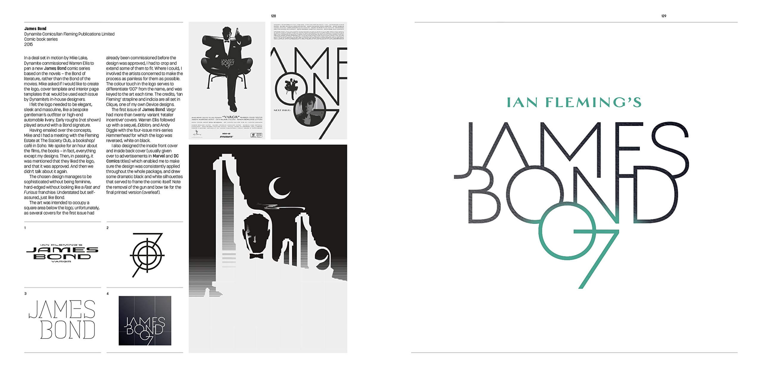
Rian Hughes – The Batman and Robin logo for Grant Morrison’s run is up there. The James Bond logo, because it’s not what a Bond logo usually looks like. My opinion changes as my tastes change.
The Logo Creative – What is your favourite logos of all time?
Rian Hughes – Probably that SHADO logo, though looking at it now it’s not particularly polished. The legs of the silhouette could certainly be refined. I think I liked the idea of a secret organisation, a club with its own secret signs and branding – though if you were trying to stay incognito, you’d not want to advertise your existence…
The Logo Creative – Can you describe or give us an overview of your logo design process?
Rian Hughes – Think of a strong, original idea. Everything else is technique. No good logo – or piece of graphic design – is simply an arrangement of shapes on the page, however beautiful they may be. Once that concept is firmly in your mind, the type choice, the style, everything else will naturally follow, because they’ll be an expression of that idea. I remember a student asking me what font I would recommend. When I said “it depends what you want to say”, they looked bemused – I think they were after tips on what was currently trendy, regardless of context. And, as an aside, I’m not even sure what is trendy these days…
The Logo Creative – What brands do you most admire and how do they influence your creative thinking?
Rian Hughes – I don’t really consider “brands” to be an influence on me. There are certain designers who, when they work on branding, produce the work I admire, but outside the obvious – Apple, IBM in the 60s – I can’t say anything immediately comes to mind.
The Logo Creative – What do you consider your most successful design project, and why?
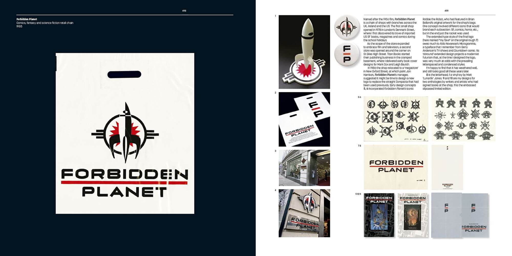
Rian Hughes – It depends what day of the week it is. I still like my Forbidden Planet logo from way back in ’93, my James Bond trade dress for Dynamite, and my Batman and Robin logo for DC Comics. I’m judging these as “successful” from an aesthetic point of view – I’ve no idea if they were successful from a marketing point of view.
The Logo Creative – How long does it take to complete the average logo design project from start to finish?
Rian Hughes – If I know what I’m doing, I can design a logo in around an hour and a half, maybe less. Sometimes it can take days, though this is generally because the number of iterations spiral out of control. This may be because the client is incapable of making a decision or giving the kind of constructive feedback that gets everyone where they need to go, or it could be because I’ve missed something essential that the logo needs to articulate, and I’m aimlessly thrashing about. All my most successful logos were designed pretty quickly.
The Logo Creative – What are you recommended design books to read?
Rian Hughes – I read Eye magazine and a few design blogs, but have never read the mainstream design press. I buy too many books, through, mostly from the 30s to the 50s. I’ve never come across a practical “how-to” for graphic design – they are either too elementary, or a gallery of inspirational images without much in the way of explanation. This is one of the reasons I included the works-in-progress in my recent “Logo a Gogo” book – I thought it’d be instructive to show the process, the thinking behind the final design.
The Logo Creative – Which software do you use frequently and is there any you would recommend to designers?
Rian Hughes – Adobe Illustrator is my go-to. I used to prefer Freehand – it was simpler and more elegant – but Illustrator has revolutionised not just my design but also my illustration work. Photoshop comes in a close second, and Indesign for multi-page documents.
The Logo Creative – What is your favourite style of logo design? And why?
Rian Hughes – “Style” is best avoided, though inevitably it creeps in under cover of darkness. It implies a superficial sheen added to a logo, rather than anything more deeply conceptual. The idea should dictate the design, and the style (unless you’re specifically referencing a historical period for effect) should emerge naturally from that. If you’re starting with a certain font or colour scheme, that’s not an idea.
The Logo Creative – What is your daily inspiration when you design?
Rian Hughes – Really, inspiration comes from trying to articulate the idea. I know I keep coming back to this like a broken record, but in trying to express that idea well you will go to new places with the design process that looking at other’s work, or even your own, will never take you.
The Logo Creative – When you’re not designing do you have a favorite free time activity you like to do?
Rian Hughes – I read – mostly non-fiction science magazines and books, collect old pulps and paperbacks, travel, eat.
The Logo Creative – What was the biggest challenge you ever faced on a project?
Rian Hughes – In general, unresponsive or inexpressive clients. If you’ll not going to engage in a conversation, we’re not going to get anything resolved, and you know the project is going south when you’re throwing random ideas out hoping something will provoke a reaction.
Technically, some projects require multiple logo variants across multiple formats. There may be different departments which require different colour schemes or straplines, or different formats – landscape, portrait – of the same design. Here, the challenge can be getting the client to use the correct one in the correct situation, so simpler is usually better.
The Logo Creative – In your opinion what’s the best and worst part of your job as a designer?
Rian Hughes – Best – actually doing the work, and seeing something come together in front of your eyes. A creatively productive day is elating. Worst – chasing clients who are late payers. Or writing long and detailed emails explaining why adding a starburst or drop shadow or a metallic Photoshop effect to the logo isn’t a good idea without seeming patronising. Sometimes you just want to say “Don’t employ useless in-house designers to implement your project!”, but of course instead you have to coax and cajole the client into taking the project through to completion without trying to “improve” it at their end and in the process completely fucking it up.
The Logo Creative – Who is the most inspiring person to you and why?
Rian Hughes – I still come back to the purity of Peter Saville (though he stole all his best work), the brash, unapologetically pop-culture aesthetic of the Designers Republic, and the compositional dynamism of the Stenberg Brothers.
The Logo Creative – Who is your favourite graphic designer and why?
Rian Hughes – Barney Bubbles. The quintessential designer/illustrator. I knew his work before I knew what graphic design was.
The Logo Creative – What’s your favourite design quote or quote in general, and do you have a mantra or saying you live by?
Rian Hughes – This one seems to have struck a chord. It’s been made into memes:
“What I’m trying to produce is the visual equivalent of the chord change that makes the hair on the back of your neck stand up.”
The Logo Creative – In less than 10 words what is graphic design?
Rian Hughes – An original visual idea, executed with finesse.
The Logo Creative – What steps did you take to start your graphic design business? Did you have to make any sacrifices on your journey?
Rian Hughes – The main sacrifice has been time – but then it never felt like a sacrifice.
The Logo Creative – Do you have any regrets? Is there anything you would have changed early on in your career?
Rian Hughes – I think I’d have started writing novels earlier. But I got there in the end – my first is out from Picador next year, with The Black Locomotive to follow.
The Logo Creative – If you could go back in time, what would you tell your younger self?
Rian Hughes – Keep a diary. Remember how lucky you are.
The Logo Creative – What’s the most important piece of advice you have received as a designer that’s helped you?
Rian Hughes – “Rian, if you can’t give me a dozen ideas I can use before lunchtime, you’re no use to me.”
The Logo Creative – What would be your advice for new Logo and Graphic Designers?
Rian Hughes – You have to love what you do.
learn more about Rian Hughes | devicefonts.co.uk | Wikipedia |

