In this article we discuss Designing a Better Logo Design
Have a browse around the internet, you may be left with the impression that designing a logo is easy; most logos look very simplistic and you may be under the impression that not alot of work goes into them. Actually, there’s more to crafting a brand’s visual identity than just placing a name in a box or next to some clip art and calling it a day.
A logo is often a company’s first impression, one that can impact a customer’s brand perception, purchase decisions and overall attitude towards a product. Just think about the number of products you purchase in the supermarket due to the fact you recognise and trust the logo, the brand… even toddlers who can’t yet tie their own shoelace recognise many logos or are able to deduce what a company sells just by looking at its brandmark!
It is essential that you design a logo for your client which ideally portrays the essence of your business to the outside world. It should be a balanced combination of color, shape, typography and your business’ attributes. A perfect logo aims to effectively capture the values and services of the business in a visual context.
We work closely with our clients to create, develop and rejuvenate their brand marks which allow us to uncover the identity values and focus them on a core brand message to communicate to the target audience. Here are some tips on creating a great logo.
Table of Contents
Don’t Skip On Research
As with any project, research is key. The internet is an ideal place to start – there is a vast sea of information online for inspiration and ideas before beginning the design process. Just running a google search for logo designs of similar companies can bring up endless ideas! and help eliminate the obverse ones that have already been designed.
It’s important to see whats already been designed and once I know I personally I like to start my reasearch phase with a mindmap and sketch note and then in books. Two of my favorite go-to books when starting a logo design project are
- Logo: The Reference Guide to Symbols and Logotypes by Michael Evamy
- Logo Modernism by Jens Muller and R. Roger Remington


Understand the Brand
Although a logo may only be an image, it’s also the introduction to the brand. The logo is going to reach a specific audience, and when designing, this must be kept in mind. It’s important to be inspired by deeper meaning as well as the aesthetics; researching other visual brands will help, but we must be careful to not take the inspirations too literally, any design work must be original and map directly back to the client’s unique brand attributes. Is the brand contemporary or quirky? What does the customer care about and what does the brand aspire to be? While it is useful to stay up to date on design trends, it’s more vital to stay true to a brand’s personality. The target audience should also always be a priority in its design. Knowing who they are, what general age range or where they may live will give huge emphasis on design direction. But, most importantly, know what the logo means. Every logo has some kind of history, filled with meaning and purpose. Since a logo is the brand’s visual keystone, the most concise expression of its personality, an honest and open approach to defining the meaning of the brand is key to a successful result.
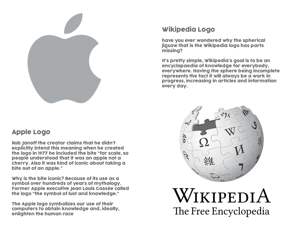
know what your logo means. Every good logo has history behind it, and this is filled with meaning and purpose. Take Apple, for instance — the fruit is missing a “byte.” Or Wikipedia, the unfinished globe of puzzle pieces covered with glyphs from different writing systems. Both logos are simple but have an added twist that circles back to brand ideology.
Be Original, Innovative and Creative
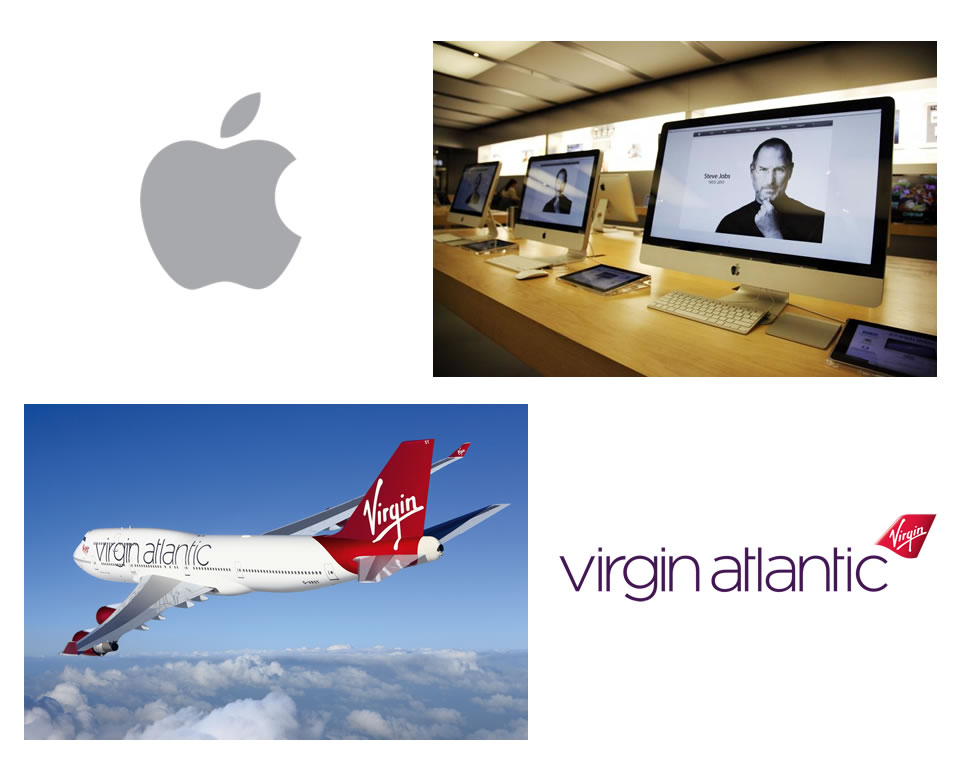
The logo is what helps to distinguish a brand from its competitors, so it’s important this stands out from the rest. In many cases, imitation is the highest form of flattery – with logo design, this is not the case. “What’s important is to create something that you believe is different from anything already out there,” David Airey, a graphic designer and creator of website Logo Design Love says. “It’s highly unlikely (some say impossible) that what you create will be original, but that should be the goal.” Creating an original design isn’t just about avoiding imitation however, but also about designing something out-of-the-box. It’s tempting to just throw an industry icon on the page, but it’s important to think creatively – for example, the Virgin Atlantic logo isn’t just a plane, just as the Apple logo isn’t a computer.
Keep Your Logo Simple
Simple designs stay in people’s minds. Large corporate companies of the world keep their logos very simple and when we see them, we instantly recognise that brand. It’s important to have a balanced combination of simple and quirky – the logo needs to be interesting, but you don’t want someone to have to stand and stare, analysing the logo. A good example is FedEx’s logo, a simple logotype with a twist. The image uses negative space to create an arrow which connotes speed, precision and direction. Amazon, too, uses just its name, but also refers to its wide inventory with the arrow pointing from a to z. logo-2-2
![]()
Colour is Key
Colour has a huge effect on the impression received from the logo. Certain colors portray a certain message. Red is known to increase the heart rate and blood pressure and is commonly used for sales items. Blue is a calm colour and used to establish trust – many banks and businesses use blue in their logos. Green is a peaceful colour and conveys growth and health. Green can be often seen in the logos of companies dealing with environment and natural health products. Yellow is a youthful and optimistic colour, and is used by Subway, MacDonald’s, and National Geographic. When taking the brand’s personality into account, you have to think about every aspect of the image. Bright and bold colours may grab someone’s attention, but could also seem brash; muted tones exude sophistication, but could be overlooked. Every colour has a different implication and can bring nuance to your message — don’t fall into the trap of conveying the wrong message because of a simple brush stroke. The Logo Company released an article “The Science Behind Colors” and an infographic displaying The Psychology of Color in Logo Design. Here’s a quick break-down:
- Red: energetic, bold
- Orange: creative, friendly, youthful
- Yellow: sunny, inventive, optimism
- Green: growth, organic, instructional
- Blue: professional, medical, tranquil, trustworthy
- Purple: spiritual, wise, evocative
- Black: credible and powerful
- White: simple, clean, pure
- Pink: fun and flirty
- Brown: rural, historical, steady.
![]()
What’s in a Brand Name?
Generally, a logo consists of two elements: a wordmark and a symbol. Before a company can think about solely representing itself with a symbol, a great deal of advertising must be done to build up brand recognition. Some companies choose to stick to a logotype entirely, like Coca-Cola, Boots, and Kelloggs. The choice of fonts for logos should be selected wisely, and generally should be no more than two typefaces. Different fonts also give different psychological impressions so this is as much an important area as choice of colour.
![]()
Keep The Logo Flexible
An important factor to consider when designing a logo is how it will be used on different media, such as business cards, websites, signs and t-shirts. In the digital age, where logos appear on multiple devices and across social media, it must look great on different backgrounds, work for apps, icons, avatars and especially in print. The design should be easily resizable and able to be used on a variety of colours – but still recognised as the logo of that company. The logo design must also be timeless, meaning it will still look fresh in a matter of years, or even months. Small iterations may be made along the way, but ultimately, the logo needs to be relevant and not feel outdated.
![]()
Don’t expect success instantly
Nike, Puma, Audi — all iconic logos, but like with anything successful, it took time for these to gain popularity. Logos won’t become instantly iconic, even if you’ve designed the most beautiful combination of vectors. It depends on the product’s success and the market in which it exists.
“What you think is your best design might very well be for a local craft store that only people in the nearby area ever see. And the design won’t be classed as iconic because it doesn’t have the reach of multinational businesses, Ultimately, iconic design status can only be achieved if the client fulfills their potential, too.” – David Airey says.
But what made those iconic logos so special? looking at how they originated, you will see that they derived from a great understanding of brand principles. The Nike logo designer Carolyn Davidson was told to create something that displayed motion and would look good on a shoe — hence, the swoosh; Audi represents the company’s four marques linked together; Puma, a simple visualization of the name, along with a leaping puma.
That’s why it’s important to be patient don’t be hasty and rush to make changes to the logo design just because the brand has not been getting the reception that was initially expected. Don’t change your logo just because you’re tired of it, or a competitor has, If its time to evolve the logo, look for elements that can be carried forward.”
If your not an experienced logo and brand identity designer then seek out a professional and invest in a quality help, creative direction and a solid design, don’t try to DIY it yourself as it will backfire and have a negative effect on your business and brand and this will not help you in your quest to build and grow your business and reap the success you are expecting.
If you would like a consultation for logo design or branding your business submit the design brief and we will be in touch.