Logos are the face of a brand, it’s how a person distinguishes the brand for who they are. A logo design is the face of a company, a single visual identifiable mark with the sole purpose to identify. It’s possibly the most valuable visual asset a brand has and if designed incorrectly it can give off the wrong message within seconds. The logos in this article definitely do just that so let’s take a look at some examples of Logo Design Gone Wrong.
When we think of the big and famous global brand logos that are instantly recognisable with the brands they are representing we think of Apple, Nike and Coca-Cola to name a few. When you visualise these logos you can instantly picture in your mind that brand, what they offer and how they do it!
Those logos do their job well! They have stood the test of time and are loved by millions of people world-wide. It’s simple: a great logo design is identifiable, memorable but most importantly appropriate which more than said for these logos in this article.
Brand consumers stay loyal to things they are familiar with, things they trust, that they have positive experiences with.
An effective logo is a must for the overall success of a company and its brand. I honestly don’t know how some of these logos were approved if designed by a logo designer, but you can tell the ones that were not and more than likely a DIY job.
Logo design is not easy. It’s a skillful task that not only requires design skills but also good research and planning to arrive at a solid working concept.
Let’s now take a look at some Examples of Logo Design Gone Wrong, some are funny but very inappropriate at the same time.
Table of Contents
Mont-Sat Antenna Logo
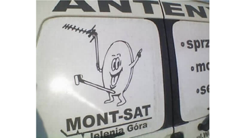
Well what can i say about this one?, he sure is happy and sending all the right signals. I think the proof is in the picture when i say the representation is definitely questionable!
Brazilian Institute for Oriental Studies
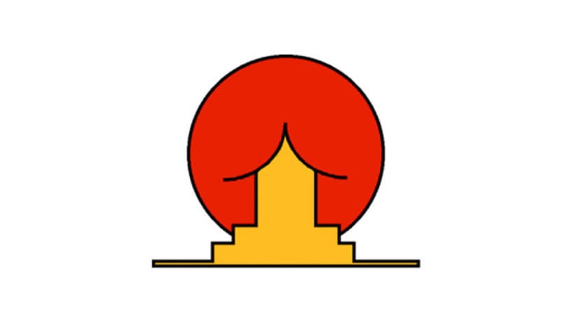
This one has made its rounds on the internet and one of the overseas ones that comes to mind when we think of Examples of Logo Design Gone Wrong. The concept was intended to be a scene of an oriental house positioned in front of the rising sun but looking at it screams something completely different. the simple use of those two inner curved black lines draws the focus in on a different image entirely.
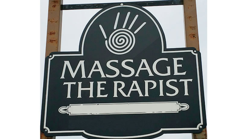
Massage Therapist?
Letter pacing in logo design is really important!
if incorrectly kerned which is adjusting the spacing between each character within the text can give off the wrong message, and say something completely different! In this case above.
Can you imagine walking around and seeing this in front of you? What i find strange is that there is such a tight kerning throughout apart from in between the “E” and “R” which makes it look deliberate.
But taking a closer look it can’t be as the word “therapist” is supposed to sit under the word “massage” inline and if kerned correctly the last “T” would fit under the “E” the same way the first “T” fits under sits under the first “M”
It definitely goes without saying that this gives off the wrong message and would put people off going in within seconds of reading this.
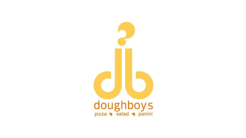
Doughboys is a “contemporary fast-casual restaurant, that offers a healthy and fresh menu consisting of gourmet wood-fired pizzas, pastas and panini’s”.
Their food may be delicious but from a visual standpoint from their logo design people may get the wrong impression entirely.
To keep this article clean we are not going to say what we think this represents visually, but it’s not too difficult to see for yourself.
Mega Flicks logo
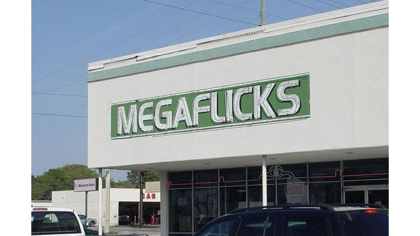
Another great example of a bad kerning issue. Letter spacing is as important as with the case here. When letters are placed too close together they can look and read like other words that they are not supposed to be.
Looking at this you may be inclined to think this movie rental store specialises in “under the counter blue stuff!” I’m not going to say what it reads but that “L” is way too close to the “I” making it look like a “U” While we can laugh and smile about it reading this could really offend some people giving the business a bad name and reputation in the process losing them a lot of trade. Wheather that was the case i have no idea but it’s a great example.
Office of Government Commerce (OGC)
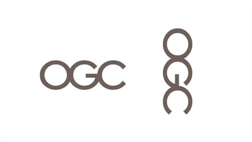
The OGC is an independent Office of the Treasury. The logo design was done in 2008 by a London agency who charged them £14,000 apparently, and according to various sources on the internet.
At first glance it looks innocent, just three simple letters joined together to form “OGC” but even the simplest of use for these three letters can design something quite obscure and generate public outrage.
If you rotate the logo 90 degrees clockwise you will see something quite different in three simple letters. The most unfortunate aspect of this logo is the fact that it’s still being used by the agency.
A good practice in logo design is to rotate when designing a logo, rotating it and testing it at every angle!
Sometimes you need to shift your view to realise potential errors.
The Computer Doctors Logo
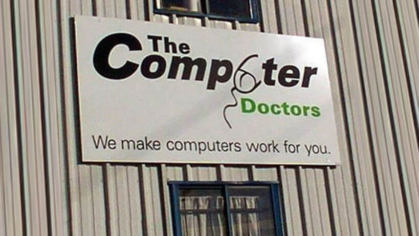
More than likely you will have seen this one floating around the internet. It’s not the worst or rudest one out there but i must say there is a heavy focus on the so-called computer mouse icon that looks like leaky genitalia to put it as nice as possible.
This logo was definitely not designed by a professional as it screams DIY job but even so it stands out like a…Well you can form your own opinion!
What Do You See?
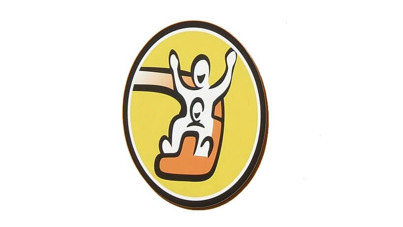
This one was sent to me by a reader some time ago when i was doing research for another article. I thought i would drop it in here for you to make up your own mind.
I understand it’s supposed to be a child sitting on someone’s knee going down the slide, but where is the rest of the child’s body? This could visually represent something else to different people. Like i said i’m just really puzzled as to why you would miss off the rest of the child’s body?
Islamic Understanding Institute

Again, this is another logo sent to me by another reader, so i will leave this one for you to pass your own judgment on!
A-Style Clothing Logo
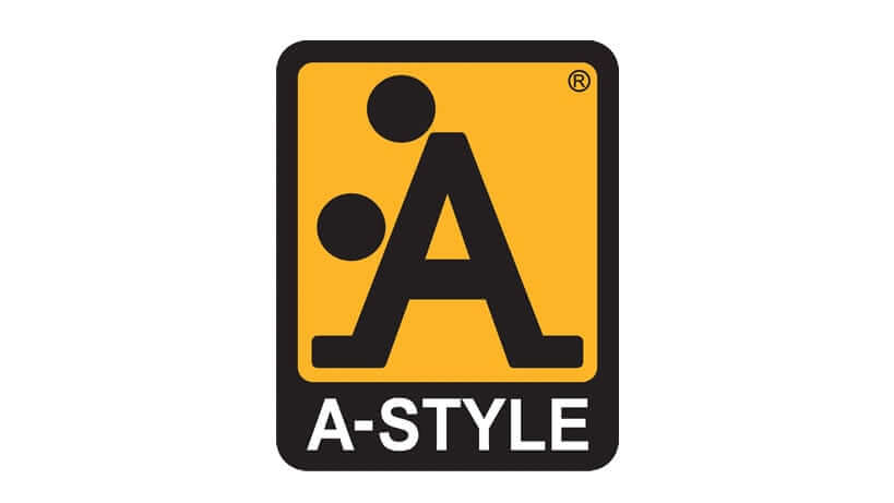
If you think this logo was a mistaken oversight, think again! This logo was very intentional!
Publicity stunts happen when people do shameless things to get attention, and it even happens in logo design, that was the case for this Italian based clothing brand called A-Style clothing.
This crude effort from the brand’s founder was in place between 1989 to 1991 well before its clothing line was made a ‘Guerrilla’ marketing ploy to draw attention from the media and get in the headlines.
The founder went as far as sticking stickers of the logo around Italian cities to draw attention, followed by other cities including Miami, Moscow, and London.
Shameful move and although not condoned it worked! They started selling their products after that under the A-Style name.
Clinica Dental San Marcelino
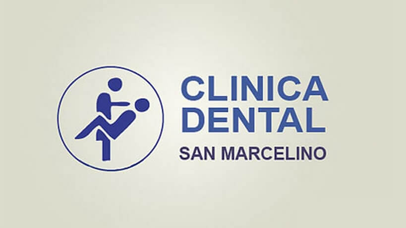
Clinica Dental in Spain certainly offers an extreme dental service by their visual representation in their logo design. When designing icons you need to think clearly about how this is going to look and how it will represent your business and organisation or medical practice and in this case not very well!
Fully Erect Tents
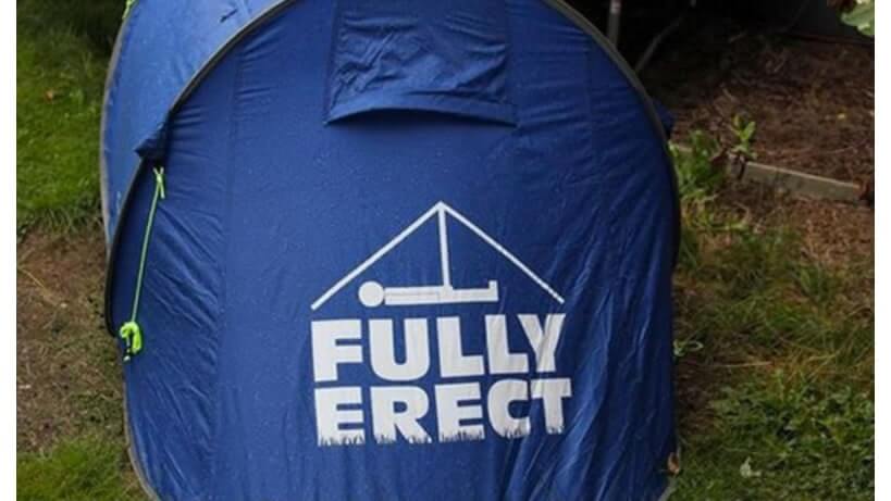
I was shocked but laughed when i found this one, for starters the name “Fully Erect” is intentional its just the image screams what the name is insinuating but in a rather different way to what it was intended to do.
The name is definitely the wrong choice for a tent company but to introduce the image with that name is mind-boggling. Why did this happen? Why was it not seen?
Dirty Bird Logo
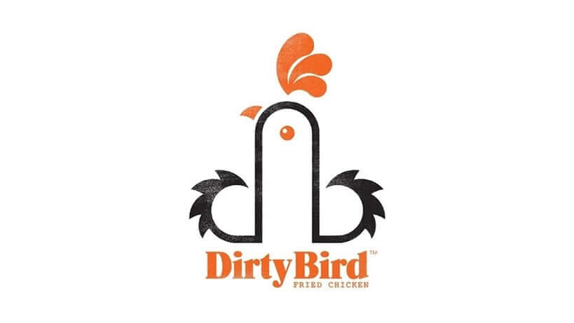
very similar to the Doughboys logo in what it represents is the street food fried chicken truck Dirty Bird, based in Cardiff. They have stated to national media that the logo design was not designed to appear phallic in any way and the concept was based around their initials “db” and in the form of a chicken.
Even when done innocently things can represent other things. I’m still shocked that the design was accepted as you can clearly see a phallus.
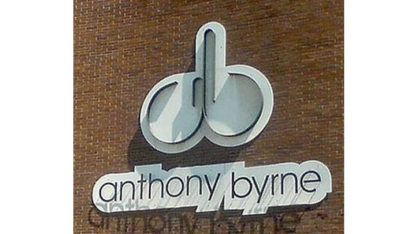
Anthony Byrne
Another Phallus resembling a logo for Anthony Byrne. We understand its “ab” but come on, don’t these people look at them and think before they mount them on buildings?
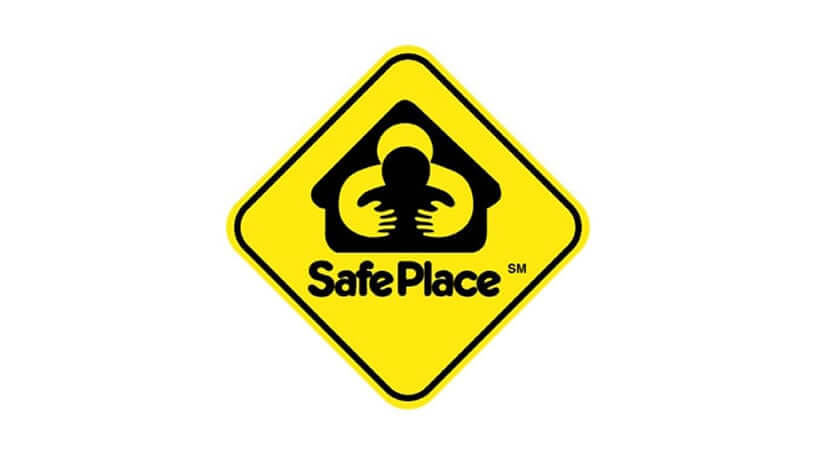
Safe Place Logo
Safe Place is a national youth outreach program. They have since changed the logo which looks very similar but now says “Safe Place” and the “A” in the word Place is a simple house icon.
The original logo shown here was listed as inappropriate in what has been described to resemble an adult grabbing and groping a child’s breasts from behind.
We understand the concept of a house with an adult caring for a child, but then you have to understand what it may resemble to other people.
What is also alarming is a yellow diamond sign signifies a warning so the whole concept of this does not marry well with the idea of a safe place even more so they have kept this yellow sign for the for the new logo.
Strange! – Representation is key especially in logo design, more thinking is needed!
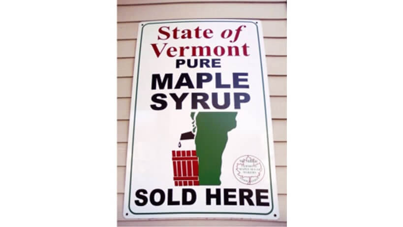
State of Vermont Pure Maple Syrup
Here is a funny one,
We won’t say too much about this one but from what we can see it looks like a man having a wee in a dustbin!
After doing a little background check, the image is of the state of Vermont, which does resemble a side profile of a person’s legs and hindquarters and…You get the jist of it!
Arlington Pediatric Center Logo
The Arlington Pediatric Center or, in this case, Pedophilic center? It really does make you wonder who approved the logo design on this one!
The logo made it onto the outdoor signage before a person pointed out that the illustration could easily be miss interpreted. They sure did gain some unwanted publicity with this great Examples of Logo Design Gone Wrong.
While the center more than likely employs some great physicians, the public will forever misperceive its services because of this logo design gone wrong!
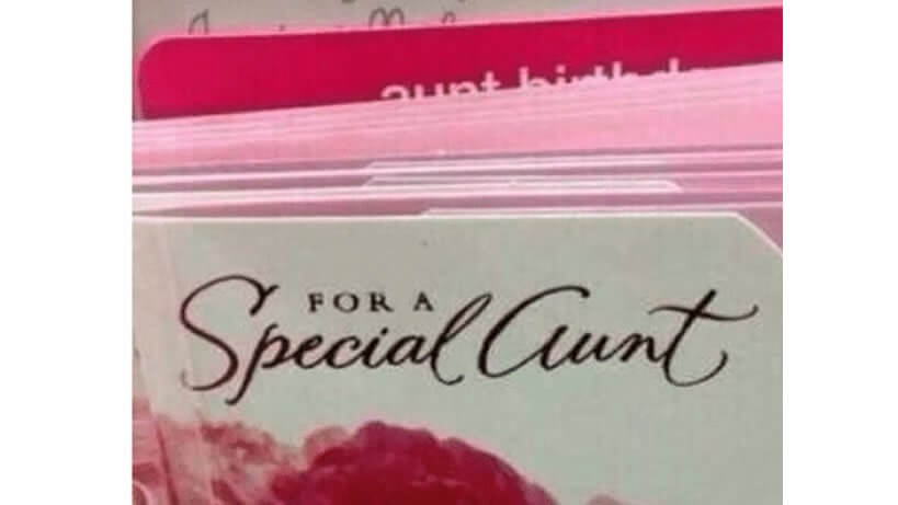
For a Special What?
Not a logo but a good example of how a miss representation in a split second can happen. I had to personally second read this as for a split second i read something else.
When looking again you can clearly see the word “aunt” but like i said that split second makes the difference, maybe a different font?
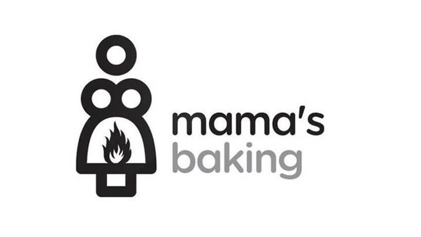
Mama’s Baking Logo
That’s one, hot mama! The Greek cafe known as Mama’s Baking has a major Oedipus complex. Enough Said!
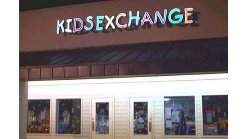
Kids Exchange Logo
The correct punctuation should always be encouraged. Yet another great example of a simple kerning issue that would have saved this company a great deal of embarrassment and humiliation.
It could very well be the sign makers’ fault in this one and not the designers as each letter is made individually so when mounting them not enough space was given.
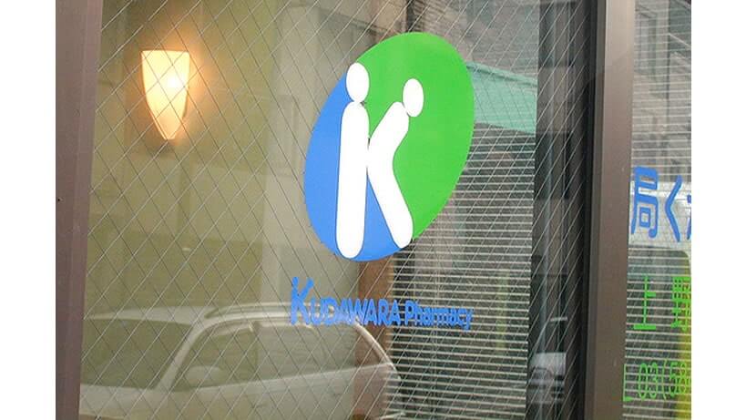
Kudawara Pharmacy Logo
This logo was once used by the Japanese Pharmacy Kudawara. It is meant to represent the letter “K”…Uhm! you don’t need to look very hard to see the two stick figures who look like their getting friendly together.
You can imagine why the logo gained widespread public attention.
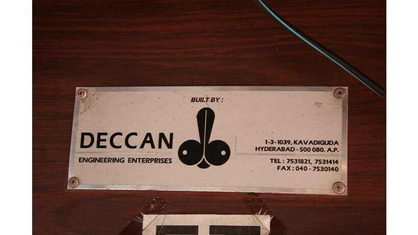
Deccan Engineering Rocketship!
Another rocket ship or is it a surprise version of the Playboy bunny?.. Built by..N#!s? … enough said! …Why just why?
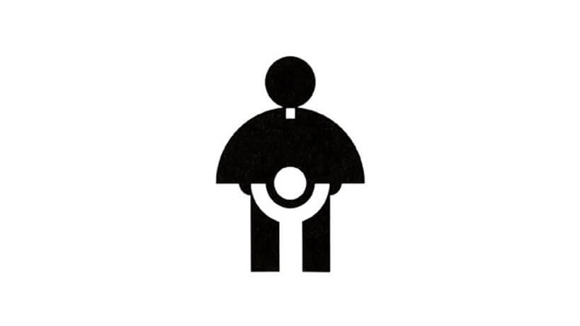
Catholic Church’s Archdiocesan Youth Commission
This isn’t alluding to anything about the stereotypes of how the Catholic Church treats young children.
This logo was made for the Catholic Church’s Archdiocesan Youth Commission in 1973 it won an award from the Art Director’s Club of Los Angeles. Even the most well meaning of pictures can be misinterpreted,
This is a prime example of how perception changes over time with new generations that are viewing things much differently from their predecessors.
What $exchange$?
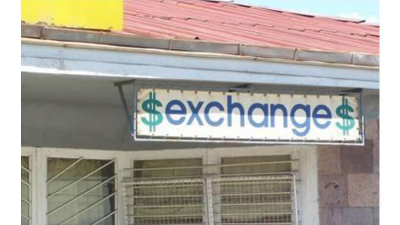
This currency exchange sign really does them no justice at all as it could read “sex exchange.” I would not call this a design but spacing is imperative to avoid in this case a negative perception.
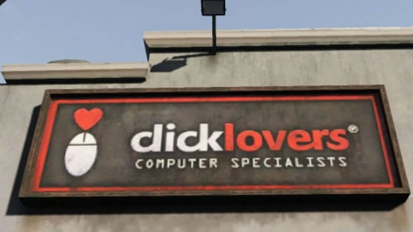
GTA 5 – Click Lovers
To finish off this fun article i remember playing GTA 5, and a sat for ages thinking i’m sure i saw a logo on one of the shops that would fit perfectly in this article. I fired up the game and hunted it down and took a pic on my phone.
I know it’s a game but this is deliberate and Rockstar games are famous for it in GTA. I love spotting things like this in games as you know there are there to find!
I hope you have enjoyed these Examples of Logo Design Gone Wrong. Be sure to leave a comment below we love hearing from our readers.
If you would like more personal tips, advice, insights, and access to our community threads and other goodies join me in our community. You can comment directly on posts and have a discussion.
Useful Links & Great Deals

