Web designers and developers are constantly dealing with changing technologies, customer demands, and user habits. There’s always the challenge of coming up with unique, user-friendly, and intuitive designs that also boost conversion. Join us in this article as we discuss Expectations vs. Reality: An Analysis of the Predicted Web Design Trends of 2019
As such, developers need to stay up-to-date with the latest trends, resources, and tools not just on web designs but also on the many ways users are interacting with technology and websites.
Below are just a few statistics showing the continued growth of the web design industry and trends that continue to influence the look and functions of online platforms.
Table of Contents
2019 Web Design Statistics
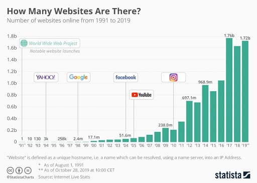
- There are 1.72 billion websites in 2019. This is almost double the number of websites only five years ago.
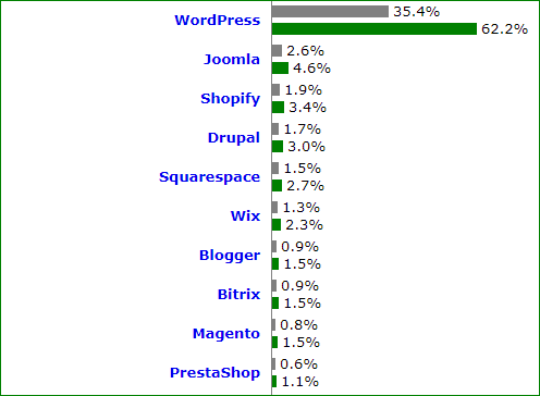
- WordPress is powering 35.4% of websites.
- Several sites (Time, NBC News, The LA Times) have adopted infinite scrolling to minimize their bounce rates.
- In the U.S., 58% of web visits came from mobile devices.
- 89% of internet users spend their media time on mobile apps, while the 11% spent on websites.
4 Ways to Spot Web Design Trends
If you want to offer your clients better, more impressive designs, you need to constantly be on the lookout for industry developments. Browsing blogs and portfolios and engaging in online discussions will help you discover other possibilities. You’ll also come across tutorials that you can use to upgrade your skills and improve your own portfolio.
Below are some ways you can discover what’s in and what’s not in the web design industry:
1. Follow web design blogs
One of the top ways to predict trends is by following design blogs. Aside from browsing their articles, view their tutorials, and observe which design styles they are actually using on their site.
Here are just a few web design blogs you can check out:
- Smashing Magazine
- Web Designer Depot
- Designmodo
- The Logo Creative
- MonsterPost
- Hongkiat
2. Look up online discussions
Aside from following design blogs, you can also predict trends through exchanges and posts shared on social media. Find out what other top designers are working on or recommending.
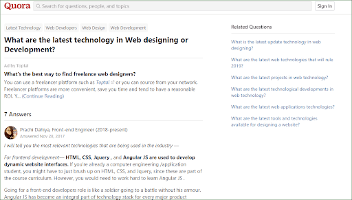
Aside from social media, you can browse question-and-answer websites like Quora. You can even post questions, exchange insights with other designers about what works, and discover new technologies.

3. Study the sites you love
As you surf the internet, whether on your desktop or mobile device, pay attention to the designs of popular brands. Notice the color, typography, and user interface.
Also, pay attention whenever a website captures your attention. Think about what drew you in–by any chance, is it the video or the color palettes? What elements made navigation a breeze?
At the same time, take note of factors that turned you off or drove you to leave the page. Was the page taking too long to load?
There’s a good chance other web visitors also share your impression and experience of these sites. You can expect more companies to adopt the effective features and drop those that are increasing their bounce rate.
4. Keep an eye out for tech developments related to UI and UX
Each year, we learn more about how people interact with their devices. For example, we know that more people are using smartphones for online shopping. Customers also demand fast loading times and quick responses to their queries.
The web design industry is constantly shifting to adapt to these demands. For example, businesses pages have become mobile friendly. Websites are being redesigned to make navigation easier for everyone, including differently-abled users.
Pay attention to these technological developments and how companies are adapting them. Notice how some of these, such as infinite scrolls and lazy loading, are also changing the way you interact with websites and apps.
2019 Web Design Predictions and Trends That Failed Expectations
Developers innovate and experiment as they search for more effective and efficient designs. Some schemes work, and we can expect to see more of these features in 2020.
But other ideas, although aesthetically pleasing, failed to help visitors better navigate sites and discover key information. If you’re using one of these features, you may want to reconsider other design options.
Hamburger Menus

Hamburger menus do have several benefits. For example:
+ It’s a recognizable symbol. When users see it, many know that they need to click on it if they want to browse other pages.
+ These menus give your site an organized, clean look.
+ Hamburger menus give your web users direct access to the pages they want to view.
However, it has disadvantages too.
— Hamburger menus don’t allow users to view important buttons in one glance.
— Users tend to think that hidden features are less important.
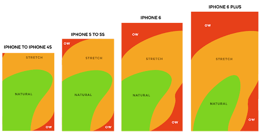
— Menus at the top of the screen are not very accessible. This is especially true if most of your visitors are on mobile devices.
Autoplay
Once in a while, you may still come across websites with a background audio or autoplay video. This can be irritating when you’re trying to focus, or worse, you’re in a public place, such as the library, coffee shop, or at work.
Google had rolled out a Chrome version that prevents the web browser from playing videos whose sounds are set on autoplay.
Image Sliders and Carousels

When you want to pack as much as possible on your website, sliders and carousels seem to be the perfect solution.
But tests reveal otherwise.
Turns out that these have several shortcomings:
- It slows down your site’s loading speed.
- It affects usability. Visitors may still be reading texts in one image when the slider moves to the next one. This is especially difficult for users who need more time to read a text, either due to low literacy, motor skill issues, or the site is not in their native language.
- Because of banner blindness, people tend to miss or ignore the slides’ contents.
- When Notre Dame University studied their carousel, they found that 84% of visitors interacted with the first slide. But the rest of the images were only clicked by 1% of visitors.
2019 Web Design Trends That Are On Point
Mobile-First Optimization
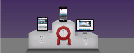
Google’s implementation of the mobile-first index in 2018 and the growing number of visits coming from mobile devices made it a must for companies to come up with mobile-friendly designs.
Faster Load Time
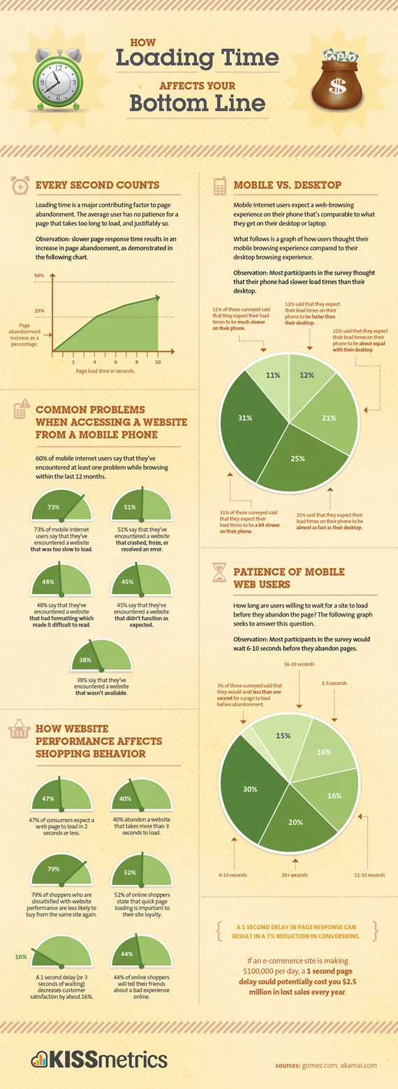
Today’s users are highly likely to leave a site or close the tab when pages or images don’t load within a few seconds. In 2019, designers continued to find ways to incorporate videos and images without sacrificing load speed.
Chatbots
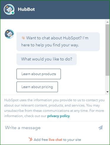
Chatbots have proven effective in helping initiate conversations, addressing inquiries 24/7, and converting consumers. Companies have innovated their chatbots to provide all types of support, from answering queries to facilitating online purchases. Madison Reed has even launched Madi, who can suggest the perfect hair color for you after you upload your picture and answer a few questions. You can expect to see more sophisticated versions in 2020.
More Video
More companies have incorporated videos on their websites, sales pages, and content. This is an essential move, as many users now prefer watching videos for learning and entertainment.

Videos allow companies to pack a lot of information and product features in short videos. For long tutorials, they have been including timestamps so users no longer have to listen to the entire material. Instead, they can only watch the sections they need and conveniently navigate video content.
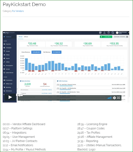
Moreover, Google had begun showing videos above other types of content in search pages. This is another motivation for businesses to produce videos to make their brand more visible.

Diversity, Inclusivity, and Personalization
This trend is not new, but in 2019, we saw more companies consciously embracing these concepts in different ways. Brands, especially those catering to multiple countries, are adopting the following:
- Images and videos of individuals representing different cultures, races, religions, gender identities, and abilities
- Content and checkout pages in multiple languages and currencies
- Option to customize pages depending on viewers’ location
- Including emojis with different skin tones


Broken Grids
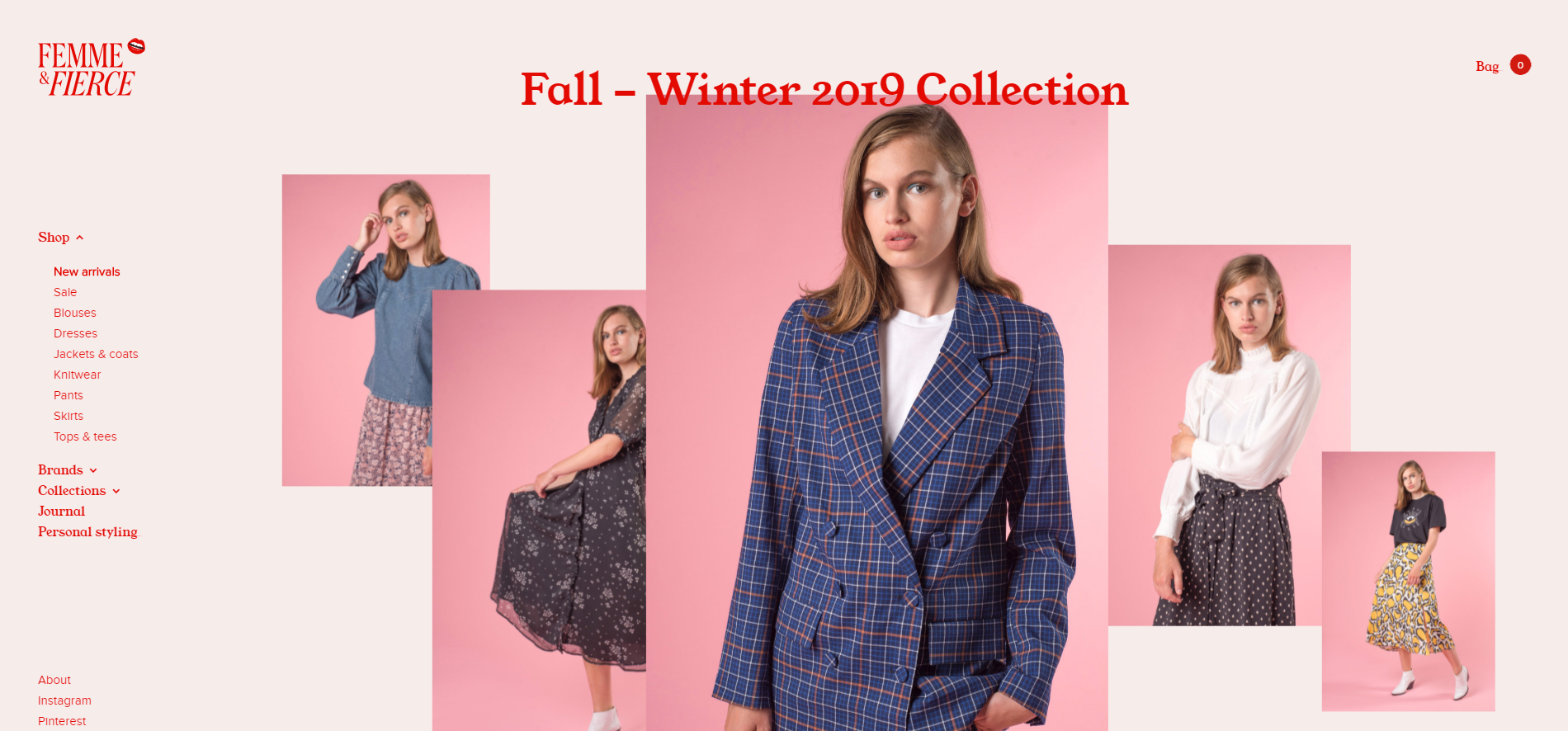
In 2019, we’ve seen more designers breaking away from symmetric grids and using asymmetry to produce interesting visuals. Broken grids, combined with varied textures and colors, are giving images more depth.
2020 Predictions: Trends That Will Sweep Through the Web Design Industry
Sustainable designs
Awareness and initiatives on climate change mitigation and adaptation continue to rise. Companies are finding ways to minimize their environmental impact, both as part of corporate responsibility and as a response to stronger consumer demands for more green products and processes.
This drive for more sustainable practices will continue to change the web design and development field. For example, we can expect to see more energy-efficient sites using compressed images, better file formats, and improved user experience.
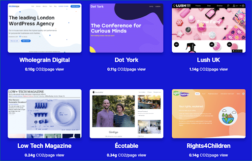
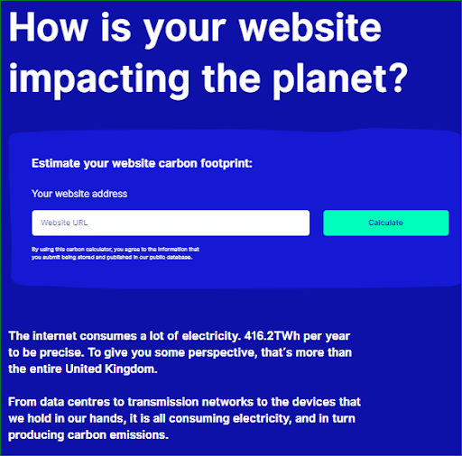
To support the move toward sustainability, Wholegrain Digital has developed a website carbon calculator. They also feature some sustainably designed websites and indicated the CO2 produced per page view.
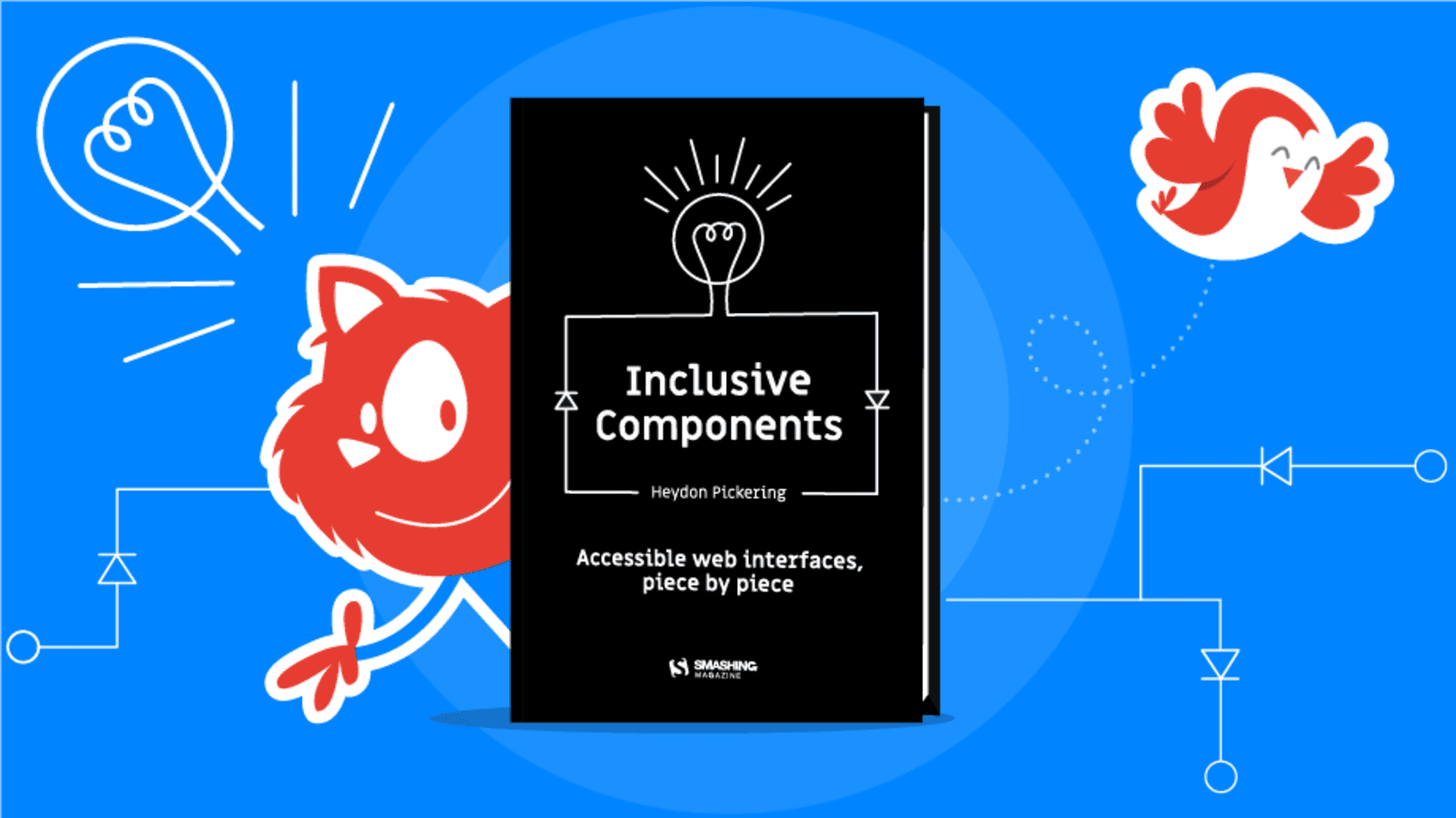
Illustrations
In previous years, we’ve been seeing brands using sketches, watercolor illustrations, and other hand-drawn designs everywhere, from their web images to logos and publications. It’s been an attractive alternative to photos and a powerful way to:
- Capture audiences’ imagination.
- Make sites and content more fun.
- Provide users with one-of-a-kind designs.
- Increase brand recognition.
We can expect to see more of this design trend in 2020, combined with interactive features to further drive user engagement.
Interactivity
Interactive designs are pulling people away from being passive consumers of information, i.e., simply reading, watching videos, or infinitely scrolling through sites. Instead, they need to provide an input, whether that’s dragging their mouse, clicking an image, or accomplishing a task on the screen.
It’s a great way to:
- Engage users.
- Create personalized experiences.
- Improve navigation.
- Give visitors more control over what materials are shown to them.
- Make site visits more interesting.
- Help users find what they need quickly.
- Encourage users to browse more products and pages and stay longer on a site.
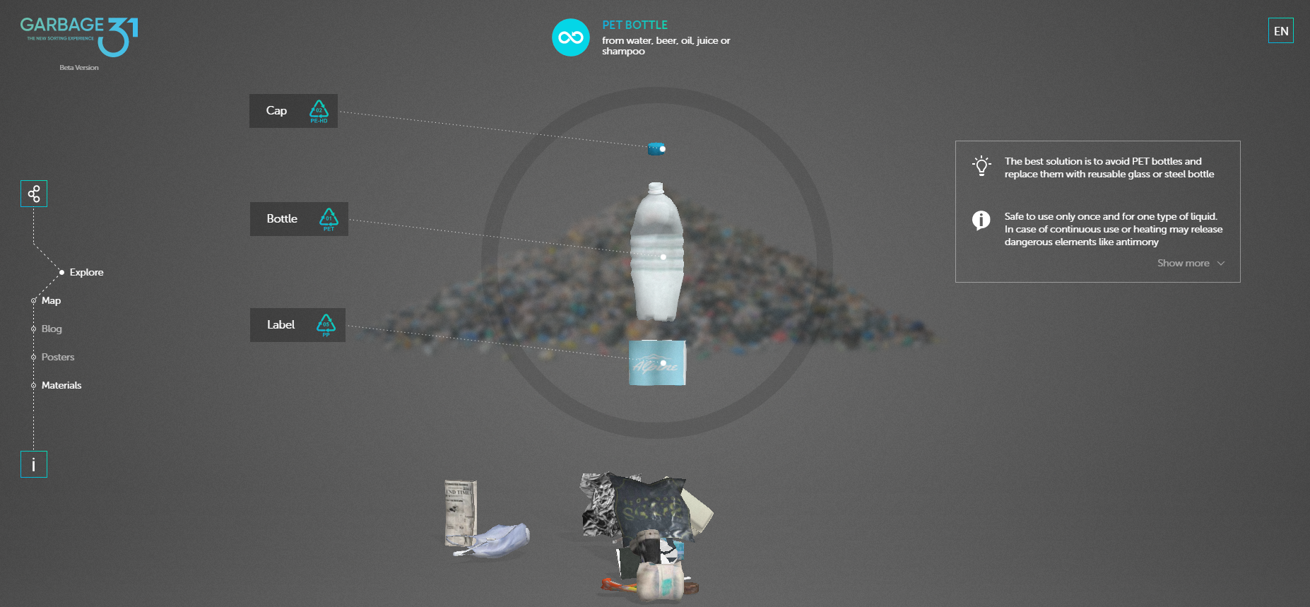
Consider this brilliant site, Garbage 31, by BambukDesignStudio. Users can pick an item from the heap of trash at the bottom of their screen. Then it flashes tips that help users make more environment-friendly decisions, like what to purchase and how to sort, recycle, or reuse the item.
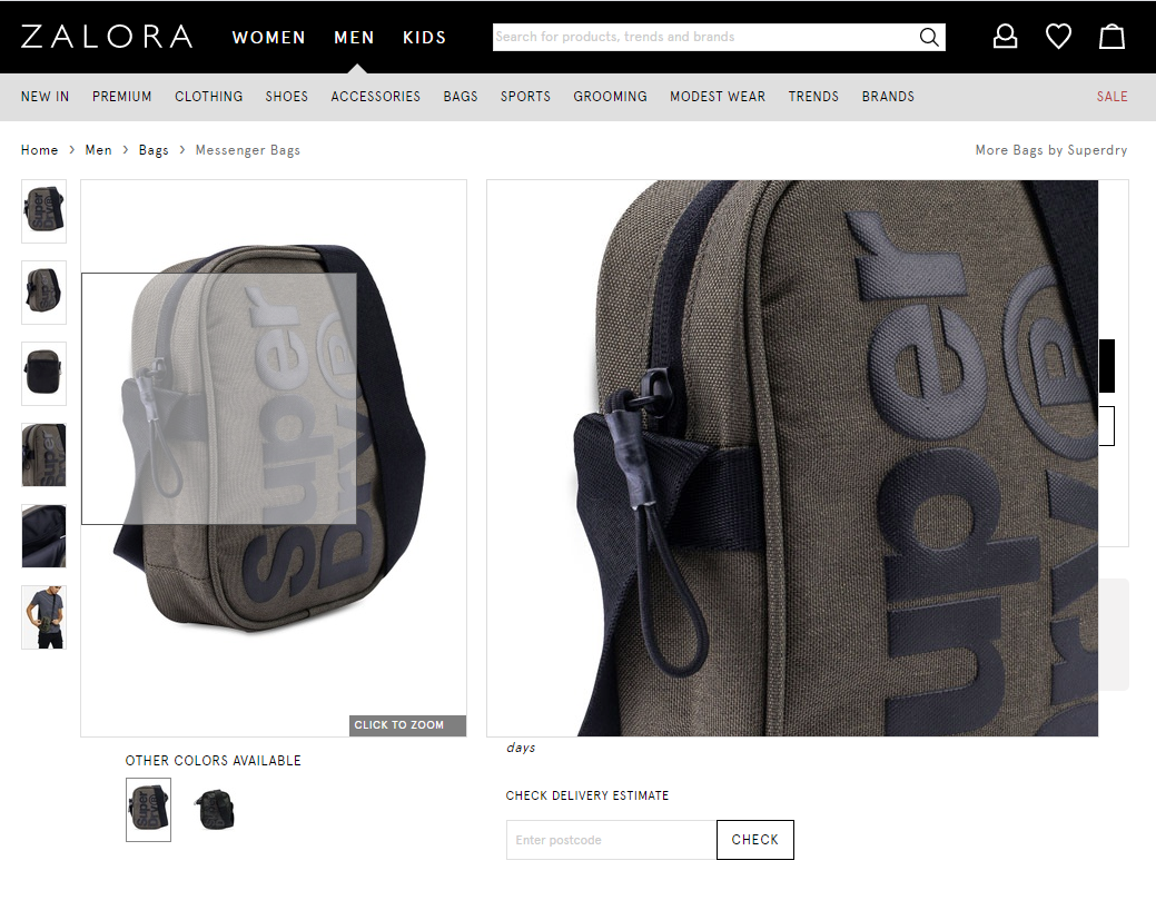
Ecommerce sites like Zalora lets users see product images in different angles and zoom in to appreciate the details.
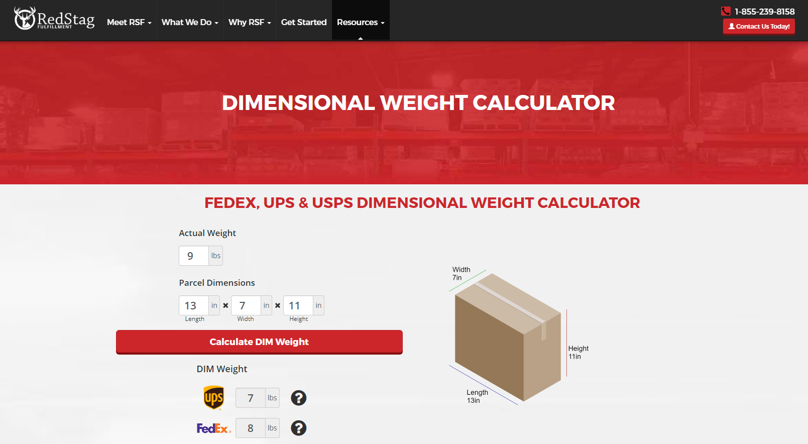
 Red Stag Fulfillment lets users input the actual weight and dimensions of parcels to calculate its dimensional weight.
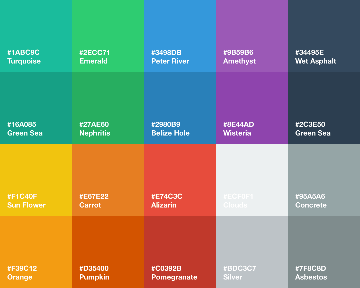
Bold colors
Bold colors in minimalist designs is another trend we can expect more of in 2020. When used well, striking colors help quickly capture readers’ interest. It helps companies direct their attention to important features, such as call-to-action buttons.
When choosing colors, match them with the feeling you want to elicit or the impression you want to have.
With all these possibilities and the tools at their disposal, 2020 is bound to be an even more exciting time for designers and developers.
As consumers, you can look forward to more unique, interactive designs this year. But beyond being beautiful, you can expect these to be more efficient, helping you find the right products and information faster.
We hope you have found the information in this article Expectations vs. Reality: An Analysis of the Predicted Web Design Trends of 2019 helpful, and be sure to leave your comments below we would love to hear from you.
Useful Links & Great Deals
- The Equipment We Use & Recommend
- Quality Design Bundles
- Get 2 Months free Skillshare
- Get an Exclusive 20% off Logo Package Express
- Learn Logo Design Online
 Author bio
Aaron Chichioco is the chief content officer (CCO) and one of the web designers of Design Doxa. His expertise includes not only limited to Web/mobile design and development, but digital marketing, branding, eCommerce strategy and business management tactics as well.

