In this article we take a look at some Famous 80s Logos: The Iconic and Nostalgic Symbols of Retro.
Step into a time when logos reigned supreme – the 1980s! Discover why these vibrant, attention-grabbing designs still hold their own against today’s modern counterparts. Prepare for a dose of nostalgia and logo envy.
Table of Contents
Unleashing the ’80s: Famous 80s Logos and Their Timeless Appeal
Step into a time machine and prepare for a thrilling journey back to the electrifying era of the 1980s. Ah, the ’80s! A decade known for its outrageous fashion, unforgettable music, and of course, the iconic logos that adorned everything from soda cans to sneakers.
Plus, I’m an 80’s baby! Join us as we explore the world of Famous 80s Logos and revel in their timeless charm.
The Bold and Colourful Aesthetics: Distinctive Elements of ’80s Logos
In the ’80s, logos underwent a radical transformation, fuelled by the spirit of excess and a desire to stand out from the crowd. Brands from diverse industries embraced similar design elements, resulting in an explosion of creativity and visual flair.
Discover the bigger fonts, bolder geometric shapes, and brighter colour palettes that defined the aesthetics of Famous 80s Logos.
From Graphic Symbols to Cultural Icons: The Power of ’80s Logos
The logos of the ’80s were more than just graphic symbols; they were the heralds of an entire cultural movement. These iconic symbols encapsulated the spirit and values of their respective brands, becoming synonymous with their industries.
Explore how Famous 80s Logos became powerful cultural icons that left an indelible mark on popular culture.
Unforgettable Icons: Immortalized Famous 80s Logos
Some iconic logos from the ’80s have become ingrained in our collective memory. Let’s take a trip down memory lane and revisit the unmistakable rule-breaking brilliance of negative space within the NBC logo or the bitten apple that symbolised a technological revolution. Delve into the stories behind these immortalized Famous 80s Logos that continue to captivate us today.
14 Famous 80s Logos
NBC’s Logo: The Art of Negative Space and Rule-Breaking Brilliance (1986 – 2010)
NBC’s logo stands out for two notable reasons. Firstly, it demonstrates the artful use of negative space. Look closely, and you’ll notice a peacock outline cleverly formed within the white space, accentuating the vibrant “feathers” surrounding it.
Secondly, NBC defied logo design norms by incorporating a multitude of colours. While best practices suggest limiting colour usage, NBC’s diverse palette paid homage to their mascot and emphasized their leadership in colour broadcasting during the ’80s.
The logo serves as a testament to innovation and breaking traditional design rules. By utilizing negative space and embracing bold colours, NBC created an unforgettable symbol that remains ingrained in the minds of logo enthusiasts and viewers.
NBC’s emblem continues to inspire, reminding us that thinking outside the box leads to ground-breaking creations. It exemplifies how a logo can capture a brand’s essence while captivating audiences with its ingenuity.
In your own logo design endeavours, take a cue from NBC. Embrace negative space and dare to break the rules, aligning them with your brand’s identity. With creativity and a willingness to go beyond the expected, you can craft a timeless logo that leaves a lasting impression.
Note: This shortened version captures the essence of the original text within 200 words, while maintaining an engaging and concise writing style.
CNN Logo: A Modest Monochrome Logo That Embraced the Vibrant World of Colour (1984 – 2014)
Founded in 1980 by media mogul Ted Turner, CNN embarked on its journey with a modest monochrome logo, mirroring the black and white television programs prevalent at the time. However, as the mid-1980s rolled around, CNN recognized the need for a change that would reflect the evolving times. And so, a pivotal decision was made—they embraced the vibrant world of colour.
But this was no ordinary choice. CNN delved into the realm of colour psychology to strategically select the perfect hue. They settled on red, a powerful shade associated with motivation, passion, and leadership. These qualities were deemed essential in the fast-paced and competitive news industry, where CNN aimed to establish itself as a frontrunner.
With this bold and deliberate shift, CNN’s logo not only became visually captivating but also embodied the spirit and values that defined the network. The passionate drive to deliver news with unwavering dedication was symbolized through the energetic shade of red.
The updated logo became a visual representation of CNN’s commitment to informing and engaging its viewers, standing out as a beacon of trust and credibility amidst a sea of competing voices. It was a statement that CNN was ready to take on the challenges of the modern media landscape and cement its position as a leader in the industry.
Today, as we witness the iconic red logo of CNN, we are reminded of the profound impact that colour can have on perception and emotions. CNN’s choice to embrace red serves as a testament to the strategic thinking and attention to detail that underpins successful logo design.
HBO’s Timeless Wordmark Logo and Comedy Legacy (1980 – Present)
Since its inception in 1972, HBO has maintained a remarkably consistent wordmark logo that has stood the test of time. But there’s more to this logo than meets the eye. The ingenious design team added a subtle touch—an artful inclusion of a small circle within the letter “O,” ingeniously representing a camera lens. A clever nod to HBO’s dedication to delivering captivating visual content.
But HBO’s contributions extend beyond their iconic logo. They have played a pivotal role in shaping the entertainment landscape, introducing us to beloved household names that have become synonymous with laughter and entertainment. Among them, comedic legends like Ellen DeGeneres, Bill Maher, and Martin Lawrence owe a debt of gratitude to HBO.
HBO’s stand-up series, aptly named “One Night Stand,” emerged as a platform to showcase emerging comedians of that era. This series became a springboard for up-and-coming talent, providing them with a stage to captivate audiences and catapult their careers to new heights.
Through their commitment to cultivating comedic talent, HBO not only entertained millions but also became a driving force in shaping the comedy landscape. They unearthed hidden gems, giving rise to future legends and leaving an indelible mark on the world of comedy.
So, the next time you witness the timeless HBO wordmark logo, take a moment to appreciate the clever symbolism concealed within. And remember, it is also a reminder of the laughter, talent, and joy that HBO has brought to our screens, forever enriching the entertainment industry.
Nintendo: From Playing Cards to Iconic Gaming, and a Colourful Logo Evolution (1983
Did you know that the powerhouse video game company Nintendo had humble beginnings in the world of playing cards? It’s true! Despite its transformation into a gaming giant, Nintendo’s brand logo has undergone only minor tweaks since its inception in 1967, maintaining a sense of familiarity and continuity.
Just as the ’80s embraced vibrant and bold makeup trends, Nintendo’s logo sported a similarly audacious colour palette. The unnaturally vibrant red became an iconic hallmark, symbolizing the brand’s energy and distinctiveness. However, in 2004, Nintendo made a significant shift, replacing the vibrant red with a more subdued gray hue. This change represented a departure from the past while still preserving the brand’s essence.
In 2016, Nintendo once again embraced its iconic red colour, injecting renewed vigour into the logo. This time, they introduced a captivating design element—an elongated oval resembling a racetrack. Placing the logo within a red box added a sense of focus and dynamic movement, further emphasizing Nintendo’s commitment to innovation and excitement.
Nintendo’s logo evolution mirrors the company’s journey from its humble origins to its current status as a dominant force in the gaming industry. The consistent yet adaptable logo showcases Nintendo’s ability to strike a balance between preserving its rich heritage and embracing modern advancements.
Next time you encounter Nintendo’s iconic logo, take a moment to appreciate the subtle changes it has undergone over the years. It serves as a visual testament to the company’s evolution and its unwavering dedication to bringing joy and innovation to gamers worldwide.
Apple’s Logo: From Rainbow Delight to Timeless Simplicity (1977 – 1998)
The Apple logo—a half-bitten fruit—has become an iconic symbol recognized worldwide. However, many of us (including myself) may not be familiar with its joyous and vibrant ’80s incarnation. During that era, Apple’s logo embraced a rainbow of colours, perfectly encapsulating the essence of the times. After all, what could be more quintessentially ’80s than being big, bold, and bursting with colours?
The colourful palette of the Apple logo was a deliberate nod to the ground-breaking Apple II, the world’s first personal computer with a colour display. It symbolized Apple’s innovative spirit and technological prowess, making a statement that Apple was at the forefront of cutting-edge computing.
As time went on, Apple decided to refine their logo, eventually transitioning to the sleek and minimalist design we know today. The monochromatic apple silhouette, stripped of colours, embodies simplicity, elegance, and timelessness. It represents Apple’s commitment to clean aesthetics and user-friendly design, which have become synonymous with the brand.
While the rainbow-colored logo of the ’80s may have faded into the annals of Apple’s history, its impact on the brand’s evolution is undeniable. It serves as a reminder of Apple’s roots and its constant pursuit of innovation and visual excellence.
So, whether you’re a long-time Apple enthusiast or a newcomer to the brand, take a moment to appreciate the transformative journey of the Apple logo. From its vibrant and colourful origins to its present-day sleekness, it continues to symbolize Apple’s unwavering dedication to pushing boundaries and revolutionizing the world of technology.
Miami Vice: The Epitome of ’80s Cool and Vibrant Logo Design (1984 to 1989)
If you were to ask anyone who immersed themselves in the television landscape of the 1980s about their favourite show, a resounding response would likely be “Miami Vice.” This NBC mega-hit exuded an irresistible vibe—a world filled with extravagant jewellery, fanny packs, and a kaleidoscope of neon colours.
The Miami Vice logo captures the very essence of the ’80s, embodying its spirit and style. The logo’s composition is a perfect blend of iconic elements. It showcases two distinct fonts, utilizing Broadway Regular for the top line and Broadway Stencil for the bottom. The interplay between thick and thin lines adds a dynamic contrast, lending an air of sophistication to the design.
What truly completes the unmistakable ’80s logo look is the eye-catching colour combination. The bold and bright magenta, paired with the vibrant aquamarine, creates a striking visual impact that is synonymous with the era. This electrifying contrast grabs attention and evokes a sense of excitement, perfectly mirroring the energy and allure of Miami Vice.
The overall design of the logo resembles a colossal neon sign, illuminating the nostalgia-laden memories of fans. It transports us back to a time when Miami Vice was the epitome of coolness and the emblem of an unforgettable era.
So, whether you lived through the ’80s or are discovering its allure through retro appreciation, take a moment to appreciate the artistry behind the Miami Vice logo. It captures the essence of a bygone era and serves as a vivid reminder of the cultural impact that television and iconic design can have on our lives.
AT&T: A Timeless Logo That Transcends Decades (1983 – 2003)
Even if you’re not an AT&T customer, chances are you can instantly recognize their iconic blue and white striped globe icon. Surprisingly, the AT&T logo from the ’80s doesn’t look vastly different from its current design, a testament to the enduring power of a well-crafted logo.
In the vibrant era of the ’80s, grabbing attention and making a bold statement were key. However, for businesses like AT&T aiming to exude professionalism and reliability, a balance needed to be struck. Geometric shapes and bold colors emerged as the go-to choose, combining attention-grabbing aesthetics with a sense of solid credibility.
The ’80s AT&T logo, with its clean lines and strong visual presence, perfectly encapsulates the essence of the era. Its simplicity and use of geometric elements create a sense of order and structure, evoking a feeling of professionalism and trustworthiness. The strategic choice of bold colors, such as the striking blue and white combination, commands attention while reinforcing the brand’s image as a telecommunications leader.
Remarkably, the AT&T logo has stood the test of time, evolving only subtly over the years. This continuity speaks volumes about the enduring strength and recognition of the brand. By maintaining core design elements and visual cues, AT&T has successfully bridged generations, cementing their position as a timeless and trusted provider of telecommunications services.
So, whether you’re a long-time AT&T customer or simply appreciate the art of logo design, take a moment to admire the enduring appeal of their logo. It not only represents a company but also embodies the essence of an era and serves as a visual reminder of the power of iconic branding.
The Symbolic Power of ESPN’s Logo: Red and Orange Unleash the Energy (1979 -1985 | 1985 – Present)

ESPN’s logo may appear basic in design, but its choice of colours holds symbolic significance. The red and orange colour palette represents power, passion, thrill, success, and determination. Red, known for its ability to increase heart rate and appetite, perfectly matches the dynamic nature of ESPN’s content.
The dominant use of red in the logo exudes energy and intensity, capturing the essence of the sports world. It evokes strong emotions and creates an immediate connection with viewers. Complementing red, the vibrant orange conveys excitement and the relentless pursuit of excellence.
Beyond their visual impact, the chosen colours also work on a psychological level. Red stimulates appetite and creates a sense of urgency, aligning with the fast-paced nature of sports coverage. This colour combination reflects ESPN’s understanding of the profound influence that colours have on our emotions and perceptions.
The strategic use of red and orange in ESPN’s logo reinforces the brand’s position as a sports broadcasting powerhouse. It showcases their commitment to capturing the spirit of sports and igniting the enthusiasm of fans worldwide.
So, the next time you see the ESPN logo, take a moment to appreciate the intentional selection of red and orange, symbolizing the energy and passion that define the world of sports.
IKEA’s Iconic Logo: Timeless Recognition with a Retro Vibe (1982 – 2019)
Even with its retro ’80s logo design, IKEA’s visual identity remains instantly recognisable in today’s landscape. The logo’s distinctiveness goes beyond its wordmark, as the overall design holds a strong visual impact that endures over time.
Staying true to its Swedish heritage, IKEA embraces a ’80s-appropriate colour scheme of blue and yellow. These bold hues not only pay homage to the brand’s origins but also align with the vibrant aesthetics of the era. The combination of blue and yellow evokes a sense of nostalgia while remaining visually appealing and eye-catching.
The logo’s blocky and high-impact lettering further enhances its recognisability. With its clean lines and simplicity, it ensures maximum visibility, even from a distance. This deliberate design choice guarantees that the logo stands out and leaves a lasting impression on customers.
While the ’80s logo retains its essence, IKEA has made minor adjustments in shape and shades of colour over the years. In 2019, these subtle modifications were introduced to refine and enhance the logo’s visual appeal, maintaining its timeless recognition while adapting to contemporary design sensibilities.
IKEA’s logo is a testament to the power of iconic branding. Its retro charm and enduring visibility serve as a visual anchor for the brand, instantly connecting customers to the IKEA experience and its Scandinavian roots.
So, the next time you encounter the IKEA logo, take a moment to appreciate its retro flair and recognize how it has seamlessly evolved while staying true to its distinctive identity.
MTV: Revolutionizing Graphic Design for Youth (1981-1994)
MTV, the ground-breaking 24-hour music TV channel, sparked a revolution in youthful and vernacular graphic design. It not only brought an abundance of music videos but also opened doors to previously inaccessible music genres and cultures. The channel’s logo, with its vibrant and expressive design, became an iconic symbol of this cultural shift.
The MTV logo featured a colourful spray-paint styled TV atop a 3-dimensional M graphic, capturing the brand’s energetic and dynamic persona. This bold choice echoed the vernacular aesthetics of the time and resonated with the channel’s youthful audience. As the brand quickly gained recognition, the words accompanying the logo were dropped, solidifying MTV’s status as a global powerhouse known simply as MTV.
Beyond music videos, MTV became a gateway to new subcultures and musical exploration, shaping popular culture along the way. The logo served as a visual time capsule, symbolizing rebellion, creativity, and freedom of expression.
Looking back, MTV’s impact on graphic design and youth culture remains undeniable. Its vibrant logo, an emblem of a cultural revolution, represents a generation that embraced diversity and the power of visual storytelling.
Whether you witnessed MTV’s birth or discovered it later, take a moment to appreciate the logo that revolutionized graphic design and became an enduring symbol of youthful expression.
Pepsi: The Evolution of a Colourful Logo Battle (1987-1991)
It may come as a surprise, but Pepsi’s logos throughout the years have remained remarkably similar, featuring a red and blue circle separated by white space. This design motif even made its way into Pepsi’s 1980 logo. The choice of red and blue colours was strategic, aimed at competing with their rival brand, Coca-Cola.
As we all know, red is an inherently captivating colour. In a bid to rival Coca-Cola’s logo, Pepsi incorporated blue alongside red, creating a more visually appealing logo than its cola competitor.
Pepsi’s use of vibrant colours was a deliberate move to attract attention and stand out in the market. By combining the allure of red with the complementary appeal of blue, the brand successfully crafted a logo that could compete head-to-head with Coca-Cola’s iconic logo.
Over the years, Pepsi’s logo has become synonymous with its brand identity, representing its ongoing quest to differentiate itself from its competitors. The choice of colours has played a significant role in capturing consumer attention and fostering brand loyalty.
So, next time you come across Pepsi’s distinctive logo, take a moment to appreciate the strategic use of colour that helped shape its visual identity and propel its competition with Coca-Cola.
Burger King: A Classic Logo that Stands the Test of Time (1969-1994)
Burger King’s 1980s logo holds a special place in logo design history, captivating the masses with its enduring popularity. The design featured prominent, bold letters coloured in red, while cleverly incorporating bun-like elements on the top and bottom sides of the logo, resembling a real burger. This clever design directly conveyed the brand’s core offering of delicious burgers.
Interestingly, the love for this iconic logo persists even in the present day. In 2021, Burger King made the decision to reintroduce the beloved logo, recognizing its timeless appeal and the strong connection it has with customers.
The enduring success of Burger King’s logo lies in its ability to capture the essence of the brand and evoke a sense of familiarity and mouth-watering anticipation. It serves as a visual representation of Burger King’s commitment to serving tasty burgers and resonates with customers across generations.
As Burger King brings back this classic logo, it invites us to reminisce about the past and embrace the nostalgia associated with a beloved brand. So, keep an eye out for the return of the iconic logo and indulge in the mouth-watering world of Burger King.
Adidas: Unveiling the Iconic Trefoil Logo (1971 – Present)
The Adidas logo is widely recognized as a representation of a mountain, but there’s more to its history. In the 1980s, the brand boasted an even more iconic logo known as the Trefoil. Originally designed in 1971, this logo featured a leaf-like design accompanied by three distinctive stripes.
The Trefoil logo, with its unique blend of simplicity and elegance, became synonymous with the Adidas brand during the ’80s. It symbolized the brand’s commitment to excellence and its strong connection to sports and athleticism.
While the current Adidas logo focuses on the mountain motif, the Trefoil logo holds a special place in the hearts of Adidas enthusiasts. It captures the essence of the brand’s heritage and its enduring impact on the world of sports and fashion.
The Trefoil logo stands as a testament to Adidas’ timeless design aesthetic and its ability to create a visual identity that resonates with generations. As you lace up your Adidas sneakers or don your Adidas apparel, take a moment to appreciate the enduring legacy of the iconic Trefoil logo.
PBS: Unveiling the Evocative “Everyone” Logo (1984 to 1998)
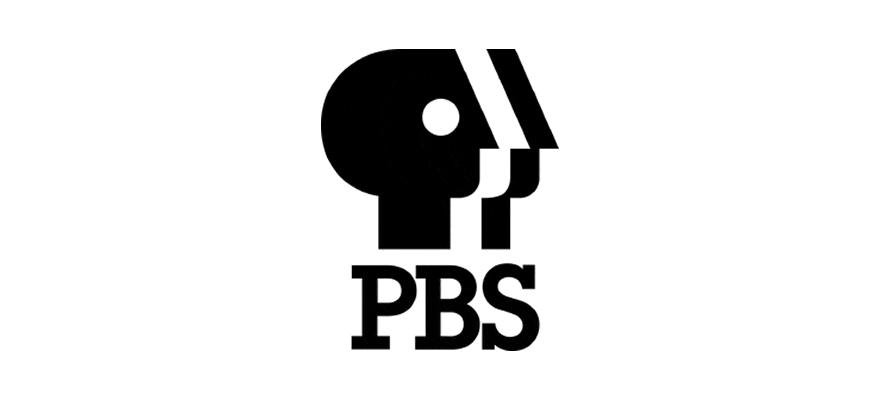
In the mid-1980s, PBS sought a fresh identity to differentiate itself from other three-letter network stations. They turned to design firm Chermayeff & Geismar for a solution to this branding challenge.
Tom Geismar took the lead in the creative process, immediately recognizing the significance of the letter “P” as the primary symbol for the broadcasting service. Geismar made subtle yet impactful modifications, tilting the “P” to the right, elongating the back of the head, and lengthening the nose and neck. Additionally, he introduced a unique element called “The Split,” which created the illusion of three faces – black, white, and black again – through clever use of negative space. The new symbol was aptly named “Everyone” and was unveiled in March 1984, making its on-screen debut in September.
Beneath the distinctive triple P-profile, the abbreviation “PBS” was prominently displayed using the ITC Lubalin Graph Demi font, paying homage to renowned designer Herb Lubalin. This font featured bold letters with rectangular serifs, adding a touch of sophistication to the overall logo design.
The “Everyone” logo not only resolved the need for differentiation but also captured the inclusive spirit of PBS. It remains a powerful symbol of unity and diversity within the broadcasting landscape, representing the network’s commitment to providing diverse and enriching content for all.
WWF Panda Logo: Harnessing Negative Space for Impactful Design – (1986 – 2000)

Amongst the logos on this list, the World Wildlife Fund’s (WWF) panda logo stands out as the sole representation of a non-profit organization. However, its inclusion is far from arbitrary. The WWF panda logo is a renowned and influential example of utilizing negative space in logo design.
The inspiration behind the panda in the WWF logo can be traced back to Chi Chi, a giant panda residing in the London Zoo when the non-profit organization was established in 1961. While the logo has retained its essence over the years, it has undergone subtle updates.
The most significant transformation took place in 1986 when the panda evolved from a traditional black and white line drawing to a more abstract representation, cleverly defined by negative space.
By employing the creative use of negative space, the logo achieved a heightened level of sophistication and a contemporary aesthetic. Its innovative design not only captured attention but also served as an inspiration for logo designers worldwide.
The WWF panda logo stands as a testament to the power of negative space in creating impactful and memorable designs. It showcases how a simple yet thoughtfully crafted logo can become an enduring symbol of an organization’s mission and values.
As you encounter the WWF logo, take a moment to appreciate its clever use of negative space, which has not only contributed to its iconic status but has also influenced the realm of logo design.
Inspiration for Today’s Designers: The Enduring Influence of ’80s Logos
Today, as logo designers and enthusiasts, we can draw inspiration from these iconic ’80s logos. Their boldness, audacity, and ability to transcend time serve as valuable lessons for contemporary design. Embrace the spirit of the ’80s and let the magic of Famous 80s Logos inspire your next logo creation.
Going Retro for Timeless Designs: Reviving the ’80s in Logo Design
Remember, when it comes to design, sometimes you have to go retro to create something truly timeless. Discover the enduring appeal of ’80s aesthetics and how you can infuse them into your logo designs. Embrace the nostalgia, stay rad, and let the spirit of Famous 80s Logos guide you towards creating memorable and captivating designs.
Now, armed with the knowledge of the iconic and nostalgic Famous 80s Logos, you can embark on your own design journey. Let the spirit of the ’80s fuel your creativity and set you apart in the world of logo design. Get ready to make a statement with designs that transcend time and leave a lasting impression.
Further Reading:
- The Different Types Of Logo Design
- 10 Examples of Powerful Global Branding
- Learning from the World’s Most Famous Logos
- Branding Beyond Borders: Elevating Your Global Presence through Impactful Logo Design
- Logo Design Trends to Watch Out for in 2023: Stay Ahead of the Curve!
- Most Expensive Logos In The World
- Every Good Logo Tells a Story! 40 Famous Brand Logos & Their Hidden Secrets
- Famous Logo Designers and Their Distinctive Style
- Using the Golden Ratio in Logo Design
- 20 Famous Brand Logos Constructed in Grid Systems
Join The Logo Community
We hope you enjoyed these Famous 80s Logos. If you would like more personal tips, advice, insights, and access to our community threads and other goodies, join us in our community.
You can comment directly on posts, access our community threads, have a discussion and ask questions with our founder Andrew.
If you’re looking to learn more about brand strategy, we highly recommend eRESONAID with our friend and acclaimed brand strategist and author Fabian Geyrhalter, it’s packed full of knowledge and insights you will need to learn to become a brand strategist or apply what you learn within your own business.


Author Bio
Andrew Marriott is the owner and founder of The Logo Creative™. He is an award-winning designer with over two decades of experience designing logos and specialising in branding for companies worldwide.
FAQ: Famous 80s Logos – Iconic and Nostalgic Symbols of Retro
What makes 80s logos so memorable?
80s logos were characterised by bold colors, dynamic typography, and innovative design elements that captured the decade’s vibrant aesthetic. They often reflected the era’s technological optimism and pop culture trends.
Which logo design trends were most prominent in the 80s?
Key trends included:
- Synthesized, futuristic styling
- Neon color palettes
- Geometric shapes
- Chrome and metallic effects
- Bold, angular typography
Are there any iconic company logos that originated in the 80s?
Several memorable logos emerged during this decade, including:
- Nike’s “Just Do It” branding
- MTV’s original logo
- Apple’s rainbow apple icon
- Nike’s “Swoosh” design
- Pepsi’s bold blue and red logo
How did technological advancements influence logo design in the 80s?
The rise of personal computing and graphic design software allowed for more complex, colorful, and mathematically precise logo designs. Early digital design tools enabled creators to experiment with new visual techniques.
Why do 80s logos continue to inspire designers today?
80s logos represent:
- A unique cultural moment in graphic design history
- Nostalgic appeal
- Bold creative expression
- Innovative design principles
Can I use 80s-inspired logo designs in modern branding?
Retro design elements can be effectively incorporated into contemporary logos by:
- Balancing nostalgic elements with modern design principles
- Using subtle 80s color palettes
- Incorporating geometric shapes
- Applying minimal 80s-inspired typography
How can I learn more about 80s logo design?
Recommended resources include:
- Retrospective design exhibitions
- Design history books
- Vintage advertising archives
- Graphic design museums
- Online design history websites


