In this article we look at some Famous Logo Redesigns and Why They Worked.
In the competitive world of branding, a company’s logo design is often its most recognizable asset. But even the most iconic logos need a refresh over time.
Famous logo redesigns like Apple, Pepsi, and Starbucks show how a well-executed revamp can breathe new life into a brand. Why do companies redesign their logos, and what makes a redesign successful? In this article, we explore successful logo redesigns and uncover the key factors that helped them boost brand recognition and relevance.
Table of Contents
The Importance of a Logo Redesign
Before exploring specific examples, it’s essential to understand why companies redesign their logos. A logo redesign is typically a strategic decision driven by several factors, such as:
- Market shifts: Changing industries or consumer behaviour can make a logo feel outdated.
- Brand evolution: As a company expands, its original logo may no longer fit the broader range of products or services.
- Reputation management: A logo change can signal a fresh start, especially after public relations challenges or a merger.
- Modernization: Trends in design change over time, and a more modern look can reflect a forward-thinking brand.
Successful Logo Redesigns in History
1. Apple’s Logo Evolution: A Simplicity Masterclass
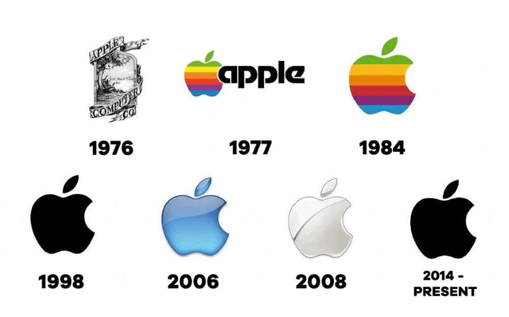
One of the most famous logo redesigns is Apple’s transition from its original, intricate logo featuring Isaac Newton under an apple tree to the sleek, minimalist logo design we recognize today. In 1977, Steve Jobs and Rob Janoff decided to strip the logo down to its essence—a clean, bitten apple.
Why it worked: The new design was timeless and simple, aligning with Apple’s focus on user-friendly technology. The decision to use a monochrome palette initially (and later a rainbow for the Apple II) helped the logo stand out while reflecting the brand’s innovation.
Today, the minimalist apple logo is one of the most recognizable logos in the world, and it perfectly symbolizes Apple’s identity as a leader in modern design.
2. Pepsi: From Curves to Clarity
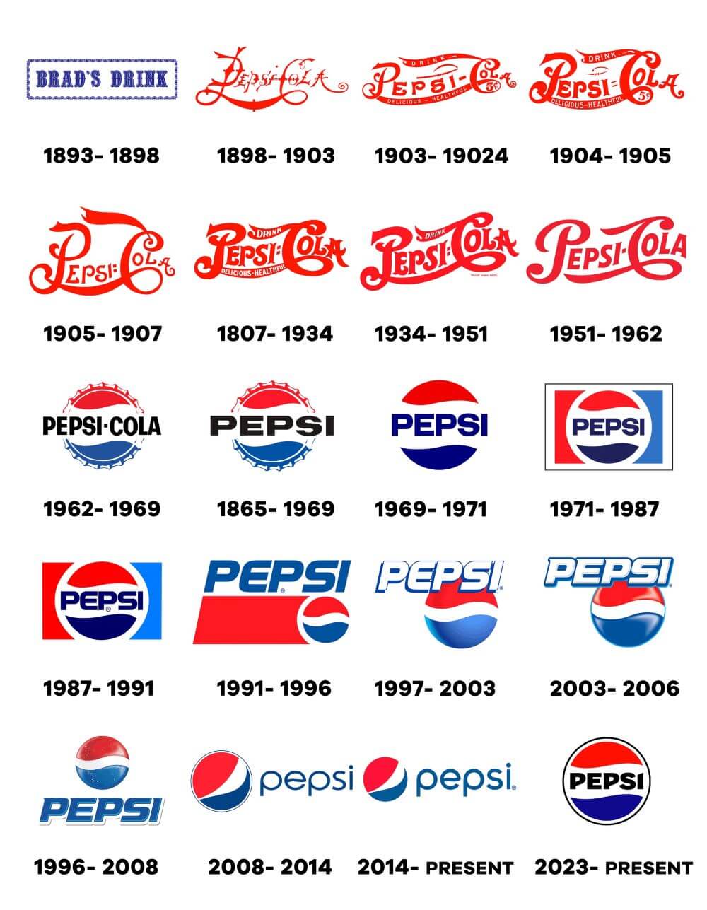
Pepsi’s logo has undergone many changes over its 125-year history, with its most recent redesign in 2008. The iconic globe logo was tweaked, and a new dynamic, swirling version emerged. This redesign symbolized movement and energy, aiming to better align with modern-day Pepsi’s youthful and energetic audience.
Why it worked: The redesign modernized the logo while retaining enough elements from its past to keep it familiar. The curved design reflected Pepsi’s ambition to be an energetic, evolving brand, while its bright, approachable colours helped maintain its recognizable identity. This logo redesign success lies in its ability to stay modern yet rooted in tradition, making it one of the best logo redesigns in recent history.
2023 to Present: A Modern Twist on Nostalgia

Pepsi’s latest logo update brings the iconic globe back to centre stage, embracing a retro aesthetic while incorporating contemporary details. The globe now shines with more pronounced light reflections, giving it a sleek, glass-like quality that adds depth and dimension. This transparent, dynamic design evokes a sense of fluidity and movement, bringing the logo to life.
Marking the first major overhaul since 2008, this redesign strikes a balance between past and present. The globe is paired with a bold, upper-case sans serif wordmark in crisp black, sitting proudly in the forefront. While it taps into the simplicity of the past, the sharp, angular details in the letters ‘P’ and ‘I’ hint at a forward-thinking vision, blending nostalgia with innovation.
3. Starbucks: The Siren Simplified
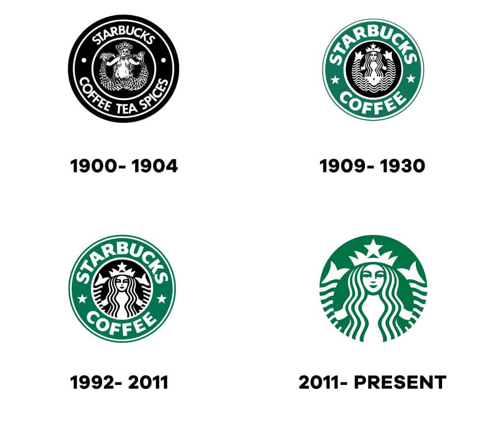
Starbucks has rebranded its logo several times, with its 2011 redesign being particularly notable. The company removed the text “Starbucks Coffee” from the outer ring of its circular logo, leaving just the iconic siren.
Why it worked: By focusing solely on the siren, Starbucks expressed its confidence as a global brand. The Simple minimalist logo design offered a sleeker, more modern feel while reinforcing Starbucks’ iconic imagery. It showed that Starbucks had grown so influential that its logo no longer needed text to be recognized—a strong indicator of brand identity evolution.
4. Google: A Flat Approach to Modern Design
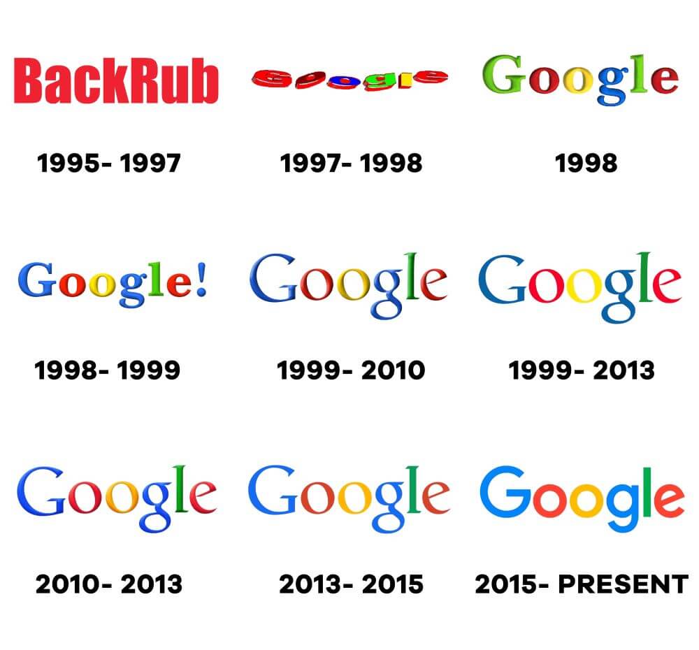
Google’s 2015 logo redesign replaced its serif typeface with a more playful, sans-serif font. The multi-coloured lettering remained the same but was refined to give the logo a sleeker, more digital-friendly appearance. The change also introduced a dynamic version of the logo for mobile and other platforms.
Why it worked: As the digital age advanced, Google’s logo had to adapt. The move to a flat design aligned perfectly with modern web and mobile design trends, making the logo more adaptable for various digital interfaces. The change was subtle yet effective, representing Google’s role as a leader in modern technology while staying true to its playful, innovative image.
5. MasterCard: A Seamless Modernization
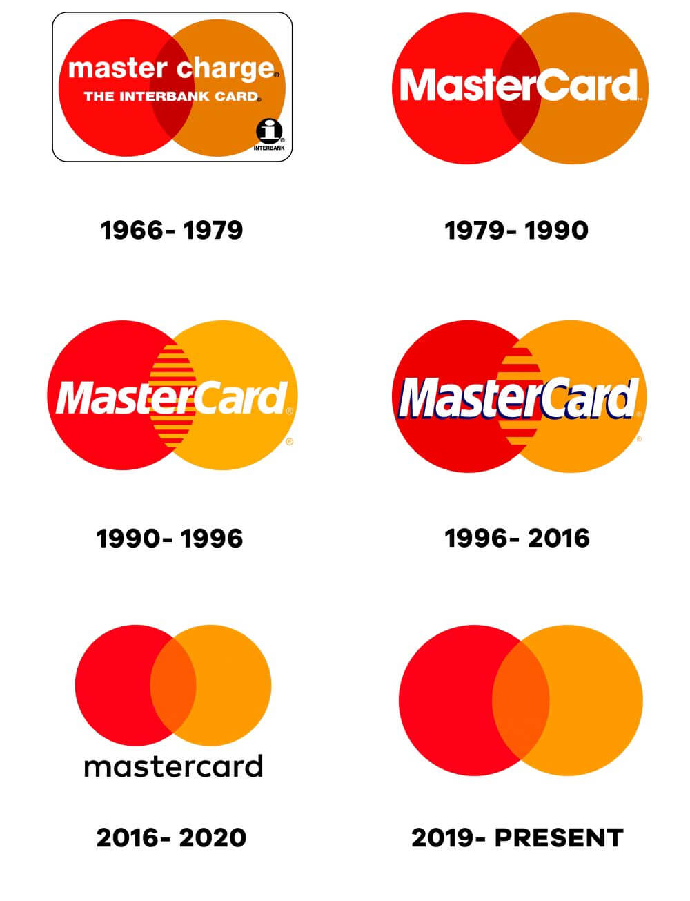
MasterCard made a bold move in 2016 when it redesigned its logo by simplifying it to two overlapping circles (red and yellow). In 2018 they made an even bolder move by removing the text “MasterCard” entirely in some cases. The circles remained the same colour, but the removal of text reflected MasterCard’s confidence in its brand recognition.
Why it worked: This redesign succeeded because it maintained the key visual elements of the brand—colour and shape—while embracing a modern, minimalist aesthetic. The clean design is more versatile for digital platforms, which was crucial as MasterCard shifted toward more online and mobile payment services. This is a great example of a successful logo redesign that didn’t require drastic changes to remain relevant.
6. Instagram: From Camera to Gradient

Instagram’s 2016 logo redesign was a radical departure from its original skeuomorphic camera icon. The company opted for a vibrant, gradient colour scheme representing the app’s diversity of users and content.
Why it worked: The old logo, while iconic, no longer reflected the app’s growth beyond photo sharing. The new logo’s minimalist and vibrant design spoke to a broader user base, including those who use the app for videos, stories, and more. The bold colour gradient also stood out in a crowded app market, showing how a modern logo redesign can boost brand identity while maintaining familiarity.
What Makes a Successful Logo Redesign?
Looking at these famous logo redesigns, there are several lessons to take away about why redesigns work:
- Simplicity is Key: Many successful logo redesigns involve stripping away unnecessary elements. Whether it’s Apple, Starbucks, or MasterCard, these brands chose simplicity, resulting in logos that are easily recognizable and adaptable across various media.
- Retaining Brand Identity: Even though the logos evolved, the core elements that made them recognizable (e.g., Apple’s apple shape, MasterCard’s circles, Pepsi’s globe) remained. This balance of new and old is crucial in ensuring that a logo redesign resonates with both new and existing customers.
- Adaptability: As more businesses expand to digital and mobile platforms, logos need to be versatile. Google’s shift to a flat design, for instance, ensures their logo looks sharp and clear across different digital touchpoints.
- Audience Consideration: Pepsi’s redesign catered to its younger, energetic audience, while Starbucks’ move reflected its established global status. Understanding the target audience plays a significant role in making a redesign successful.
Read more about: Learning from the World’s Most Famous Logos.
Risks and Rewards of Logo Redesigns
While many of these logo redesign success stories illustrate how effective change can be, there are also risks involved. A logo is a visual representation of a brand, and drastic changes can alienate loyal customers.
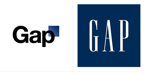
The infamous Gap logo redesign in 2010, which reverted to the original within a week after public backlash, is a cautionary tale about changing too much too soon. Brands must weigh the benefits of modernizing against the potential cost of losing their recognizable identity.
Conclusion – Famous logo redesigns

Logo redesigns are a crucial part of brand evolution, but they must be handled with care. The famous logo redesigns we’ve explored demonstrate the power of simplicity, adaptability, and staying true to a brand’s roots.
Whether you’re running a global brand empire or a local business, these redesigns offer valuable lessons on how to ensure that your brand stays relevant and recognizable. So, when considering your next logo redesign, ask yourself: What makes a logo redesign effective, and how can it boost your brand’s image?
Join The Logo Community
We hope you have enjoyed this article about Famous Logo Redesigns and Why They Worked. If you would like more personal tips, advice, insights, and access to our community threads and other goodies, join us in our community.
You can comment directly on posts, access our community threads, have a discussion and ask questions with our founder Andrew.
If you’re looking to learn more about brand strategy, we highly recommend eRESONAID with our friend and acclaimed brand strategist and author Fabian Geyrhalter, it’s packed full of knowledge and insights you will need to learn to become a brand strategist or apply what you learn within your own business.

FAQ – Famous Logo Redesigns and Why They Worked
Some famous logo redesigns include Apple, Pepsi, Starbucks, MasterCard, Google, and Instagram. These companies revamped their logos to stay relevant, modern, and aligned with their evolving brand identities.
Companies redesign their logos to adapt to market changes, modernize their look, improve brand recognition, and reflect their business growth or new direction. A successful redesign can refresh the brand’s image and increase visibility.
A successful logo redesign simplifies the design, retains core brand elements, and is versatile across digital platforms. It must resonate with both new and loyal customers while enhancing brand identity.
A well-executed logo redesign can significantly boost brand recognition by modernizing the look, making it more memorable, and appealing to a broader audience. It also shows that the brand is evolving and adapting to current trends.
The main risk of redesigning a logo is alienating loyal customers if the change is too drastic or doesn’t retain key brand elements. A poorly executed redesign can confuse or upset the existing audience.


