Some Facts about SHELL
Founded:- April 1907 in London ● Headquarters:- The Hague, Netherlands ● Registered office:- Shell Centre, London, England ● Founders:- Royal Dutch Petroleum Company, “Shell” Transport & Trading Company Ltd ● Company:- Royal Dutch Shell plc ● www.shell.com
I thought I would start this new section about famous logos with Shell, This was the first logo that my daughter recognised at 3-year-old, I wrote about this “Brand Awareness From an Early Age” as she identified the logo with what the company sells.
The Shell name first appeared in 1891 as the trademark for kerosene shipped to the far east by Marcus Samuel & Co., originally a company trading in antiques and seashells. When Samuel founded the “Shell” Transport &Trading Company in 1897, with quotations, he gave the Shell name corporate status.
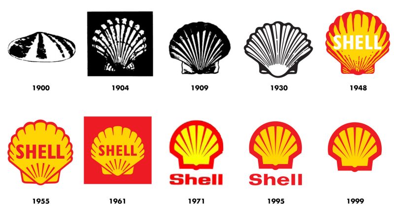
The first Shell logo was a mussel shell. It was changed to a scallop or Pecten shell in 1904. Both of these initial logos were drawn realistically.
Both the word “Shell” and the Pecten symbol may have been suggested by a certain Mr. Graham, who imported Samuels’ kerosene into India and later became a director at “Shell”. His family adopted the ‘St James’s Shell’ as their coat of arms after ancestors made the pilgrimage to the Spanish town Santiago de Compostela.
After the merger with the Royal Dutch Petroleum Company, becoming the Royal Dutch Shell Group in 1907, Shell was chosen to be the brand name with the Pecten as its symbol.

The shape of the Pecten has changed gradually over the years. Color was added in 1915, first appearing at California service stations. It may well have been Mr. Graham again who chose the colors; as a Scotsman, he would have been partial to the red and yellow of the Royal Standard of Scotland. Alternatively, the company may have opted for red and yellow as the Spanish colors, echoing the origins of many early Californian settlers, as well as the pilgrimage made by Graham’s forefathers.
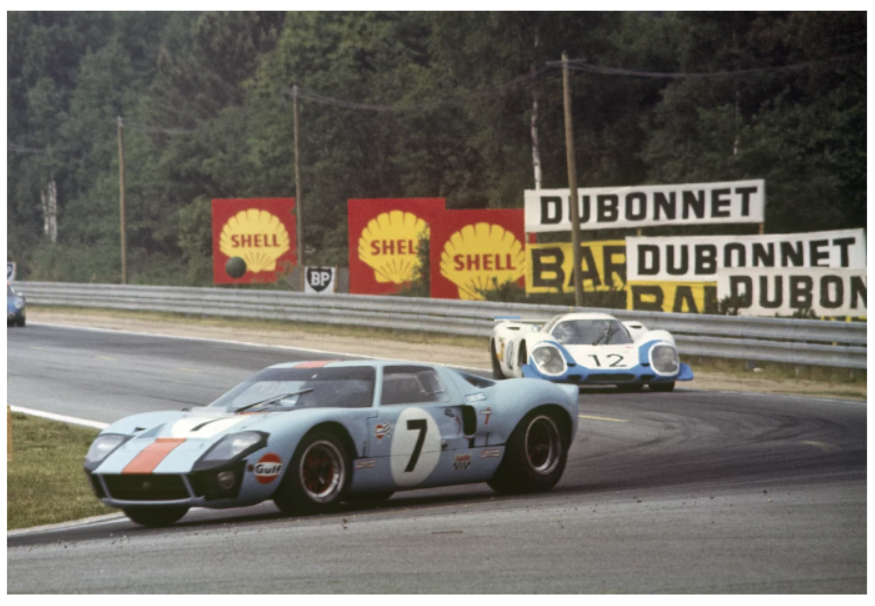
 Le Mans, 1966 with the Shell logo in the background
In the forties, the brand name started consistently showing up inside the Shell symbol, while the mid-fifties showed a start of significant simplification, which reached its peak in 1971.
The 1971 logo was designed by Raymond Loewy; his shell symbol is still in use today. The logotype changed in 1995, and the colour scheme now used a brighter red and a warmer yellow, but the shape stayed the same. Even without the brand name, it is one of the best-recognized logos in the world.
 The evolution of the Shell logo
Today Shell continue to operate as an international energy company as an expert in the exploration, production, refining and marketing of oil and natural gas including the manufacturing and marketing of chemicals.
As of 2017 Shell operates in 70+ countries with 86,00 employees world wide. The company sold 66 million tonnes of Liquefied natural gas and produces the equivalent of 3.7 million barrels of oil per day. When going about your everyday life its hard to not pass a Shell petrol station or even spot one of their delivery trucks on the road.


