
In this article we take a look at Famous Logos & Their Hidden Meanings Revealed.
Logos are more than just symbols; they are the visual identities of brands that convey their values and mission. In this article, we will uncover the hidden meanings behind some of the most famous logos in the world. From the iconic Apple logo symbolism to the clever design of FedEx, discover how these logos use symbolism and colour psychology to connect with consumers. Get ready to explore the fascinating stories that not only enhance brand recognition but also influence consumer perception!
Table of Contents
The Power of Logos in Branding
Logos play a crucial role in corporate branding. They serve as the face of a brand, making a lasting impression on consumers. A well-designed logo design can communicate a brand’s values and mission effectively while enhancing brand visibility. This is why understanding the hidden meanings of famous logos can provide valuable insights for marketers and consumers alike.
1. Apple: The Bite That Changed Technology
One of the most iconic logos in the world is Apple’s. The simple silhouette of an apple with a bite taken out of it is instantly recognizable. The bite symbolizes knowledge, inspired by the biblical story of Adam and Eve. It represents the pursuit of knowledge and enlightenment, aligning with Apple’s mission to empower users through innovative technology. Additionally, the sleek design reflects the company’s commitment to simplicity and elegance in product design.
2. FedEx: The Arrow of Precision
At first glance, the FedEx logo appears to be a straightforward design featuring the company’s name. However, a closer look reveals a hidden arrow between the letters “E” and “X.” This arrow signifies speed and precision—core values of FedEx’s shipping services. The use of bold and vibrant colours (purple and orange) also adds to the brand’s dynamic identity, making it both modern and approachable.
3. Amazon: A to Z and a Smile
Amazon’s logo features an arrow that connects the letters “A” to “Z,” indicating that the company offers everything from A to Z. This clever design highlights Amazon’s vast product range and commitment to customer satisfaction. The arrow also resembles a smile, reflecting the brand’s focus on delivering a positive customer experience. The use of black and orange colours adds to the logo’s effectiveness, creating a sense of trust and friendliness.
4. Coca-Cola: The Timeless Script
The Coca-Cola logo is one of the most recognized logos globally, featuring a flowing, cursive font. The logo’s design conveys a sense of nostalgia and tradition, representing the brand’s long-standing history since 1886. The colour red evokes feelings of excitement and energy, making it appealing to a broad audience. The wave-like design in the lettering can also be interpreted as a symbol of refreshment, aligning perfectly with the product itself.
5. Toyota: The Circle of Trust
The Toyota logo consists of three overlapping ovals, which symbolize the unification of the hearts of the customers and the company. This design signifies trust, quality, and innovation—essential attributes of the brand. The use of silver in the logo conveys a sense of modernity and technological advancement, reflecting Toyota’s commitment to leading the automotive industry.
6. Nike: The Swoosh of Movement
Nike’s Swoosh logo is a symbol of movement, speed, and agility. Created in 1971, the design reflects the brand’s focus on athletic performance. The simplicity of the logo allows it to be versatile across various products and marketing materials. The Swoosh is not just a logo; it’s a representation of empowerment and motivation, encouraging consumers to “Just Do It.”
7. Volkswagen: The Peace Symbol
The Volkswagen logo, with its distinctive “V” and “W” enclosed in a circle, represents the brand’s commitment to providing reliable and affordable vehicles. The simplicity of the design conveys a sense of functionality and accessibility. Interestingly, the circular shape can also be interpreted as a peace symbol, reflecting Volkswagen’s roots in post-war Germany, where the brand aimed to provide affordable transportation for everyone.
8. Starbucks: The Siren’s Call
The Starbucks logo features a twin-tailed siren, a nod to the brand’s maritime roots and its connection to the coffee trade. The siren symbolizes allure and temptation, enticing customers to experience the brand’s offerings. The green colour represents growth and freshness, aligning with Starbucks’ commitment to sourcing high-quality coffee beans. Over the years, the logo has evolved, but the siren remains a powerful symbol of the brand’s identity.
9. BMW: The Circle of Excellence
The BMW logo features a circular design divided into quadrants of blue and white, representing the colours of the Bavarian flag. The logo is often mistaken as a spinning propeller, which symbolizes the company’s aviation history. The circular shape conveys a sense of unity and excellence, reinforcing BMW’s commitment to quality engineering and performance in the automotive industry.
10. McDonald’s: The Golden Arches
The iconic golden arches of McDonald’s are synonymous with fast food. The arches symbolize a gateway, inviting customers to enter and enjoy the offerings inside. The bright yellow colour evokes feelings of happiness and warmth, making it appealing to families and children. The logo’s simplicity and recognisability contribute significantly to McDonald’s brand recognition worldwide.
11. Tour de France: The Dynamic Cyclist
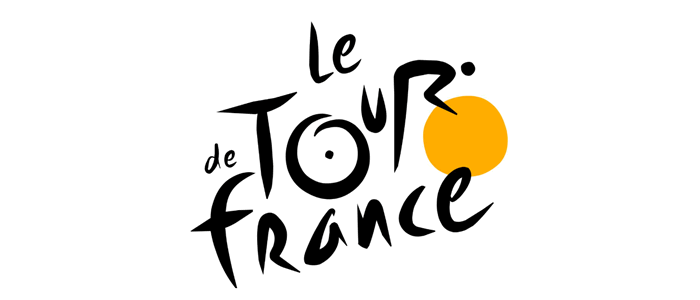
The Tour de France logo features a stylized cyclist in motion, symbolizing the essence of the race—speed, endurance, and competition. The yellow colour represents the iconic leader’s jersey, which has become synonymous with the event. This logo captures the spirit of cycling and the prestige of one of the most famous races in the world.
12. Vaio: The Wave of Technology
The Vaio logo cleverly combines the letters “V” and “A” with a wave symbol, representing the brand’s commitment to innovation and technology. The wave also symbolizes the analog signal, while the “1” and “0” in the design reflect the digital aspect. This duality signifies the brand’s expertise in both realms of technology.
13. MyFonts: The Typography Connection
The MyFonts logo emphasizes the importance of typography in branding. It features a playful yet professional font that conveys creativity and variety. The logo’s design showcases the brand’s focus on helping users find the perfect fonts, appealing to designers and businesses alike.
14. Adidas: The Three Stripes
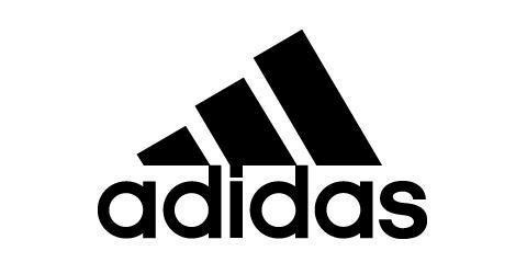
The Adidas logo features three parallel stripes that symbolize performance and quality. This simple yet powerful design represents the brand’s dedication to athleticism and sportswear. The stripes are also a nod to the brand’s heritage, signifying a legacy of excellence in sports.
15. Baskin-Robbins: The 31 Flavours
Baskin-Robbins’ logo features a playful combination of the letters “B” and “R,” cleverly incorporating the number “31” in pink and blue. This design highlights the brand’s promise of offering 31 different flavours, emphasizing variety and choice. The bright colours evoke a sense of fun and enjoyment, making it appealing to ice cream lovers.
16. Toblerone: The Hidden Bear
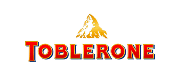
The Toblerone logo features a mountain, which represents the Swiss Alps, but hidden within the design is the silhouette of a bear, symbolizing the city of Bern, Switzerland. This clever integration reflects the brand’s heritage and connection to quality chocolate. The triangular shape of the logo also emphasizes the iconic chocolate’s distinct form.
17. Pinterest: The Pinning Inspiration
The Pinterest logo features a stylized “P” that resembles a pin, perfectly representing the platform’s purpose of saving and sharing ideas. The red colour conveys passion and excitement, inviting users to explore a world of creativity. This logo effectively encapsulates the essence of discovery and inspiration.
18. Tostitos: The Celebration of Sharing
The Tostitos logo features two friends sharing a chip and salsa, cleverly illustrated within the lettering. This design embodies the brand’s focus on fun and social gatherings. The bright colours enhance the feeling of celebration, making it an inviting logo for snack lovers.
19. NBC: The Peacock of Diversity
The NBC logo features a colourful peacock with six feathers, representing the network’s commitment to diversity and entertainment. The vibrant colours reflect the variety of programming offered by NBC. This logo has evolved over the years but remains a powerful symbol of the brand’s legacy in broadcasting.
20. Pittsburgh Zoo: The Connection to Nature
The Pittsburgh Zoo logo features a playful animal design that captures the essence of wildlife and conservation. The vibrant colours and friendly imagery convey a sense of joy and connection to nature, reflecting the zoo’s mission to educate and inspire visitors about wildlife and conservation efforts.
The Significance of Colour Psychology in Logos
Colour plays a vital role in logo design, influencing consumer perception and behaviour. Different colours evoke different emotions and associations, which can impact a brand’s image. Here are some common colour associations:
- Red: Excitement, passion, energy (e.g., Coca-Cola)
- Blue: Trust, reliability, professionalism (e.g., FedEx)
- Green: Freshness, growth, sustainability (e.g., Starbucks)
- Yellow: Happiness, warmth, optimism (e.g., McDonald’s)
- Black: Sophistication, luxury, elegance (e.g., Nike)
Understanding colour psychology in branding can help brands create logos that resonate with their target audience and enhance brand recognition.
Cultural Significance and Global Impact
Logos can also carry cultural significance, reflecting the values and beliefs of a particular society. For instance, the lotus flower in the logo of a Southeast Asian brand may symbolize purity and enlightenment. As brands expand globally, it’s essential to consider cultural interpretations of logos to ensure they resonate with diverse audiences.
Conclusion: The Art of Logo Design
The art of logo design is a critical aspect of branding that goes beyond mere aesthetics. Each famous logo carries a hidden meaning, reflecting the brand’s identity, values, and aspirations.
By understanding these symbols, consumers can gain deeper insights into the brands they engage with, and marketers can create more effective branding strategies. If you want to explore more about logo meanings or learn about effective branding techniques, check out our other articles!
Further Reading:
- Learning from the World’s Most Famous Logos
- Best Global Rebrands and Logo Redesigns of Major Brands
- The Psychology of Shapes in Logo Design
- Unlocking the Magic of Logo Design: A Guide to Creating Memorable Logos
- Branding Beyond Borders: Elevating Your Global Presence through Impactful Logo Design
- Logo Design Trends to Watch Out for in 2023: Stay Ahead of the Curve!
- Most Expensive Logos In The World
- Every Good Logo Tells a Story! 40 Famous Brand Logos & Their Hidden Secrets
- Famous Logo Designers and Their Distinctive Style
- Using the Golden Ratio in Logo Design
- 20 Famous Brand Logos Constructed in Grid Systems
- 14 design principles of good logo design
- 10 Common Logo Design Mistakes to Avoid for Stronger Branding
Join The Logo Community
We hope you have found these hidden meanings in famous logos helpful. If you would like more personal tips, advice, insights, and access to our community threads and other goodies, join us in our community.
You can comment directly on posts, access our community threads, have a discussion and ask questions with our founder Andrew.
If you’re looking to learn more about brand strategy, we highly recommend eRESONAID with our friend and acclaimed brand strategist and author Fabian Geyrhalter, it’s packed full of knowledge and insights you will need to learn to become a brand strategist or apply what you learn within your own business.


Author Bio
Andrew Marriott is the owner and founder of The Logo Creative™. He is an award-winning designer with over two decades of experience designing logos and specialising in branding for companies worldwide.
FAQ – Hidden Meanings in Famous Logos
What hidden meanings are behind the Apple logo?
The Apple logo features a bitten apple, symbolizing knowledge and enlightenment, inspired by the story of Adam and Eve.
How does the FedEx logo represent speed?
The FedEx logo has a hidden arrow between the letters “E” and “X,” signifying precision and the brand’s commitment to fast delivery.
What do the colours in famous logos signify?
Colours evoke emotions: red signifies excitement, blue indicates trust, green represents freshness, and yellow conveys happiness.
Why are logos important for brand recognition?
Logos serve as visual identities, creating lasting impressions and enhancing brand recognition through symbolism and design elements.
What are some examples of logos with hidden meanings?
Examples include the Amazon logo with its smile arrow, the BMW logo representing a spinning propeller, and the Starbucks siren symbolizing allure