Designing a logo based on the current trends in logo design is never the way to go. Don’t ever design or redesign a logo to incorporate these latest trends just because everyone is talking about them as trends come and go they may fizzle out within a matter of months and my advice is to know what people are talking about and be aware of what’s happening but don’t follow logo design trends just because you think its the right thing to do because its not.
Logo design trends are just like phases created into buzz words to try to get everyone heading in the same direction and what’s really happening is a shift in innovation followed by new technology and hey presto! a new visual language is born.
It’s a complete package, from start to finish, it’s not the end goal as many predict. What should really be the start of a new journey, a story to tell and form that will grip us, and inevitably end up as, you guest it, trends.
In this article we are are not listing what’s been talked about as a current logo design trend but areas that have been popular in previous years and look like they are Logo design trends that are here to stay in 2019.
Table of Contents
Why Logos Should Not Be Based On Trends
Before we jump in let’s explain why a logo design should not be based on trends. A logo design is designed to be timeless, and give greater emphasises to a brands identity: hence why the logo design should not be based purely on trends. You need to keep away from incorporating every new logo design trend into a logo design just because it is been talked about by others.
There are many ways a logo can be designed from a symbolic approach to a wordmark and even an emblem: these are not trends and have been used for hundreds of years, and will continue to be used for hundreds more.
Why? because we all have a subconscious connection to recognise an entity through its brand mark regardless of what current design trend is been used, this is not a fashion show! When I look at a brand mark I look for a visual connection, simplicity, and memorability a mark that is solid and I can see lasting the test of time. I don’t look for fanciness, I look for recognition.
As a logo designer, I agree that logo designers must keep to a set of rules, first one being that it needs to work on new emerging technologies such as smaller devices such as smartphones and the increasing popularity of smartwatches. this is again a reference to innovation and technology that precedes visual identity and it should be supportive and not trending.
Secondly, more and more people are designing their own logos, posting them on social media after feedback from experienced logo designers within the design community. And this is happening for a couple of reasons:
These people are waking up to these crowdsourcing websites that are damaging the industry for professional logo designers, not from a competition point of view but how they actually do more damage than good for someone’s brand and this makes it harder for a client to put their trust in a professional designer to turn it around for their company.
A crowdsourcing website is bad because there is no communication and one to one between client and designer, the designers don’t understand the client’s company as research has not been carried out, they are simply designing from a brief that can’t be trusted without carrying out the correct research
The client is not always right! and they don’t normally understand what they need, it’s the designer’s job to understand their client and understand exactly what they need to solve their design problem.
So why do people use these types of services? Because technology has flamed this growing shift into the do-it-yourself creating the idea that anyone can design their own logo. Crowdsourcing is cheap which makes it attractive to a small budget client, others think they can micromanage the project based on their personal preferences with a smaller price tag.
The best advice is simple: DONT DO IT! stay clear of these services if you want your business to reach heights it has the potential to reach. Hire a good logo designer that knows and is experienced in the industry a designer that can understand your brand and translate the research they conduct to fully understand the goal to create a logo that truly resonates with your brand its target market. The end result will offer you far greater results!
That’s Not a Design Trend
Each year we see the same things popping up on these new design trend lists, and below we will discuss a few of them.
Colour
A computer displays roughly 16.8 million colours to create a full colour picture on the screen. A lot more than we need! Yet each year we see colours labeled as a current design trend.
I don’t quite understand this concept of how a colour can be named a design trend. There are already numbers of colours available how can it be a trend? A why would you want to use the same colour as thousands of other people at the same time everyone is banging on about how popular it is?
This is not a trend topic but a very big part of the visualiIt’sion. It’s a given fact that colour will never ever go away!
The best advice is to select a colour that best represents your brand, base colour on your brand not just because its so-called trending! And don’t just go with The Pantone “colour of the year”!
Typography
Typography has changed considerably since the digital age began, and a lot of the traditional methods of creating a solid typeface are few and far between. The principal objective of creating good typefaces is as good as the new generation’s knowledge of the subject. Only a few have come through very well, but we all know once a good typeface appears, it becomes ubiquitous.
For the past three years vintage typography was all the rage, from corporate to niche service/product, everyone wants to use the latest cool font, only to get bored of it after a year and change. Find a typeface that works with your brand;
- Does it emphasis your entity?
- Does it strengthen your brand?
- Does it allow for readability across the many devices?
- These are some of the typical questions you should start with, and then go deeper;
- Does it balance well with the logo/symbol mark?
- Does it hit the right note with our customers?
Graphics Style
Should you choose flat design, skeuomorphism or neither of them?
For years now we have seen designers hopping around the subject of visual language and each year we see the what’s trending articles. Apple made a change from its skeuomorphism design and ever since it’s been labeled a trend.
Google followed through with Material Design, which is the same as flat design as most people know it as but they rebranded it with a buzz word to gain attention all of a sudden, it’s a new thing.
But in all respect material design goes further than flat design with innovation and possibly technology and science behind it. But without knowing this you would not be any wiser or be able to tell the difference.
Understanding The Logos Importance for Your Brand
Without having the right approach to branding, you will face an incredible challenge in building a trustworthy and reputable brand presence. There are countless reasons to why the creation of a logo should be at the top of every brand’s list and be the utmost priority. You need to know to understand a logo’s significance and its importance in the role it plays for your brand.
Good Visibility Creates Everlasting Memorability
A brands logo is far more than just a static symbol is possessing far more potential. The brand’s logo is to be a visual identifier for the brand to make it memorable and this needs to be key when designing brand identity. Without a logo that visual identifier the brand is faceless and holds no visual value and presence.
To build a trustworthy brand that resonates with its target market and drives consumers towards your brand the brand needs an identifying mark that is memorable and connects with consumers creating trust and credibility in their minds.
Logos can make or break a brand so the logo plays an important factor in the overall branding process. Creating a visual and emotional connection is key within the design elements of the logo while incorporating the brand values so people can easily understand what the brand stands for.
Gains The Audiences Attention Visually in Seconds
You want to capture your audience’s attention in seconds, those few initial seconds of looking at a brands logo are crucial. People want thing fast; they want to look at something and within a few seconds they want reassurance that they can trust a brand.
Once you have potential customers approval within those crucial seconds, they will then go on to find out more about the brand by digging deeper and reading your about page on your website or search your products and services.
By having a strong appealing and convincing logo this makes the whole process of driving those potential consumers to your brand a whole lot easier and natural. In the form of this single visual aspect, you can exhibit your brand’s vision, values and the offerings it provides gaining the brand attention you need to build a strong brand.
Helps in Building a Firm Brand Identity
Without a strong, memorable and impactful logo, your brand would have no real visual presence at all. The brand logo certainly plays a vital and key role in building that brand identity. The logo possesses the power of taking it to greater heights.
It’s all about consumers being able to distinguish your brand over the competition and having that credible presence over them. Many aspects go into forming the overall branding of a company however the formation of a solid brand identity starts with a logo and this should always be the focus for every brand out there.
Conveying a Professional Image For Your Brand
Besides being a visual identifier for a brand the existence of the logo is to also visually convey what a certain brand is all about. To stand at the top of the brand mountain and shine the brightest light in your relevant field or industry having a professionally designed logo will help in doing this as it leaves a meaningful impression but also increases the memorability factor for your customers.
After those initial and crucial first seconds of viewing a professional logo, your audience would not be hesitant in forming an association with you and your brand’s offerings. With a professional image, you would have the credibility to your brand’s name, which leads to building trust among your audience or potential consumers.
Strong Logos Bring Consistency to Your Brands Image
Maintaining brand consistency is not an easy task to achieve, an effective logo plays a key role in keeping your brand consistency on track. With the amount of online digital platforms like websites and social media networks, a brand must keep a consistent visual presence on each of them its a smart tactic to remain visually consistent for the brand to be identifiable on each of these platforms.
The logo provides a brand with a specific theme that can be used in various types of branding strategies. You might want to create business cards or maybe a flyers but it is suggested that you utilise the same thing as you have used in your logo as this leads to consistency within your brand.
Logo Design Trends That Are Here To Stay In 2019
Now that we understand the term “Trend” and the importance of a logo let take a look at what trends are going to stay in 2019.
The success and eminence of a brands logo depend upon a number of crucial factors but it is subjective. For some, it is about the visual aesthetics, while for others it is about the value a certain logo portrays.
It’s nice to keep an eye on the ever-changing logo design trends and styles but it’s not the be all and end all you need to design for relevance not for trendiness.
Graphic Design is ever-evolving and as we mentioned earlier Some logo design trends are recurrent year after year while others just vanish off the face of the creative planet. While observing logo trends over the years we have compiled the logo design trends that are surely here to stay and have become more than a trend and more of a promising and inspiring aspect that cannot be ignored.
Gradients & Bright Bold Colours
I’m sure you will have noticed the vast amount of logos with shiny bright vivid, and saturated colours. They are very eye-catching and impactful and have been popular for quite some time now. Gradients and bright colours have also been popular in web design and interface design over the last few years.
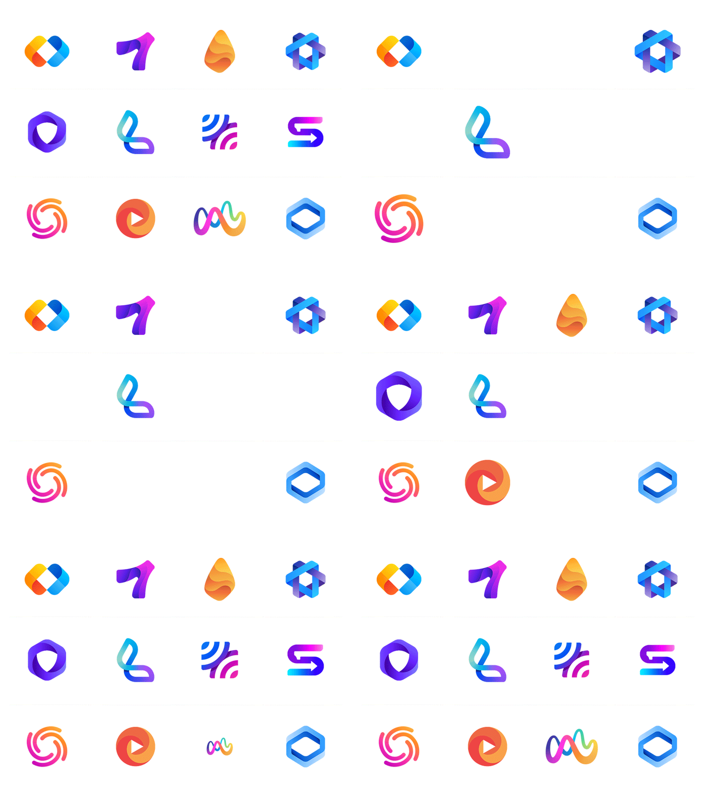
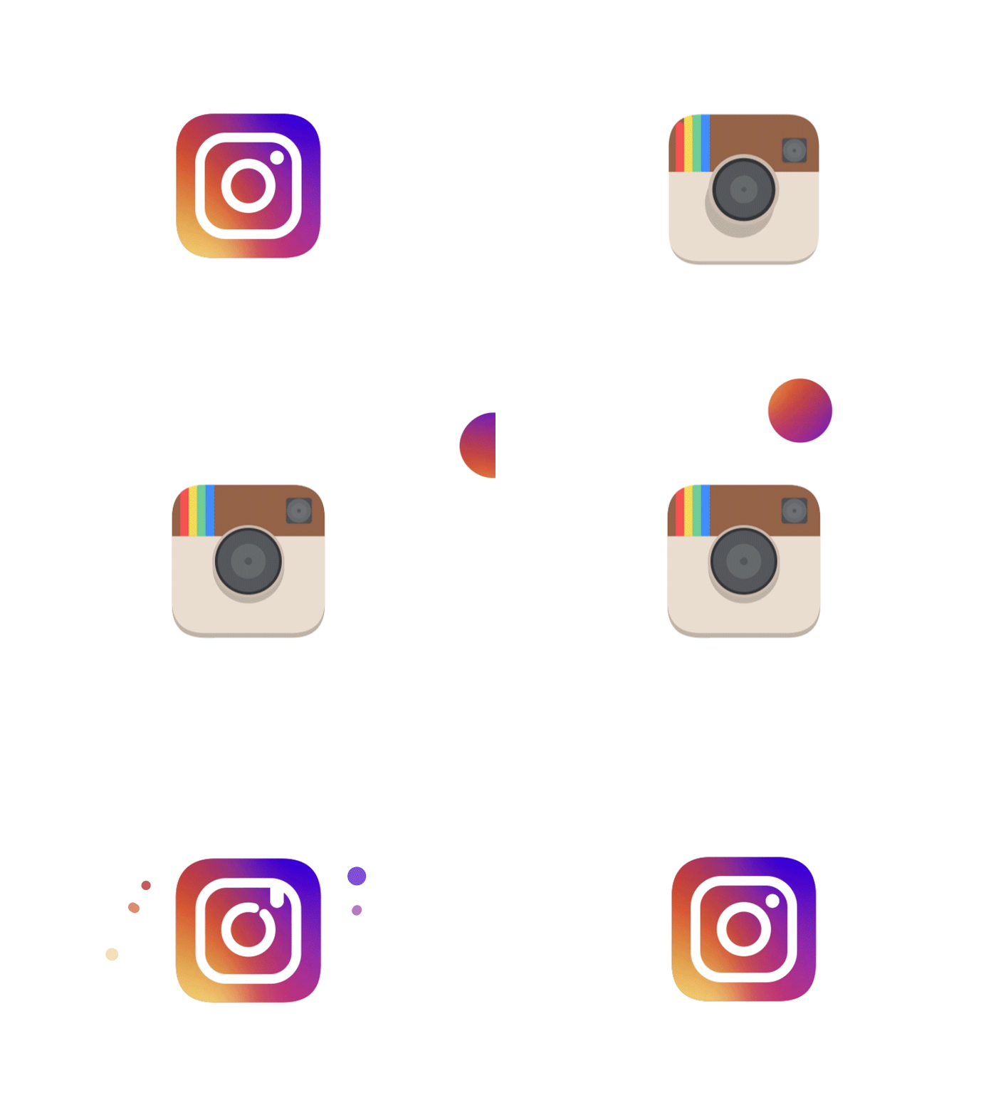
You may have noticed the come back of gradients also becoming more vivid than in previous years in logo design. It kind of started with the Instagram logo redesign that happened in 2016 and it started the movement in bright colours and gradients to make a comeback in logo design.
One of the reasons gradients and bright bold colours are so popular is due to the diverse colour palettes that can be created with the vast amount of colour combinations available. Bright bold colours and gradients are not for every logo design they work well with some but not all if you can balance the right combination of gradient colours and it can reflect the brand then its a good direction to in.
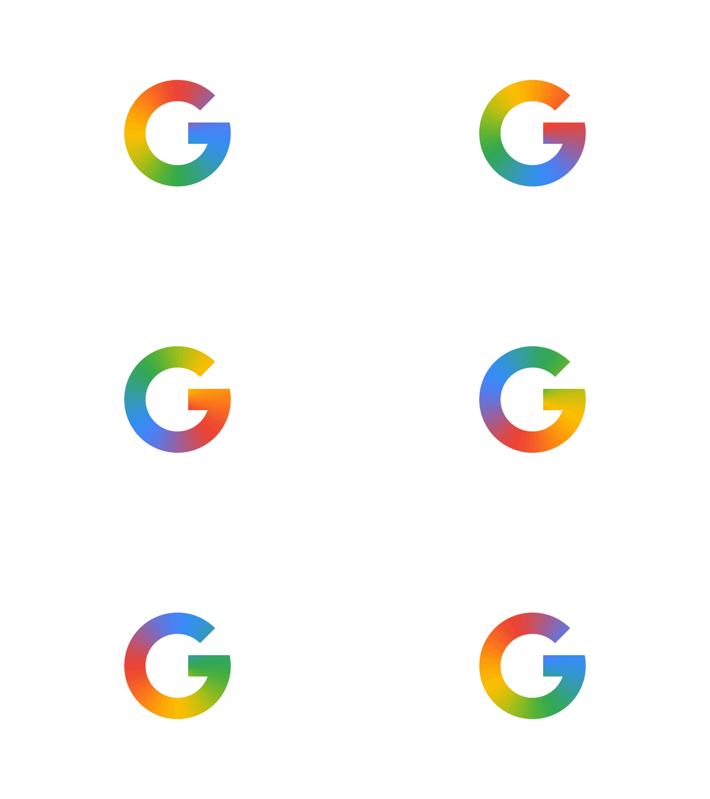
Gradients and bright colours are ever becoming more popular with animated logos that we discuss later on. As seen above the google “G” combined with an animated gradient of the brand’s colours is quite fetching.
Experimental Movement & Animated Typography
When we think of animation design most of us think about web design, when we think of Moving images known as GIFs we think of social media, but its popularity has seen the merge of animation and design that forms a completely new and intuitive form of logotypes. Animations have a big impact in keeping the viewers engaged so it’s no wonder why this aspect is been achieved in animated logos.
Movement research is something that we would more likely relate solely to kinesthetic experiences. When it comes to logotypes and brand identity, moving images are going to be desired in 2019 just as much as a flat design and static imagery.
The vast majority of logo designers are experimenting with animated logos. More precisely, they are trying out the moving typography practice and motion design exercises to create outstanding logotypes that can really resonate in an emotional and visual way with its viewers.
Overlaps in Logo Design

Overlaying vibrant bright and bold colours creates a brand-new hue, giving great depth to a logo design. MasterCard’s logo overhaul breathed new life into the technique, proving that it fits all kinds of brands, including high-profile companies.
Hand Lettering
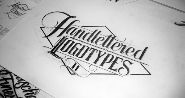
Custom hand lettering is more popular than ever and a style that is truly unique to a logotype. A vast number of industries, including cafes, barber shops, and photo studios, will continue exploring the power of this style. Prepare to see more logotypes with intricate inscriptions!
Illustrative & Contextual Logos

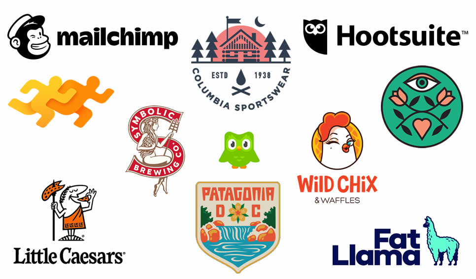
A logo would look a lot different for a fitness gym then it would for a local bakery company. So, contextualising the logo design is a vital and essential stage in the strategy of the branding process. It all relates to the visualisation of the brand’s values, mission, and their style and energy and everything else that the brand stands for. We are seeing more brands going in the direction of unique icons, illustrated characters with funny imagery and metaphorical representations of their brand.
Monochrome & Minimalistic Design
Monochrome and minimalistic design goes in contrast with bright colorful logo imagery, These two trends are not opponents, at all. Black and white duality is sort of an evergreen trend in logo design, one that is elegant and classic, and a style that you cannot go wrong with. The simplicity of the minimalistic approach trend or I prefer to say style that is sure to stay.

Being simplistic in logo design is kind of a rule that most logo designers aim for the “less is best” approach and minimal logo design will always have its prominent place in the logo kingdom. Minimalistic design has encountered countless transformations over the years and exists in the form of abstract yet minimalistic concepts.

What is good about taking a simplistic approach and designing a logo in minimal form is these gives more power to the viewer and helps them formalize visually what the logo is conveying. The curiosity to know more in the shortest time, in turn, leads to driving more consumers to your brand.
If you’re in the market for a minimal logo, you should know that there are logo designers who specialize in creating only monochromatic and minimalistic logotypes.
Geometrical Shapes
In the logo design industry geometrical shapes must be one of the oldest trends, I prefer to call it styles that there is and a style with the highest value among them all. The use of circles, squares, triangles, hexagons, and simple lines has been around since day one, and this is a style that will continue to be used forever. logo designers are always inventing the wheel and finding new and creative ways of using geometry in their logo designs.
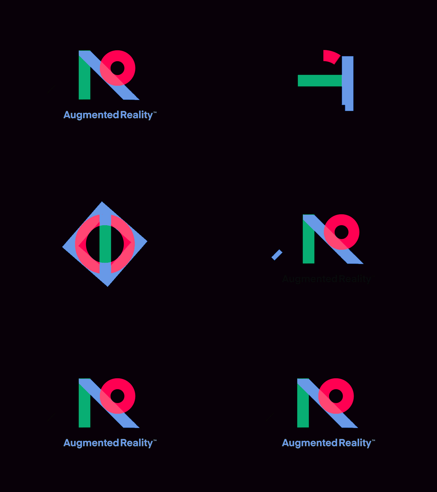
Following on from taking a simplistic approach and trying to be as minimalistic as possible by using shapes and symbols in their simplest form to represent certain meanings or notions of symbolism makes using geometrical shapes a popular style in logo design.
Using sharp-edged shapes are better representation for resolve and control while delicate shapes with curves and rounded corners represent smoothness and simplicity. The selection of shapes will be dependent on the qualities a brand represents.
Negative space
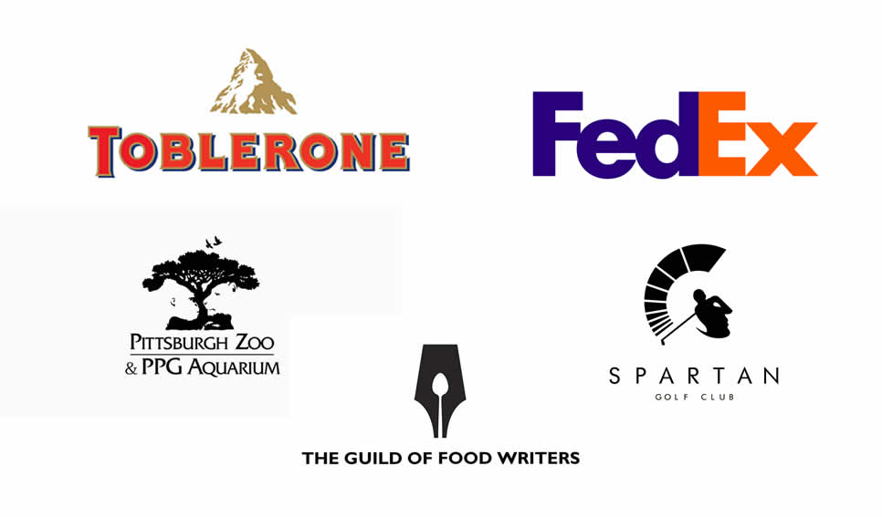
The style and technique of using negative space in logo design require no introduction. Logos with negative space have been around for years, and 2019 will be no exception. The style has incurably evolved over the years, shifting from logomarks to logotypes. Now we see more text logos with shapes and images hidden inside or between the letters. When this style is achieved correctly it can be simplistic, cleaver, impactful and just a beauty to look at.
Neon Logos
Neon graphics were a popular graphic style in the 80s such as the retro neon style that was also very popular in the 80s and this trend has slowly been brought back to life once again.
Neon logotypes are being merged together with typography and lettering elements to give the design a visually bold appeal. Neon colours and designs are not only limited to logos as other forms of digital branding are also making use of neon-based graphic styles.
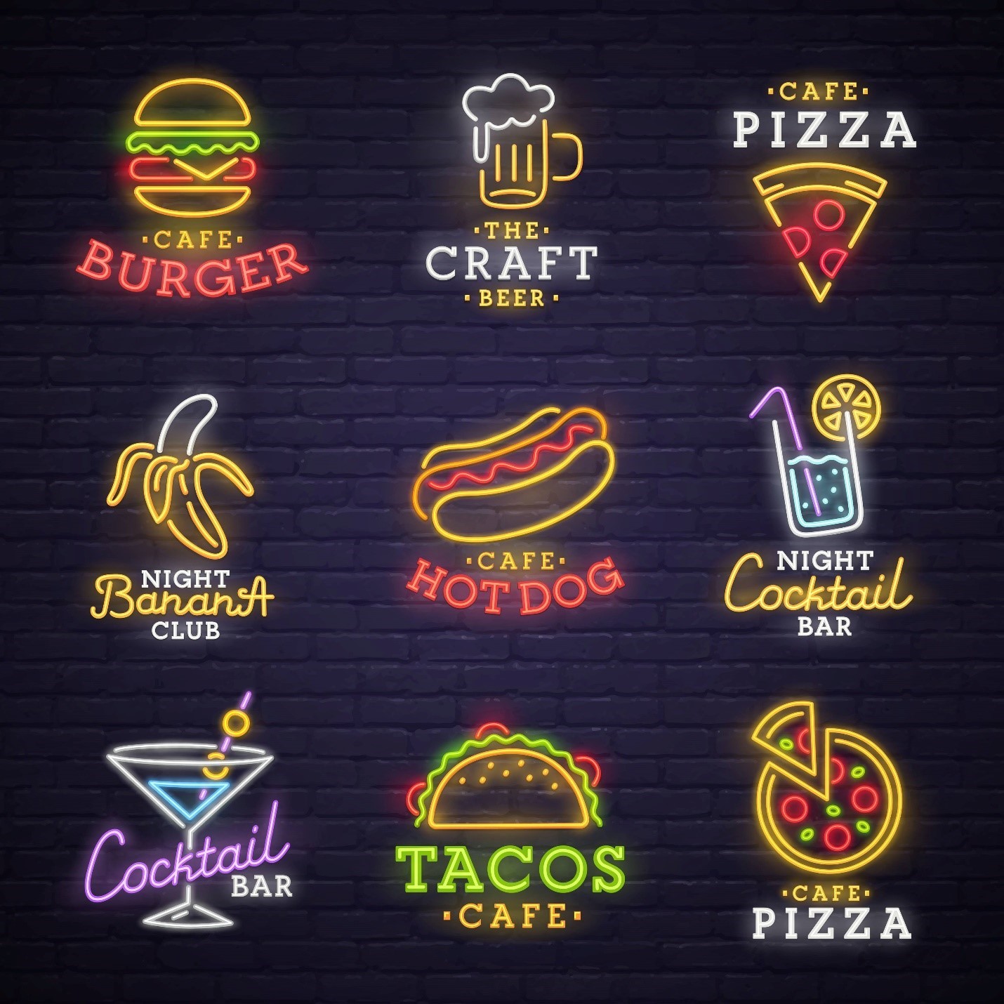
The revival of the neon style promises aesthetics based on both urbanism and retroism and that expands the scope of branding. The overall vibe and appeal neon graphics have made the style a favorite over the years and 2019 surely is the year to make the most out of it.
Learning Logo Design
If you’re looking to learn or develop your logo design skills then we have some great resources on our logo design resources page. The best way to learn in the modern world is online and here at The Logo Creative we have some recommendations for you. Skillshare is a fantastic online resource jam-packed with courses by some of the industry’s best designers from Aaron Draplin, Geroge Bokhua to Jessica Hische and plenty more. You can get 2 months free learning with our link above it’s a win-win!
Logo Core has a great online course dedicated to logo design their masterclass is a one time fee and you get lifetime access to study and learn at your own pace, it well worth checking out you’ll be designing logos in no time!
If you fancy reading a great book then we have something for you The Ultimate Guide To Logo Design 109 pages jam-packed to learn all things logo design. The book is written by a friend and fellow logo designer Kyle Courtwright so it’s a quality purchase you will not regret full of logo design tips and insights you can put into practice.
Conclusion
Designing from scratch, redesigning, or simply refreshing your branding style, along with the looks of your logo is a cost-effective way to supercharge your brand in the upcoming years, and make your company stand out among the competitors. It can make your brand become more appealing to the target audience and more recognizable on a global scale.
The year 2019 is certainly expected to be an exciting year for digital design styles. Some trends from the 80s have made a big comeback while some other styles are still very new to us.
We are currently living in an era that is also depending upon dynamism and most of the recent popular logo designs contain properties and aspects of two or more design styles.
This fusion has led geometric shapes to be used in minimalistic styles and vibrant colors in modern typography design elements. Every single design trend is made to leave an everlasting impactful impression, and we are looking forward to seeing what other styles and trends are yet to be unfolded.

