In this book review, we take a look at Graphic Design for Art, Fashion, Film, Architecture, Photography, and Product Design & Everything In Between by Andy Cooke
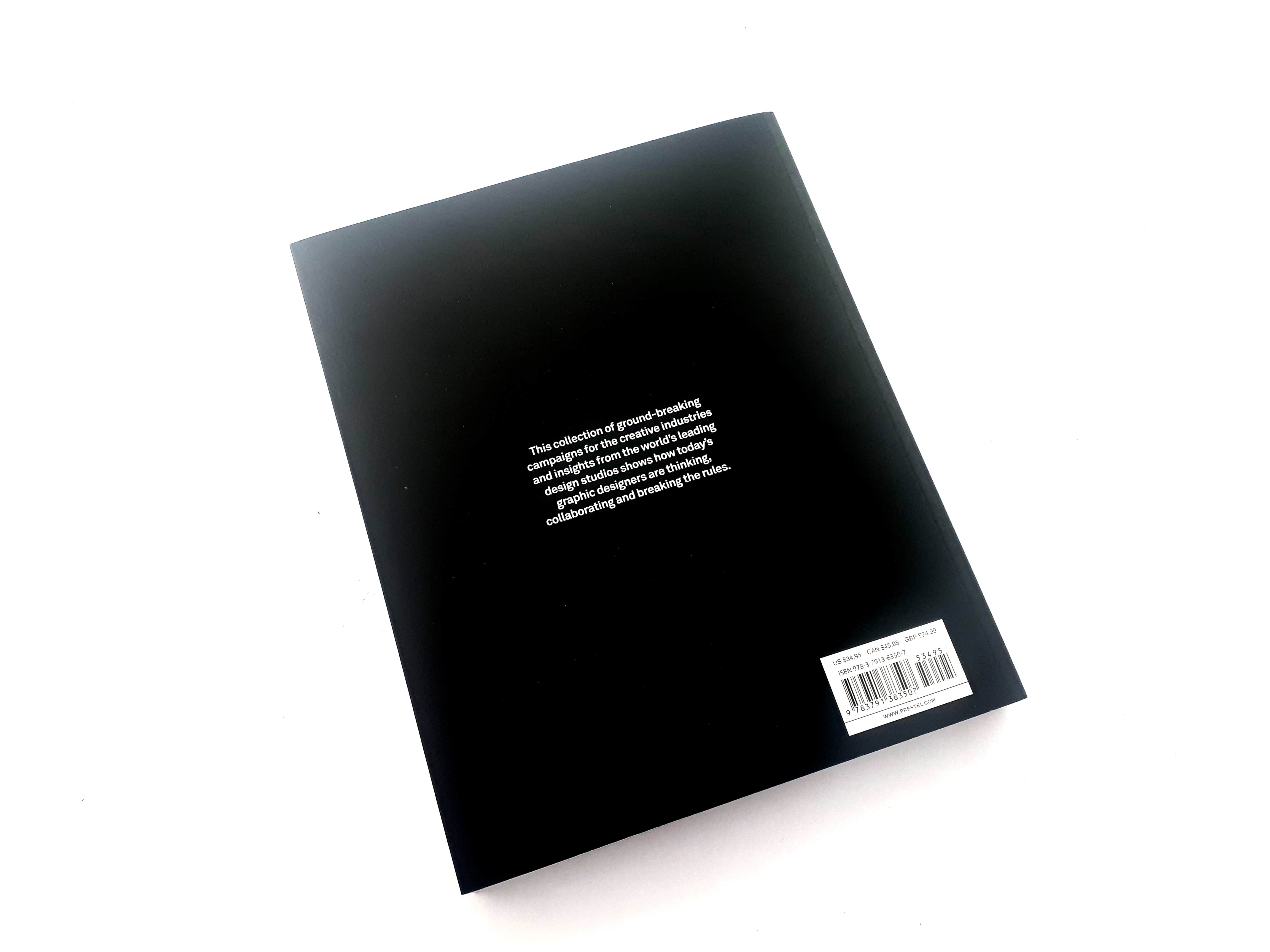
It’s a collection of ground-breaking campaigns for the creative industries and insights from the world’s leading design studios and shows how today’s graphic designers are thinking, collaborating and breaking the rules.
The book was written by Andy Cooke who is a graphic designer and entrepreneur from Staffordshire, UK. He is currently based in Lucerne, Switzerland, where he is an integrated art director for global education, travel and lifestyle company Education First.
From afar, he is the director of graphic design studio Weather, based in Stoke-on-Trent, where he works with a number of creative and corporate clients across identity and design for print and digital.
He also co-owns a Pizzeria, and co-runs a creative company centred around gallery, screen-printing workshops, and graffiti-led commissions.
He has been immersed in the creative industries for many years, initially trying his hand at product design be for moving on to graphic design, curation and project management.
Between 2013 and 2017 he taught at Staffordshire University on their BA Advertising and Brand Management program, and he has curated and project managed art exhibitions across the UK.
Before we jump into the contents of this book I would like to thank Andy Cooke for sending me a copy of this book I have thoroughly enjoyed each and every page.
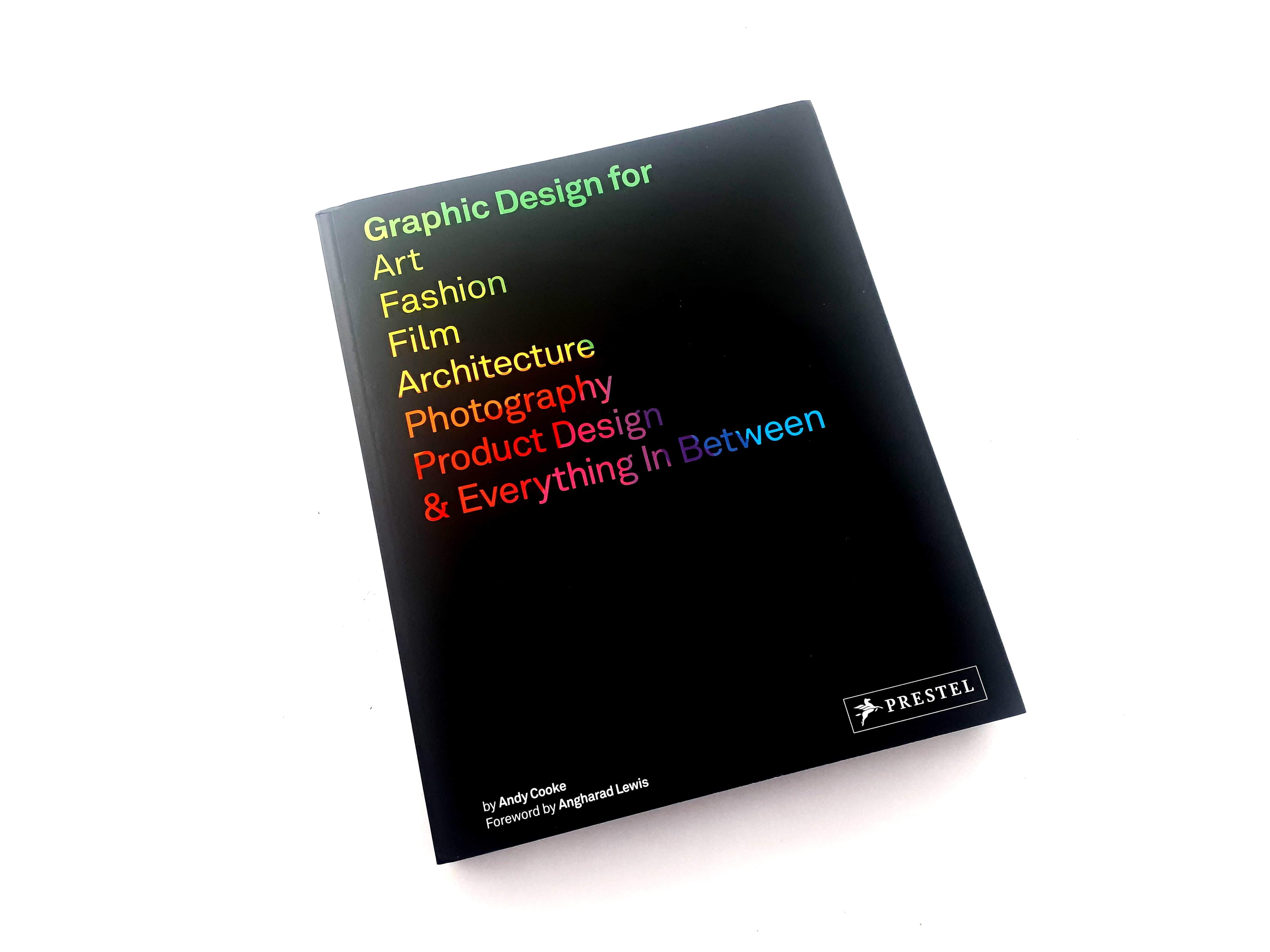
Ok, let’s start with the cover design as I do with all the books I review. The first element that strikes for me when looking at the book is its pure simplicity of a black cover with the title as the main focus and how the tile stands out on the black background with the gradient of colours that run through the letters, less is best and it works very well for this book.
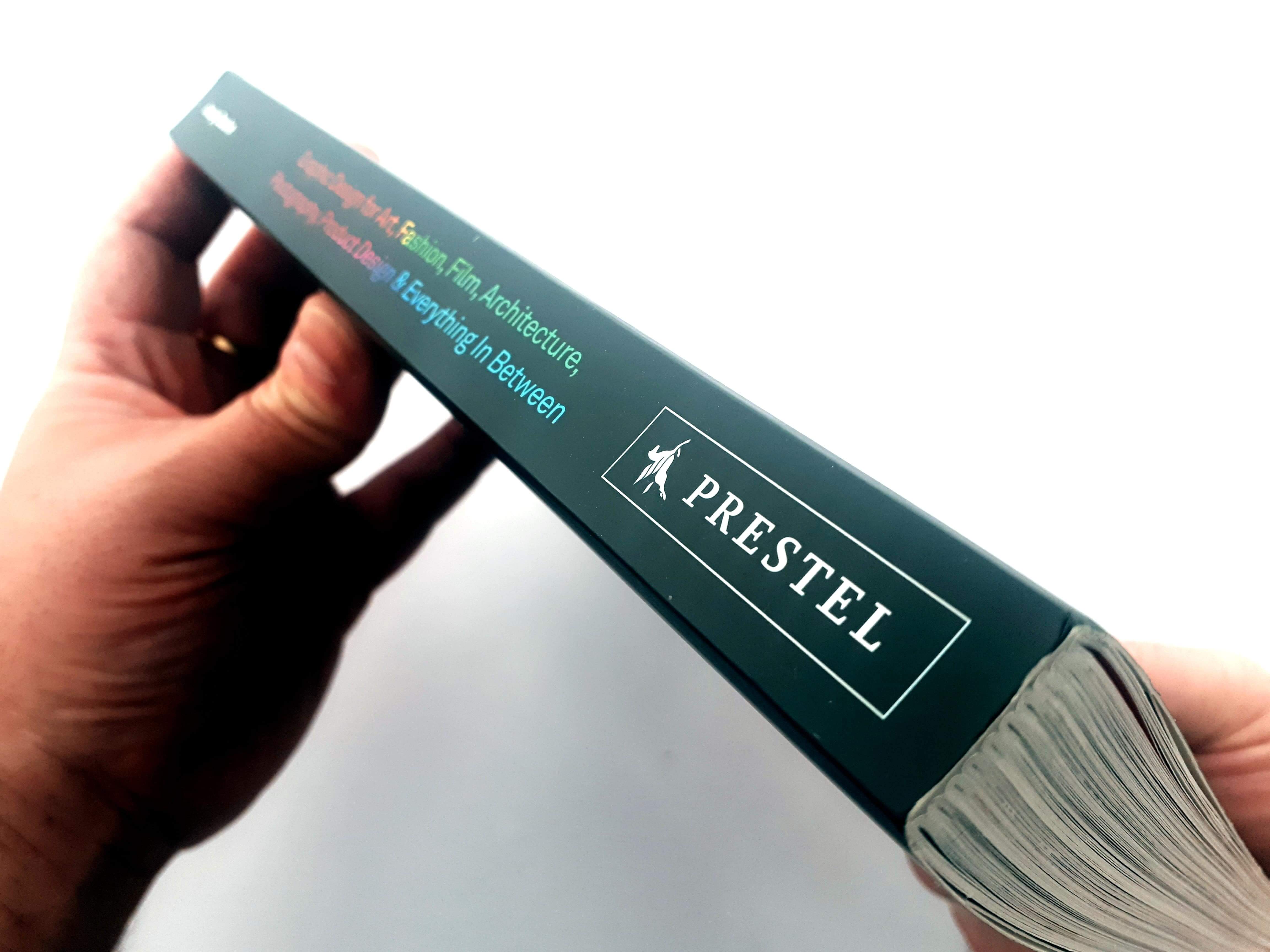
It was published by Prestel Publishing in February 2018, The book is a paperback, with flaps, and has a premium high quality feel with a strong spine that is approximately 7.75” x 9.5” containing 240 pages including 415 colour illustrations.
The book itself explores the ways in which graphic designers can successfully collaborate with other creative professionals and sectors, whether it be on a more sophisticated logo for a product, a better-designed lookbook for a fashion brand, or a more intuitive wayfinding system for a museum.
It features exceptionally conceived design solutions across a variety of industries, from architecture and product design to art, fashion and film.
Each example illustrates the significance of the graphic designer’s role in making a campaign marketable and successful, and insights from the clients and the designers themselves reveal the inner workings of the process.
The result is an indispensable reference for the graphic design industry that shows how excellence can be achieved when creative minds work together.
The work featured within the book is brilliant contemporary work that isn’t too trend-based compared to other collection books, but it’s not too static like the work featured in more era based design books. The work featured feels like it is some of the best representational work from this era of design, and is some of the work that’ll continue to be looked at in the decades to come.
There’s a very good mix of large and small, well-known and lesser-known, and award-winning work. Despite this diversity, there is a lack of representation from studios outside of Europe, more specifically, England.
Almost all of the studios presented are from Europe, with only a few being from the United States and Canada, and none from South America, Africa, or Asia.
One of the best attributes of this book is the detailed descriptions for each project. They not only describe the studio and the client, but they describe the context of the project and which decisions were made due to the context. This is one of the only contemporary collection books that actually describe the reasoning for some of the design decisions. This is so beneficial to the reader because it gives them insight as to why the work looks the way it does, and why the work is successful. The work is not just aesthetically pleasing, but it succeeds in what the client wants and succeeds in what the clients’ audience desires.
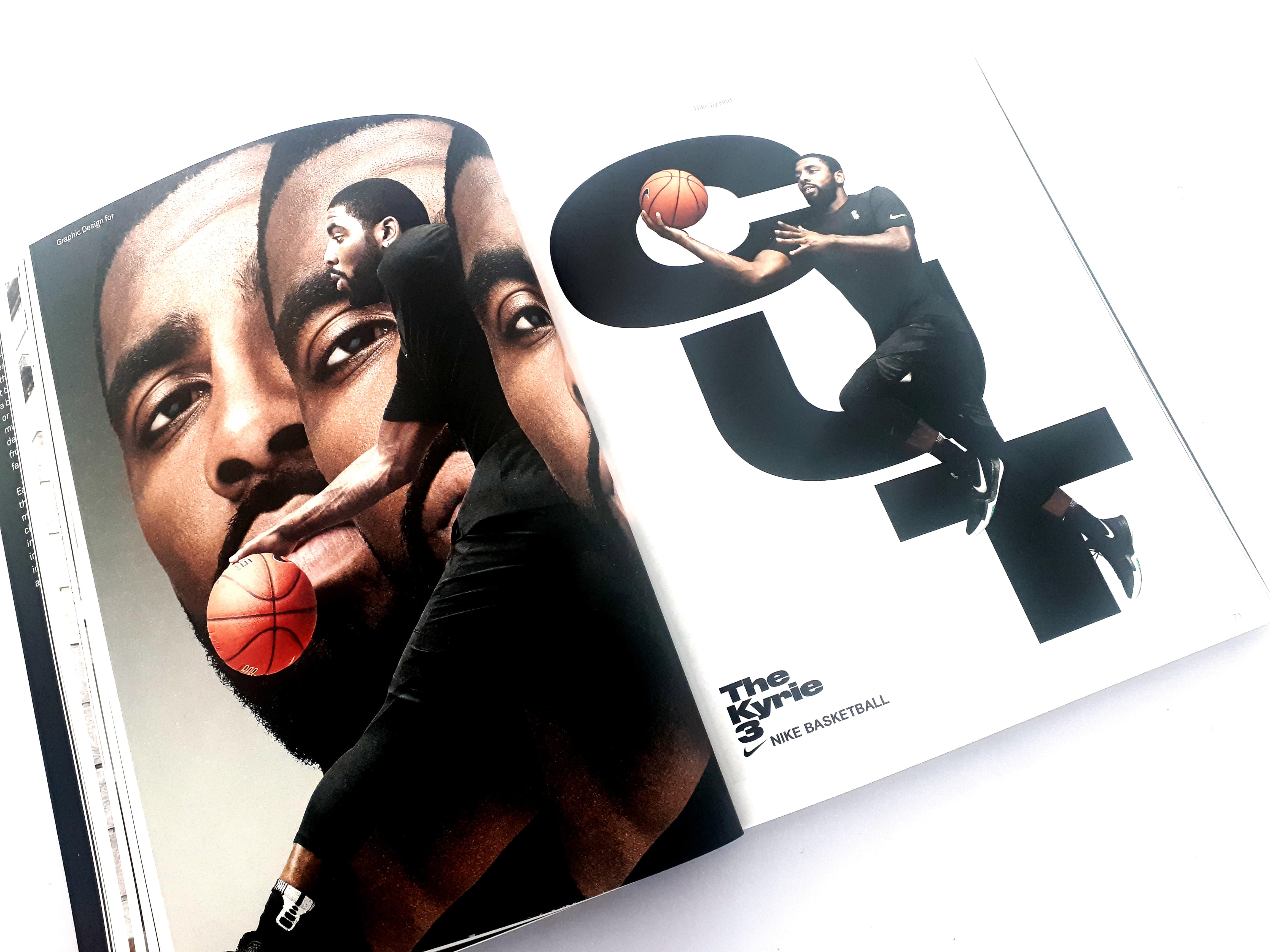
The book’s content design and layout is really nice and consistent. The type hierarchy is very solid, and the layout is modular, making each spread as interesting as the next one. The contrast between images and text is different from each spread and gives a variety, but is somehow similar.
The elements are structured similarly each time. The text blocks are always the same width, and roughly the same length and images fit into one of several templated sizes. All of the design choices fit the rules of layout design which is very nice.
The purpose of this book is the focus on the work being presented, and it does a good job doing that. This book would be helpful for designers who are looking to create their first portfolio, or for designers looking to do a revamp.
The book serves a great purpose; reiterating the notion that collaboration yields more interesting design work than staying within one’s own field of design. This book shows that example after example, case after case.
I enjoyed reading this book as it was something different, and I would recommend it for any graphic designers working in the design field who are looking to collaborate more with other designers. The book also serves as a great inspiration when it comes to creating your portfolio.
We asked Andy a few questions about the book and the graphic design industry.
The Logo Creative – What inspired you to write this book, and where did the idea come from?
Andy Cooke – A few years ago I was doing a guest lecture and workshop at York St. John University with a class of Product Design students. It was very clear, very soon, that there was a strong need for an awareness and understanding of how graphic design can work to elevate their ideas. That thought became the seed, which eventually turned into this multi-discipline publication that aims to inspire not only individuals in product design but also other creative sectors where graphic design has a huge role to play.
The Logo Creative – How long did it take to produce and finish the book?
Andy Cooke – From signing the contract to getting it on the doormat, 18 months. This included curating the features, conducting interviews, writing, copy editing, proofing, designing, and production.
The Logo Creative – Did you have a process in place for selecting the work featured in the book, and how did you proceed to select the work featured?
Andy Cooke – Maybe selfishly, but also quite simply, all the work selected is that which is on my favorites list. For some features, I have a working relationship with the individuals or studio’s featured, but for others, it was a case of reaching out directly and enquiring about their co-operation.
I did want to capture a broad spectrum of types of work, between brand, editorial, and wayfinding (for instance) across the different sectors. I considered it important to show the breadth of graphic applications.
The Logo Creative – How important is a graphic design to the wider design industry?
Andy Cooke – This is a question I asked practitioners in the book, but one I’ve not really answered myself. As a graphic designer, I’m somewhat programmed to say that of course graphic design is immensely important to the wider creative industries. Whether the wider industry agrees is part of the conversation.
In many ways, it’s so easy to accomplish at a basic level that it’s easy to dismiss the role it plays. Access to software, however advanced or rudimentary, is more viable than ever, and therefore the implied value of graphic design diminishes every day. And there will always be those who see it adding no value to their business and others who see it as invaluable. For me, what’s most important as graphic designers is to try and educate the former, whilst doing great work for the latter.
The Logo Creative – Do you think as a designer that having multiple design disciplines is a viable approach for designers working in the industry?
Andy Cooke – Yes. Now more than ever I feel it’s imperative. There’s a quote I always think about when designers strive to specialise in a single area of design: “You learn more and more about less and less until you know everything about nothing.” By striving to learn about more about more, our influence and knowledge pools grow and we can create better work all round off the back of that. Who doesn’t want that?
The Logo Creative – What are your predictions for the role of graphic design in the future?
Andy Cooke – The aforementioned spectrum of accessible graphic design software will only grow and will push the gap between novice and professional even further. There will be clearer distinctions and designers will be in limbo if they exist anywhere but close to either pole. Right now it’s hard to tell the difference in many respects. But as clients become savvier as a result of accessibility this should equal a higher appreciation and knowledge of what good design is.
In general, I think new and exciting opportunities await. There is so much that hasn’t been fully figured out. How does design work for AR, for VR? How will social media evolve, and design with it?
But hell, how does design really work online for the everyday person using the internet? I’m not convinced we know what we’re doing as much as we think we do here. ‘Best practice’ in terms of digital design changes so rapidly and the relatively recent emergence of titles within this field shows how naive it is and nuanced it’s become.
There are lots to figure out, and lots of potentials to play along the way.
The Logo Creative – Do you have any words of wisdom, and advice for other graphic designers that may help them in their career?
Andy Cooke – The best advice I ever received was from Creative Director John McFaul: “Don’t think. Do.” Overthinking is the enemy of creativity. Trust your intuition and just get that thing done. If it fails, you learn. If it works, you learn. If it needs more work, you learn. But if it’s never done, you don’t learn at all.


