You can get anything in there. Even a tiger.
Table of Contents
That’s what my cabby said as we barreled down Brompton past the iconic art nouveau architecture.
I didn’t get a chance to see the inside until the next day. The Harrods experience hadn’t fully been cemented in my head until the second visit.
Some brands are one-dimensional. Only the visual sense is stimulated. These aren’t memorable ones. Branding is an afterthought to these organizations. Some are multi-dimensional and robust. They are also visual but their creatives invest the most in their emotional touchpoints. In these cases, they are rewarded with loyalty. As a byproduct, the visual elements are strengthened.
Harrods Department Store is a century’s old brand that effectively utilized its already-established brand perception to build a culturally strong brand.
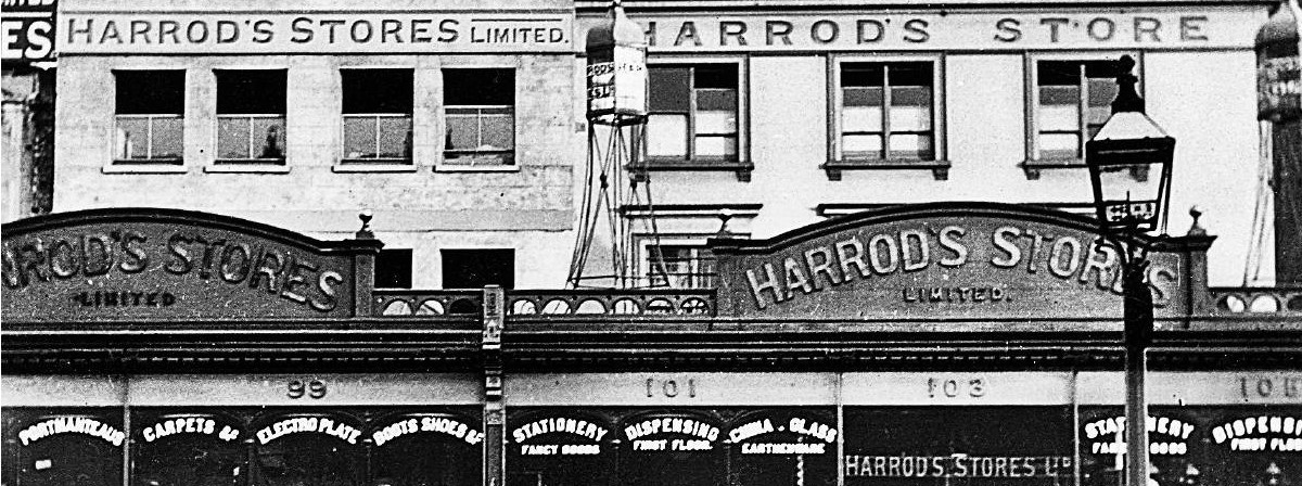
Harrods² 1890 frontage
The First Mark
To understand the prolific branding of Harrods we have to start in 1849. London merchant Charles Harrod relocated his market from Southwark to Knightsbridge, rebranding to a retail operation offering medicines, perfumes, clothing and food.
 Brand Identity 1849 (Corporate Identity Guideline)
The first mark I can find is an 1849 signature-looking script from their Corporate Identity Guideline.
This ‘mark’ seems to be more of a sign-off than a brand. So I am to believe that the department store’s very first creative director was the man himself, Charles Harrod.
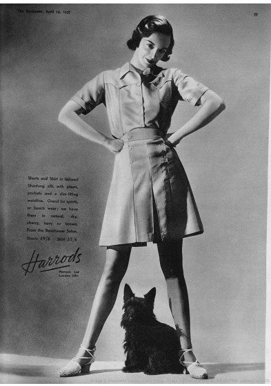
As the century turned, Harrods seemed to bypass a consistent logotype in favor of the luxurious imagery of it’s architectural frontage as found in this 1904 full page advert found in St James’s Gazette.
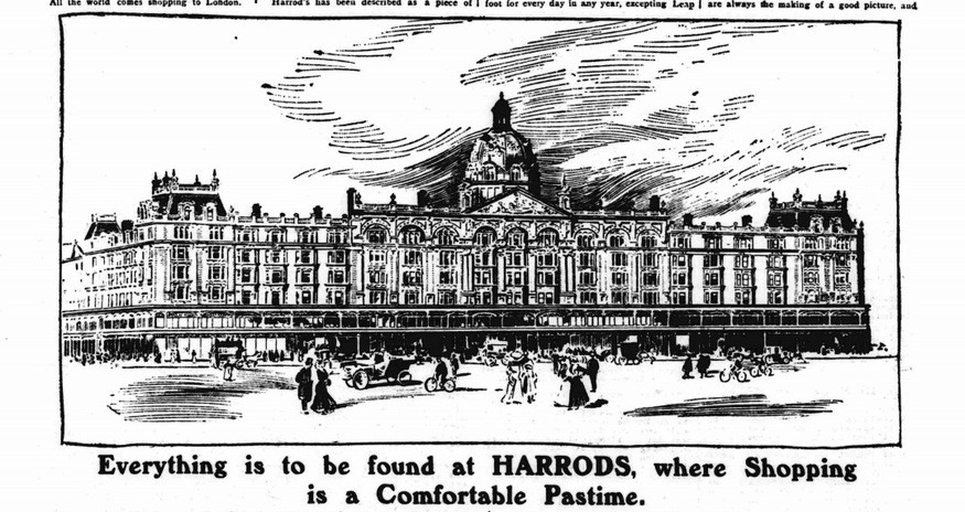
1904 St James’ s Gazette full page Harrods advert
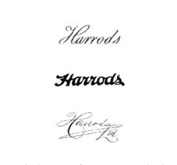 1902–1920s script logotypes from Corporate Identity Guideline
Experimenting with Typefaces
Throughout the early years of the 20th century, Harrods seemed to fluctuate between typeface to typeface, usually sticking with a script elegant style. Any agencies of record are not in fact on record, so I am to assume branding in the visual sense was an afterthought.
Underlining the Experience
Halfway through the ’20s, Harrods opted for a sophisticated underline to its cursive and slanted name. You can finally recognize the makings of their finalish design.
1930s Logo from Corporate Identity Guideline
War Years
Throughout the war-torn 1940s, Harrods promoted itself in serif caps. Although the company wasn’t straying from its elegant feel, it still needed a consistent look.
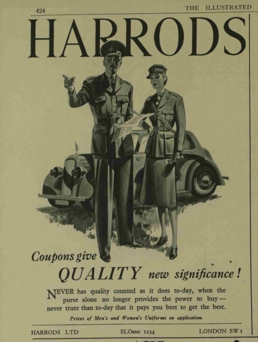
1942 war years advert
For an unknown reason in 1949, Harrods celebrated it’s 100th year with cursive caps.

1949 Anniversary Logo from Corporate Identity Guideline
A standardized script version made its way into television adverts by 1952.
 1952 Version from Corporate Identity Guideline
Agency of Record
![]()
Minale Tattersfield, a creative agency branded by a ‘scribble’ logo understood consistency in branding.
It must’ve been overwhelming to observe multiple wordmarks associated with the store by the late ’60s. A lettering artist worked to perfect the logo and color palette.
The challenge here was to unify multiple products throughout the store while differentiating independent products.

1967 iteration from Corporate Identity Guideline
This look served Harrods well for a few decades, with only minor updates in the 1980s. The addition of ‘Knightsbridge’ name below the logotype to give it a sign of pedigree and enduring quality.
 In 1987, the location of Knightsbridge was added to the logotype.
Brand Identity Guide
![]()
Around 2007, Sasha Vidakovic of SVIDesign worked with the brand to create a consistent brand identity. “Unsanctioned permutations” began to creep in to its identity. ‘Knightsbridge’ was taken off of the logotype as unnecessary.

Clear direction like color palette and typography (Harrods Green Pantone 574C and Harrods Gold Pantone 871C) are visual touch-points to promote the ideals of:
confidence, simple, effective, British, sensation, luxury, service, innovation, rare, precious, glamour.
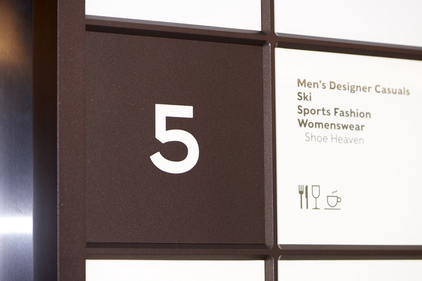
Signage within the store
Enter Pentagram
Historically, Harrods had pioneered the ‘moving-staircase’.⁶ Innovation and mobility around the store is still quite a concern for the brand, thus Harrods tapped world-famous Pentagram to take on wayfinding.
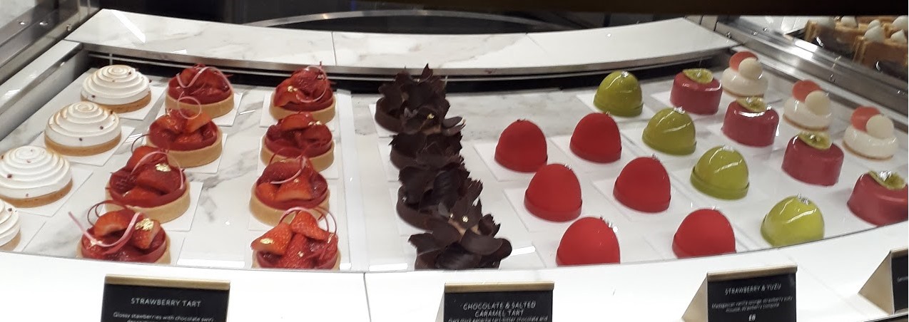
Food Hall
The food hall is absolutely the most impressive part of the entire store. Every detail of the food hall is thought out. From the intricate tile work to the signage, Harrods partnered with creative agencies to produce an unforgettable experience.
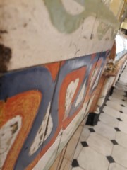
Harrods Food Hall Tile
David Collins Studio brought about the fresh upgrade of the food hall in 2017. The studio was inspired by history, reaching out to Historic England and the Royal Borough of Kensington and Chelsea to create the ‘Taste Revolution’. Simon Rawlings, head of the Studio says,
It’s important for Harrods and for ourselves to respect the historic infrastructure, but more importantly we always strive to create designs which are firmly forward-looking. It’s a fine balance between the respect of the old and the implementation of the new to ensure a contemporary yet timeless interior.
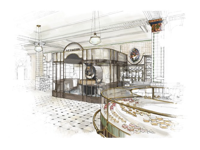 Drawing of the Coffee Roastery

Remember how packaging on Harrods products was so diverse? Multiple agencies came together to create a consistent art deco inspired packaging design. One was Honey, the agency responsible for bespoke packaging solutions you see on their shelves.⁹
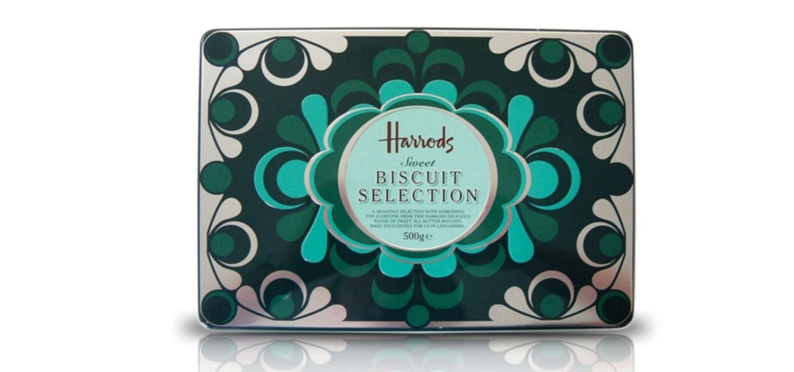
Honey packaging design
Luxury
Back to the remark my driver made. The idea you can walk into a store and ask for anything you want is the height of luxury. Should a customer have the means to pay, Harrods has the means to deliver.
From the beginning of its Corporate Identity Guide, Harrods touts its message as:
a rare and precious brand. One of the world’s famous names, its reputation has been built on extraordinary glamour and vision. It is a theatre of dreams that astonishes us with its breathtaking range. Harrods has always offered constant innovation, service and quality to people all over the world.
Thus, a story from the BBC in 1969.
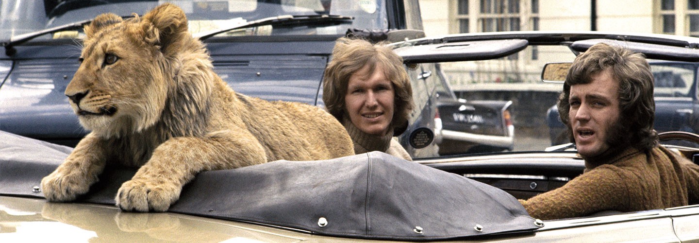
Christian the Lion
Christian
Leave it to two Australians named John and Ace to tame the king of the jungle. Sort of.
John Rendall and Anthony “Ace” Bourke had come across “Christian” late in 1969, at the Harrods zoo (not in existence today). They payed about £3,500 in today’s money and Christian walked into immediate fame with his new Crocodile Dundees.
Luxury, rare, uniquely British, precious. Harrods has lived up to its corporate identity.
I still don’t know if you can get a tiger.
 Author Bio
Juliane Bone is a brand identity designer in California. Her writings and creations focus on the alignment of a brand and its message.