Today Designer Spotlight: Harmony Extracts Brand Identity Spotlight
Harmony Extracts is a cannabis concentrate company that uses state-of-the-art extraction technologies to transform marijuana plants into high-quality, potent concentrates. A new enterprise based in Denver, Colorado, one of the nearly 30 states where marijuana is now legal, Harmony commissioned Pentagram to design its brand identity and packaging for the company’s initial line of products.
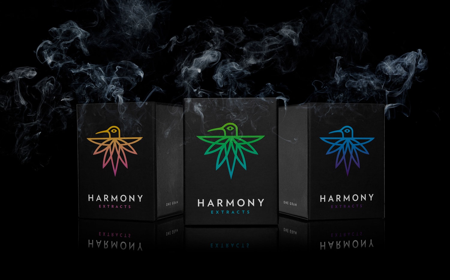
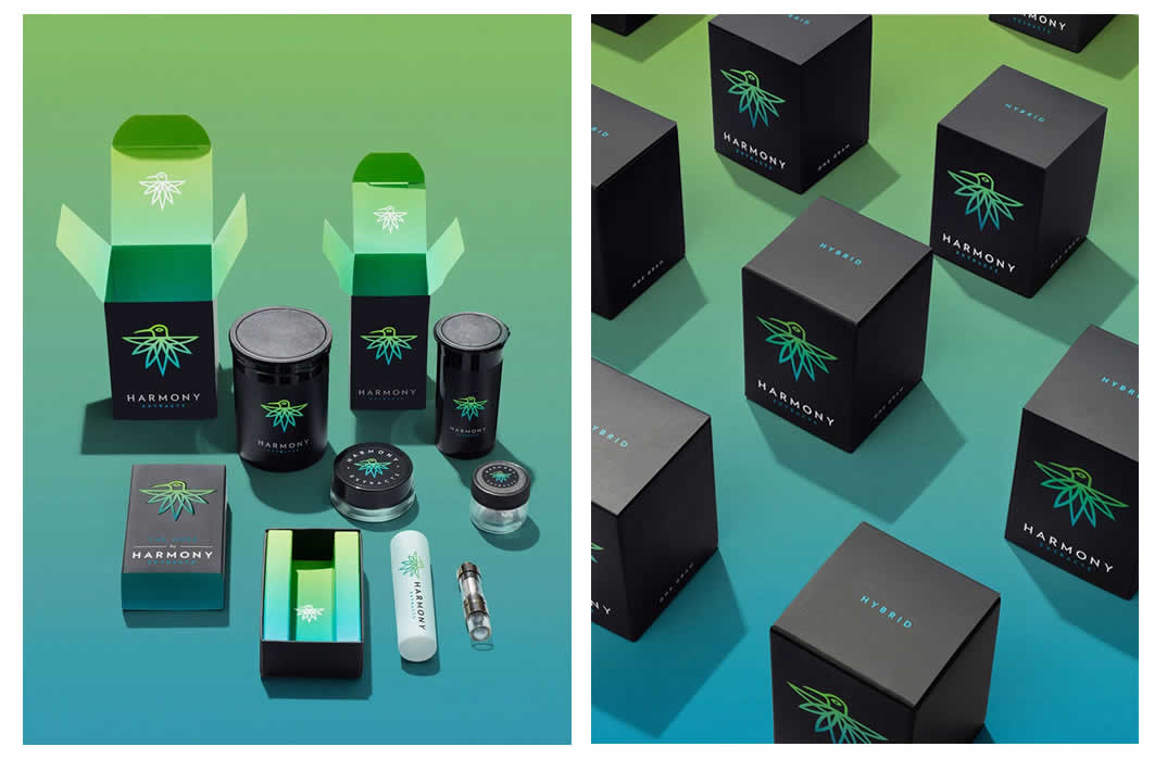
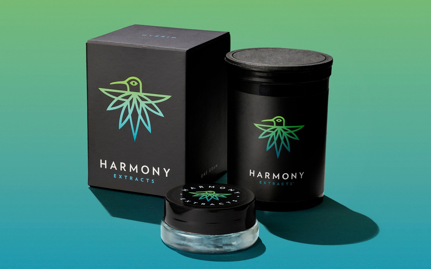
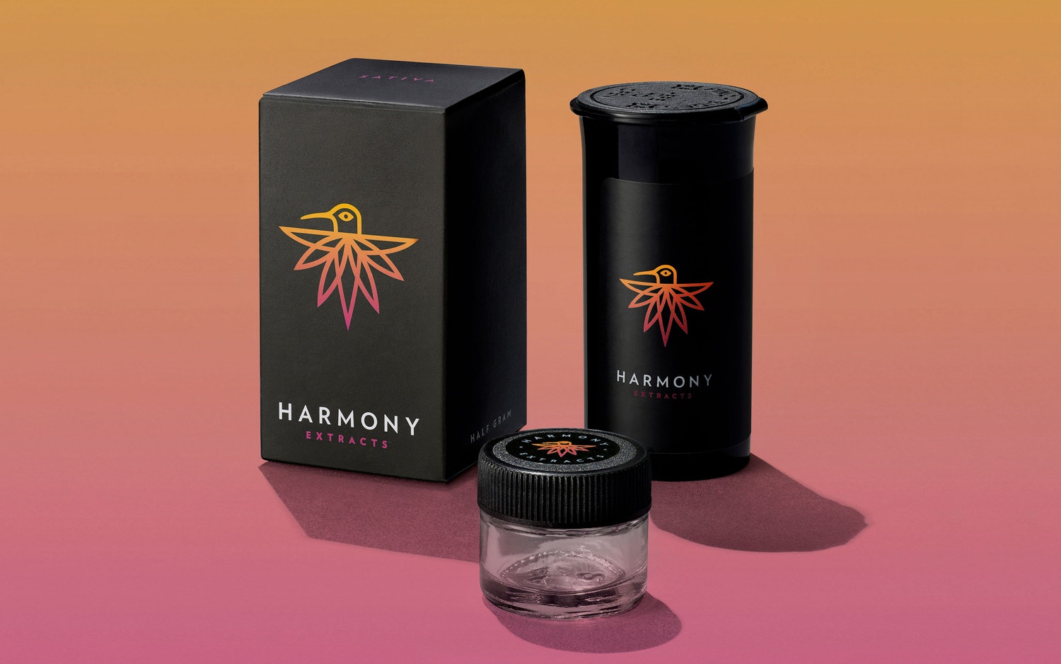
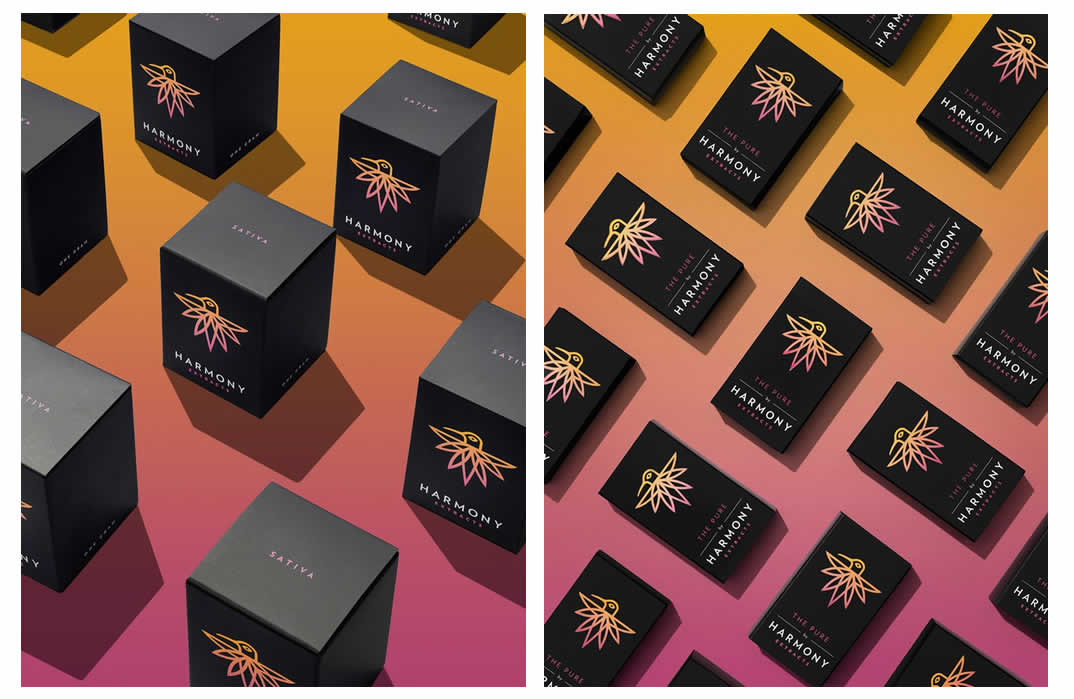
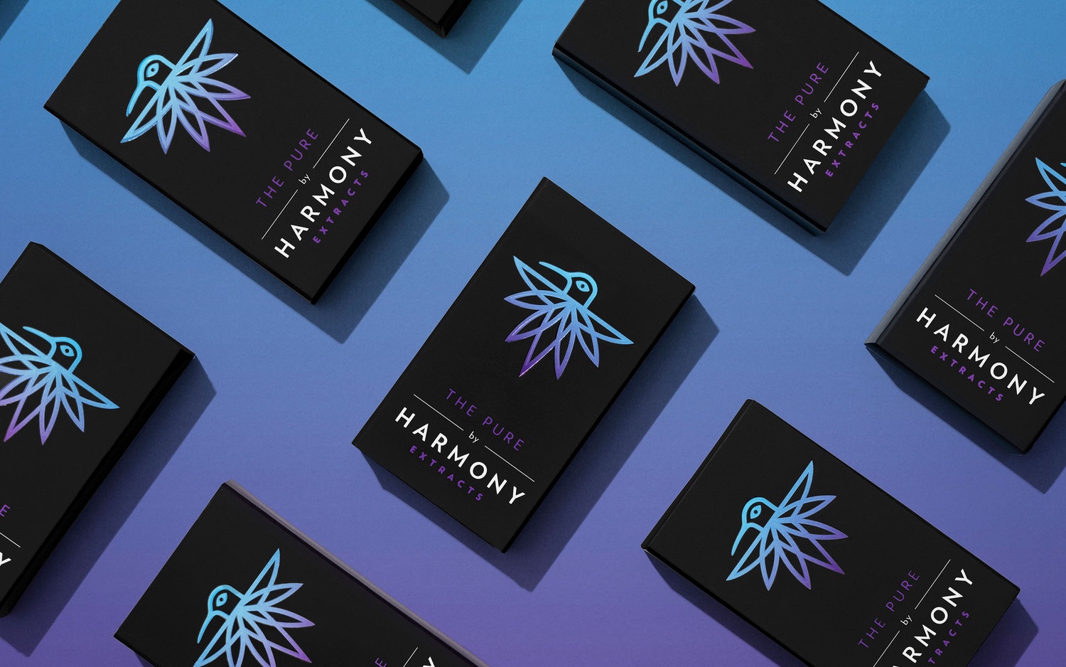
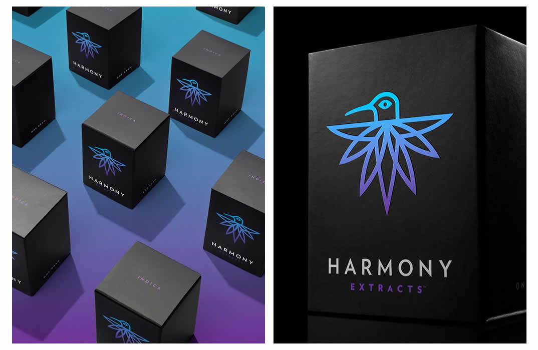
The Design for the cannabis concentrate company highlights its roots in nature. A hummingbird with distinctive marijuana-leaf shaped tail feathers is the symbol for the company and its line of extracts.
Pentagram said:
Early in their brand identity explorations, the design team landed on the idea of using an image of a hummingbird, with distinctive marijuana-leaf shaped tail feathers, as the symbol for Harmony and its line of extracts. A hummingbird, “nature’s little extractor,” is an energetic, participant in the natural ecosystem and seemed to be the perfect symbol for the new company. The resulting “Harmony Hummingbird” icon was paired up with the typeface Verlag to complete the main identity lockup for the brand.
See more of Pentagram Design’s Work | Pentagram Design

