The story of the rise of the Amazon brand is quite fascinating. A way from a regular online bookstore to one of the world’s biggest online stores, where you can buy absolutely everything, was long and definitely not easy. Founded in 1994, it is still here, and we can’t imagine a life without it. Join us in this article as we take a look at the History of the Amazon Logo Design Evolution.
The very story of Amazon resembles a screenplay of some Hollywood movie. Selling books, they managed to succeed, making over $20,000 per week within the first two months. Today it may sound just fine, but we should consider that in 1994 the Internet was not so widespread as nowadays.
Table of Contents
Amazon History – How The Company Started

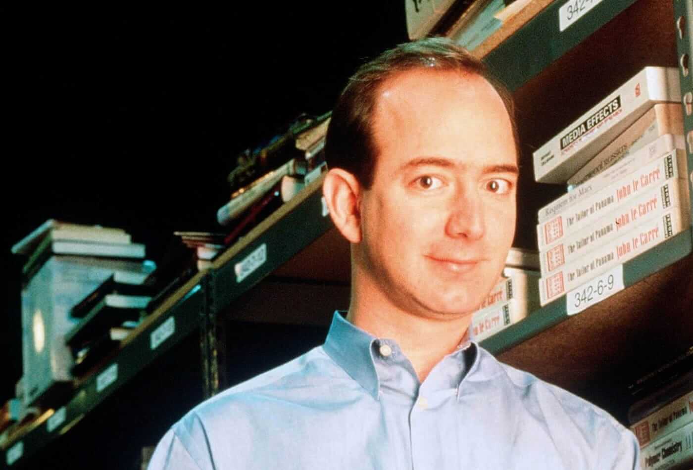
Amazon was first founded in Bellevue, Washington, in July 1994 by its founder Jeff Bezos in 1995 Amazon first launched as a website that only sold books but the founder had a long-term vision for the online company’s explosive growth and e-commerce domination. Jeff Bezos knew from the very beginning of the companies formation that he wanted Amazon to be a we sell everything online store.
Within the 2013 book The Everything Store: Jeff Bezos and the Age of Amazon by author Brad Stone the author paints a picture of the early days of the company and how it grew into the global brand it is today.

Amazon was first set up and operated from Jeff’s Bezos garage and the servers that were set up for the business to operate required an extreme amount of power that Jeff and his wife cound not even run a vacuum air hair dryer in their home without blowing a fuse.

In the very early days of business a bell would ring in their office every time someone would make a purchase from the store, everyone would gather around to see who had made the purchase and if it was someone they knew. It only took a few weeks before the bell was ringing frequently they had no choice but to turn it off. Amazon has grown into one of the worlds biggest global brands that has a multinational presence with offices and facilities such as their, Headquarters, fulfillment centers, software development centers, campuses and retail hub.
The company has come a very long way since first starting out in a garage initially as an online marketplace for books but later expanded to sell electronics, software, video games, apparel, furniture, food, toys, and jewelry.
Amazon has come along way since the early marketplace business model, and now an multinational technology company focusing on e-commerce, cloud computing, digital streaming, and artificial intelligence. Amazon is considered one of the Big Four tech companies, along with Google, Apple, and Facebook. It’s been referred to as “one of the most influential economic and cultural forces in the world.
Amazon has developed its own technology products and services including the distribution of downloads and streaming of video, music, and audiobooks through the Amazon Prime Video service, Amazon Music, and Audible subsidiaries.
Amazon also has Amazon Publishing (simply APub) it’s own publishing arm, Amazon Studios it’s own film and television studio, and a cloud computing subsidiary known as Amazon Web Services.
The Amazon company also produces its own consumer electronics that include the Kindle e-readers, Fire tablets, Fire TV, and Echo devices.
The Amazon Logo Design History and Evolution
But along with business development, we can observe the changes that have occurred with its logo. Starting from a strange word “Cadabra”, Amazon came a long way to the modern-day smiling arrow. And while it is not too obvious why that exact look is a logo of one of the most successful online businesses in the world, we can’t deny that it is both a witty idea and a memorable label recognized by anyone.
The evolution of Amazon’s logo has made it clear that the brand has to adjust itself according to the times and demands of customers. You might think that logo changing is something companies should avoid in order to build up brand awareness and clients’ loyalty. Still, the example of Amazon demonstrates that the mentioned goals can also be reached with logo adjustments.
Anyway, we’ve decided to follow the evolution of Amazon’s logo brand and see what has influenced it, and what profits the company has gained. It can be quite inspiring to research how the most famous brands have changed the logos and what was standing behind those decisions.
1994-1997 – Amazon’s river
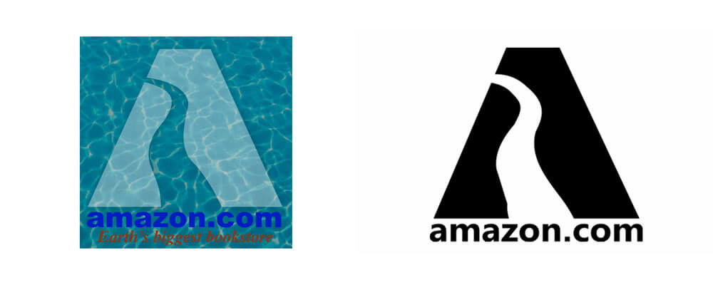
 Amazon’s earliest logo was, in fact, very literal. The company, founded in 1994 as a “Cadabra”, changed its name in order to evade an association with the “cadaver” word. The river’s name was a better idea. Besides, it was easier to develop a brand’s logo. This version of the logo was created by Turner Duckworth believe it or not!, who was approached by Jeff Bezos to create the logo design.
The image of the Amazon river was incorporated into an emblem with prevailing blue color. The general picture was supplemented with a slogan: “Earth’s biggest bookstore”. Taking into consideration that it was the beginning of the online era, users had nothing to compare with, so even not the best design idea was quite sufficient.
But, anyway, the logo looked like someone not really experienced experimented with Microsoft Word’s clip art. The logo, in fact, was tough to read, it was blending with the background and, when printing, people usually got some odd blot rather than a corporate emblem. Finally, the river looked like a poor decision that could be used anywhere and was utterly featureless. Amazon’s marketing department knew the brand’s purpose was to be valuable and memorable, so they understood that there were lots of things to work on.
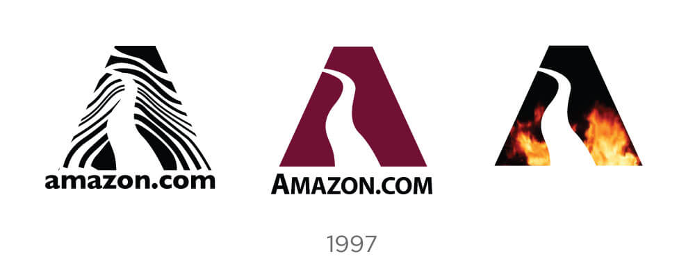
1997 and 1998 – Years of searches

Being faceless, a river as a symbol is both good and bad. It is indeed can be used for any purpose, being universal and appealing. On the other hand, it doesn’t help to make a brand distinguishable and eye-catching. Up to 1997, Amazon was able to grow its income and was thinking of several new markets. It became bigger than a simple online book store, so it required a strong logo to be recognized among the ever-growing amount of competitors.

At first, a logo called a “typeface” seemed like a good idea. However, it lacked some style. It consisted of black letters on the white background with the familiar slogan below. While it was the first step towards something new, the logo’s design looked like a transitional option between the old one and something new. Something that yet had to be developed.
The main issue with the typeface was… well, it also was absolutely faceless. It was merely a brand’s name and a motto. And even that slogan was losing its relevancy due to corporate plans to enter new markets. “Earth’s biggest bookstore” became too small for the companies development plans.
1998 – The biggest “O”

This year Amazon introduced a new logo with a giant ring instead of the letter “O” in the name. While looking a way more fresh than the typeface, it still was, in fact, faceless. Good riddance to the slogan because, by the beginning of the year, there were many other goods available in a former book store. New markets required a new appearance.
The giant ring in the brand’s name, perhaps, supposed to mean something. The problem was that nobody actually understood that message. Was it a bond between customers and the store? Or a rising sun? Or, perhaps, a symbol that demonstrated the vast amount of goods in Amazon’s stocks? The big “O” was a step forward, yet it still couldn’t help to uplift brand awareness.
And what’s more – both professionals and customers felt it was a logo born out of necessity to change at least something. It was a logo embraced because there were no better ideas. Still, it brought a new color to the Amazon’s image – the orange “O” looked really nice between those stylish black letters. It was a fresh spot that Amazon required so much. Also, it became clear that the company’s name as a logo was a good choice.
1998-early 2000 – Looks familiar

The big “O” survived until early 2000. During its searches Amazon decided to get back to a lower-case version of the brand’s name. One of the reasons for that was people who started to misspell the company’s name in different ways. Besides, this upper-case “O” was distracting from the overall style.
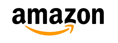
According to the polls conducted, the lower case made a user feel more comfortable and welcome. Small letters helped people to feel more like entering a well-known store behind the corner, where you know all the positions and where to look for them. People were glad to enjoy that sense of comfort. Moreover, the warm orange underlining looked like a signature or a smile.
It doesn’t really matter if it was done for purpose or accidentally, but a new logo seemed warm and friendly, making people forget that it was a huge corporation making millions out of its customers. The orange color added some joy and warmth, making people more likely to click that nice-looking name, rather than go to some cold and faceless stores.
2000 to early 2012 – Smiling

Well, the smile was up in the air, so there was nothing surprising that it appeared in a full view. Moreover, orange smile connected letters “A” and “Z”, implying that you can find all the things you need on Amazon – from A to Z. That was indeed a magnificent combination of the general company’s message, a warm smile, and an emphasis on Amazon’s global scope. It was a book store no more. It was, indeed, a vast river, a flow of all the goods you can imagine!
The smile added more confidence to a brand. But, if you look at a bit deformed “Z”, you may see a cheek. It was a confident yet warm smile, welcoming customers. It was pure emotion, embedded in a logo. Or, you may consider it a smirk of a winner, if you wish. A satisfied smirk of a glad customer who has found whatever needed. Amazon managed to feel people they were welcome there.
Let’s look at the colors. Nothing extra, since by this time Amazon had defined the exact corporate colors. Firm black was for stability, making the image of a solid business. Orange was for warmth, friendship, and coziness. Adjusted by an easy-to0use interface, a logo made people feel like visiting their favorite store to make routine purchases.
2002 Addition of the slogan “and you’re done”

The logo from 2000 was looking very similar to the previous logo design, but there were some slight differences between the two versions. The 2002 logo included the addition of a slogan “and you’re done”, which had been added to the bottom right corner of the logo design. This logo has remained in existence ever since and it is one of the most popular logos. The only thing that changed to the present day was the removal of the slogan and the .com to simplify the logo design.
2012 to present-day – No more “.com”

A visually small adjustment, almost the same logo has lost the “.com” part. Everybody today knows that Amazon is the world’s biggest online store. Ah, yes, there is some river, named after this store, how dared they… Everybody knows what Amazon is, so there is no need in extra words and elaborations.
Besides, there is something bigger behind loosing the “.com”. The reason is the same that was in 1998. The store has grown too big for the Internet expanding too far. No more links management, no more website attachment, Amazon has become more than just an online store by developing its delivery drones and making TV-shows.
In this case the logo reflects a reality. Amazon is just too big to be limited. Its spheres of interest reach far beyond online-trade. Amazon invests in scientific researches, environmental programs, robotics, transportation and whatever else. Besides, it has become too famous. It looks like the next step in its logo’s evolution will make the emblem get rid of the name itself. Because you can’t mix this smile with something else these days.
***
Amazon’s example shows us that the logo adjustment is inevitable, if the company is developing. It can reflect its scale change. It can be turned into something that will set customers’ moods. And, of course, it can be something that makes people feel comfy. Smile when they get to the main page. Or a smirk of the victor, if you want to think about it this way.
We hope you have enjoyed the History of the Amazon Logo Design Evolution and be sure to check out the video below of Jeff Bezos on starting Amazon is an interesting watch.
Useful Links & Great Deals
- The equipment we use & recommend
- Quality Design Bundles
- Get 2 Months free Skillshare
- Get an exclusive 20% off Logo Package Express
- Learn Logo Design Online
Author Bio
Marie Barnes is a writer for LinksManagement and an enthusiastic blogger interested in writing about technology, social media, work, travel, lifestyle, and current affairs. She shares her insights through blogging.


