On the surface, a logo design might not seem like a big deal. It’s just one component of a brand. While that’s true, and building a solid brand requires building value and consistency, your logo will often serve as a first impression. Let’s look at How Modern Logo Design Trends Humanize Brands by Embracing Authenticity.
How Modern Logo Design Trends Humanize Brands by Embracing Authenticity
Think of some of the most infamous and recognizable brand logos. McDonald’s tells you to look for the “golden arches”. Apple is self-explanatory and powerful. Nike is a symbol recognized around the world.
While having a memorable and recognizable logo is important, it’s just as essential to consider how your logo can humanize your brand. Today’s consumers aren’t just looking for traditional advertising techniques.
They’re looking for relationships with the brands they frequent. That requires humanizing your business to build trust and loyalty — and when you consider your logo to be a first impression, you have the opportunity to make it more personable while letting your audience know who you really are.
Thankfully, many modern logo design trends are leaning toward the humanization of brands. Let’s take a look at some of those trends and how they can help your brand to embrace authenticity.
Table of Contents
How a Logo Can Humanize a Brand
Can a logo really humanize a brand? Shouldn’t you be more focused on promoting your company values and engaging with your audience? While you should absolutely spend time on those things, your logo is what will draw your audience in so they can engage with you in the first place.
There are plenty of modern logo design trends that are emphasizing authenticity. Some of the best trends that can help to humanize your company brand include:
- Embracing past eras to help you escape from the chaos of today’s modern world;
- Minimalistic designs that can appear less chaotic and more comforting;
- Substituting letters for icons for fast and easy recognition;
- Mission-first branding so audiences know company values upfront.
There’s no reason why you can’t express who your company is and what you represent through a logo. Working with a qualified designer is one of the best ways to ensure you’re getting your message across clearly.
But it’s also important to give designers your input so they can bring your values to life from the colors they choose to the fonts they use.
What Makes a Logo Seem More Approachable?
There’s no golden rule when it comes to creating a logo design that will attract the attention of your audience. However, there are certain elements that can help to personalize both your logo and your brand, letting your audience know who you are before they dig deeper into your company.
Some of those elements include hand-drawn fonts or images, custom typography, organic shapes, or even personal narratives. These elements not only add to the originality and uniqueness of a logo, but they can make images seem less formal and more inviting.
![]()
Take logos that utilize “signatures”, including H&M, Ray-Ban, and Kellogg’s. They look hand-drawn to “humanize” the brand and make people feel more comfortable.
When it comes to personal narratives and storytelling, perhaps no logo does it better than Amazon. When you take a look at the Amazon logo, you’ll see a golden smile underneath the company name.
![]()
Look closer, and you’ll realize that the smile stretches the length from the letter “a” to “z”, indicating that the company has everything you could be looking for, and you’ll be satisfied with your experience.
Start by considering the color(s) you want to use in your logo. It’s worth it to look into color psychology to determine how people respond to certain hues. Consumers often use emotion to make decisions, and specific colors can evoke certain emotions that might influence them one way or another.
Different colors are also associated with and can stir up specific emotions. If you want to use the psychology of colors in this way, consider the following colors and concepts associated with them:
- Red: Passion, love, power, and confidence;
- Orange: Trust, energy, playful and optimism;
- Yellow: Happiness, hopeful, cheerful, and fun;
- Green: Peace, nature, harmony, and renewal;
- Blue: Tranquility, calm, intelligence, and trust;
- Purple: Royalty, wisdom, compassion, and creativity;
- Pink: Optimistic, innovative, creative, and childish/feminine;
- Black: Power, modern, sophistication, and strong;
- Gray: Neutral, calm, wise, and professional;
- Brown: Natural, stable, friendly, and comfortable.
When you’re trying to create a logo that feels comfortable, inviting, and human, you might consider using greens, blues, or browns. But you can also go bold with reds and blacks if those colors match the message you’re trying to convey.
Brands That Have Successfully Embraced the Trends
If you’re looking for inspiration when it comes to how you can humanize your logo, there are plenty of successful brands that have found the sweet spot between easily-recognizable designs and authenticity.
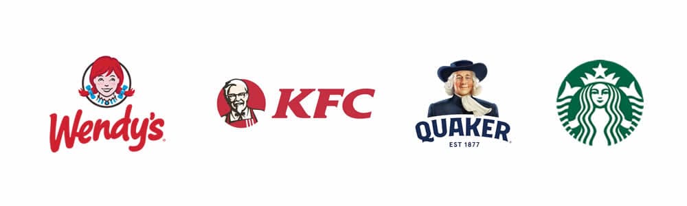
First, take a look at some of the world’s most famous brand logos that literally portray humans in their logos. Wendy’s, KFC, Quaker, and Starbucks all feature people or faces in their logos, and it makes consumers feel like they’re interacting with a person rather than a brand.
After all, what’s KFC without Colonel Sanders, and what’s a bowl of oatmeal without the Quaker Oats man smiling at you while you prepare it?
If you don’t want to put a face on your logo, you can still incorporate human figures. One of the best examples of hidden humanity is in the Tostitos logo.
![]()
The brand takes three letters in the middle of their name and transforms them into two friends eating delicious corn chips over a bowl of salsa. It’s not quite as obvious as some other mascot logos, but that’s the point.
We already touched on the fact that retro and nostalgic designs are trending, and there is perhaps no bigger brand that leans into that than Coca-Cola. While there have been subtle changes to the classic design over the years, it remains very similar to the logo that originated in the 1890s.
People feel a sense of comfort and familiarity when it comes to nostalgic logos, and it can make them more likely to trust your brand since they can feel more connected to those nostalgic values and beliefs.
Overhauling Your Brand Positioning
You don’t need to be a new business to make changes to your logo design. It might be time to consider an overhaul when it comes to your brand positioning and how you want your company to be seen by your target audience. When you start by changing your logo design, consider the following:
- What does your brand have to offer?
- How will you get your message out?
- How are you going to benefit your customers?
While overhauling your brand can be a lengthy process that requires a lot more than a logo redesign, your final design can stem from the underlying values and stories you want to tell.
If you truly want to humanize your brand, don’t be afraid to incorporate storytelling into your marketing. Be personable and genuine with those stories, and you’re more likely to build successful, long-term relationships with your audience.
Your logo can tell a story. It might be nothing more than an image and words with specific design elements, but by using things like custom or handwritten typography, or even incorporating your message into your logo, you’ll tell your audience who you are immediately without them having to dig deeper and do more research.
Of course, you have to be prepared to back up the values and stories your logo is portraying. Your brand humanization strategy should include things like personalized outreach, user-generated content, behind-the-scenes footage and employee spotlights, and an active social media team.
If you’re still not sure where to begin when you’re designing a new logo, consider taking graphic design classes yourself. Graphic design classes can help you learn more about things like color psychology, the use of images and shapes, and typography.
You won’t just learn how to put things in place, but how to give them meaning. That kind of information will be useful to your entire marketing team and will allow you to implement changes as necessary while your company moves forward with rebranding.
Finally, don’t hesitate to listen to feedback. If you really want your company to seem more human, show that you have the ability to listen and take suggestions to heart.
You might be surprised how much those changes will mean to the people who brought them up. When you show that you’re listening to audience feedback, you’re telling your target market that their opinions matter to you — that they matter to you.
What could foster a stronger relationship than that?
Conclusion
On the surface, logo trends will come and go. It’s important to use discretion when it comes to the fads you buy into. Consider what has lasting power and what would resonate the most with your audience.
It doesn’t make sense to create a logo that doesn’t line up with your company values or how you want people to perceive you. So, while looking at design trends can be helpful, it’s more important to follow the trends that speak to your target audience.
When you do, you’ll be able to hang onto your authentic logo for years to come. Even if you decide to change details, you can keep the core design elements that provide comfort, stability, and familiarity to your audience.
Join The Logo Creative Community
We hope How Modern Logo Design Trends Humanize Brands by Embracing Authenticity has been insightful. If you would like more personal tips, advice, insights, and access to our community threads and other goodies, join me in our community. You can comment directly on posts and have a discussion.
*TIP – We use and recommend DesignCuts for all your fonts, mockups and design bundles.