Wondering How to Design a Logo for Startup? We have you covered in this article as we explain what you need to know.
You’ve got a great idea for a startup, everything’s planned out, and your friends and colleagues are on board. But as you start building your pitch deck for investors, you suddenly realize—you don’t even have a logo.
So now you’re asking yourself: is a logo really that important for a startup? Is it worth investing time, money, and maybe a few sleepless nights to create something unique, or can you just settle for a basic stock logo?
We believe investing investing in a professinal logo design is very important, even for a startup, and here’s why.
Table of Contents
A Logo Starts With Building A Brand

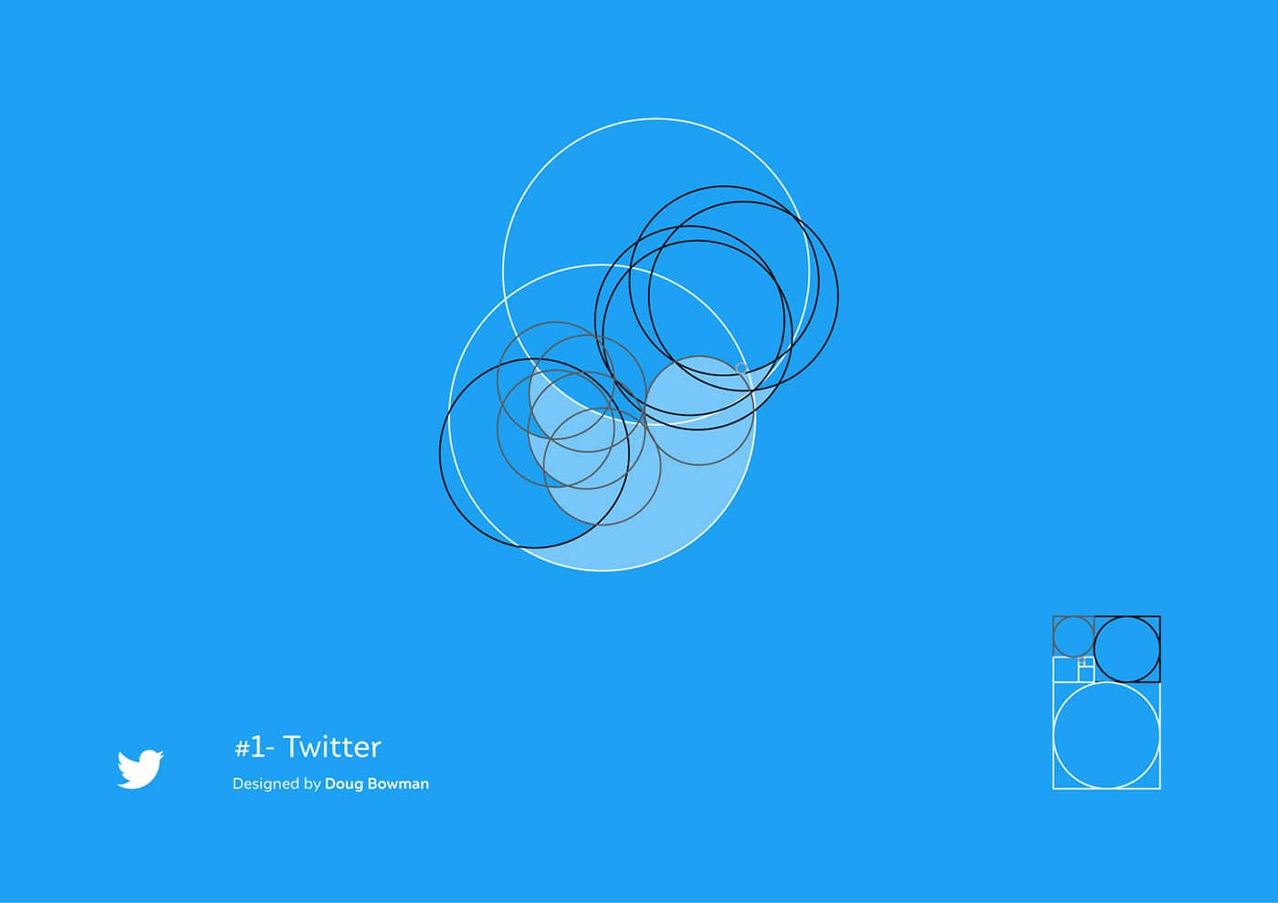
Every logo should not exist in isolation; it needs to reflect the essence of your brand. My favorite example of successful branding is Twitter before it became “X.” I have nothing against rebranding, but the previous branding was incredibly spot-on. The colours, logo, and overall concept were beautifully and cohesively aligned, perfectly capturing the essence of Twitter.

To create strong branding, you need to thoroughly understand your audience. Some designers believe you should also analyze competitors in your niche, while others think this can throw you off course. So, analyzing competitors is up to you.
Next, you should clearly define your values, goals, and mission. A great brand always comes with a great story, so don’t forget that either. Once you’ve worked through these elements, the brand concept should naturally be the final touch of this creative process.
Sometimes, a good slogan is needed to complement the brand, but minimalism in logo design is in vogue right now, so whether you include a slogan alongside your logo is entirely up to you.
Crafting a Logo Step by Step for Startup
Many designers believe that before you start creating a logo, it’s important to keep in mind certain logo design principles that define a good logo today.
- Simplicity is key to success
I get that sometimes you might want to design a complex logo concept with deep meaning or hidden information. However, the more complicated a logo is, the harder it is to understand, and you don’t want your customer to have to think too much. Everything should be easy to grasp, and remember, simplicity is always in style. - The logo must be scalable
Your logo should look good on various backgrounds. If your logo is black, make sure to have a white version for dark backgrounds. It also makes sense to create a smaller, square version of the logo for things like site icons. Your logo should look great both in small formats and blown up on a banner during your favorite sports team’s sponsored game. - The logo should be timeless
Don’t design your logo based on passing trends. Yes, there are timeless classics, but don’t confuse those with trends. Your logo should still be relevant 200 years from now when your descendants are running your business. Great examples are the Ford or Disney logos. - Color psychology is real
The colors in your logo matter a lot. For example, yellow is often associated with caution or danger. So if you’re selling hot sauces, you might want to use yellow to emphasize the spiciness of your product. Colour psychology is important in logo design. - Typography
Fonts are as important for your website as they are for your logo. Everything should be cohesive, and don’t forget about your audience. A bad font in a slogan next to your logo can ruin both the slogan and the logo itself.
Finally Creating the Logo for Your Startup
Play with Concepts
Every logo starts with concepts—sometimes just a few, sometimes dozens or even hundreds. Don’t forget to keep your brand and audience in mind. A great concept doesn’t always come right away—much like first love, you’ll know when you find the right one. Experiment with shapes and colors, and show your concepts to friends or colleagues for feedback.
Refine the Logo Style
Usually, the style chooses the logo, and the logo chooses the style. Once your concepts are ready, picking a style won’t be too difficult, especially since you’ve already defined your audience and brand.
Time to Create Digital Versions
What looks good on paper doesn’t always look the same on a screen or mobile device. Don’t be afraid to make adjustments if something feels off when you transfer your concept from paper to a digital format.
Test the Result
Ask friends, colleagues, or partners what they think of the logo. If you have the time or budget, find a focus group that resembles your target audience and test your logo on them. There are even companies that can handle this for you. A tested logo can be a great bonus when presenting your pitch deck to investors.
The Final Touch
A valuable piece of advice from branding and logo experts: set your logo aside for a bit and come back to it with a fresh perspective. Make any necessary adjustments after receiving feedback from your focus group or others you showed the logo to.
When Is It Better to Hire a Professional?
Let’s be honest—there are entire companies that make a living by creating brand designs, UX design for startups, and even pitch deck presentations for you. They’ve seen both success and failure and, most importantly, they offer an outside perspective to help you view your startup objectively.
It’s always better to trust a professional rather than following a guide from the internet. However, a good professional can be expensive, so the choice is yours—maybe you’re skilled enough to handle it all yourself.
Conclusion
Good design is crucial for a startup because it has a huge impact on how high your startup can soar. Without a well-designed logo, your idea might go unnoticed, be undervalued, or misunderstood. How your idea looks is 50% of its success, and it’s just as important as how it works.
Almost all successful startups have had strong branding and logos, so don’t skimp on resources or time. Create a great logo for your startup, and you and your company could become known worldwide.
Join The Logo Community
We hope you have found these hidden meanings in famous logos helpful. If you would like more personal tips, advice, insights, and access to our community threads and other goodies, join us in our community.
You can comment directly on posts, access our community threads, have a discussion and ask questions with our founder Andrew.
If you’re looking to learn more about brand strategy, we highly recommend eRESONAID with our friend and acclaimed brand strategist and author Fabian Geyrhalter, it’s packed full of knowledge and insights you will need to learn to become a brand strategist or apply what you learn within your own business.

FAQ – How to Design a Logo for Startup
What are the key elements of a startup logo design?
A successful startup logo should include simplicity, relevance to the brand, a unique design, and adaptability to different mediums (like digital and print). It should reflect the startup’s vision and values.
How do I choose the right colors for my startup logo?
Start by considering the emotions and messages associated with different colors. For example, blue represents trust, while red signifies energy. Choose colors that align with your brand identity and the emotions you want to convey.
Should a startup logo be simple or complex?
A startup logo should generally be simple to ensure easy recognition and memorability. Complex logos can be harder to reproduce and may not be as effective across different platforms.
What role does typography play in logo design for startups?
Typography is crucial in conveying the brand’s tone and personality. The right font can make your logo more distinctive, whether you choose modern, playful, or traditional styles. Ensure that the text is legible across various sizes.
Why is versatility important in startup logo design?
A versatile logo can be used across multiple platforms, such as websites, social media, and merchandise. It should look good in color and black-and-white, and it should scale well from small to large sizes

