It’s time to show your work, and today we’re going to learn how to present logos and identity projects. Ben Burns from the futur teaches us How To Present Logo Design and Identity Projects to Clients.
Table of Contents
So What Is This
This Here is a logo presentation methodology homed in by years of stakes:: School of Hard Knocks presenting logos is a science, not art so by learning this methodology you’ll be able to sell your logo designs more easily to your prospective clients
if the logo is the product, the presentation is the packaging and good packaging presents what’s inside clearly and without question where this fits into the overall identity process right after you’ve completed your first round of logo design, the draft, and what you want to present to the client.
This is a presentation that happens immediately after that so before this, the client should have seen any designs for you and they’re coming into this expecting big things.
I can remember when I first started and the first time I sent logos for approval to a client it was in an email that each logo was a JPEG file that was attached to each version individually and I sent fifteen options to the client that was a huge mistake! and I think what I was really looking for was for the client to provide some level of artistic direction.
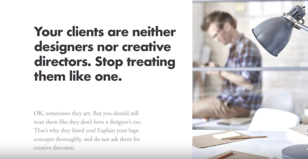
Quick note to all of you guys who are sending your logo designs over email, stop it! identity design jobs are best presented in person or over the phone, stop treating your clients like designers and creative directors because they’re not OK, sometimes they are designers and creative directors, but you should still treat them like the design part, the creative direction part is your job because that’s what they’re hired to do.
But the real reason why this is important is to manage and control revisions I know that you have all experienced this, scope creep revisions getting out of control version sixteen, seventeen, eighteen and the whole reason you want to present your logos beautifully the first time is to sell the client on a single concept.

Before we get into the actual presentation and breaking that down there’s a few prerequisites in the first, which is a solid discovery.

The discovery phase is where you take all of the words and the ideas that the client has in their heads and organize and streamline this information into something that you can digest. The goal is to start the project on the same page.
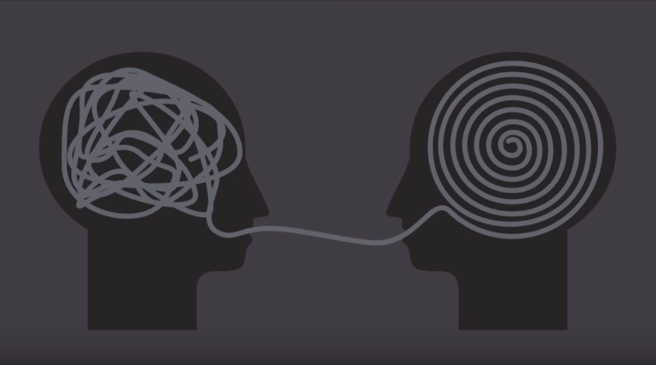

The number to take collaborative steps from the outside to look at this is what a logo design project looks like for a client you start at point A, which is all the information that they have rattling around their head and then you wind up at point B.

which is a perfect logo when in reality we all know that the creative process looks kind of like this.
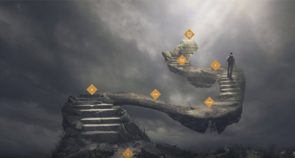
where you have point A and then point B. and then point B V two and then the final and then point C. and then you have the final and then you have the final, final version three, and it’s along winding road to get to the perfect identity. Now Chris Do calls that scaffolding you’re building towards the final product in a set of sequences of steps for me it kind of winds around a little bit so that’s why I like this image.
One of the best things to do as a collaborative step is to do style scapes or like mood boards on crack we’ve done many videos about them just search The Futur Channel for the word “style scape” to find them but if you have this you have a broad compass direction in which to take the brand. So you’re basing your decisions not just on words but also visuals.

Alright, the next requirement is incredible work, it should go without saying, but you need to present your best work to the client.

The fourth is the right tools.
So here at blind we use a combination of Photoshop to generate mock ups of our logo designs and then we present them using keynote software I know a few of you out there are on Windows machines but keynote is amazing you can buy it I think for Windows not sure but the bottom line is use keynote is way better than Powerpoint.
A few of you have seen this new Adobe app that is out called Dimensions This is really promising and I am super excited about the dimensions. I have no idea how to use it yet stay tuned for that tutorial as soon as I learn it.

Alright drum roll please let’s build the presentation…
Step one you want to start at the beginning seems common sense but you’ll be surprised how many designers just jump into throwing up their logos as soon as the meeting starts or worse just sending off a PDF that has one logo per page and expecting the client to flip through it.
You need to start at the beginning. What I mean by that is to recap the reason why they want a new identity. One thing that I like to say is if you guys can remember our goal is to build a new visual identity that….

Then you insert the pain point here and if they don’t have a pain point insert the objective here

re positioning you to to gain more sales, increase your revenue, have your brand match your audience better these are all examples of the reasons why people need a new identity now this should have been fleshed out way before way before discovery in your early sales calls so you should have this already somewhere in your notes.
By reliving the pain point, you’re putting that person back into the buying mentality that they were when they started the engagement, and this can be a really, really powerful thing for approval.
This is also a great place to just confirm that you have the right goal to begin with and to make sure nothing has changed.

Step two: recap the steps that you guys have taken together, let’s say something like guys, before we dig into the work, let’s take a step back and review the process to date.

and then show them a slide that looks similar to the one below.

These are all the important words that we drew out of a discovery session and I walk them through and I say look you know you want to be bold, powerful but bright and basic, colourful, current, inventive, you want to remind them of the place that they were in when they were giving you this inspiration to begin with.
It’s difficult for people to disagree with other people a lot. It’s even more difficult for them to disagree with themselves and so if you remind them of the decisions that they’ve made to date like the words that they chose to describe the brand they want and makes it really hard to refute the results of what you’ve drawn out here.
So then we look for patterns you know unvarnished, character, preservation, quality, on the left and then we have premium, hip, expressive on the right and what we’ve drawn here is unvarnished beauty.
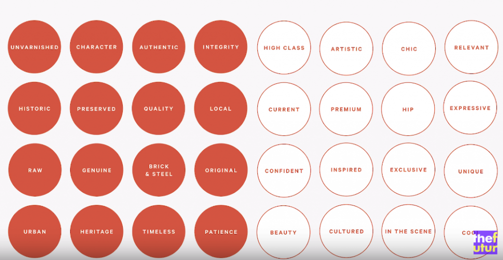
After this point we will typically just go over the style escape that they chose and then we will be caught up. Typically if you want to spend no more than five minutes on this you just want to give everybody a palate cleanser kind of like
“Hey remember this? Let’s go… let’s build on the steps that we’ve already taken” and that’s why this is really important because he wants everybody in the room to be on the same page at every step during this meeting.

Step three this is the big one to display your work so the ideal number of logo concepts to present is three.

One thing I have found is that by presenting three options you’re allowing them to say no to one without saying yes to one right there in the room, so that means because they have three they can say “you know what I’m not really feeling this one” but they still can choose between the two.
So all this being said, the three logo options that you present need to be very closely related to each other because you’ve already set the direction on the style scale.
So as you present your work you need to explain the thought behind each version and this is really really important
You know they did a study a while back about e-bay sales and they found that even something as simple as a computer sold for a much higher price point on e-bay if the description included a story about it, I think the average was like $350 the difference between one that was just the tech specs and then one with some elaborate story about where this computer has been, how much revenues generated and how your so attached to revenue.
Having a story behind each piece lets you sell it easier, but one thing you need to ask yourself is, is this story better told visually?
Another idea is to look for ways the you can show the relationship between the piece that you designed and an element that you hold for inspiration or in the style escape.

So in this circumstance we needed to use a piece of the flame on the left and we eventually turned it into a kind of nice elegant swoosh to the right. This slide was used in the presentation to the client to explain our process and how we arrived here.

Let’s dig into the actual slides, each of the three versions should be presented in the same sequence of slides, the first being just a simple isolated logo in white so what this does is allow the client to just look at the logo.

We’ve seen fancy logo presentations that dove right into mockups and it’s difficult for a client to really absorb the visual information, plus they just see it on a white background we place a logo in the centre of the page with a lot of negative space around it to really focus their eye on the actual logo
The second slide is a split screen one colour logo this is really important because the goal here is to demonstrate how great your logo looks on a dark background and a light background without any assistance from colour and hopefully this will show some thought when the client’s looking at this like I never thought about how the logo would look on a black background.
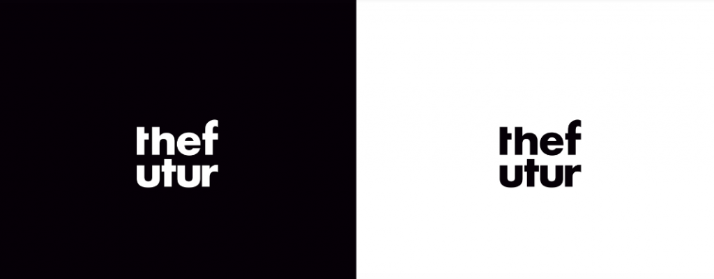
The third side is a collection of standard mock ups and what I mean by standard mock ups is the typical mock ups that you would expect from a love of presenting a business card, stationary, maybe an envelope, these are things that people expect to see their logos on. It’s crucially important to draw elements from your discovery from the style scapes to use in these mock ups.
Things like coloured backgrounds and making sure the colour of the shirt matches the new brand that you’re building, there’s nothing worse than presenting a logo on a mock up template that doesn’t fit the brand, so you want to make sure that every template, every stock photo that you purchase is on brand every time.
Slide number four small format mock-ups it’s pretty self-explanatory guys it’s the logo done really small so things like pens, pencils, pins, wax seals, cufflinks.
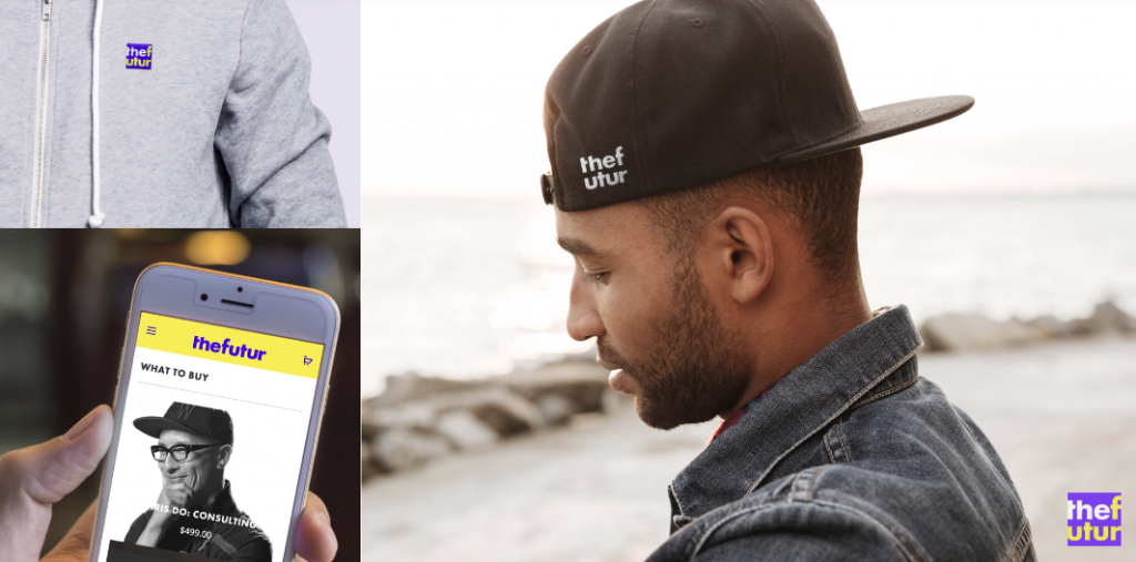
You really want to get into the brand in trying to figure out how they would use the logo in a small space, and as we move through this you’ll find that the things that you present here I want to say seven times out of ten you’re going to wind up designing down the road.
The clients can see that they’re going to love it, they’re going to ask you “Hay Let’s do that.. we should do that” “how much do you think it would take for you to design that?” so this is a great way to both demonstrate the brand and upsell other services.
So since we did a small format the next stuff is a large format now a large format is signage wayfinding interior graphics, billboards, things like that thing that really puts the logo at scale.
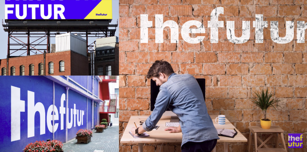
By putting their logo on the side of the building, that is such an ego boost for a small businessman.
I mean, think about it, what if you walked into a room or walked into a meeting and somebody had your logo on the side of the building? It’s going to feel good and that’s the goal with this so feel free to have fun with it if you’re rebranding a lawyer you know think about ways maybe you can put some gold foil on a window sill or if it’s a coffee shop maybe a hand painted sign or something like that something where you’re really conveying their brand in a physical space in large format.
Finally, you want to wrap up every single version with an isolated logo in white, again what this will do with you know, remind them that hey all this stuff is it’s all examples none of the stuff has to be created or fulfilled or executed on.. this is the logo! so it’s kind of like a closure to the chapter that is this version and quite simply you just want to repeat it for all other versions so you should have five slides for three Logo versions for a total of fifteen sides.
We you have completed all fifteen slides demonstrating all the versions of the logo of the design you’re presenting you want to have one slide that compares all options so we get this question all the time and this is one of those, “we never really wanted to put all the logos side by side” every single time we do a logo presentation client asked for it so typically we’ll have it in the slide deck maybe just hidden. I don’t like to compare apples to apples like that but have that slide in there just in case.
so before we get to the final steps of the presentation, I thought that you guys would like to see how we can create these logo mockups and Emily has created some (you can see them in the video below).
The first step is to find stock images that work really well.
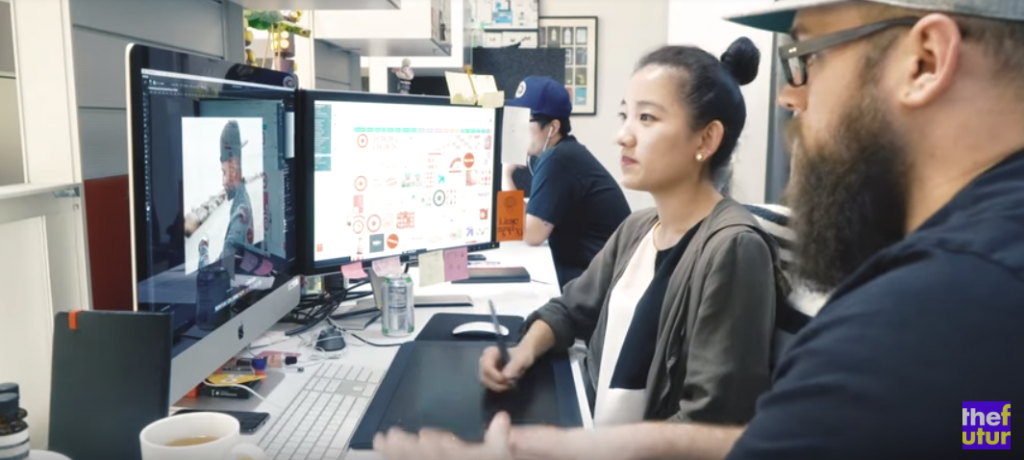
In this demonstration we’re looking for stationery like business cards, envelopes, the standard mock-ups, that’s the first slide of mock ups that we talked about earlier.
When you’re looking at stock photos, look for really high resolution and Designcuts website sells really high-resolution images and also if it’s stationary some close up images to be able to see textures and stuff that matches the brand that you’re designing for so something like a rustic scene wouldn’t work out really well for really slick polished brands like Apple.
Some Good Bundles to Have!
- Branding Mockup Essentials
- Social Media Mockups Collection
- Essential Packaging & Branding Mockups
- The Ultimate Signs Collection
Checkout The Entire Mockups Section
We then bring this into Photoshop and we’re going to use some smart objects so that way if you are the client changes their mind or design it can be easily changed without doing all the work again.
So at this point your logo presentation is complete and you should have a slide that says thank you, we love you, you’re the best, you’re awesome. Well, however, you want to say it but now it’s time to ask targeted questions here are some questions that we ask.
This is my favorite question of all time and it always gets a laugh because right after you’re done presenting your work there’s always that weird moment where nobody’s really talking they don’t want to be too complimentary but you know they don’t want to say anything negative so it’s kind of like this weird space that you’re in so to break the ice a little bit I always ask

“So do we miss the mark completely? It always gets a laugh for some reason. Typically it’s a nervous laugh but you know whatever, but it’s a great way to start things out on a positive note because even if you bomb it, the clients can be like “oh yeah you have, this is a step forward” so it’s a great way to kick things off a positive note.
Another thing that we ask a lot is we go back to discovery and we create user profiles and we always name these people and it’s always something stupid like Joe Dirt. So at this point, I’ll pull that name back into the mix and I always ask “hey how do you think Joe Dirt would react to these logos?”

What that question is doing is it’s taking the client out of “hey what do I like?” “I like this!” “I like that!” “I don’t like this!” You’re asking them to dig into the empathetic side and really put themselves in their users shoes and this is how you overcome that personal preference.
Just a side note every single one of the questions that you should ask you need to be directing the client away from any kind of personal preference statement so I try to stay away from open-ended questions like “What did you think did you like these?” It’s kind of a danger zone area level question.
One good question to ask is “Did we take a step in the right direction to solve?” If you remind them of the pain point it ends up looking like we did take a step in the right direction to help you grow your revenue in 2018

Here’s another question that’s great and it’s:-
“is there one direction that we can just cross off the board right now?”
As you present your work there’s always going to be one option that they like the best and one option that they don’t like at all or like the least. what you’re asking them to do is to say “hey you know I don’t like this one” we’re not asking them to show the trump card of which is their favourite yet.
All right step six don’t expect feedback. This is really key, the most feedback that we typically get is “I don’t really like this one!” “I’m kind of leaning towards this” you always want to say “look I know it’s a lot to digest, I know you probably want to share it around and ask other people, let’s go ahead and give you some time.”
You always want to give your client the time they need to digest what you just presented so don’t expect feedback and don’t expect creative direction, we talked about that at the beginning, but it is key not to expect creative direction.
The last step is to set timelines and expectations you never want to leave a meeting without the next steps and expectations, it’s crucial I’m sure you guys have all seen this where you give a client something to get feedback on and then they just go away and they kind of ghost!.
If you always want to set a due date for feedback, whether that’s a meeting or an email, then it’s thanks and they’re going to give you hugs, hopefully there are tears streaming down their faces because you just knocked the project out of the park. That is!…
I hope you guys got value out of this, this is a huge question that I had when I first stepped into this business is how do I present my work so I’d love to see you guys share your wins, share your pitch decks and share some of the insights that you’ve gained from this that would mean a lot to me.
Get Awesome Mockups With Designcuts
Studio quality stock for a fraction of the cost, with story blocks downloading all of the stock video images and audio to your heart’s desire from their member library, including HD footage after effects templates, stock photography, motion backgrounds and more.
Plus, get exclusive discounts on millions of additional marketplace clips where you save forty percent and the original artist takes home one hundred percent of the sale price.
All of the content is royalty-free so you can use it for both commercial and personal projects, new clips, video, and audio are all added regularly so there’s always something fresh to download.
We hope this article has helped you to understand and learn more about How To Present Logo Design and Identity Projects to Clients. If you would like more personal tips, advice, insights, and access to our community threads and other goodies, join me in our community. You can comment directly on posts and have a discussion.
Check out the video presented by Ben Burns
* We contacted Ben and asked his permission to feature this video as an article and he was more than happy for us to do so.
Useful Links & Great Deals
- The Equipment We Use & Recommend
- Quality Design Bundles
- Get 2 Months free Skillshare
- Get an Exclusive 20% off Logo Package Express
- Learn Logo Design Online

Author Bio
Ben Burns is a brand strategist, award-winning designer, and an expert in user experience. As the Digital Director of Blind, he oversees the intersection of design and technology in all client work.

