A lot of people get confused about the different types of logos, and most importantly which style they should use to represent their own business. In this article we discuss How to Select the Best Type Of Logo For Your Business.
How much effort do you put into your branding?
If you really want to make a success of your company or product line, then your answer should be, at the minimum, “A lot!”
Hopefully, your answer is, “As much as it takes!”
Branding is a hugely significant factor that helps to dictate how successful a company is. It’s what identifies the company, what helps the audience to remember and recall the brand, and what gives marketing more bang for its buck.
What branding boils down to, ultimately, is a type of design system that contains different pieces that all work together in harmony, presenting your potential customers with a whole-cloth brand that simultaneously sends an accurate message and draws interest.
And the most significant part of branding, in terms of connection with the audience, is the logo. The logo is the flagship of a brand. It’s the first piece of branded content that a customer gets familiar with, and it’s the main image that they think of when they hear the company name. It needs to be readily identifiable, promote memorability, stay on-message, and be visually appealing. Read this interesting article about what is a logo Design? to learn more.
Of course, there’s a lot of room for adaptability in a logo — not least because there are at least ten different main types of logos, and each type sends a message of its own.
So which kind suits your brand the most? And which message will reinforce the brand’s personality?
Let’s break the ten main types of logos down, one by one. We’ll include examples of famous logos, and talk about the messages that each type sends.
Table of Contents
Wordmark & Logo Type
Many of these logos are easy to identify based on what they’re called. The wordmark is no exception. This type of logo uses a word, often the name of the company, as the main center and focal point. It relies heavily on a clever choice of fonts, which means that the font itself is often a direct reminder of the brand — think Disney, for example. It’s hard to see anything written out with that iconic little loop over the i and not expect to see Cinderella’s castle outlined underneath it.
Wordmarks run the gamut as far as messaging goes, since they can be aloof and dignified, or fun and hand-made, depending on the font choice. They’re best used for companies with shorter names, such as one to three syllables.
Logotype is a fun take on font-based logos. Logotypes use the same basic idea as the other types above, but include clever adaptations to make the logo more than just a font. These sorts of logos add a definite “I’m smart” vibe to the company’s message, and can often be a way to draw customers in as they look for the hidden figure.
Think FedEx, for example. At first glance, the logo is just a straight colorblocked wordmark. But if you take another look, you’ll see the white forward-facing arrow that is hidden between the E and the x.
Lettermark & Monogram
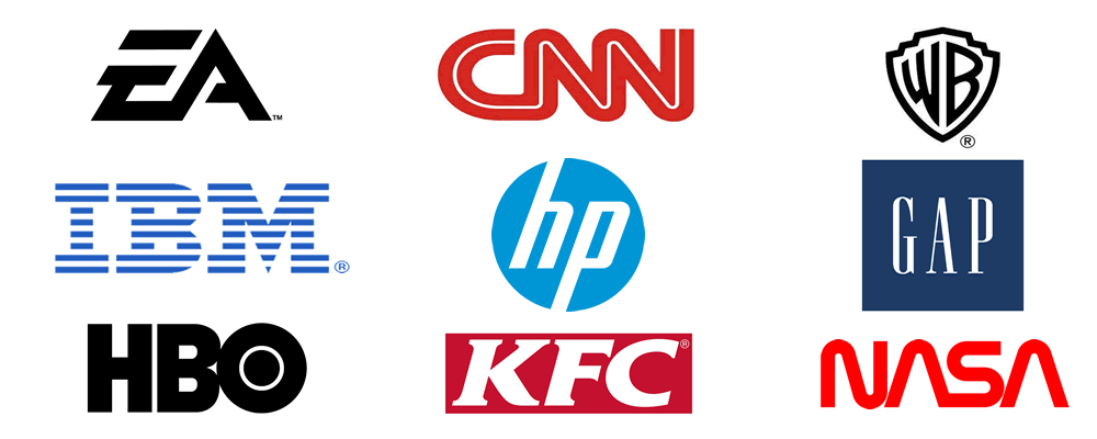
This type of logo, much like a wordmark, relies heavily on the chosen font. Lettermarks often use just the initials of the company name.
Because this isn’t really all that much content to work with, clever lettermarks often use negative space or highly-stylized design to make that one little letter really stand out. If you have a company with a longer name, but want to use a typography-based logo, and if you can adapt it accurately, a lettermark logo can give a smart, unique and evergreen vibe to a logo.
Monogram logos are extensions of lettermark logos, using the initial letters of a longer company name. These types of logos are so successful that we tend to identify companies by their monograms, often without even knowing the real, full name of the business.
- International Business Machines? Try IBM.
- Bayerische Motoren Werke? Try BMW.
- Home Box Office? Try HBO.
These marks are great when the business name is too long to say, too difficult to spell, or too hard to remember.
Symbolic & Abstract
If type-based logos just aren’t your style, don’t worry— there are plenty of other options to choose from. A symbolic logo, for example, uses a symbol, as you might have guessed. The symbol is a graphic or icon which forms the focal point of the logo.
This is becoming more and more commonly used as we turn to tablets, smart phones, and apps, because more information packed into smaller spaces becomes prized. It’s harder to adapt a wordmark or monogram into an app icon; much easier to use a clear, simple graphic.
To get some idea of famous symbolic icons, just look at the app interface on your phone. Instagram, Twitter, Snapchat — all of these are symbolic, or iconic, logos.
This type of logo is perfect for a web-based or app-based company.
 Abstract marks are harder to pin down with a description than a symbolic logo. But it’s easy to think of an example: just think of the Nike swoosh.
Yes, that’s what’s really called — a swoosh.
Calling something a swoosh and turning it into one of the most famous logos of all time is some serious big-designer energy! But that’s the thing about abstract logos — when they’re poorly designed or just don’t work, no one knows what you’re talking about. But when they’re well designed and have ascended into iconic status, it’s clear that you’ve done something right.
Abstract logos are best kept simple. They’re a great way to illustrate the uniqueness of your company, and really stand out from the crowd.
Emblem
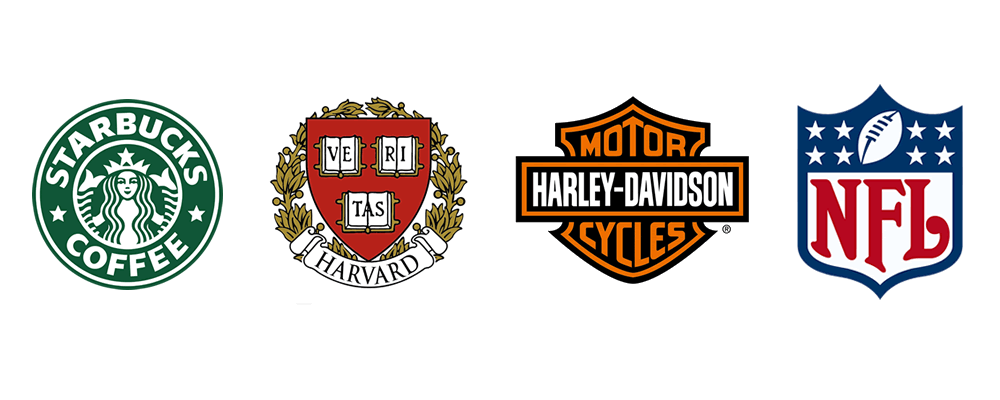
Emblems definitely lend power and gravitas to a logo. For example, take a look at most car manufacturers. There are emblematic logos left and right.
Emblem logos often use a banner or a shield to frame the logo. So they’re well used for brands that want to send a message of trustworthiness, of being established, and of being classic and reliable.
Mascot Logos
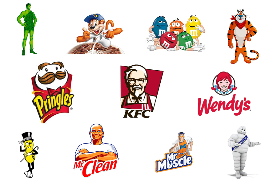
We all love a good mascot. It helps us to identify with a brand, and increases our involvement and engagement — and that’s exactly what the logo designers want!
Mascots are often seen with sports teams, schools, and towns — anything that benefits from loyalty. But you can also see them in logos for restaurants and other companies, like Wendy’s, Red Robin, and Kentucky Fried Chicken. Yes, Colonel Sanders is a mascot. Just picture him dressed up in a giant chicken suit, dancing on the sidelines of the big game.
Mascots are one of the best ways to create a higher level of engagement with your customer. So if you want to build loyal customers and your company is informal enough to put a cute face on its brand, a mascot logo is the way to go.
Basic Shapes
If you’re looking for a basic, simple, easy to remember type of logo, a shaped logo is a good choice. These logos often use geometric shapes and typography to create simple logos with simple color palettes. Think of something like Ikea.
If your company is a stripped-down, basic, reliable brand, this is exactly the type of logo you’re looking for.
Combination
But what if you want it all?
Or at least more than just one option?
That’s where combination logos come in. Combination logos are just what they sound like: a combination of other types of logos. Designers don’t always go out of the gate thinking that they’ll create a combo mark — sometimes it just happens, due to the client’s request or just because a combination mark works best.
Combination logos are highly adaptable to a variety of settings, because you can add or take away individual elements as needed, without necessarily compromising the integrity and memorability of the logo. Combine a shape with a graphic, or a monogram with a mascot, and you’ve got a unique, adaptable logo that can go anywhere and do anything — and, more importantly, represent your company accurately.
Choose Your Logo Type
Now you know all the important facts behind the ten different basic types of logos, which means we’ve come down to the moment of truth.
Which logo fits your company best?
As you read through the different types, which message resonated with your company’s message?
We hope this has helped you in your thinking about How to Select the Best Type Of Logo For Your Business.
Whichever type of logo you choose, remember that the important thing is to stay true to your company’s personality. Don’t choose a logo type that clashes with your brand’s message. Remember, you’re choosing the flagship for your entire brand.
Want to learn logo design online? Check out the online masterclass you only pay for once, and get lifetime access to learn at your own pace. It’s a great course full of everything you need to design great logos.
If you would like more personal tips, advice, insights, and access to our community threads and other goodies join me in our community. You can comment directly on posts and have a discussion.
Useful Links & Great Deals
- Quality Design Bundles
- Learn Logo Design Online
- Get 2 Months of Free Skillshare
- Get an Exclusive 20% off GrindKit
- The Equipment We Use & Recommend
- Lean Brand Strategy – Brand Master Secrets
- Get an Exclusive 20% off Logo Package Express
Author Bio
When not working on website projects, Cynthia Adam loves to write about web design, web development and how to market them. Her writing aims to ease the process of web design and web development for other website owners.

